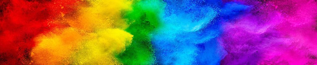
I believe that colours have a massive impact to one’s thoughts and feelings, this is something I would like to explore in depth for my major project.
As someone whose emotions are affected by colours, it intrigues me to figure out why and if others feel the same way. The deep emotions we feel when looking at colours can come from what clothes we were, what we chose to eat or the product on a supermarket shelf that has drawn us in. Why did you paint your bedroom that colour? Were you considering how your future self may feel waking up to a bedroom of that specific colour? Why do we enjoy flowers so much? These are just some of the questions that make me want to delve deeper into the psychological level of the colours in our mind.
I would also like to incorporate street photography into the major project. I aim to research the colours of different weather types and how it affects a person’s mood. I want to investigate different times of the day and how the weather projects certain colours across the world. Why do some people find comfort in the night slowly appearing and projecting a dreary blue-like atmosphere across the streets. A good example to further explain what I want to research is the ‘golden hour’ of the day, this is a popular term used when the sun is starting to set and leaves a warm, yellowy orange glaze before completely setting. This is the time of day when people enjoy taking photos. Many people find this time of the day very pleasant and aesthetic. I personally, enjoy the golden hour, it makes me feel happier, warmer inside and gives me a sense of nostalgia.
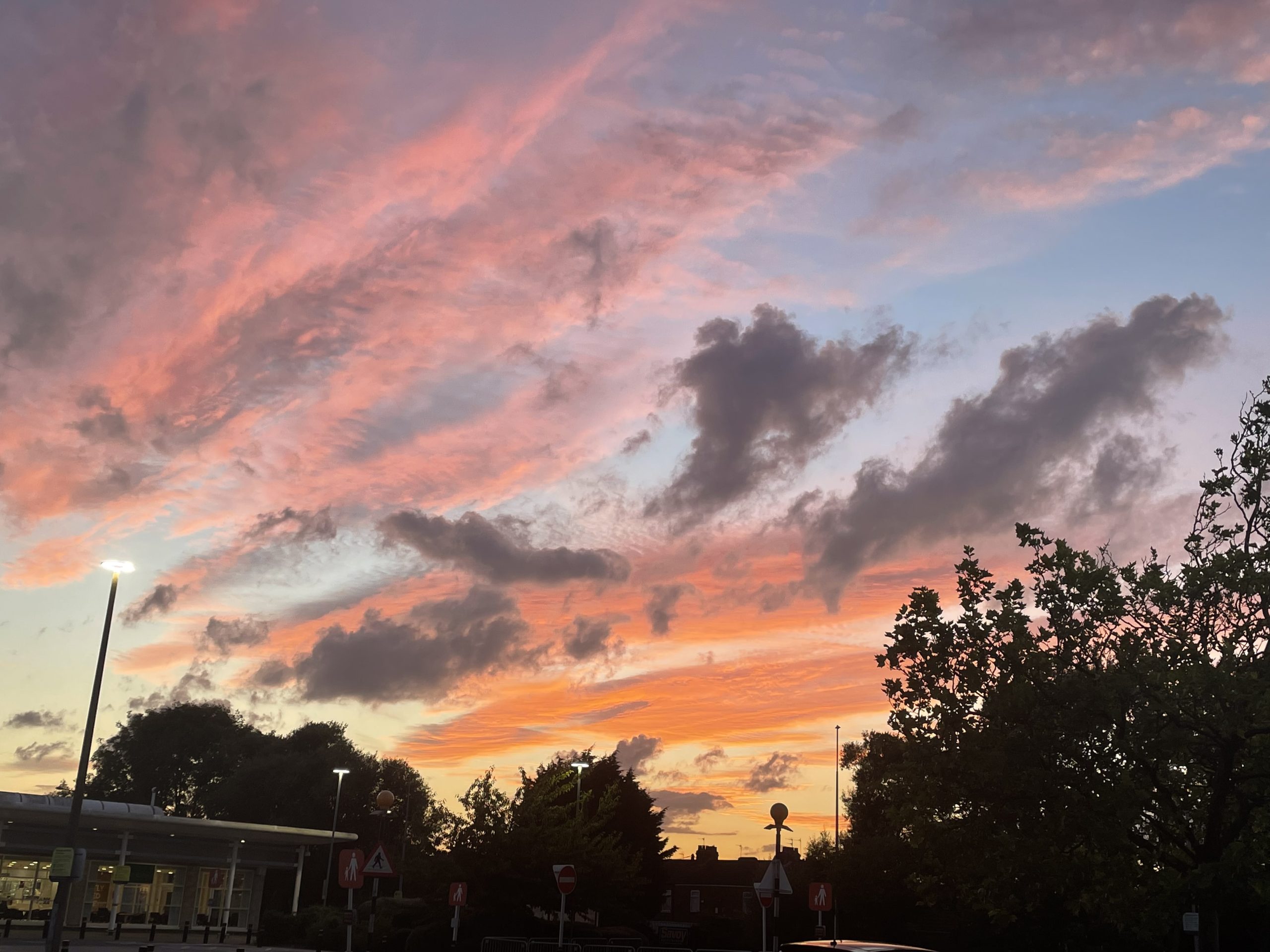
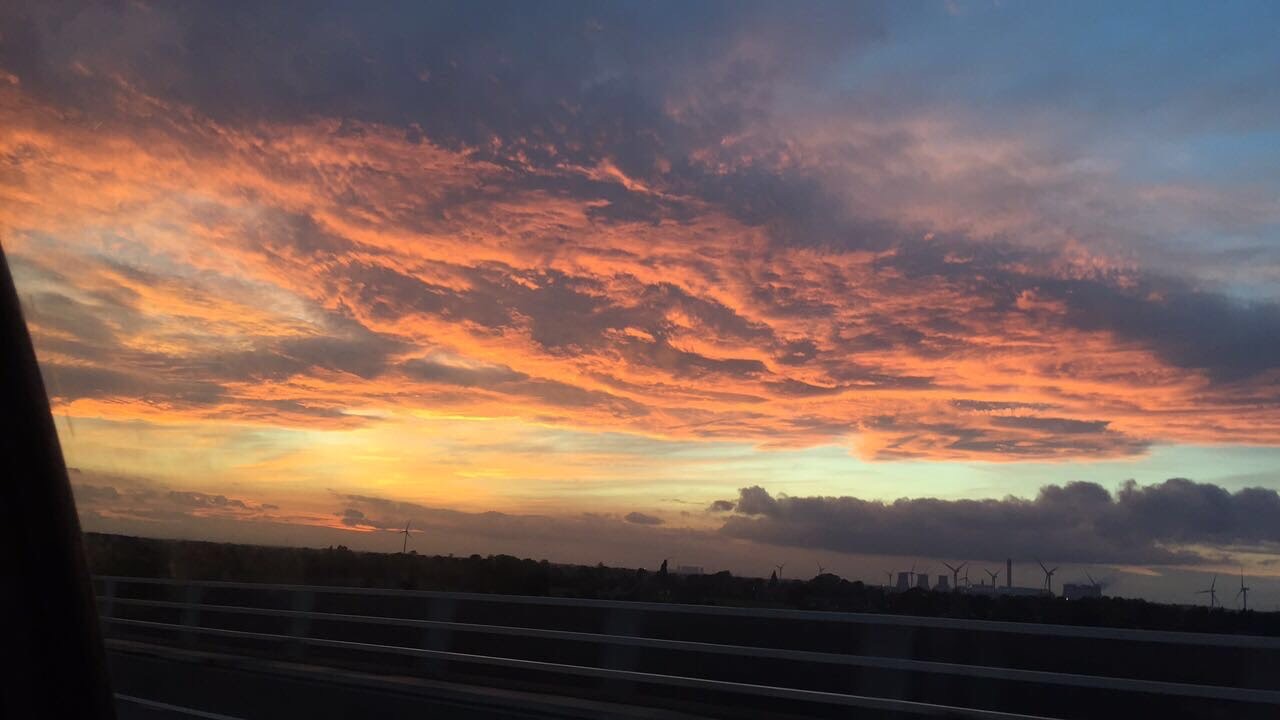
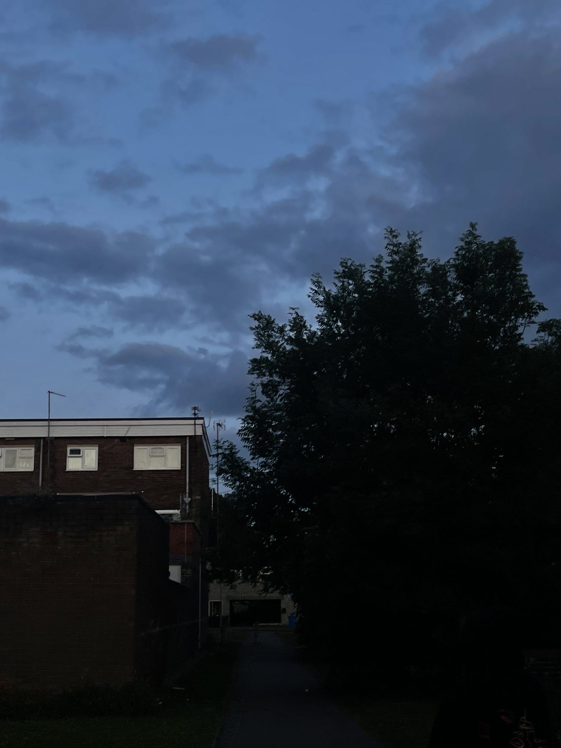
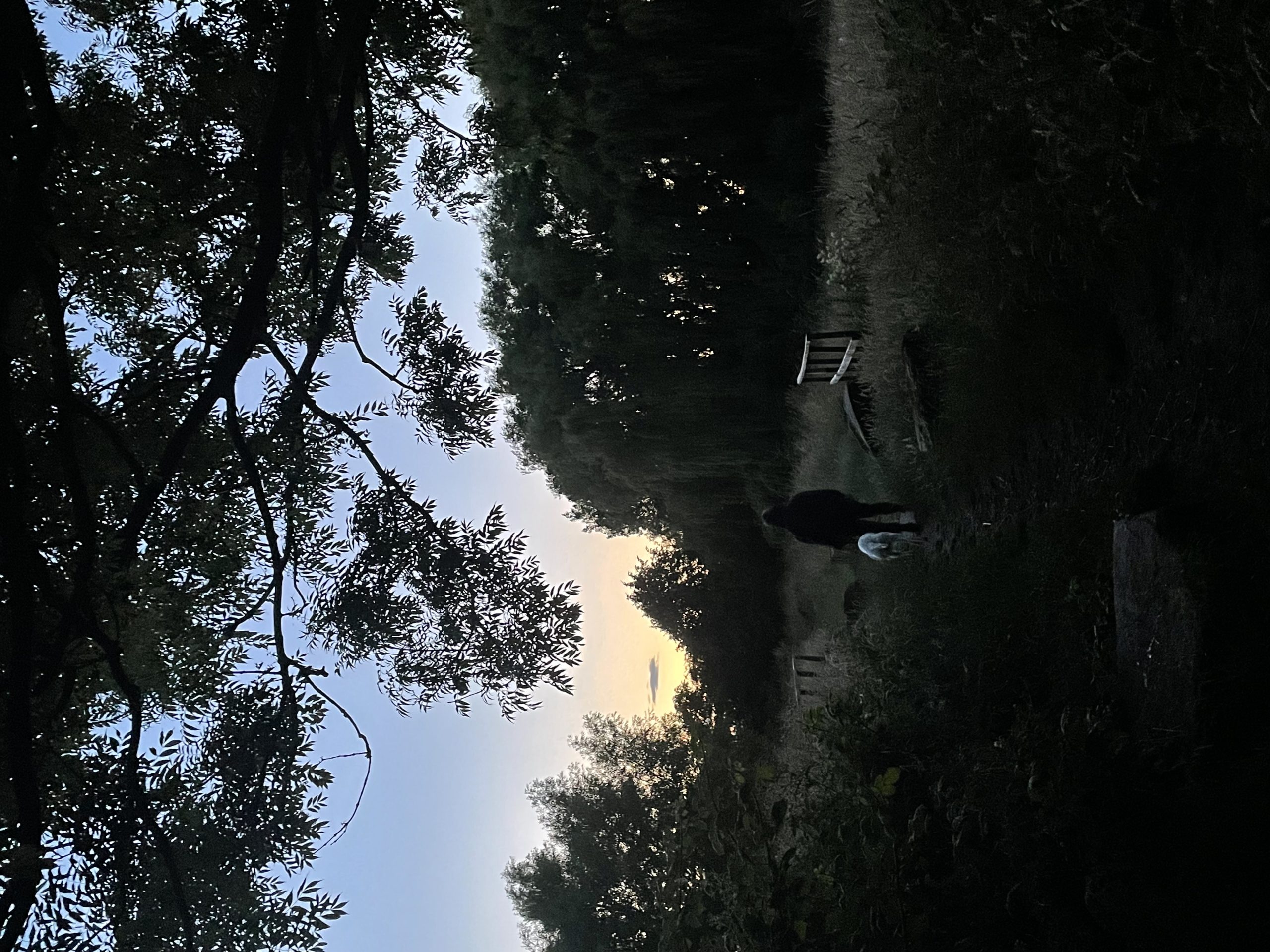
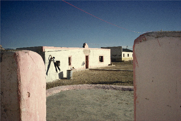
A collection of photographs from my personal gallery, these images have been used to show how I felt when taking them.
These are some of my own photos that I have taken when I’ve felt something from the colour of the weather/day. The first two made me feel a lot of comfort, when taking these photos, I felt a great deal of gratitude because of how beautiful the weather can be. The last two images make me feel more peaceful. When I took these photos, I felt sombre. I want to be able to capture these emotions through the audience of my work.
(Colour Branding: The Importance of Colour Choice)
Colours can be such a wide spectrum to explore but I would like to venture into the emotions we feel when viewing or using certain colours. ‘We might also like certain colours because of their emotional connotations. Yellow, for example, is often seen as a ‘happy’ colour, while darker colours can be more mellow and reflective.’ (Jarrett). A lot of the emotions we feel from colours can be influenced from our childhood and growing up. Seeing yellow as a happy colour could be because of the sun, we make some of our fondest memories in the sunshine and brighter blue tones can be paired with that happy colour because of the blue skies we witness on sunnier days. ‘Feeling blue’ is a popular term used when we are experiencing more negative emotions, this could be because darker blue tones can be associated with more drab, dull weather.
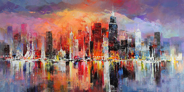
William Haenraet’s ‘City Scrapes’ showing the use of colour in fine art (Georgiy).
William Haenraet’s ‘City Scrapes’ is a great example of how colour can be used in fine art to show how the weather and city streets may look throughout times of the day. This painting looks as though it is split into two. The left-hand side looks sunny and bright, full of life. The golden sun shines on the city buildings, leaving yellow and orange reflections. This side of the painting makes me feel warm, it makes me want to be there basking in the sun. On the right-hand side, it appears duller, as though it has started raining and heavy clouds are hovering over the buildings. This side gives off feelings of emptiness or sadness and now I don’t want to be there. This painting was quite the eye-catcher when researching artists and their use of colours because it is full of so much life and emotion. The reaction I have towards this painting is how I want to portray my work for the major project.
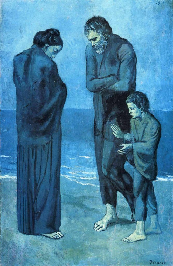
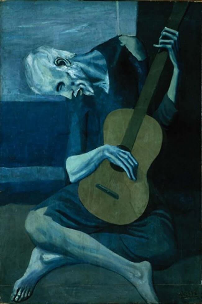
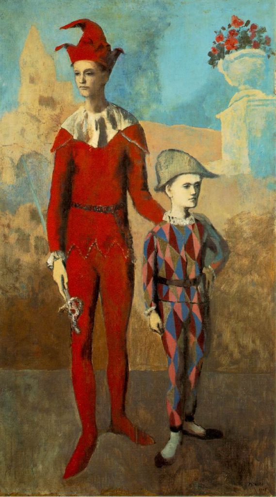
(Pablo Picasso Blue Period)(PabloPicasso.org)(Pablo Picasso Rose Period)Pablo Picasso’s ‘The Tragedy’, ‘The Old Guitarist’ and ‘Acrobat and Young Harlequin’, three paintings portraying the strong emotions Picasso felt at the time of creating them.
Moving on to something that portrays much darker emotions, Picasso’s ‘Blue Period’. This time of Picasso’s career is very well known but the reasoning behind these sad paintings might not be. Picasso’s ‘Blue Period’ started when he lost a friend to suicide (PabloPicasso.org), thus leaving very negative thoughts and feelings. These emotions have been portrayed through these paintings. Although the paintings show people with very depressing facial expressions and body language, the emotions still very much came from the colours used. These shades of blue have been depicted carefully to help portray the feelings that Picasso was experiencing so deeply, if these blue and green tones were any brighter, it would not be as upsetting to view. Picasso’s palette started to brighten when he met his mistress, thus creating the ‘Rose Period’. During this time, his paintings became full of life because his personal emotions started becoming brighter.
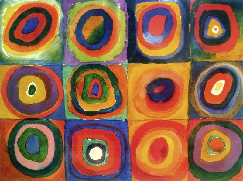
Wassily Kandinsky’s ‘Squares with Concentric Circles’ showing the use of bright colours against darker colours (Wassily Kandinsky).
I wanted to include Wassily Kandinsky’s ‘Squares with Concentric Circles’ because this painting doesn’t involve any form of object or person, so it is harder to depict any form of emotion created from this artwork. I do think that there is no possibility of feeling any negative thoughts from this bright selection of colours. In area’s where darker, duller colours have been used, they’ve been counteracted with a brighter, fuller colour.
References
Colour Branding: The Importance of Colour Choice. 4 Mar. 2021, waterfront.digital/colour-branding-the-importance-of-colour-choice/. Accessed 2 Nov. 2023.
Georgiy. Ten Artists, Who Conquered Colour, 22 May 2016, art-bydens.blogspot.com/2016/05/ten-artists-who-conquered-color.html#.Wz_QENJKhPY. Accessed 2 Nov. 2023.
Jarrett, Christian. “Why Do We Have Favourite Colours?” Www.sciencefocus.com, www.sciencefocus.com/science/why-do-we-have-favourite-colours. Accessed 2 Nov. 2023.
Pablo Picasso Blue Period. www.masterworksfineart.com/artists/pablo-picasso/blue-period. Accessed 2 Nov. 2023.
Pablo Picasso Rose Period. www.masterworksfineart.com/artists/pablo-picasso/rose-period. Accessed 2 Nov. 2023.
Photography is one of the most powerful forms of art, like colour, it has a very wide range to talk about but the style I have chosen to study is street photography.
With photography and the power of editing, some of the most amazing stories can be captured and available for the world to see. Photography can be as simple as taking a photo of some flowers and to want to take that photo, you must feel some sort of emotion to what you’re capturing.
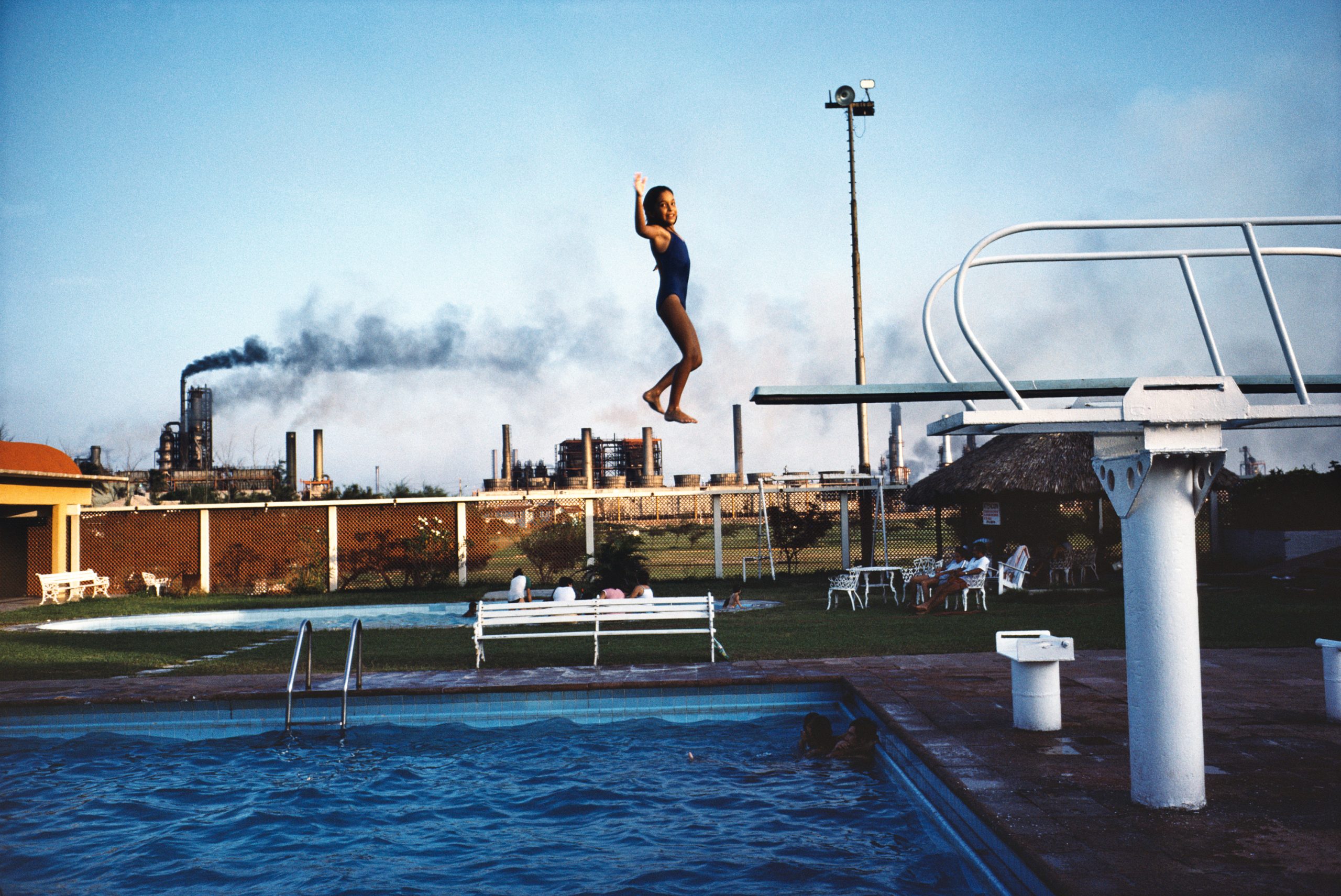
Ciudad Madero, Tamaulipas, Mexico, 1983Tehuantepec, Oaxaca, Mexico, 1985Boquillas del Carmen, Coahuila, Mexico, 1979A range of Alex Webb’s photographs showing a good example of how the colour blue can be associated with positive emotions (Alex Webb: La Calle).
I’ve chosen to study these three specific photographs by Alex Webb because of how beautifully the colour blue has been captured. Unlike the blue tones talked about with Picasso’s Blue Period, these shades of blue give me a sense of happiness and excitement. It’s the same shade of blue that you think of when imagining blue skies on a summer’s day. Webb’s style of photography intrigues me because making the colours seem so powerful must come down to how the photos are edited. These colours have so much saturation compared to the everyday world we’re used to which makes this photography style so refreshing and nostalgic.
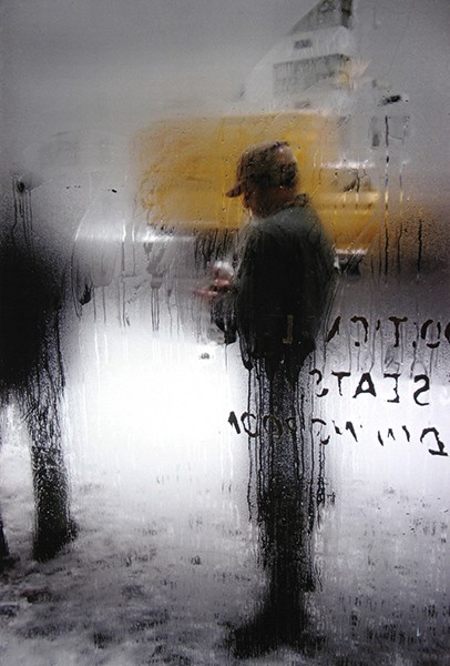
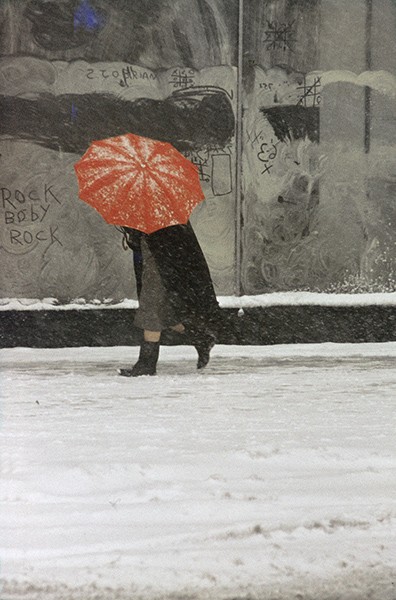
Snow, 1960.Red Umbrella, 1958.Two of Saul Leiter’s photographs, showing how a single pop of colour can draw more attention (Haus Der Photographie).
Saul Leiter is a good example of capturing emotions through weather. A lot of Leiter’s work can be seen with rain or just dull weather. Some of his street photography will capture dull and dreary colours but will always consist of a brightly coloured object or vehicle which draws the audience in and increases the want to explore further. A good example of this is ‘Snow’, having the pop of colour directly behind the main subject of the photograph, which is very dark and dull, draws your eyes straight towards it. Another example of this technique is ‘Red Umbrella’. In this photo, the subject, also dressed in dull colours, is holding a very vibrant red umbrella, this being the only colour in the photo.
References
Alex Webb: La Calle. independent-photo.com/news/alex-webb-la-calle/. Accessed 2 Nov. 2023.
Haus Der Photographie. www.kehrerverlag.com/en/saul-leiter-retrospektive. Accessed 2 Nov. 2023.
Colour plays a major role in photography so it would be simple to combine the two together but the way I would like to do this for my major project is through a photobook or magazine.
The aim of the photobook is to have the viewer experience a rollercoaster of thoughts and feelings when flicking through the pages. Throughout the book I want to portray different times of the day on different days to really get the full effect of how the colour of the weather can impact emotions. It will showcase sunny days, rainy days and everything in-between. I want to tell a story through a timeline.
To include the graphic design aspect to this photobook, I will be designing the pages in a grunge-like manner. I aim to include text, handwritten words or just simple decals to some pages, making it niche.
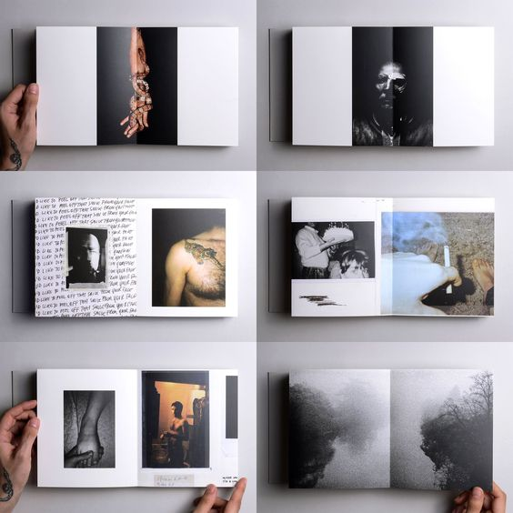
These are some examples of photobooks to further explain my thought process and visions I have for future productions.
First example of a photobook layout that inspires the final major project photobook (“Oyster — Marco Marzocchi”).
The first example above shows the layout for a photobook designed by an artist named ‘Void’. This is a good example of how I would like my final photobook to look. The photographs seen in the image have different sizes and are have unique placements throughout the pages. This niche way of layout design is appealing and refreshing because it differs to the stereotypical photobook, this inspires me to design something niche.
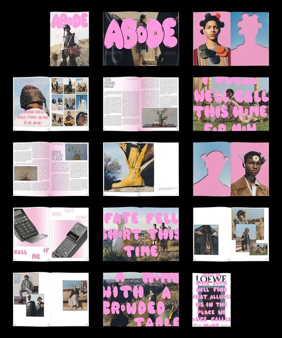
Adobe magazine layout that showcases similar design styles that will be used in the major project photobook (“ABoDE Magazine Layout & Design”).
This magazine has been included as a good inspiration towards my final photobook because it shows how typography can be intertwined with photography to create something grunge-like. The same pink tone has been used throughout all the pages which adds character and connects every page. Like the first example, the photos are all sized differently and the pages are very editorial which makes this magazine very aesthetic to view.
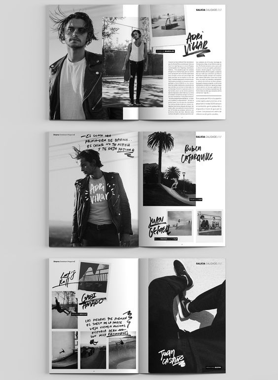
Dogway Skateboard magazine showing a good example of how photography can be arranged to keep the attention of the reader (“Dogway Skateboard Magazine”).
Although this last example lacks colour, the layout of these magazine pages really caught my eye. The use of handwritten text is very modern and is similar to the work I intend to produce. The photography layout is has been carefully thought out, there is no negative space and the placement of the text used is edgy and artistic.
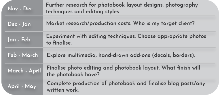
Now that the basics if this design idea have been discussed, it’s time to consider the future production of my photobook. From now (November 2023) to next May, the final product has to be complete, as well as any minute design ideas such as a logo for the photobook, the typography included and the finish of the entire book. Are the pages going to be glossy or have a matte finish?
A chart created to help plan the future development of my final major project.
I created this chart to help me through the designing, this helps me specifically calculate the time I have to complete everything and can be a reminder if I’m ever feeling lost throughout the process.
From November to January, I will continue to research into photobook layouts and look for any inspiration towards the editing side of photography. I then want to delve into some multimedia techniques that can be added into the photobook, like the Dogway magazine, spoken about in the previous post. I want to be able to add my own handwritten text onto my photos to make my finished product more appealing to the younger generation.
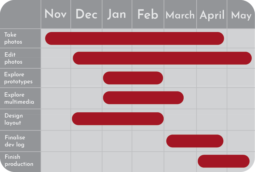
A gantt chart to further show the thought process of what is to come over the next few months.
Using this gantt chart can help me with future planning. This planning style gives me exact times to have tasks completed by. With photography being quite a new topic for me to explore, I want to spend most of the seven months taking photographs, I intend to take multiple photos for each hour of the day so I can have a detailed option in choosing the most fitting one for the book. Having multiple photos for one particular thing can also increase good editing and layout options.
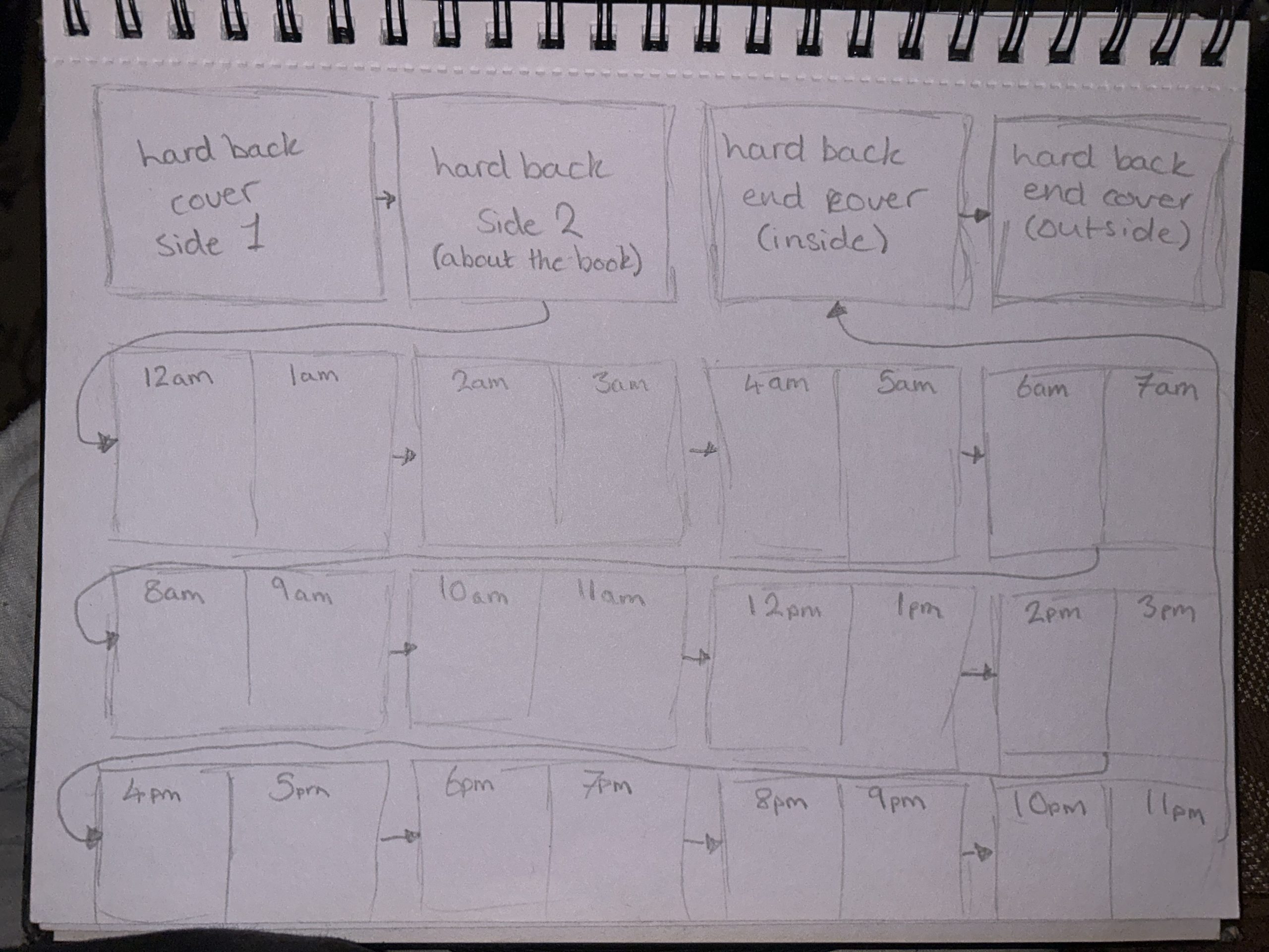
A rough sketch of the design layout for the final photobook.
As shown in this rough sketch, I want to use each page to showcase every hour of the day, the photos may not be from the same day because I want to include different types of weather/seasons. The aim of this photobook is to tell a story, I want to be able to feel many emotions when looking at each photograph. From here, the next step is to start taking photographs and exploring the creative side of this project.