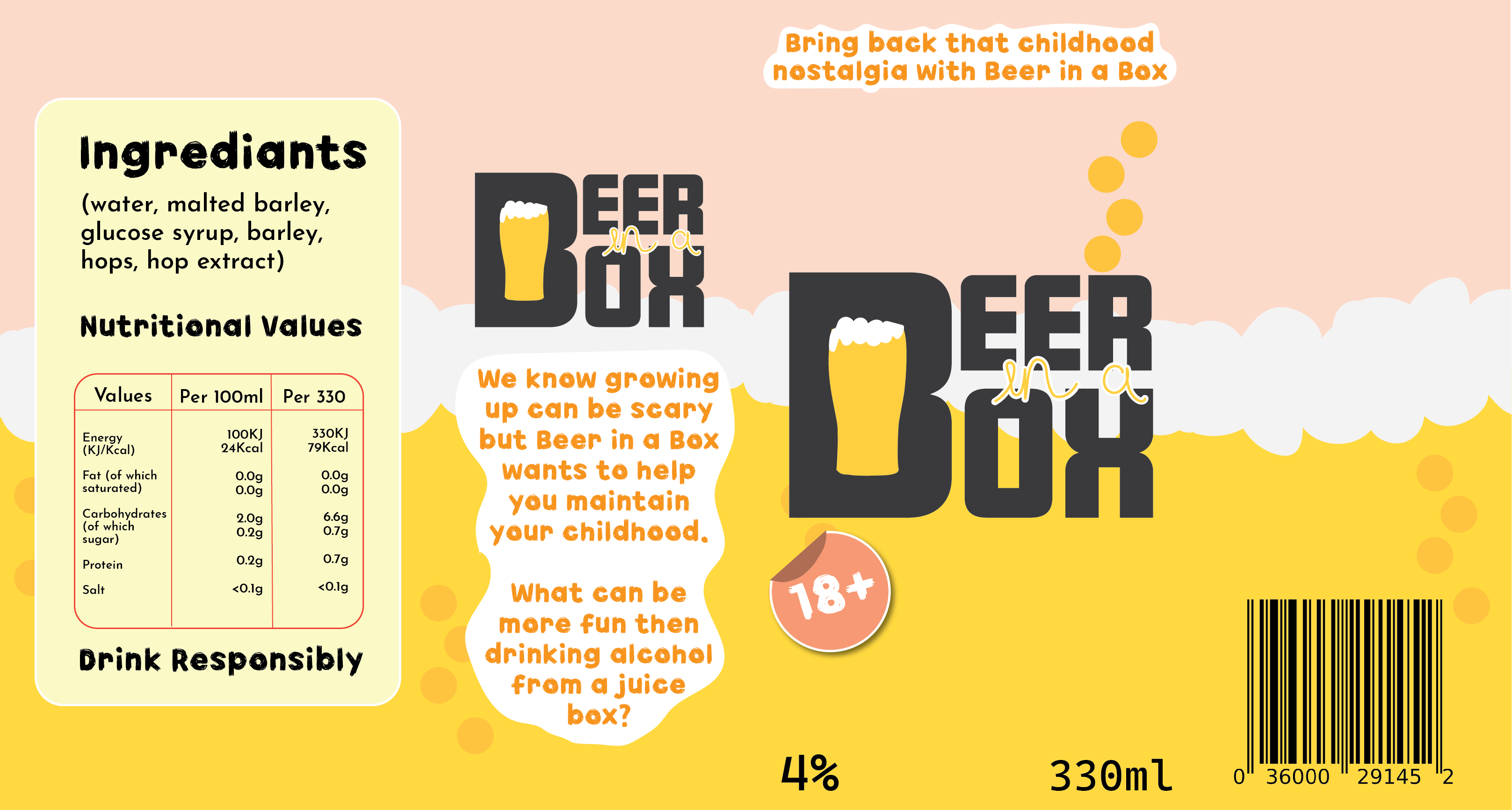
With the brief of creating a nightclub advertisement/infographic, it was decided that the theme of this animation was going to be underground and grunge. The chosen colour palette used within the design process was going to be red, black and grey.
With the theme and colour palette thought out, it was time to design the logo concept. To keep the grunge theme, the name/logo of the fictional nightclub was going to include the old English font. This font has become very popular in alternative and gothic communities. The name of the nightclub will be ‘After Hours’, this name was decided because it fit perfectly with the aspect of a gothic/grunge nightclub, it felt vampiric which was very desirable.
To include the aspect of conceptual design to this logo, it was decided to swap out the ‘U’ in ‘hours’ and replace it with a crescent moon, still giving the desired U-shape to still be easily readable. After some experimenting in Adobe Illustrator the neon sign effect was created.
The background in the animation was created using multiple layers of squares so it could move smoothly. The idea of it being zoomed in almost creates an optical illusion, drawing the viewer in. The dancers on either side of the screen and the arms that enter the screen later were added to show users what this nightclub can offer without the animation becoming chaotic by using a lot of text.
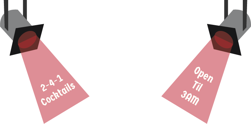
In a separate animation document, the pop-ups were created and edited. This was done by inputting certain codes to create the button that triggers the pop-up. In the video, there’s a demonstration of both buttons being clicked so the pop-up can play, then clicked again to close the pop-up.