Categories
Development Log

Website Design Artwork Development (Post 1)

Adobe XD link to web design –

https://xd.adobe.com/view/871099b8-6faa-4d19-8f95-37a0f094c7d4-d243/

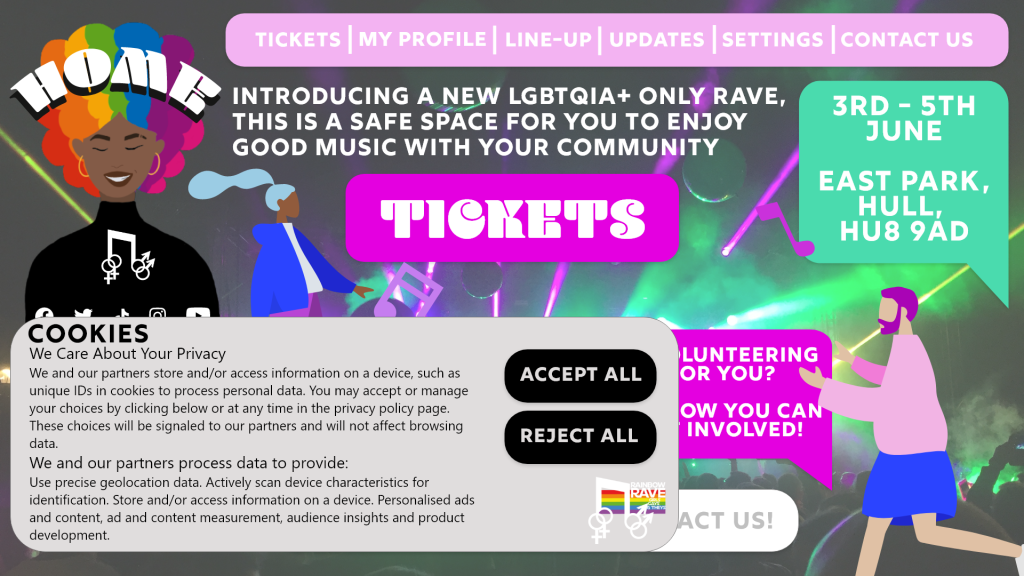
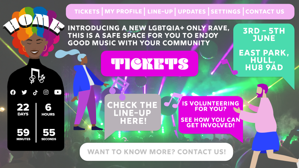
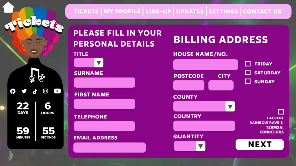
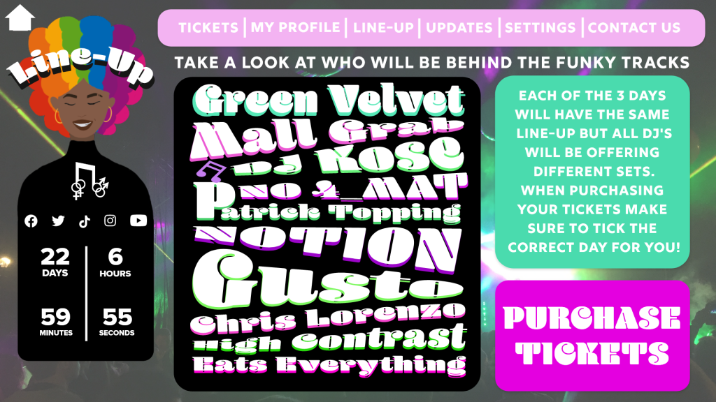
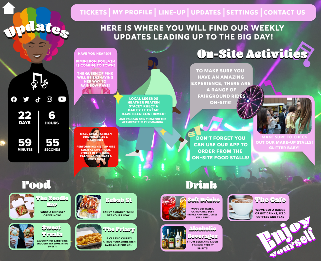
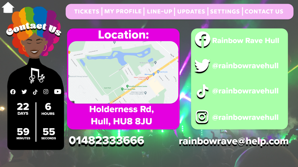
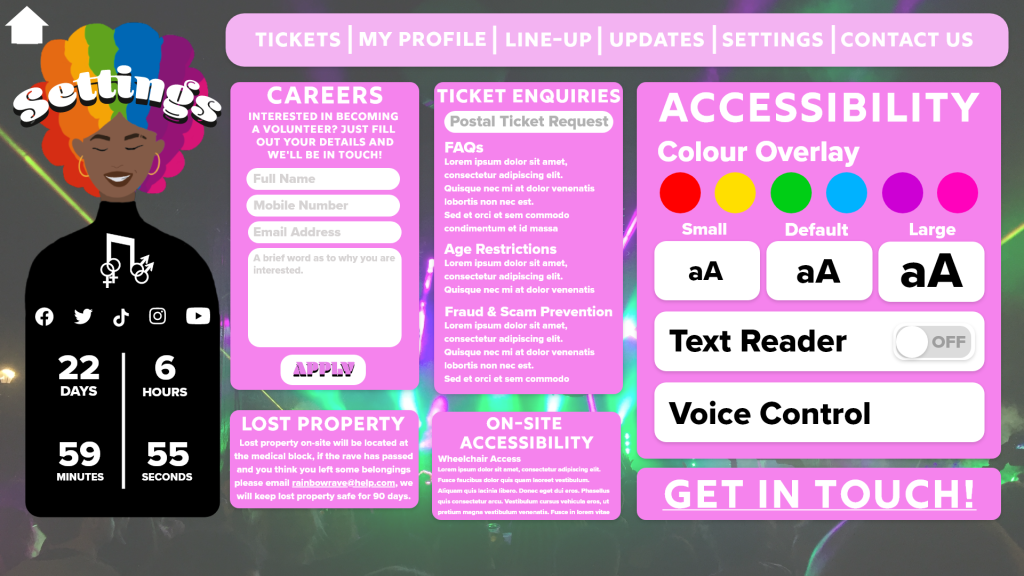
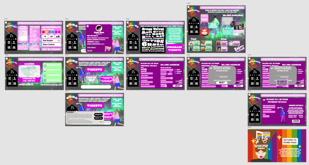
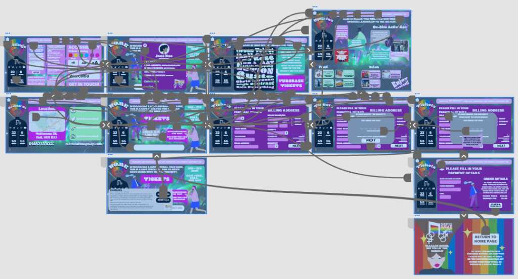
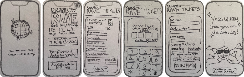
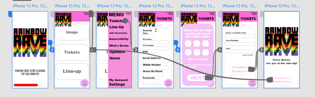
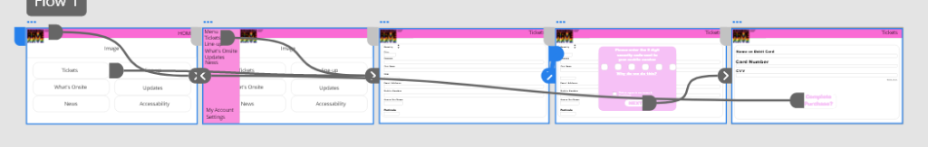
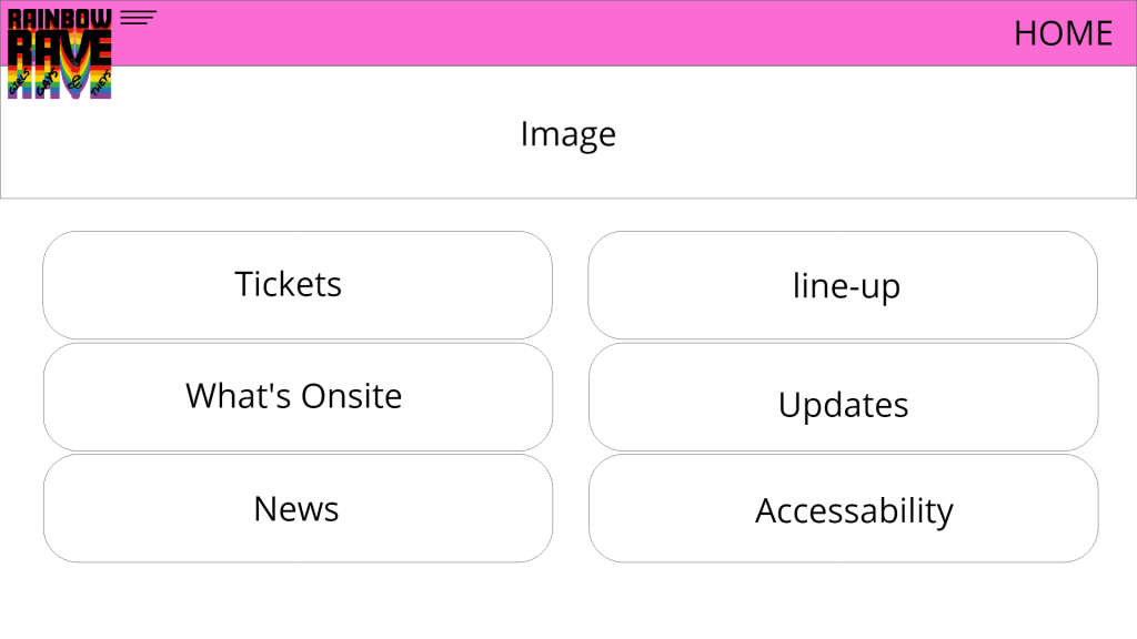
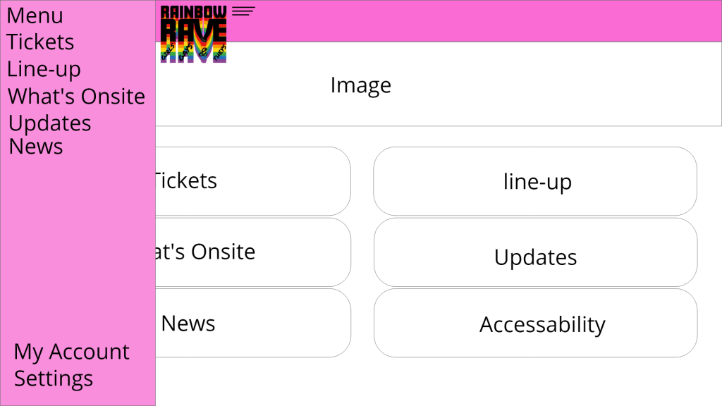
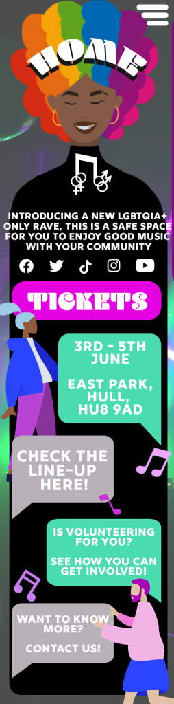
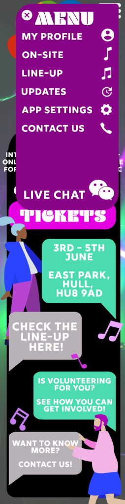
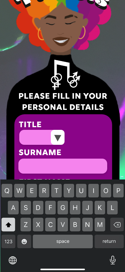
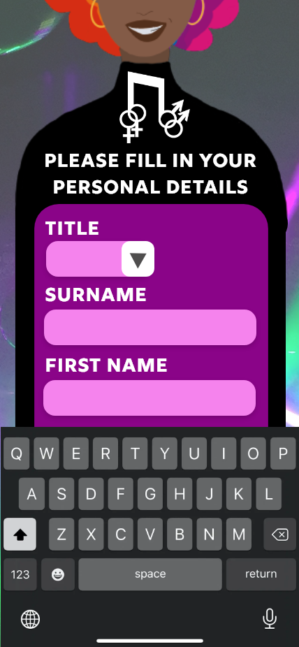
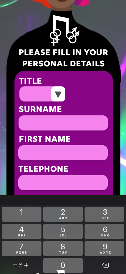
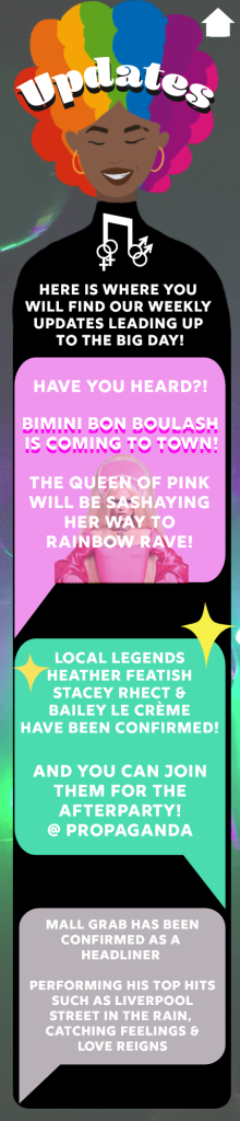
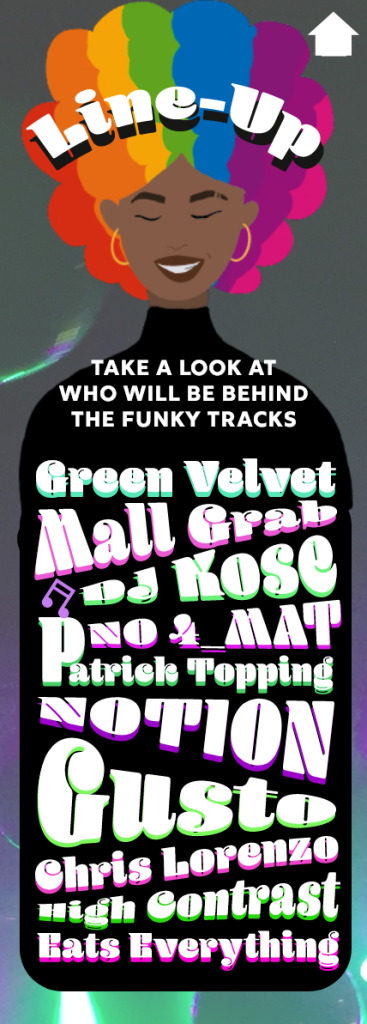
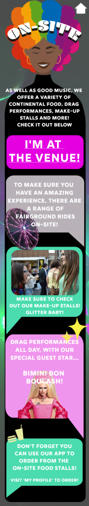
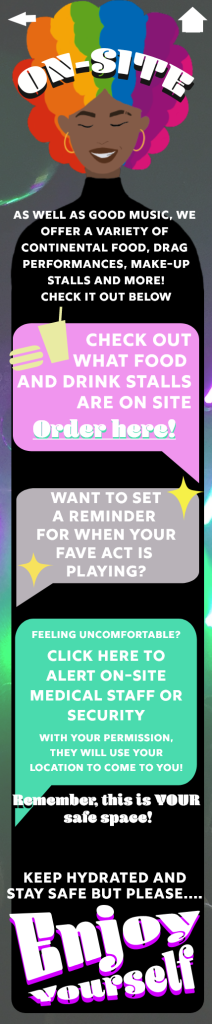
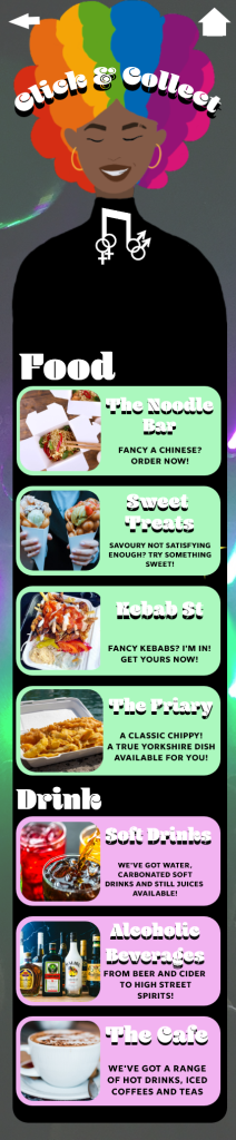
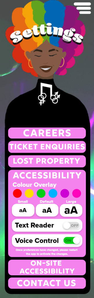
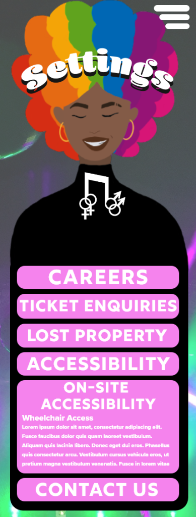
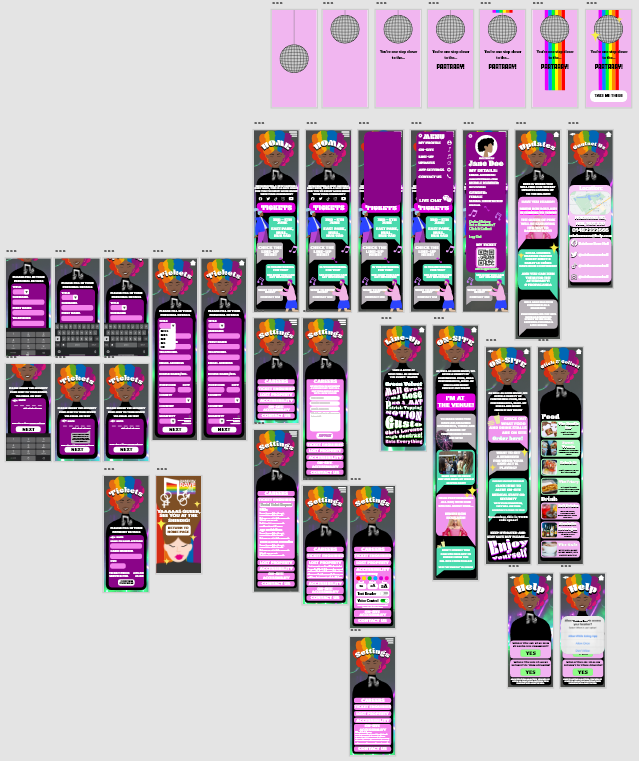
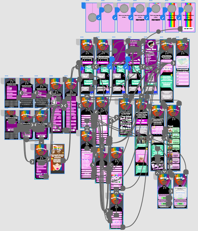
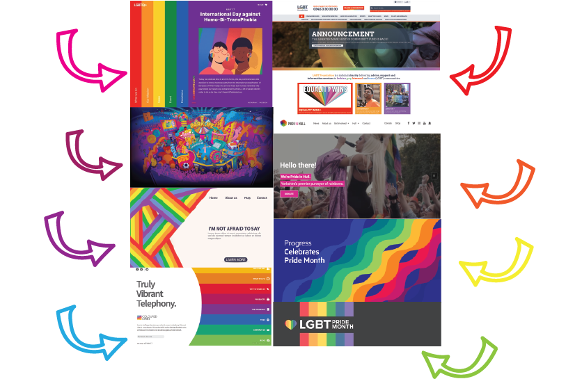
The web design consists of 12 artboards, showing each screen and their purposes. The website is designed to purchase tickets, see updates, view the line-up, and access your profile. The banner at the top of each screen is the menu, having the menu bannered across the screen makes it easily accessible and navigable as it will be available on every screen. After researching into other festival websites, the menu categories were chosen. Websites such as Leeds Festival (Leeds Festival Menu, n.d.) and Download Festival (Download Festival Menu, n.d.) show similar categories to the Rainbow Rave one, the idea to add an updates page came from the ‘News’ categories of the Leeds Festival menu and the Download Festival menu.

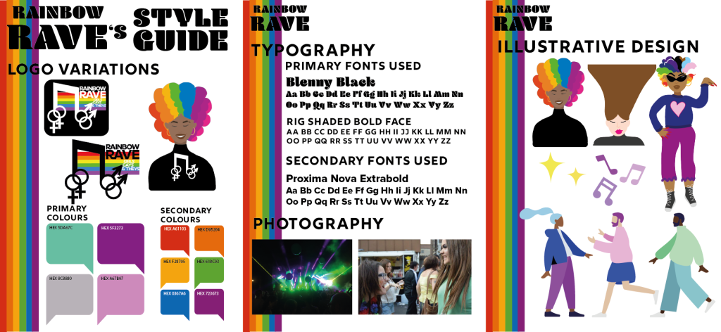
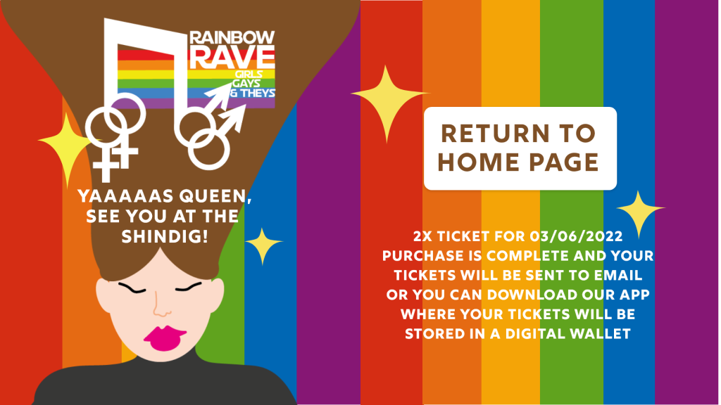
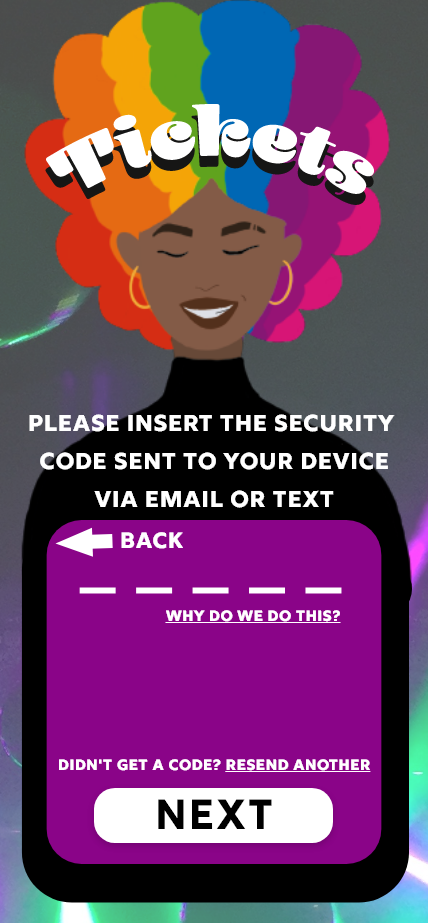
On the left-hand side of each screen is the Rainbow Rave logo, a countdown to the event and social media links have been incorporated into the logo, this reduces negative space within each page. The countdown also increases the user’s excitement but can also cause a sense of urgency to purchase tickets for the event.

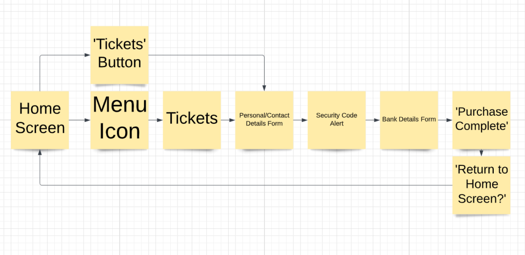
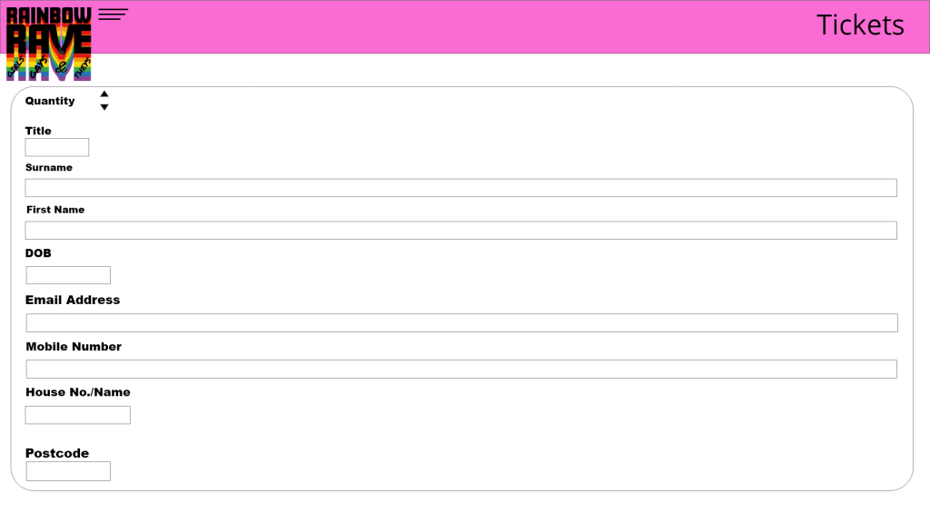
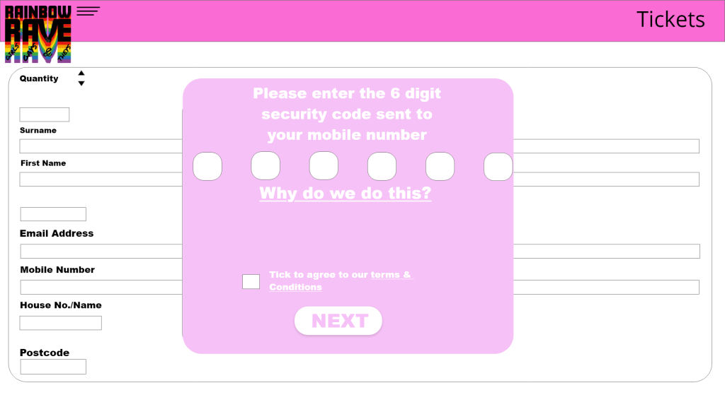
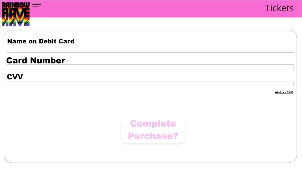
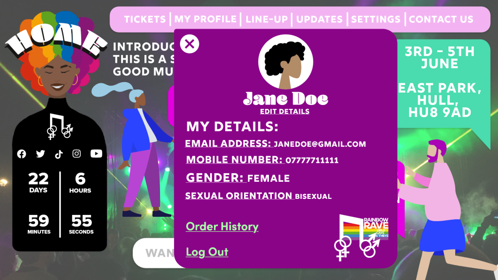
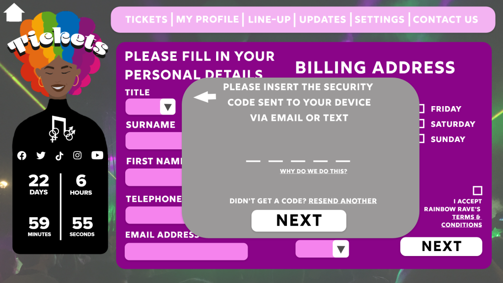
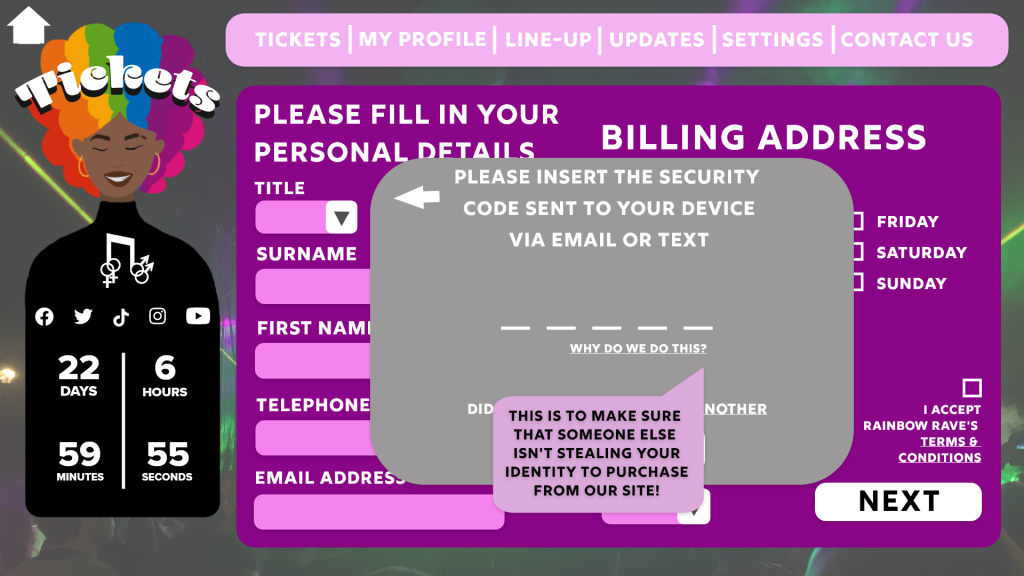
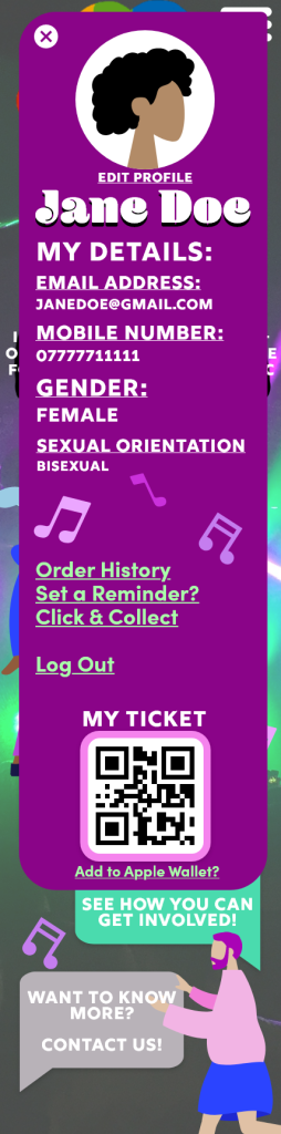
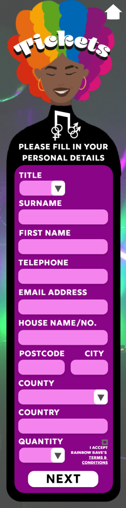
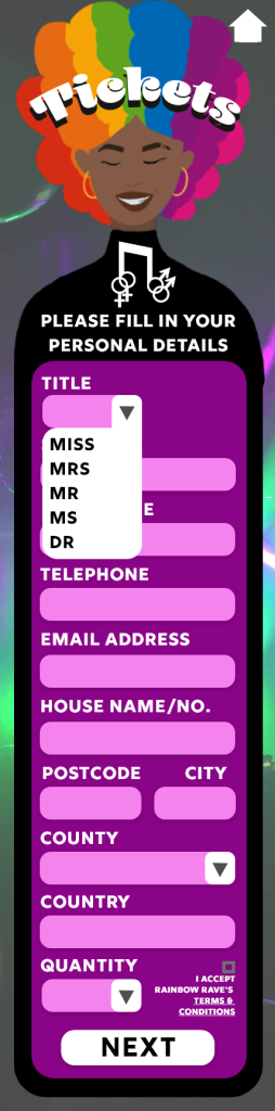
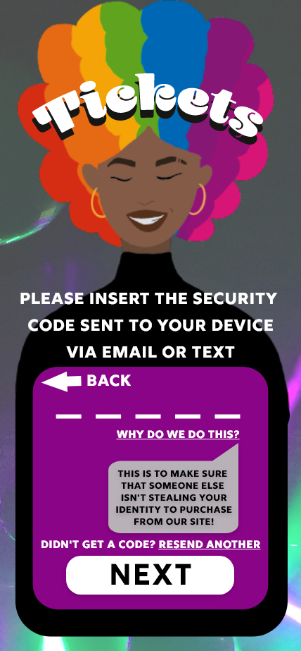
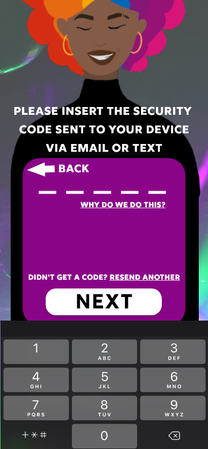
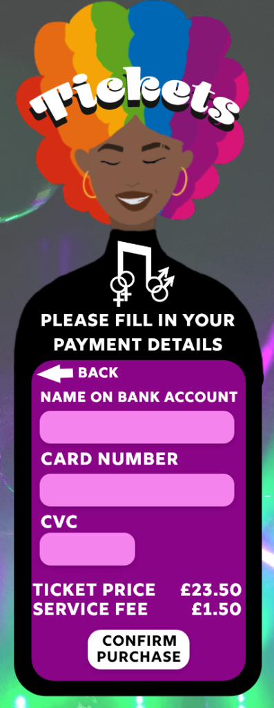
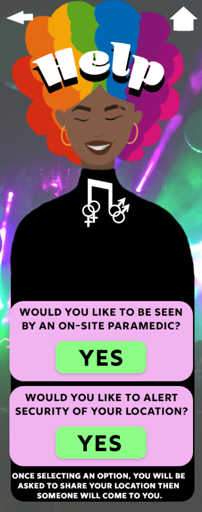
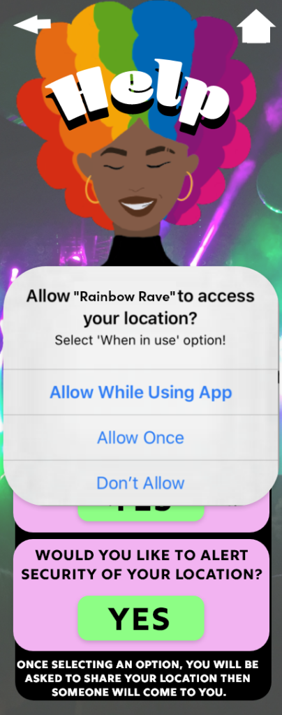
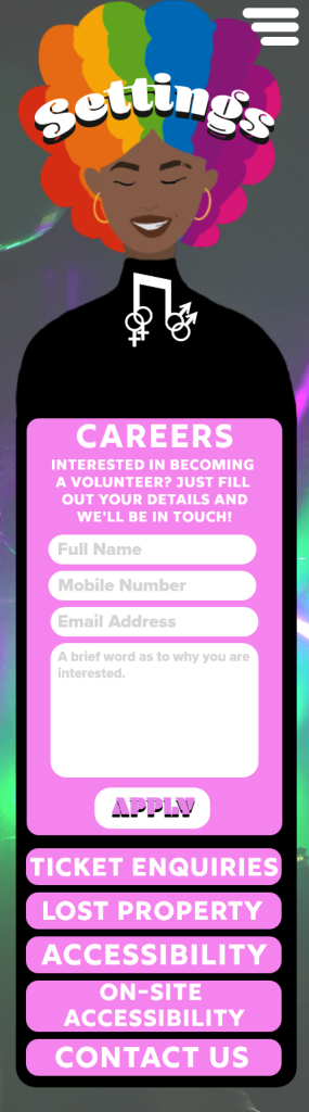
Smaller details have been added throughout the design to add to the level of professionalism that the design creates. One the first page you can see the cookies pop-up, these pop-ups can be seen on almost every website you use so including these adds a touch of realism to the design. Other smaller details that you may find are the terms and condition tick box on the personal details page of the ticket purchasing process, the option to find out why we ask for a security code and the option to request a new security code. These are all things you would find within websites that include the purchasing of an item.

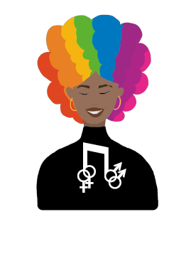
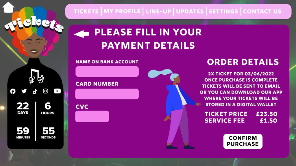
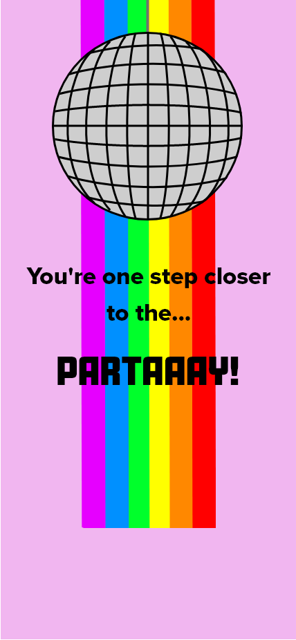
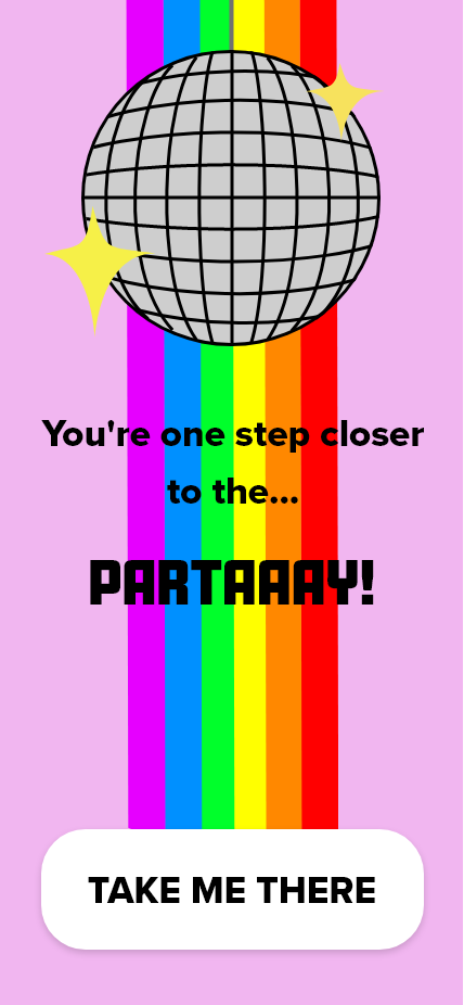
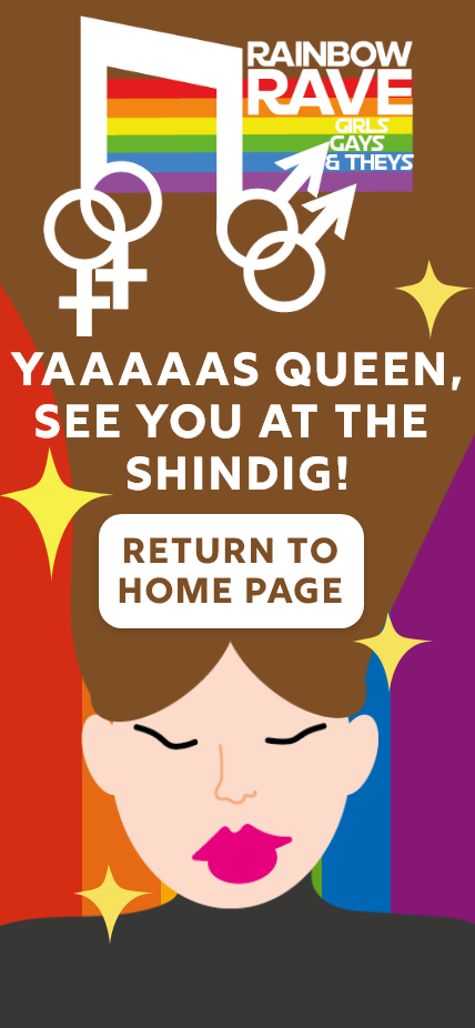
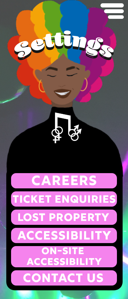
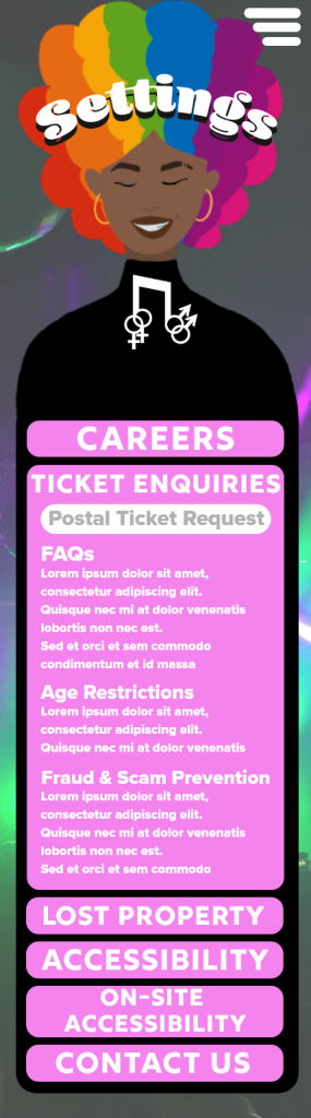
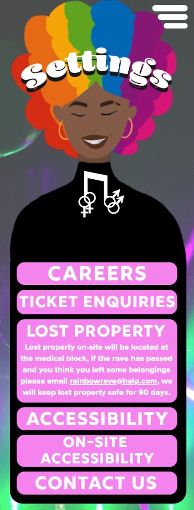
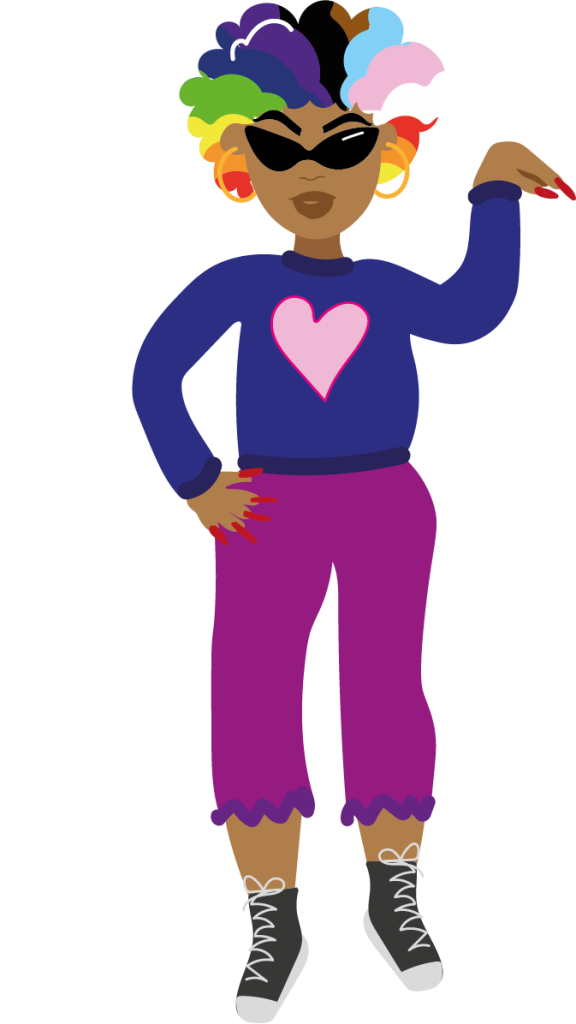
Illustrations of people have been added throughout the website, this is to reduce the negative space. More information could have been added where there was negative space, but the idea was to keep the pages minimal, too much text could overwhelm or bore the user whereas the illustrations keep it looking minimal but also adds some youthfulness to the design.

The website design is accessible to all desktop and tablet screen sizes, blocks of text have been used so they can be easily moved when dealing with certain screen sizes but still look perfectly fine and still easily readable. Because of the use of negative space within the design, nothing will be affected when using smaller screen sizes because the negative small will decrease but the blocks of text will still be perfectly in tact.

Download Festival Menu. (n.d.) Download Festival. Available online: https://downloadfestival.co.uk/ [Accessed 22 May 2022].

Leeds Festival Menu. (n.d.) Leeds Festival. Available online: https://www.leedsfestival.com/ [Accessed 22 May 2022].

Categories
Design Portfolio

Rainbow Rave Design Portfolio

Asus Widescreen Monitor. (n.d.) Amazon. Available online: https://www.amazon.co.uk/Asus-Widescreen-Monitor-1920×1080-DVI-D/dp/B0058UUR6E [Accessed 22 May 2022].

IPhone 13 Screen. (n.d.) Apple. Available online: https://www.apple.com/uk/iphone-13/.

Categories
Development Log

App Design Artwork Development (Post 2)

Adobe XD link for app design –

https://xd.adobe.com/view/ee92371e-358b-48e0-b20c-e9041c4352fc-bbc1/

The companion app for the chosen festival ‘Rainbow Rave has many similarities to the web design but is focused more on the on-site purposes. Like the website design, the user will be able to purchase tickets, view the line-up, check for updates and access information about the event. The call-to-action will be the same process, but the app offers the storage of the digital ticket and the option to add it to the smartphone’s wallet, making it environmentally friendly and the entry process will be a lot quicker. The app design is based around Apple’s IOS, so the option is there to ‘add to Apple Wallet’.

Another unique option that the companion app will offer is the chance to order food and drink while at the venue from the food stalls and bar tents, the user will then be notified to collect their order when it’s ready. This decreases queues and allows the festival goer to spend as much time enjoying the event and not worrying about a queuing system.

The user will also be offered to set reminders for when their favourite act is about to perform. There is also an option to alert on-site security or a medical professional of the user’s location within the venue for when the user seeks medical attention or is feeling uncomfortable because the main goal of the festival is to be a safe space for the LGBTQIA community.

Moving onto the design of the companion app, the flow of the design has been kept similar between each screen, all screens but the loading screen will include the same background image, the same primary colours, and the same primary fonts, this allows the design to remain simple and increases the memorabilia and navigation of the app.

Blenny Black has been used for screen titles and subheadings throughout the artboards, but underlying colours have also been included to add a playful 3D effect to the titles. This can also be seen for the line-up to make it look more exciting and inviting. An icon plug-in has been used for the menu to show what that category will be about; this is to include those who are more visual learners and again increases memorabilia.

The start-up screen has been evolved into an animation of the disco ball rising and an LGBTQIA flag rolling down, the idea behind this was to again, create some excitement but to also keep the user occupied while the app is loading, plain loading screens may create more risk of the user leaving and not purchasing any tickets where as this colourful, fun animated screen will make the user want to join the party even more.

Categories
Development Log

Mood Board & Research (Post 3)

The initial idea behind the Rainbow Rave design plan was to include the distinctive LGBTQIA flag colours which are the colours of the rainbow. After doing some research into other LGBTQIA themed websites, the designs are very minimal because of the rainbows featuring throughout. Most of these websites, shown on the mood board diagram above, have a plain white or dark coloured background with rainbows appearing through.

After doing some research it is said that neutral colours have the best effect when designing with the colours of the rainbow. ‘You can achieve some amazing visual effects by combining neutral colors with rainbow-influenced colors. The rainbow colors balance the neutral colors providing a magical touch to the design. Graphic designers tend to use the effect in dark designs to give it a special hypnotic charm.’ (Jansen, 2021). Below are some designs testing which backgrounds work best with rainbows.

The final decision was to use an original image as the background and use the colour palette from that photo for the app design, shown below there is the original photo and samples of those colours taken from the photo.

After looking into this colour combination, it was decided that the design’s colour palette would lean more towards the complimentary colours of the colour wheel, as seen below the yellow toned greens compliment the mauve tones and the greens compliment the pink toned mauves. This was the final colour palette chosen for the app and web design.

Another goal for the initial design was to include original illustrations. A lot of inspiration came from the Parklife web design with chaotic illustrations, the visual designs bring a lot of excitement to the customers and shows there will be a lot happening just from the first page. Sketched illustrations also add some personality to the design and can create a closer relationship with the stakeholders.

The illustration on the left is a rejected design for the Rainbow Rave logo, there is no relationship between the colours, the design is quite complicated and there seems to be too much happening for it to become a logo. The design in the centre was a completely different concept, it was decided to combine both music with LGBTQIA aspects, thus turning it into a conceptual design. The slogan ‘Girls, Gays and They’s’ has been added back to the design, this is a simple, memorable design. The logo on the left is another variation for the middle concept, it was decided to only include the top half of the woman in black clothing and brightly rainbow coloured hair. The text has been removed, simplifying the design, this creates less chaos with the chosen colour palette and background image.

Flamboyant Navigational Aids. (n.d.) DesignMantic. Available online: https://www.designmantic.com/blog/wp-content/uploads/2016/09/Flamboyant-Navigational-aids.jpg [Accessed 21 May 2022].

Jansen, M. (2021) 14 Ways to Use the 7 Colors of the Rainbow In Graphic Design. DesignBro. Available online: https://designbro.com/blog/inspiration/7-colors-of-rainbow-graphic-design/ [Accessed 20 May 2022].

Parklife. (2019). Parklife 2019. [online] Available at: https://parklife.uk.com/ [Accessed 2 Mar. 2022].

Pride at Progress. (n.d.) Progress. Available online: https://www.progress.com/blogs/pride-progress-promoting-inclusivity-june-beyond [Accessed 21 May 2022].

Pride in Hull. (n.d.) Pride in Hull. Available online: https://prideinhull.co.uk/ [Accessed 21 May 2022].

Categories
Development Log

Development Process for Rainbow Rave (Post 4)

Above is a reminder of the first few steps of the design development towards the Rainbow Rave App and Website, these can be seen in the Development Research Blog. These are low-fidelity and mid-fidelity prototype of the call-to action process, from there the progress has developed and increased.

The two images above show further development progress for the app design, as you can see the prototypes now include the entire user interface for the final app design. The digital mind map has been coloured co-ordinated to show the categories and sub-categories. With the mind-map planning the artboards could be progressed further but smaller details like the logo, colour palette and the use of fonts needed to be explored further. As you can see above there is a logo for Rainbow Rave, this was the very first logo developed but it didn’t feel complete, so more logos were designed and evolved to create the ones you see in post 3.

Once the logo was developed, the design was starting to come together. The idea was to use an original image from a previous festival and decipher the colour palette from that image which resulted in the purple and green tones you see. It was then decided to use text bubbles as informative blocks of text, this was to attract the younger generation who are more likely to use technology and send text messages between friends. The idea of the design was to feel like a conversation with a friend, so slang has been used throughout the designs such as ‘yaaaas queen’ which is a phrase that can be heard within the LGBTQIA community. The goal was to make the user feel as comfortable as possible while exploring the app or website. Keeping the user calm while viewing the app or website increases the chances of ticket purchasing.

Categories
Development Log

Style Guide (Post 5)

This is the style guide for rainbow rave, showing the colours, typography and photography used. Style guides are used to show designers what certain aspects are used within company’s web/app designs. The style guide also needs to be designed and look professional for the company’s benefit.

The first page of the style guide shows the logo variations and the colours used throughout the app and web design. As you can see the logo can be used in three forms, the first and second being a black and white version of the finalised logo and the third is a separate design with no text included. The idea behind using a logo with no text is to make it easier for the memorabilia of the company. ‘Your logo is important to your business because it communicates ownership, quality, and values. It’s imprinted on your products, your business card, website, social media, and most importantly, in the minds of your clients.’ (Why A Good Logo Is Important For Your Small Business › Design Powers, n.d.). On the bottom half of the first page, it shows the primary and secondary colours used within the app and web design. The primary colours are the main, most-used colours throughout the design, for example, the headings, sub-headings, borders etc. The secondary colours are the smaller fragments of that colour used, in this concept it’s the rainbow colours which can be seen on the loading screen, the ticket confirmation screen and the logo.

Page 2 of the style guide takes you through the typography and photography used in the designs. Like the colours, the app and web have primary and secondary fonts used. The most-used fonts (primary) are again, used for headings and sub-headings but also informative text. The secondary fonts can be used for pop-ups, drop-down options, and less informative text. The photography portion of the page shows the original images used in the designs; the left image can be seen as the background design.

The third and final page shows illustrative designs that have been used, the logo can again be seen within this page as well a rejected logo design, small decorative illustrations have also been added to show that they do make a difference in visual design. The bottom section of this page includes pre-made human illustrations called ‘Humaaans’ by Pablo Stanley, this is a plug-in feature for Adobe XD. The pre-made illustrations have been altered slightly to match the theme of the colour palette and to show certain personas. Using these original and pre-made illustrations add personality to the design, it can also increase attention to the younger generation because it is visually pleasing to view.

Why A Good Logo Is Important For Your Small Business › Design Powers. (n.d.) Design Powers. Available online: https://www.designpowers.com/blog/why-a-good-logo-is-important-for-your-small-business [Accessed 21 May 2022].

Categories
Development Research Blog

Defining UX

The chosen festival to create a website/app for is called ‘Rainbow Rave: Girls, gays and theys’. This is a LGBTQIA+ only event that will take place in the summertime, during pride month. This event is created to offer a safe space to those who enjoy raving and apart of the LGBTQIA+ community.

UX (user experience) is the process designed used to create products and services that provide a meaningful and relevant experience to the user (Interaction Design Foundation, 2019).

The UX for the chosen festival should be inviting and exciting yet simple and straight-forward. The call to action for this site will be the ticket purchasing, it should be easy to navigate and memorable for future purchases. When purchasing tickets, the user will be presented with a form to fill for personal and contact details then they will be asked to fill in their bank details, this process is quick and simple which leaves the customer feeling content, adding anything more to the purchasing process could leave the user feeling frustrated and overwhelmed, it also creates risk towards the user stopping the process and leaving the site (Yablonski, n.d.a).

Due to the growth in technology and the internet today, users expect certain tools to be in the same position for every website because we’re so used to websites being similar that it frustrates us when those tools aren’t in the same place. According to Jakob’s Law ‘users spend most of their time on other websites. This means that users prefer your site to work the same way as all the other sites they already know.’ (Yablonski, n.d.b)

The companion application will act as a necessary device while at the festival, it will include all the food and drink stalls so users can order themselves a beverage or meal to collect, this reduces queues and gives customers more time to enjoy the music and atmosphere of the rave, its also something quite unique which could attract more festivalgoers. The UX of the app will also provide feedback reminders for when their favourite artists are performing.

References

Interaction Design Foundation (2019). What is User Experience (UX) Design? [online] The Interaction Design Foundation. Available at: https://www.interaction-design.org/literature/topics/ux-design [Accessed 1 Mar. 2022].

Yablonski, J. (n.d.a). Hick’s Law. [online] Laws of UX. Available at: https://lawsofux.com/hicks-law/ [Accessed 1 Mar. 2022].

Yablonski, J. (n.d.b). Jakob’s Law. [online] Laws of UX. Available at: https://lawsofux.com/jakobs-law/ [Accessed 1 Mar. 2022].

Categories
Development Research Blog

Requirements, Gathering and Analysis

The focus of the UX for the chosen festival is to make everything on the website navigable, every single available page on the site should be memorable and accessible but the call to action, that being the ticket purchasing process, is something that should be the top priority for accessibility.

The other requirements to think about when looking at the UX for the site and companion app is the information, location, accessibility options for those with disabilities, who’s performing, date and time and reviews on the previous events. These are the main goals for the site and companion app, but the app will focus more on when the customer is at the festival, offering click and collect for food and drink stalls, options to add reminders for when their preferred artists are performing, ticket storage that can be easily scanned for quick access into the venue and options to alert an onsite medical professional if the user feels uncomfortable or unsafe. This concept is quite unique, which will attract more customers and will spread awareness of the event.

The target audience for the website and app will be 18+ but aimed more for young people who are new to the LBGT clubbing scene and people in the LGBT community who feel uncomfortable in generic clubs and bars because of judgement, drug spiking or risks of assault. One of the main focuses of this event is the user’s safety which is why the site will also offer online live chats for any queries onsite or any UX/UI related problems.

Personas

Like the Parklife website (Parklife, 2019), the website for ‘Rainbow Rave’ should include some nice visual graphics to intrigue the user even more and give them something satisfying to look at while browsing the page but within the Parklife website, the visuals are quite chaotic and overwhelming, making it hard to navigate certain options.

Free, C. (2021). Rainbow House. The Washington Post. Available at: https://www.washingtonpost.com/lifestyle/2021/04/28/rainbow-house-paint-neighbor/ [Accessed 2 Mar. 2022].

Parklife. (2019). Parklife 2019. [online] Available at: https://parklife.uk.com/ [Accessed 2 Mar. 2022].

Twitter, F. (n.d.). @flowersofsappho. [Online Image] Twitter. Available at: https://twitter.com/FlowersOfSappho/status/1325194178012147712 [Accessed 2 Mar. 2022].

Categories
Development Research Blog

UI Principles

The call-to-action process will be quick and easy with only 2 short forms to fill, this will be the personal/contact details form and a bank details form. Once the user has input their mobile number or email address on the first form, they will receive a security code via text or email, they will then be asked to put that code into the website before proceeding to the bank details form. This may be frustrating to the user with them having to switch from the site to their texts/emails, but it provides a sense of security and privacy to their details. Once both forms have been completed, they will be presented with a ‘Purchase Complete’ screen and an option to ‘Return to the Home Screen’.

When using Hick’s Law ‘the more stimuli (or choices) users face, the longer it will take them to make a decision’ (Soegaard, 2021), meaning the process for the call-to-action should remain simple to keep the user engaged in the site, if the user is presented with too many things to put their details into, it increases the risk of them leaving the site and having an uncomplete purchase. It can also leave the user feeling frustrated and stressed which influences the idea of not wanting to go to the event.

Feedback will be used within the website to alert the user of any errors and positive actions. A negative alert will be used when the user has input the incorrect information and an upbeat chime-like sound will be used when the user has completed the purchase or created an account. Within the companion app the same feedback will be there but with added reminder alerts which the user can customize themselves for when they want to be reminded of when certain acts are performing or when their click and collect food order is ready.

Soegaard, M. (2021). Hick’s Law: Making the choice easier for users. [online] The Interaction Design Foundation. Available at: https://www.interaction-design.org/literature/article/hick-s-law-making-the-choice-easier-for-users#:~:text=Hick [Accessed 14 Mar. 2022].

Categories
Development Research Blog

Rejected Designs

This is a low fidelity prototype for the chosen festival’s call to action on the web page, this has been rejected due to the use of negative space and the placements of certain options.

The menu icon has been placed on the left-hand side of the web page, next to the logo. When using Jakob’s law, users will not want the menu icon in a different position to most other websites, this confuses the user and increases the risk of them leaving the site. Bringing in the law of proximity ‘the principle of proximity states that items close together are likely to be perceived as part of the same group – sharing similar functionality or traits’(Experience, n.d.). The menu icon of this design is too close to the logo and on most websites, when clicking on the logo it’ll take the user back to the home page so having the menu icon so close to another button may cause frustration for the stakeholder if accidentally clicking on the opposite option to what they wanted.

The amount of negative space used on this web design leaves the pages bare and simply quite boring, this can be improved by adding in some visual graphics or illustrations to enlighten the user when scrolling through the site. The top banner could include a live countdown to when the event starts, this can excite the user and give them a sense of urgency to purchase the tickets, so they don’t miss out. Live countdowns can be seen on websites such as Download festival.

Another reason this design has been rejected is the fact it looks like an extended version of an app design. The text, titles and icons are too small for a web page, these should be evaluated for those who have vision impairments.

URL for Adobe XD Prototype – https://xd.adobe.com/view/d33a1469-542c-4e0c-b722-27ec1397dfe4-8669/

References

Download Festival. (n.d.). [Online Screenshot] Download Festival. Available at: https://downloadfestival.co.uk/ [Accessed 14 Mar. 2022].

Experience, W.L. in R.-B.U. (n.d.). Proximity Principle in Visual Design. [online] Nielsen Norman Group. Available at: https://www.nngroup.com/articles/gestalt-proximity/#:~:text=Definition%3A%20The%20principle%20of%20proximity [Accessed 14 Mar. 2022].