Categories
Development Log

Dev Blog 9 – Overview of advanced techniques

The parallax effect in design involves a background that moves in a different pace to the foreground content, the visual technique creates the illusion of depth (17 unique websites with parallax scrolling effects | Webflow Blog, n.d.).

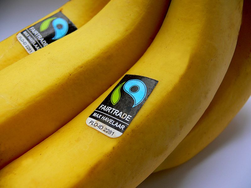
For this activity I created a webpage, promoting a range of fair trade products, as instructed. After completing step-by-step tasks on how to create the parallax effect within Elementor, I felt confident enough to create the Fair Trade webpage.

Figure 1: Screen recording of the webpage design, showcasing the use of Parallax.

Using this visual technique creates a sense of professionalism within web design. Having simple animations throughout a website can increase the onboarding aspect for a user experience. Like the video above, showing different images through a parallax animation is enticing to the user, it can make the user want to interact more with the animation.

I’m very glad to have learnt this technique and will be exploring it further for my design portfolio campaign piece.

References

17 unique websites with parallax scrolling effects | Webflow Blog. (n.d.) Webflow. Available online: https://webflow.com/blog/parallax-scrolling#:~:text=What%20is%20a%20parallax%20effect [Accessed 21 Jan. 2023].

Fair Trade Facts for Kids. (n.d.) Available online: https://planbee.com/blogs/news/fair-trade-facts-for-kids [Accessed 21 Jan. 2023].

Fair Trade Labels: The Complete Guide. (n.d.) Available online: https://www.traidcraftshop.co.uk/the-thing-about-fair-trade-labels [Accessed 20 Jan. 2023].

Fairtrade Foundation (2021) What is Fairtrade? Fairtrade Foundation. Available online: https://www.fairtrade.org.uk/what-is-fairtrade/ [Accessed 20 Jan. 2023].

Fairtrade Logo. (n.d.) Available online: https://greensouthwell.org.uk/2022/04/29/fairtrade-matters/ [Accessed 20 Jan. 2023].

Fairtrade reflects people’s personal values. (2019) Available online: https://www.sustainweb.org/news/may19_fairtrade_survey/ [Accessed 20 Jan. 2023].

Honey, H. (n.d.) Hilltop Honey Tesco. Available online: https://www.tesco.com/groceries/en-GB/products/301234925 [Accessed 20 Jan. 2023].

Mars launches Fairtrade certified Malteasers in the UK. (2017) Available online: https://www.confectionerynews.com/Article/2012/06/20/Mars-launches-Fairtrade-certified-Malteasers-in-UK [Accessed 20 Jan. 2023].

Pearce, E. (2021) Everything you need to know about Fairtrade. Available online: https://www.coop.co.uk/blog/everything-you-need-to-know-about-fairtrade [Accessed 20 Jan. 2023].

Smith, S. (2015) 11 Best Fairtrade Food and Drink. Available online: https://www.independent.co.uk/extras/indybest/food-drink/chocolate/best-fairtrade-food-and-drink-organic-sainsburys-coconut-oil-waitrose-10065562.html [Accessed 20 Jan. 2023].

Categories
Development Log

Dev Blog 10 – AI and manipulating Images

Artificial intelligence is used to create unique image manipulation. No two images are the same. AI is the simulation of human intelligence created by computer systems. Images can be created when prompted with key words or images.

An example of how AI works is a website called Nightcafe (https://creator.nightcafe.studio/), I input the key words ‘purity’ and ‘pollution’ into the AI generator.

I then downloaded the mobile app ‘Dream’ by Wombo and experimented with the AI styles. These are the images created when using the key word ‘Purity’.

And these were the image results when I used the key word ‘Pollution’.

The series of AI images created using the word ‘purity’ all look very clean and minimal, which does imply the sense of purity without seeing the words used to create the images.

The gallery showing the images created using the word ‘pollution’ all have a common theme with blue and grey tones. All images look very busy and chaotic. A cold feeling is presented when viewing these images.

Figure 13: Screen recording showing the AI manipulated images being used for web design in Elementor.

When using these images in Elementor, I created a hover effect, as instructed. The first presented images in all three widgets are the purity images from gallery 4 and when you hover over them with a cursor, it displays the AI manipulated images from gallery 5.

References

🖼 AI Art Generator, Photo to Painting App. (n.d.) NightCafe Creator. Available online: https://creator.nightcafe.studio/ [Accessed 22 Jan. 2023].

Definition of purity | Dictionary.com. (n.d.) www.dictionary.com. Available online: https://www.dictionary.com/browse/purity [Accessed 22 Jan. 2023].

Dream by WOMBO. (n.d.) dream.ai. Available online: https://dream.ai/ [Accessed 22 Jan. 2023].

the definition of pollution. (2018) www.dictionary.com. Available online: https://www.dictionary.com/browse/pollution [Accessed 22 Jan. 2023].

Categories
Development Log

Dev Log 12 – Social Media Campaign

Campaigns tend to use marketing techniques across social media platforms to promote their products or services. It’s becoming very popular with the growth of social media and technology.

I decided to take a look at an event of cultural significance, Pride in Hull. Pride in Hull do already have accounts across social media platforms but after doing some research, I noticed that they are no longer active at the moment, they stopped posting when 2020’s pride had occurred.

As you can see, their Instagram page has become very quiet. Pride in Hull is an event that occurs every year so posting on their social media’s actively can increase the interest of their event.

I decided to redesign their Instagram and Facebook page to show how they can become more active.

I decided to redesign their Instagram page, using edited images. I decided to introduce an ongoing theme to make the Instagram page look more aesthetically pleasing to view. The rainbow border used across their images gives more personality into the page. Posting an image like this weekly can increase their page views and interaction to the actual event they host annually.

Like the Instagram redesign, this Facebook design shows the activeness they could achieve on their social media platforms. Again, using the bordered images creates an aesthetic and also creates a sense of memorability.

To further develop the redesign of their social media platforms, the artistic rainbow border could be created as a photo filter which users and event attenders could use to show their experience at the event, this would also create more profile interaction.

Figure 15: Reworked design for the Pride in Hull logo, adjusted to fit the social media profile pictures.

References

Freepik (2019) Freepik – Free Graphic resources for everyone. Freepik. Available online: https://www.freepik.com/ [Accessed 23 Jan. 2023].

Instagram Redesign – Free XD Resource. (2020) Adobe XD Elements. Available online: https://adobexdelements.com/instagram-redesign-2/ [Accessed 23 Jan. 2023].

Social Media Feed Mockup and Templates. (2022) Xd File. Available online: https://xdfile.com/social-media-feed-mockup-and-templates/ [Accessed 23 Jan. 2023].

Categories
Design Research Blog

RP6 – Social Media Channels

RP6 Presentation Video

In today’s society, everybody has easy access to social media, and because of this, companies will use social media such as Facebook, Twitter, Instagram and Tiktok to advertise and campaign their causes. Marketers have took the opportunity to use social media to show users their message.

A good example of social media marketing is Cadbury’s ‘Secret Santa’ campaign. Around the UK there are Cadbury Postal Services dotted around so you can secretly send a Cadbury’s chocolate bar for free. The idea behind this campaign is to put a smile on people who may be having a tough time and with the cost of living crisis within the UK, Cadbury’s are helping the less fortunate to still send a little gift.

Cadbury’s have also used Facebook and Instagram to boost their campaign, their Facebook and Instagram posts have links straight to their website for more details on how to send the chocolate bar. On their instagram they also have a ‘highlights’ section which shows celebrities using their postal service.

Another good example of social media marketing is the brand Absolut Vodka, Absolut have introduced a campaign called ‘Born to Mix’ which raises the importance of body positivity, self-love and equal rights.

The ‘#borntomix’ has created a movement on Instagram, users have been using the hashtag to show off their body positivity. Over 5000 people have used their hashtag which further spreads their message across the social media platform.

The final campaign to discuss is J & B Scotch, this isn’t a good example however, I’d like to discuss the potential of using social media to market their campaign,

J & B Scotch Christmas 2022 Advertisement

The Christmas advert shows the campaign for trans rights, it shows an older man practicing make-up on himself so he can give his trans granddaughter a make-over on Christmas. Below are some screenshots of their Facebook and Instagram, as a brand, they are not very active on social media platforms.

To boost this campaign, they could start actively posting on Facebook and Instagram, many young trans people will find comfort in this advertisement so their social media platforms could become a safe space for them. Actively posting about this campaign on social media is great marketing strategy because it gains more attention towards the LGBTQIA community which could increase sales.

References

Absolut Vodka | Swedish Vodka. (n.d.) www.absolut.com. Available online: https://www.absolut.com/ng/ [Accessed 15 Dec. 2022].

J&B – She, un cuento de J&B, English subs (‘She, a tale by J&B’, Diageo, Xmas, 2022). (n.d.) www.youtube.com. Available online: https://youtu.be/oOVVgEtuybk [Accessed 15 Dec. 2022].

Send Chocolate secretly to someone you love. (n.d.) secretsanta.cadbury.co.uk. Available online: https://secretsanta.cadbury.co.uk/ [Accessed 15 Dec. 2022].

Categories
Design Research Blog

RP5 – Websites that break the ‘rules’

‘Brutalism in web design is a crude, plain, and transparent style that prioritizes functionality over form and effectivity over aesthetics.’ (How to Use Brutalism in Web Design + 7 Great Examples, 2022)

The websites previewed on brutalistwebsites.com vary from extremely chaotic to very basic and boring. An example of an extremely chaotic webpage is m-o-l-l-y.com, when you click on this website you are presented with a background video and a dancing woman layered over the video. Straight away it’s very busy and it takes a couple of minutes to load.

When you click on ‘Design – Writing’ you are presented with the above image on the right. This page could not load properly when first clicked on but after refreshing the collage style layout was presented but the background video could not play. The images can be moved, rotated and do present bigger when clicked on. After reading Molly’s interview they stated that they designed the website themselves but used Wix, which is a website designing brand (HOME, n.d.).

Another example of an extremely chaotic web design is ‘Studio Job’ (https://www.studio-job.com/), below is the home page the user is first presented with. It’s animated and full of life. There are no negative spaces within this web design. Studio Job are contemporary artists and their web design really do represent their art and personality (Studio Job, n.d.).

Moving on to quite a timid and basic website, Kostas Murkudis (http://kostasmurkudis.org/ss2018) is a website showing photography collections.

As you can see this website is very timid compared to the two other examples shown above. On the left half of the website there is a block of text stating the collection names and dates, this runs throughout the whole website so the content shown can only be seen on the right half of the page. When the user scrolls up, they will be presented with an ‘about me’ page and when they scroll down the website will go through the collections throughout the years. In the interview with Kostas Murkudis, they state that their design focuses on the content with no effects. The design is very clean and pure but could struggle to keep a user engaged, it lacks in colour and the font used is very basic. (Kostas Murkudis, n.d.).

Bibliography

Brutalist Websites. (n.d.) brutalistwebsites.com. Available online: https://brutalistwebsites.com/ [Accessed 4 Nov. 2022].

HOME. (n.d.) molly. Available online: https://www.m-o-l-l-y.com/ [Accessed 4 Nov. 2022].

How to Use Brutalism in Web Design + 7 Great Examples. (2022) Elementor. Available online: https://elementor.com/blog/brutalism-in-web-design/#:~:text=Conclusion- [Accessed 4 Nov. 2022].

Kostas Murkudis. (n.d.) Kostas Murkudis. Available online: https://kostasmurkudis.org/ [Accessed 4 Nov. 2022].

Studio Job. (n.d.) www.studio-job.com. Available online: https://www.studio-job.com/ [Accessed 4 Nov. 2022].

Categories
Design Research Blog

RP4 – Visual Responsive Websites

A visual responsive website is a web development that creates changes within the appearance of the design, depending on the size of the screen (Experience, n.d.).

Starting off with a good example of a responsive website/application, the two images below show the Netflix webpage and their application.

Netflix’s website, showing the dynamic change of appearance compared to their application (Netflix, n.d.).
Preview of Netflix’s app showing a similar layout to their website.

The two screen designs have very similar layouts, the website has allowed more than two thirds of the page to be an advert for a new film/series. The app also does this but the once the website has loaded the advert will play straight away whereas the app is just an image, promoting a new film/series. The menu that is across the top of the website wouldn’t be found on the app design because it has been developed into categories that automatically recommend films/series for you.

Web design for Wayfair, showing the layout of their home page (Wayfair, n.d.).
This is also the web design for Wayfair but shown an a IPhone screen.

The two images above show the homepage of Wayfair, the web design looks very busy, there is a lot to look at whereas the mobile sized version looks very zoomed in, yet minimal.

On the larger sized screen there is a lot of options on show from the first screen, but the smaller size has just about 3 options in view. This is a good example of responsive websites because the spacing in the larger area has been used to add in more options.

Screenshot of Snapchat as a desktop layout (Snapchat, n.d.).

Snapchat was first created as an application for mobile and was not able to be accessed as a website, so this was going to be a bad example of a responsive website, but it turns out that Snapchat have now created a website with the same purpose as the app, you can still take pictures and chat with contacts through the website. There is still a lot of negative space on the web design but that is because the camera in the middle of the screen is still the size of a mobile so it can be shown on other mobiles.

Bibliography

Experience, W.L. in R.-B.U. (n.d.) Responsive Web Design (RWD) and User Experience. Nielsen Norman Group. Available online: https://www.nngroup.com/articles/responsive-web-design-definition/#:~:text=Responsive%20web%20design%20(RWD)%20is [Accessed 26 Oct. 2022].

Netflix. (n.d.) Available online: https://www.netflix.com/browse [Accessed 26 Oct. 2022].

Snapchat. (n.d.) Available online: https://web.snapchat.com/?lang=en-GB [Accessed 26 Oct. 2022].

Wayfair. (n.d.) Available online: https://www.wayfair.co.uk/?refid=GX587302180078.Wayfair%7Ee&position=&network=g&pcrid=587302180078&device=c&targetid=kwd-297288814273&gclid=Cj0KCQjwteOaBhDuARIsADBqReg8nx9XdZAsUNDTn9lTYq9GZ-9q6fsIej6vRhxwhBgHk5Pr3sSxhzgaAhrxEALw_wcB [Accessed 26 Oct. 2022].

Categories
Design Research Blog

RP3 – Storytelling

“Designers use storytelling to get insight into users, build empathy and reach them emotionally. Designers create personas to represent target users and add conflict to stories that reflect their user journeys and problems. Crafting stories, designers can better understand what users want from a solution.” (What is Storytelling?, 2013).

The storyboard example above shows four scenes within a film. The script on the right of the illustration’s states the angle and positioning of the camera during these scenes. Like graphic design, visuals are needed in the process of any storytelling because it helps developers understand the end result that designers or writers want. These two storyboards are scenes from Jordan Peele’s ‘Get Out’, a very popular psychological horror.

An example of storytelling in photography (Atkins, n.d.).

Storytelling doesn’t need numerous scenes to get the message across to an audience. The example above is by a wedding photographer, Simon Atkins, his main focus is to tell a story within his photographs. As you can see the man on the left is teary while looking at his presumed daughter in her wedding dress. This tells a beautiful story of happiness and joy within a family.

My example of storytelling through photography with added script.

Above is my own version of storytelling through photography. This is five images of my dog that create a narrative sequence of him trying to eat a bubble. Included is a script stating what the dog is doing and how the camera is angled, this was inspired by Eric Yamamoto’s Get Out storyboard.

Bibliography

Atkins, S. (n.d.) Storytelling Wedding Photographer. Available online: https://www.weddingphotojournalist.co.uk/storytelling-wedding-photography/ [Accessed 20 Oct. 2022].

What is Storytelling? (2013) The Interaction Design Foundation. Available online: https://www.interaction-design.org/literature/topics/storytelling [Accessed 20 Oct. 2022].

Yamamoto, E. (n.d.) Get Out Sunken Place. Available online: https://www.studiobinder.com/blog/storyboard-examples-film/ [Accessed 20 Oct. 2022].

Categories
Design Research Blog

RP2 – Multichannel UX

Multichannel User Experience is when a company uses multiple medias to engage with users. An example of a company using a multichannel is Superdrug, below are some images taken in-store.

Superdrug has used multiple designs around the store, including leaflets for their sim deals, posters showing student discount with an interactive QR code for their digital health and beauty membership card and posters showing different promotions for certain products.

Moving on to their digital side of things. Superdrug have an app and website where users can order products to their door or to their nearest store. Both the website and app also store a digital version of the membership card, this is convenient for the younger generation of users that use their phone more often.

Another company that uses Multichannel UX is fast food chain, Mcdonald’s. Mcdonald’s use many different designs throughout their restaurant such as their food packaging, wall art and the posters used for their trays.

Figure 12: Photo of a Mcdonalds Restaurant showing in-store UX. (Partridge, 2020)

Another example of design used within the restaurant chain is their yearly Monopoly. Recently they have switched the Monopoly to digital but a few years ago they would give customers a foldable Monopoly board for users to add their stickers. Below is a comparison of the 2.

Another good example of Mcdonald’s use of multichannel UX is the packaging used for Christmas time. The design is different and includes illustrations to fit the theme of Christmas, this is a good marketing scheme to convince the user to try their yearly Christmas menu.

Figure 15: Photo showing the Christmas design of the Mcdonald’s hot drinks cup. (Mcdonald’s Christmas Cup, n.d.)

Bibliography

Mcdonald’s Christmas Cup. (n.d.) Available online: https://www.pinterest.co.uk/pin/407153622537336192/ [Accessed 12 Oct. 2022].

Mcdonald’s Website. (n.d.) Available online: https://www.mcdonalds.com/gb/en-gb.html#carousel-e3792f9941-item-4f61fb3085 [Accessed 12 Oct. 2022].

Mcdonalds Monopoly. (n.d.) Available online: https://qsrmedia.co.uk/promotions/news/monopoly-returns-mcdonalds-uk-thirteenth-year [Accessed 12 Oct. 2022].

Partridge, J. (2020) Mcdonald’s to reopen. Available online: https://www.theguardian.com/business/2020/may/01/mcdonalds-to-reopen-some-restaurants-for-deliveries-during-coronavirus-lockdown [Accessed 12 Oct. 2022].

Superdrug. (2019) Superdrug.com. Available online: https://www.superdrug.com/ [Accessed 12 Oct. 2022].

Categories
Design Research Blog

RP1 – Grids & Frames

Grids and frames are the foundation to any design, using a grid brings accuracy to a design, it helps the structure become straight, clean and uniform. Grids are commonly used in architecture, whether that be the blueprints or the actual build itself. If you were to strip back a building, you would see that within the walls there are wooden frames in a grid like layout.

Above are some photos of buildings, these structures show examples of how grids can be used in architectural design. As well as the cubic structure of these buildings, the windows also create a grid layout with the same placement and size. The window frames also show very grid-like designs. Each of these four buildings show a modular grid within their structure.

Figures six and seven are again showing how grids are used within architecture.

Another grid to look at is the ‘rule of three’ grid. This is typically used within photography and above is an example of how this grid is used to make photos and designs look a lot cleaner and more professional. Grid layouts can normally be found within camera apps on smartphones for this reason. Another example of this grid can be seen below.

Grids and frames can also be found in everyday essentials, such as the toaster shown below. An example of a column grid can be seen within this toaster.

Bibliography

Galvan, M. (2021) Getting started with grids in digital design. Medium. Available online: https://uxplanet.org/getting-started-with-grids-in-digital-design-7aa3bcc8c881 [Accessed 6 Oct. 2022].