Categories
Development Log

Conceptual Energy Drink Brand Logo

When researching energy drink brands, not many of the popular brands contain any conceptual design within their logo but the two images below show fantastic examples of conceptual design within a brand logo.

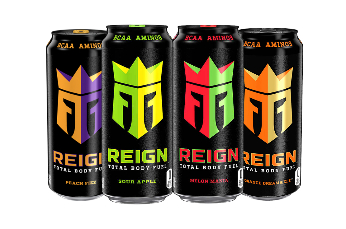
The logo design for the energy drink brand ‘Reign’ shows two ‘R’s with a crown sat on top of them. The ‘R’s have been manipulated in a way that creates the shape of a knight’s helmet, with them wearing a crown. This creates a brilliant example of conceptual design because the word ‘reign’ means to control and show power.

Energy drink brand ‘Reign’ displaying a good example of conceptual design. (Reign Total Body Fuel Energy Drink, n.d.)

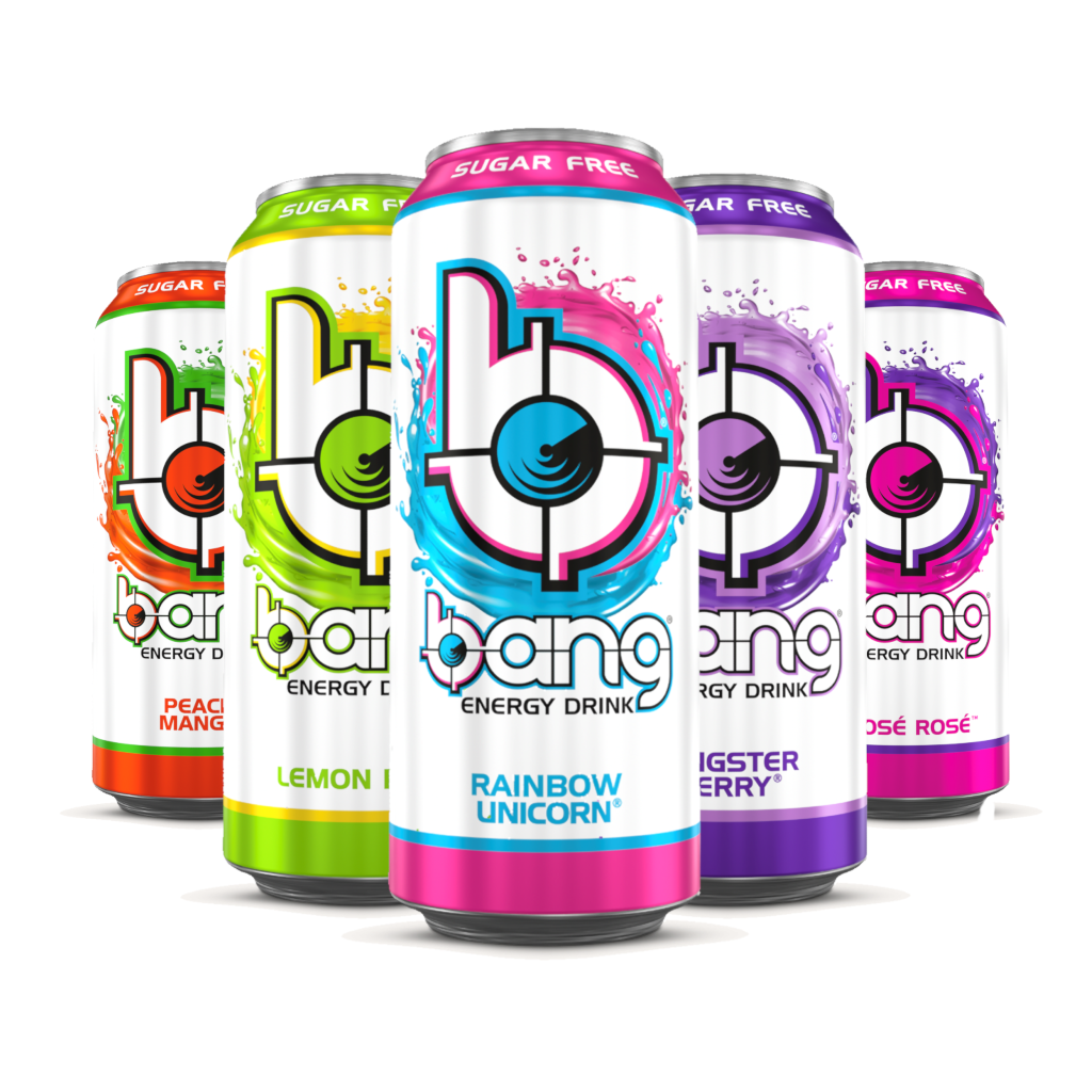
Another good example of conceptual design is the logo for the energy drink brand ‘Bang’. The logo shows a lowercase ‘b’ and a target that has been incorporated into the counter of the ‘b’. Many people do associate the word ‘bang’ with some sort of gunshot, thus creating a good example of conceptual design.

Energy drink brand ‘Bang’ showing another good example of conceptual design. (Bang Energy Drink, n.d.)

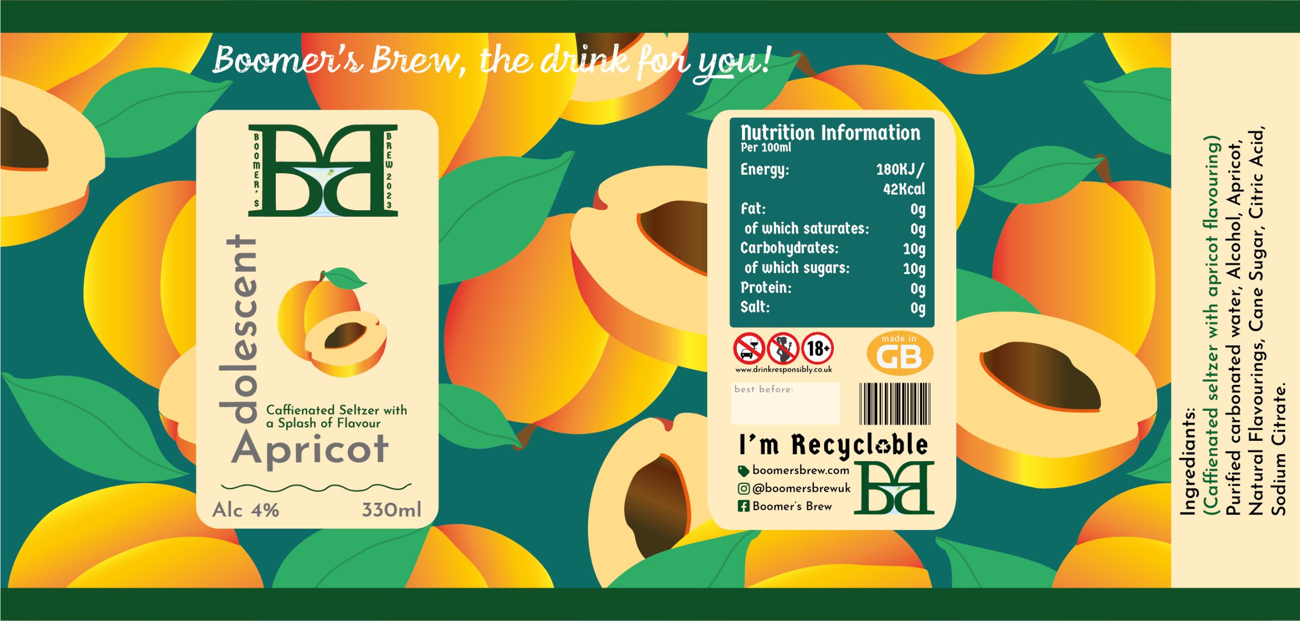
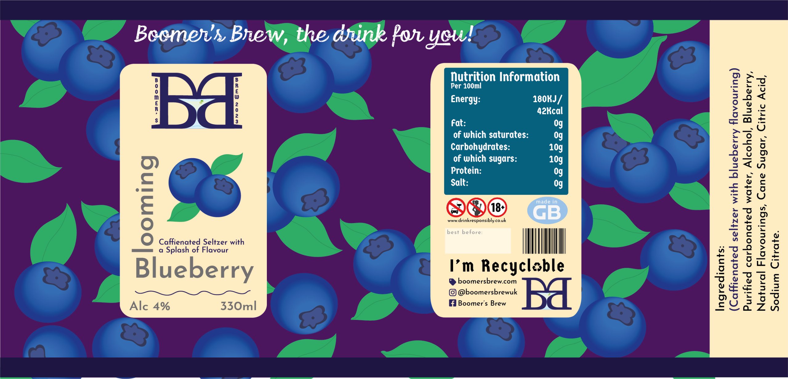
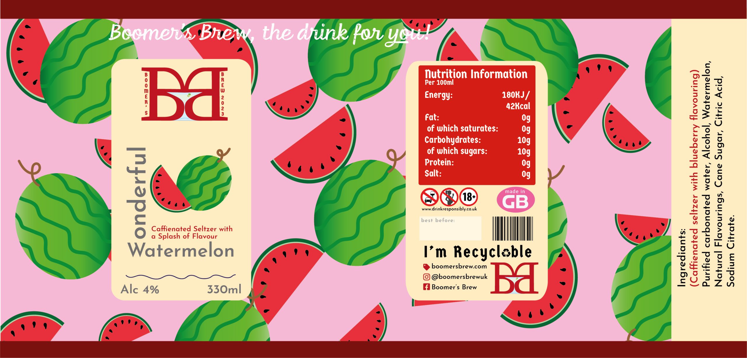
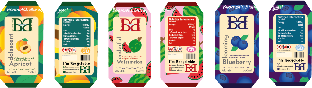
The energy drink brand created will be called ‘Boomer’s Brew’. The given brief was to aim the energy drink to over 60’s which relates to the word ‘boomer’, this word is commonly used amongst the younger generation as a nickname for the older generation. Having an alliteration within the name makes the brand more memorable and easier to pronounce. Now that the name has been chosen and finalised, it was time to develop the logo.

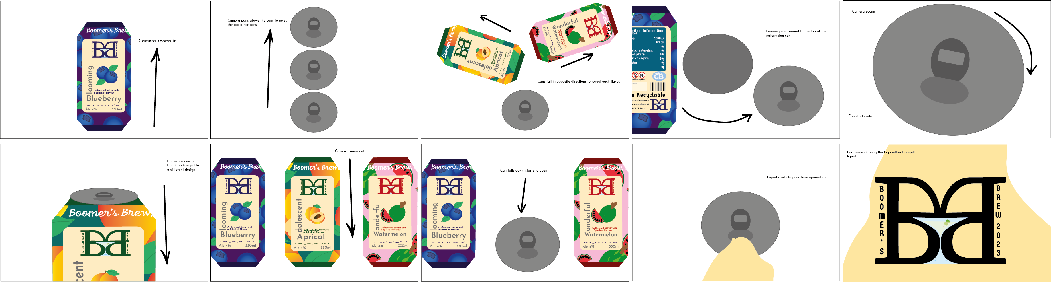
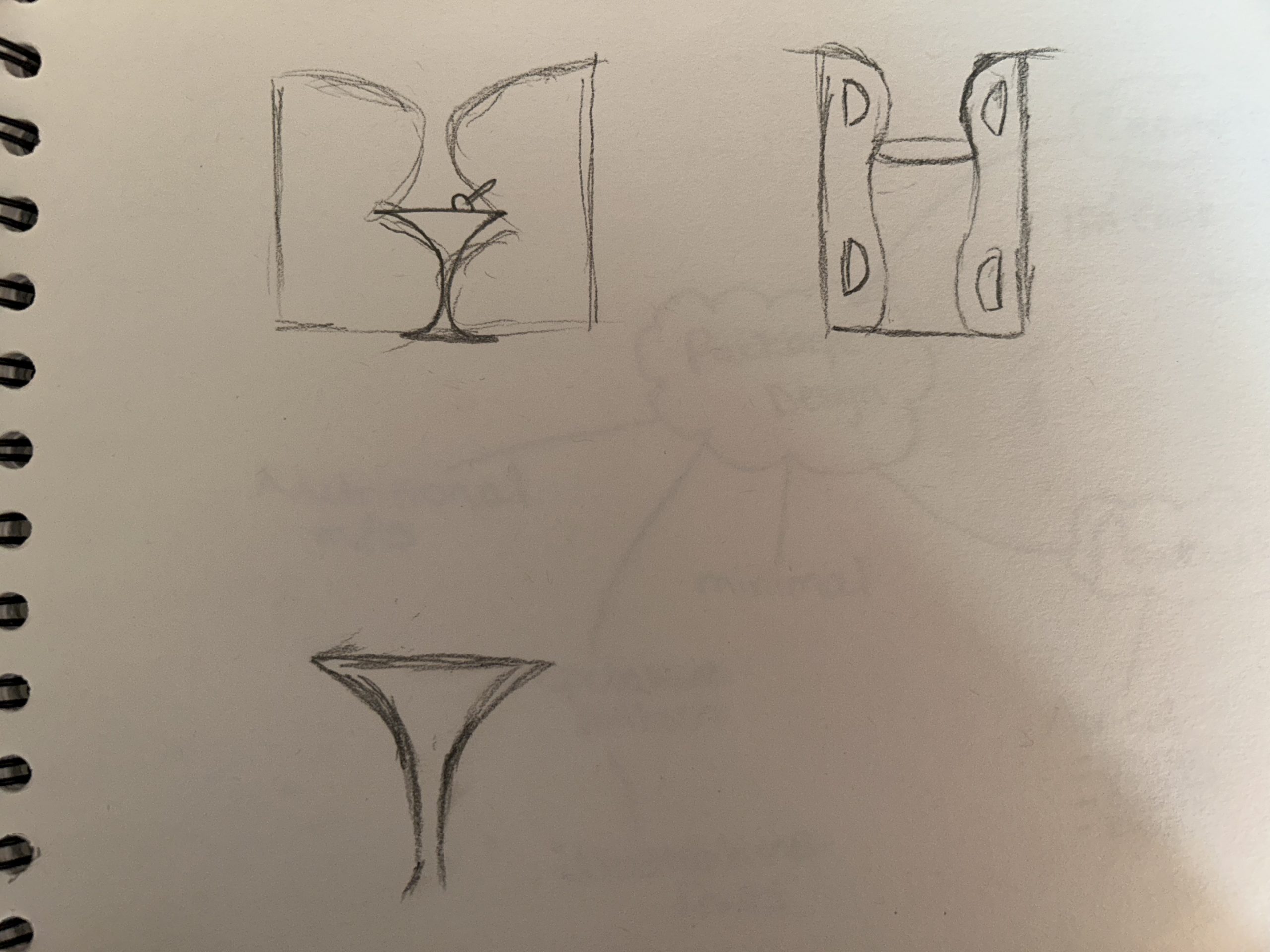
Here are some rough sketched ideas for the ‘Boomer’s Brew’ logo. The logo consists of the two ‘B’s, one has been horizontally flipped and when placed together and slightly manipulated, it creates the perfect shape for common cocktail glass. It was a passing thought to have the energy drink contain alcohol so with this logo in mind, it was decided to make it a caffeinated seltzer. With further enhancement of the logo, a conceptual design was created and matched perfectly with the alcoholic aspect.

First sketches of the Boomer’s Brew logo concept.
Digitally enhanced variations of the Boomer’s Brew logo, containing conceptual design.

Rejected Ideas

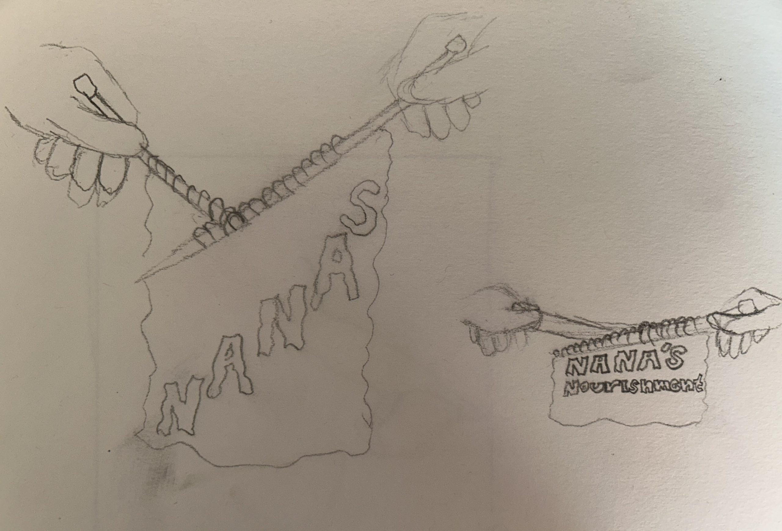
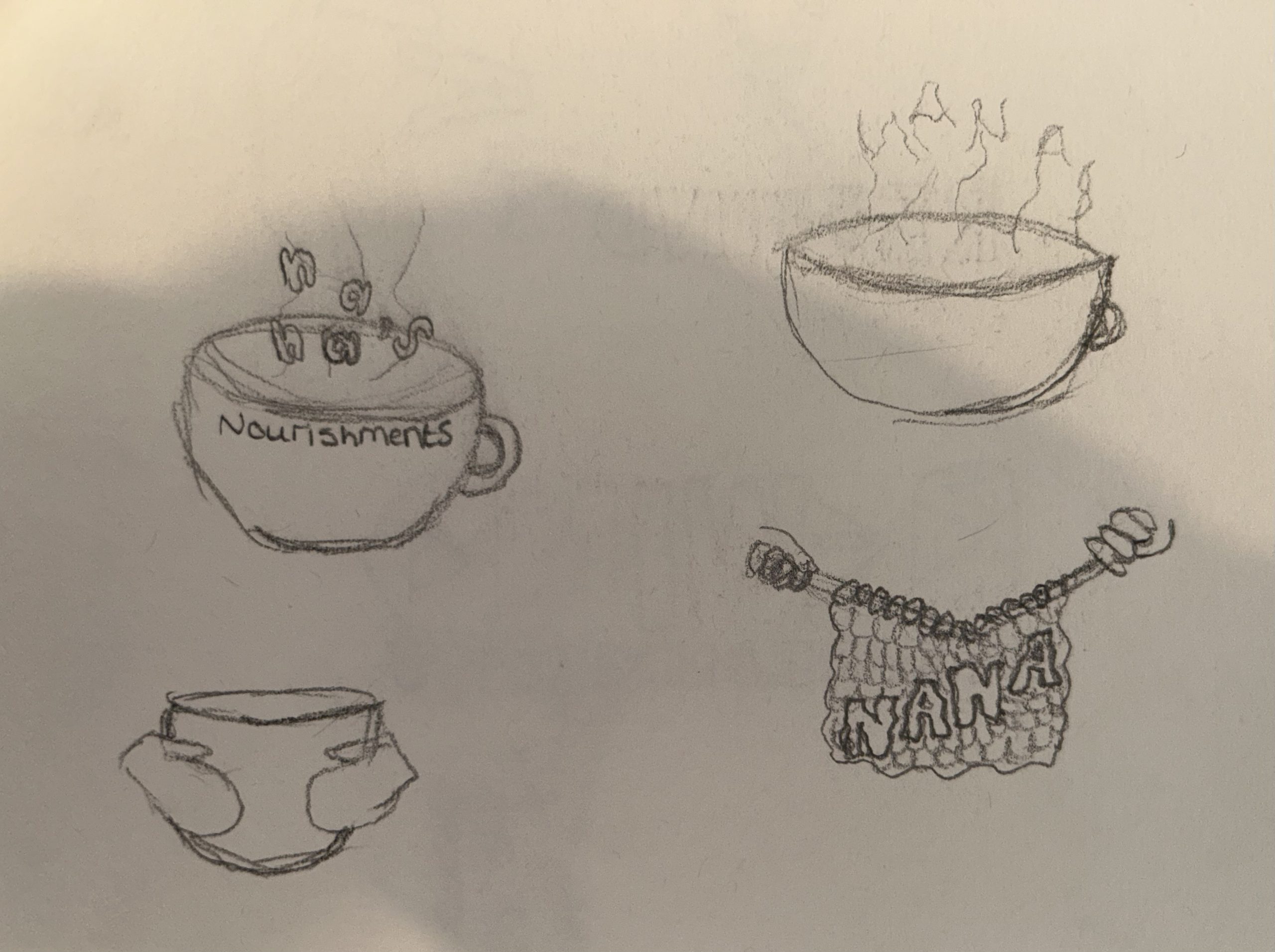
Many brand name concepts consisted of the alliteration such as ‘Nana’s Nourishments’, the idea behind this name was to create a cosy feeling that grandparents tend to have. One of the logo designs was a hot cup of tea and the conceptual aspect of this design would be the hot stream creating the word ‘nana’. Another logo design for this name was to have the brand name knitted. Knitting is a very common hobby for the elder generation so this concept would have enticing towards the specific audience.

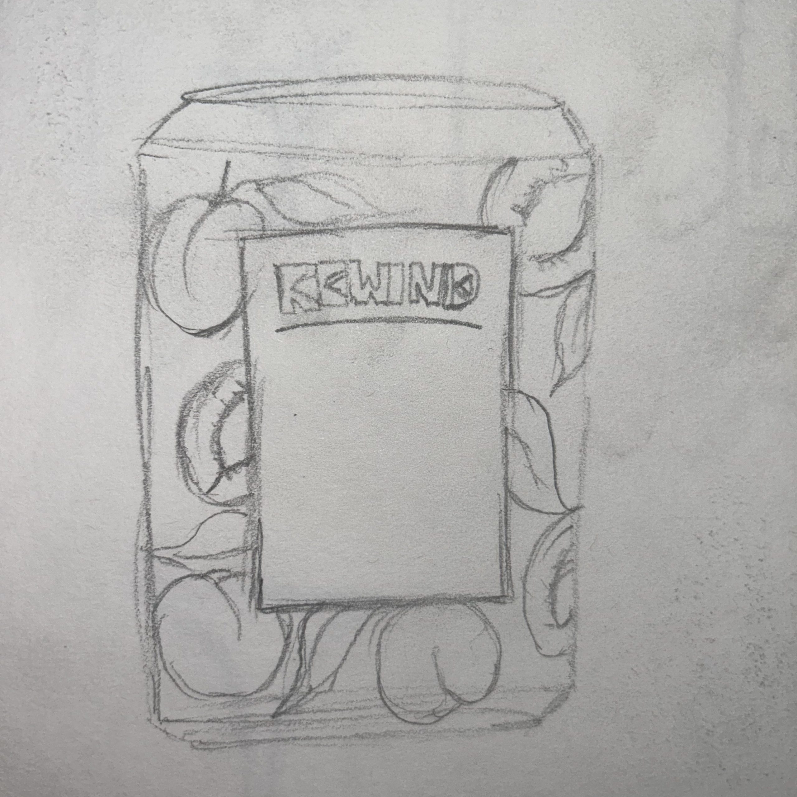
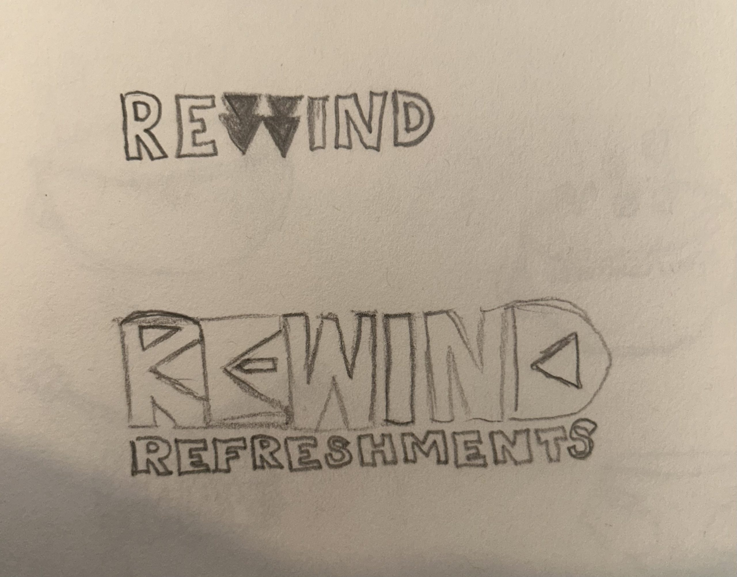
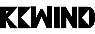
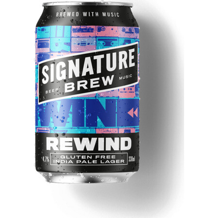
Another rejected idea that did become more enhanced was the name ‘Rewind’, the logo design contained the rewind icon within the ‘R’ and ‘E’. The name ‘Rewind’ was chosen at first because it is likely that people over 60 do wish to rewind time so this name would have worked well with the audience but after some further research, it was found that this was already a brand with a similar logo concept.

First initial ideas for the brand name ‘Rewind’ that later became a rejected design.
Digitally enhanced version of the first concept for the brand name ‘Rewind’.
Example showing the ‘Rewind’ concept already in use. (Signature Brew Rewind, n.d.)

References

Bang Energy Drink. (n.d.) Body Shocker. Available online: https://bodyshocker.co.uk/product/bang-energy-drink-12-x-500ml/ [Accessed 12 Apr. 2023].

Reign Total Body Fuel Energy Drink. (n.d.) Protein Pick and Mix. Available online: https://www.proteinpickandmix.co.uk/reign-total-body-fuel-energy-drink/ [Accessed 12 Apr. 2023].

Signature Brew Rewind. (n.d.) eEbria Trade. Available online: https://www.eebriatrade.com/products/beer/signature-brew/35228-rewind [Accessed 12 Apr. 2023].

Categories
Development Log

Energy Drink Package Design

Research and Inspiration

After receiving the brief for the energy drink branding, the first initial thought was to design the packaging like an IPA can. IPA can designs can be very chaotic, colourful and full of life. IPA cans are very artistic and always look as though a lot of time, planning and design has gone into the can. Having a can design like this on the shelves of supermarkets and it not being an IPA can attract a lot of people due to the sheer fact of it looking aesthetic but because this energy drink brand is aimed at the elder generation it was decided to develop something a little less chaotic and more minimal.

Another inspiring packaging design comes from the brand ‘Lostboy Cider’, specifically their explorer series. These can designs consist of illustrations wrapped around the can. Some have imagery of the drink flavours and other contain scenery. This type of design is still artistic and looks aesthetic yet it’s not chaotic like the first example of IPA cans.

The finalised energy drink concept will be a caffeinated seltzer with added flavouring called ‘Boomer’s Brew’. The initial design of the can has the flavour illustrated across the can for example, the first developed design is the Apricot flavour, this design will have an illustrated apricot repeated across the entire can. This creates an appealing aesthetic. Another reason for this design concept is for those within the elderly audience that have visual impairments or those that struggle to read, they will be able to seek out the flavour of the drink via the illustrations around the can. Three package designs have been developed and customised to fit the flavourings.

First sketch of the design plan using the rejected brand name ‘Rewind’.
Packaging design for the Apricot Flavour called ‘Adolescent Apricot’.
Second packaging design for the blueberry flavour called ‘Blooming Blueberry’.
Third packaging design for the watermelon flavour called ‘Wonderful Watermelon’.

Other aspects to think about when designing a drink’s packaging are the nutritional values, the barcode, ingredients, and the brand’s contact details. With this being an alcoholic beverage, it is also important to include the drink responsibly website and icons showing not to drink and drive, not to drink pregnant and not to drink underage.

‘Every bit of ink on a graphic requires a reason. And nearly always that reason should be that ink presents new information.’ (Tufte, 1985, p.96). Using Tufte’s data-ink theory to develop the labels used on the packaging design, the front label will only contain the brand name, logo, the name of the flavour, what the drink is and imagery of the flavour whereas the label on the back of the can will display only the nutritional values, contact information, alcohol responsibilities and if the packaging can be recycled. The labels are minimal with a beige background colour and no border. Having minimal labels are more attractive to the elderly because it can be seen as vintage.

Rough visual of how the designs will look on a common can shape.

References

2021 explorer series – Gherkin. (n.d.) Lostboy Cider. Available online: https://www.lostboycider.com/shipped-cider-41-states/ [Accessed 12 Apr. 2023].

2021 explorer series – Ruby Red. (n.d.) Shop Ciders. Available online: https://shopciders.com/lost_boy_cider/explorer_series_-_ruby_red_66868 [Accessed 12 Apr. 2023].

2021 Explorer Series. (n.d.) Vino Shipper. Available online: https://vinoshipper.com/shop/lost_boy_cider/explorer_series_-_beach_day_75065?list= [Accessed 12 Apr. 2023].

Heavy Seas Announces 24 Anniversary Ale: Quadruple IPA. (n.d.) Craft Beer. Available online: https://www.craftbeer.com/news/beer-release/heavy-seas-announces-24-anniversary-ale-quadruple-ipa [Accessed 12 Apr. 2023].

Long, M. (2020) New Beavertown Brewery range. Design Week. Available online: https://www.designweek.co.uk/issues/7-13-december-2020/beavertown-brewery/ [Accessed 12 Apr. 2023].

McCormick, L. (n.d.) Cherry Blossom Can Design. Behance. Available online: https://www.behance.net/gallery/124270983/LostBoy-Cider-Cherry-Blossom-Can/modules/706175091 [Accessed 12 Apr. 2023].

Signature Brew Rewind. (n.d.) eEbria Trade. Available online: https://www.eebriatrade.com/products/beer/signature-brew/35228-rewind [Accessed 12 Apr. 2023].

Tufte, E.R. (1985) The Visual display of quantitative information. Cheshire, Conn.: Graphics Press, 96.

Wintrygrey (n.d.) Craft Beer Label. 99 Designs. Available online: https://99designs.co.uk/profiles/wintrygrey/designs/894368 [Accessed 12 Apr. 2023].

Categories
Development Log

Stop Motion Teamworking Evidence

Stop motion is an animation technique which consists of the movement manipulation of objects which are photographed between each movement. It’s a very time-consuming way of animating. Some very commonly known films such as ‘Wallace and Grommit’, ‘The Night before Christmas’, ‘Coraline’ and ‘Fantastic Mr. Fox’ were all created using stop motion animation from big named directors such as Tim Burton and Wes Anderson.

Behind the scenes of Fantastic Mr. Fox, a stop motion classic (Albarran, 2020).

Fantastic Mr. Fox was under development for five years before it was released in 2009. The production of this film had a team of around 140 staff, 146 different sets and over 4,000 props. The lead role Mr. Fox took over 7-months to get the first model with around 535 puppets. The film is shot with 12 frames per second and uses around 125,000 individual pictures (Albarran, 2020). The majority of stop motion animations are all developed using a team of people so as a class, we created our own stop motion animation in teams.

In a group of three, Sydney, Jordan, and myself, we developed our own stop motion animation using a mannequin, green screen, an iPhone camera, and a camera stand. As a team we planned to have the mannequin run during the animation.

To create this animation, a team member moved the mannequin into a running position and another team member capture a photograph. Between each photo, the mannequin was delicately placed into another position, not one that would make a lot of difference but enough to create the running illusion when all the captured images are placed together. When only minimally moving the mannequin, the result looks a lot smoother and is clear to view what the object is doing. If there was a big difference in the mannequin’s positions in each photograph, the result would look unprofessional and choppy.

Behind the scenes of our own stop motion animation.

After all the photos were taken, they were then placed into a video editing app to add the photos together. The photos were put on a 0.1 second timer, using minimal seconds also adds to the smoothness of the result.

In conclusion, it is better to work as a team on something as delicate as stop motion animation. Working as a team also speeds up the process of the production, although this project only had a team of three, it was still a lot better then working individually with multiple things to do to create the animation.

References

Albarran, M. (2020) Eleven years of Fantastic Mr. Fox. Stop Motion Magazine. Available online: https://stopmotionmagazine.com/eleven-years-of-fantastic-mr-fox/#:~:text=For%20their%20leading%20character%2C%20%E2%80%9CIt [Accessed 12 Apr. 2023].

Categories
Development Log

Conceptual Energy Drink Animation Storyboard

Storyboarding allows one to enhance their vision of how they want a final product to look, it allows a person to further present and explain their ideas visually to their team members, this works best in the creative industry.

With the packaging design complete for Boomer’s Brew, it was easier to now think of how the animation will look. With only 10 seconds, the animation had to show the three different package design and include a conceptual transition.

Rough sketch of the storyboard showing the transition through each second.

This is the first initial planning for the final animation, this rough sketch shows 10 frames for each second of the animation with added annotations. The aim is to start the animation off with a single can facing towards the camera, the camera will then pan above that can to reveal the top of the other two cans. Once the camera has reached a birds-eye view, the two cans will fall in opposite directions, thus revealing the labels and flavours to the camera. After the cans have fallen the camera will pan around to the top of the watermelon package, zooming further in as the can rotates, as the camera zooms back out the can will change to the apricot package, this will be the conceptual transition.

Using a conceptual transition within an advertisement creates more attraction towards the product, it also allows the producer to show the different variants of the product in a professional manner, in this case it is the different flavours of the energy drink.

Moving on to the seventh second of the animation, the camera will continue to zoom out, showing the three different cans stood side by side. The apricot can will fall over while opening and the beverage will start to spill. As the beverage is pouring out of the can the camera will start to zoom into the liquid, creating a background for the Boomer’s Brew logo to appear on.

Digitally enhanced storyboard with added annotations, developed with finalised package designs.

Each second of the animation had been thoroughly planned out, each second should contain 12 images and after 10 seconds the animation should use around 120 images. Each image should only play for 0.05 milliseconds to create a smooth, professional, and clean transition.

Categories
Development Log

Stop Motion Energy Drink Branding Animation

Boomer’s Brew stop motion animated advertisement.

Royalty free audio used from ‘Pixabay’.