Categories
Design Portfolio

Conceptual Design Idea and Research

Metamorphosis is a state of change or evolution within an object, person or animal. It can be a rapid shift in the growth of something. A good example to explain what metamorphosis really is, is holometabolism, which is mainly seen in insects such as butterflies, bees, ants, flies and beetles. Holometabolism include the four life stages: egg, larva, pupa and imago (“Types of Metamorphosis”).

When talking about humans, metamorphosis is usually used in psychological terms. A human cannot undergo metamorphosis physically because they are fully formed in the womb but can experience psychological metamorphosis when going through big life changes or exchanging identities (“How to Deal with Major Life Changes”).

The chosen subject to base the animation on is the planetary structure based on the works of Alexander Calder. Calder was an American sculptor from Pennsylvania, ‘he is best known for inventing wire sculptures and the mobile, a type of kinetic art which relied on careful weighting to achieve balance and suspension in the air.’ (Tate).

The inspiration for the planetary structure animation is Calder’s monumental sculptures. Calder stated:
‘people think monuments should come out of the ground, never out of the ceiling but mobiles can be monumental too.’ (“Alexander Calder: Monumental Sculpture, Rome, October 29, 2009–January 30, 2010”)
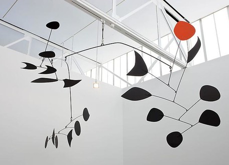
Alexander Calder’s ‘Rouge Triomphant’ 1959-1963. (“Alexander Calder: Monumental Sculpture, Rome, October 29, 2009–January 30, 2010”)

To link both metamorphosis, planets and the works of Alexander Calder together, it’s been decided to design a sculpture showcasing the appearance of earth throughout the years. After doing some research into the evolution of earth throughout the years, it was found that there has been drastic differences to the appearance of earth.
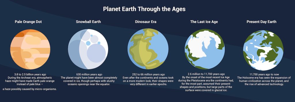
Image showing the different stages of Planet Earth, starting from 3.8 billion years ago. (“Planet Earth through the Ages”)

Below is a rough sketch of the planetary structure for the final animation. There’s five versions of Earth which will be showcased in a diagonal position.
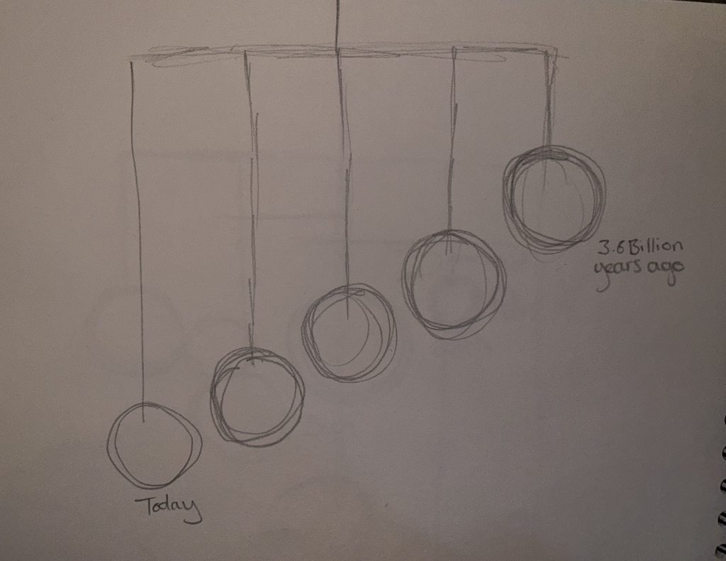
Rough sketch of the planetary structure used in the final animation.

This is an enhanced digital illustration of the structure designed. included in the right side view to explain why the planets are on a diagonal. When view from the right hand side the planets sit nicely in a timeline, starting with Earth’s appearance from billions of years ago and ending to the planet’s appearance we know today.
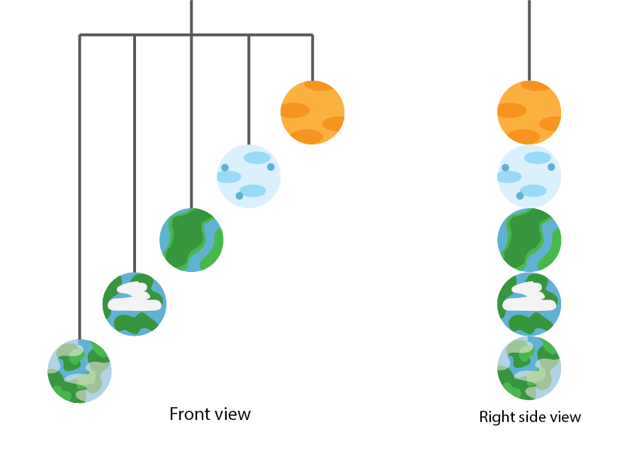
Digital illustration of the planetary structure, showing examples of different side views.

References

“Alexander Calder: Monumental Sculpture, Rome, October 29, 2009–January 30, 2010.” Gagosian, 12 Apr. 2018, gagosian.com/exhibitions/2009/alexander-calder-monumental-sculpture/. Accessed 27 July 2023.

“How to Deal with Major Life Changes.” Oprah.com, www.oprah.com/spirit/strategies-to-deal-with-every-phase-of-major-life-changes/all#:~:text=Humans%20do%20it%2C%20too%E2%80%94not. Accessed 27 July 2023.

“Planet Earth through the Ages.” Exoplanet Exploration, exoplanets.nasa.gov/resources/2245/planet-earth-through-the-ages/. Accessed 27 July 2023.

Tate. “Who Is Alexander Calder? | Tate.” Tate, 2015, www.tate.org.uk/art/artists/alexander-calder-848/who-is-alexander-calder. Accessed 27 July 2023.

“Types of Metamorphosis.” BYJUS, byjus.com/biology/types-of-metamorphosis/#:~:text=Zygentoma%20and%20Archaeognatha.-. Accessed 27 July 2023.
Categories
Design Portfolio

Animation Storyboard

To create an animation based on the planetary structure designed in the first blog post, a storyboard was needed to visualise the final piece and to create guidance for the actual animation.

‘The storyboard is essentially a series of sketches that map the key events of the narrative, presented chronologically. This provides a visual bridge between the script or overall concept and the finished animation.’ (“How to Storyboard for Animation | Storyboarding Tips | Adobe”)

It is important as graphic designs to be able to visualize the results of a project and being able to create a storyboard for an animated piece adds a steppingstone to the design process. Storyboarding is also a great way to present the visuals happening within the mind.

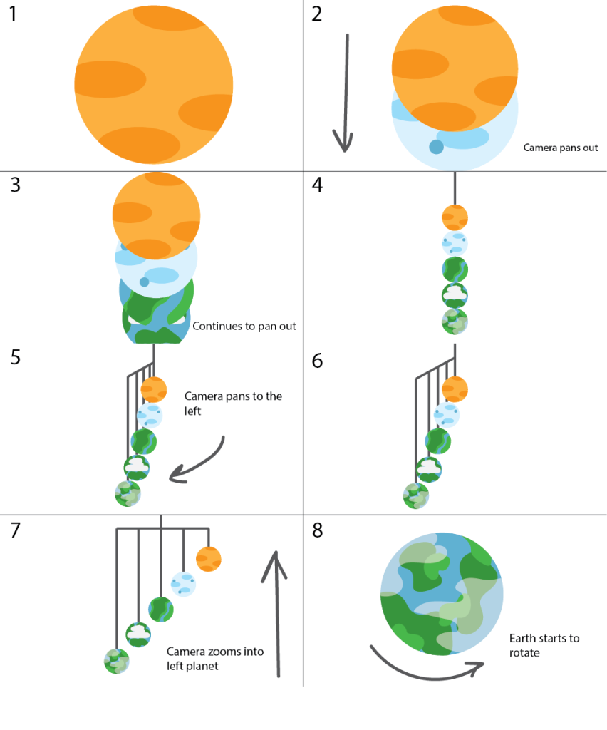
This is the illustrated storyboard showing how the final animation will look, the storyboard shows eight scenes and annotations describing the camera angles throughout those 30 seconds. The animation will start zoomed into the first variation of Planet Earth from 3.8 billion years ago. The camera will then start to zoom out and pan down to reveal the other four Earth variations in a vertical chronological order. Once all Earth variations are in view, the camera will then pan to the left to reveal the full structure of all five Earth variations. In the last two scenes, the camera will then zoom into the left Earth variation, this being the modern-day earth we know. This animation will represent the timeline of the appearance of Planet Earth.

Illustrated storyboard visualizing the final animation based on the planetary structure.

The video below is an example of the inspiration behind the animation. This animation shows the main object only through camera panning and zooming. This animation is also a good example of how the different Earth variations will look texture wise. Throughout the video the camera zooms into multiple planets which is a good way to visualize how the starting and closing scenes will look in this final animation.

Planetary animation showing how camera panning can be used to focus on the main object. (“Solar System 3D Animation | Planets Animation”)

References

“How to Storyboard for Animation | Storyboarding Tips | Adobe.” Www.adobe.com, www.adobe.com/uk/creativecloud/animation/discover/animation-storyboarding.html#:~:text=The%20storyboard%20is%20essentially%20a. Accessed 27 July 2023.

“Solar System 3D Animation | Planets Animation.” Www.youtube.com, 10 June 2021, youtu.be/nqPV8K6Zqfw. Accessed 27 July 2023.

Categories
Design Portfolio

Visual Design Treatment

Use of Colour

‘Note the effectiveness and elegance of small spots of intense, saturated colour for carrying information.’ (262588213843476)

Edward Tufte’s theory on the use of colour has been incorporated into this product via the initial design of the planetary structure and the storyboard for the final animation. The five Planet Earth variations each have their own colours and style.

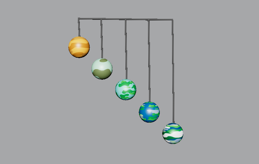
Colour is crucial when it comes to design, it’s used to provide key information without any text. Tufte’s examples of this are maps which are colour coded for the correct information. Within the design of the planetary structure, only the earth variations have colour, the wired structure is grey because its not so important. The eye of the audience needs to be caught by those five planets because that’s the main piece of information that is trying to be portrayed.

The five different Earth variations showing the use of colour.

The use of small multiples

Tufte believes that the consistency of small multiples can pass off more information to the audience with just a glance. The multiples can all have slight differences, but the brain can be tricked into seeing these differences because there are multiple versions of the main attraction.

Using this theory in the planetary structure, there are five variations of Planet Earth, taking the audience through a timeline. There are multiples of Planet Earth, each differing in colour and style. With just a glance the audience can see that this is portraying a timeline in the appearance changes of Earth.

Narrative of space and time

Just like the use of small multiples, this planetary structure shows the narrative of time throughout the history of Earth. The narrative of space and time also portrays information to the viewer without any text. The timeline of the planets starts from billions of years ago and ends with the appearance of today’s earth as we all know it.

This theory will also be used throughout the animation as it will portray the timeline through camera panning, the planets will reveal one by one, this emphasises the anticipation and appearance.

Layering and Separation

Tufte’s layering and separation theory can be used to show the minimalism within a design. Keeping a design minimal and reducing unnecessary factors allows the audience to focus on informative areas. This theory is relevant to the planetary structure because the design is very minimal and only provides key information through the visuals.

Micro/Macro Readings

‘Enormous amount of data is being generated every day by us. The visual graphics should be designed in such a way that it is data rich and the data is presented in a more tabular, contrast way so that it is easily captured by the human eye.’ (Sampathkumar)

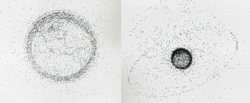
Micro readings are mainly used within graphs or charts to convey large quantities of information, this is normally portrayed in very minute details. An example of this is this diagram of Earth’s Orbital Pollution. Each tiny speck represents the debris that’s revolving around Earth.

Earth’s Orbital Pollution showing 7000 pieces of debris revolving around the Earth. (Sampathkumar)

This theory could be incorporated into the planetary structure. Although the design is not presenting a mass of information, the designs of the little Earth variations each show where grassy area’s are or the air pollution in the sky.

References

262588213843476. “Edward Tufte on Use of Color.” Gist, gist.github.com/deadprogram/782074. Accessed 27 July 2023.

Sampathkumar, Shruthi. “Micro / Macro Readings.” Medium, 7 Feb. 2019, medium.com/@shurisk96/micro-macro-readings-cd987ce6bc63. Accessed 27 July 2023.

Categories
Design Portfolio

Final Design

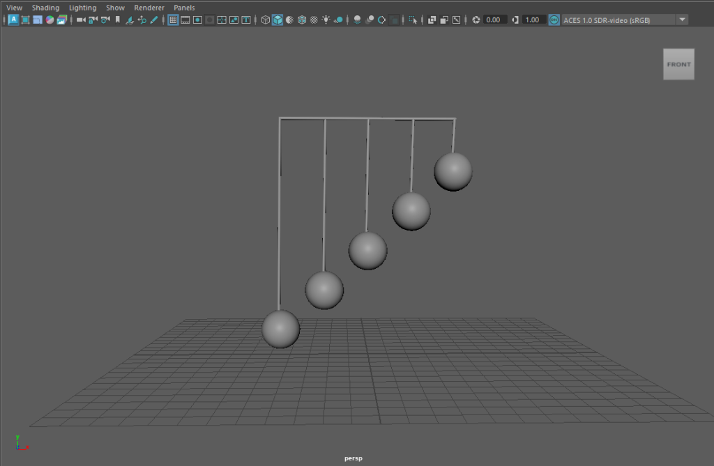
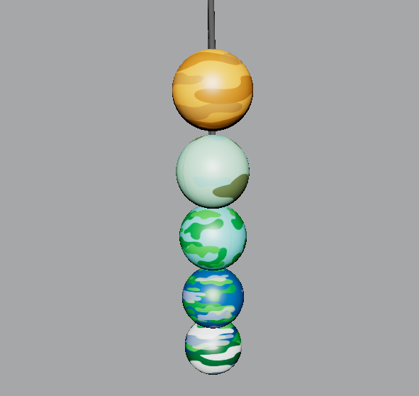
Now that all the plans had been put into place, it was time to further develop the animation of the planetary structure. To include the work of Alexander Calder, a 3D mobile model was created in the modelling software, Maya.

Image of basic model structure.

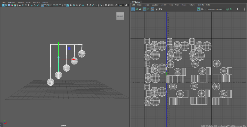
After creating the basic structure, UV maps needed to be made so each shape within the structure could be texturized. Each shape had to be unfolded to get a 2D shape, thus creating the UV map.

Screenshot showing the UV mapping of each shape used within the structure.

Tufte’s use of colour theory has been incorporated into this final animation piece. As spoken about in the previous post. Each of the five Earth variations have been designed to look cartoon like, they’re vibrant and all different in style. The use of colour on these planets emphasises the type of information being told. A timeline is being told and having each sphere look different but also having similarities creates the story of history. This can also be linked to Tufte’s theory on small multiples. Using this theory means the story can be told with just a glance because each small multiple has slight differences.

Another one of Tufte’s theories used is the narrative of space and time. A big focus within this animation is the way the camera is panning around the structure, zooming in and out of the spheres. In the opening scene, the planets drop down to reveal themselves one by one. This creates a narrative for the story of the timeline.

Categories
Design Portfolio

3D Animation (Planetary Structure)