Categories
Development Log

Original Artwork One (Developed from the Master Plan) – Rooted in Hull’s Pizza Project

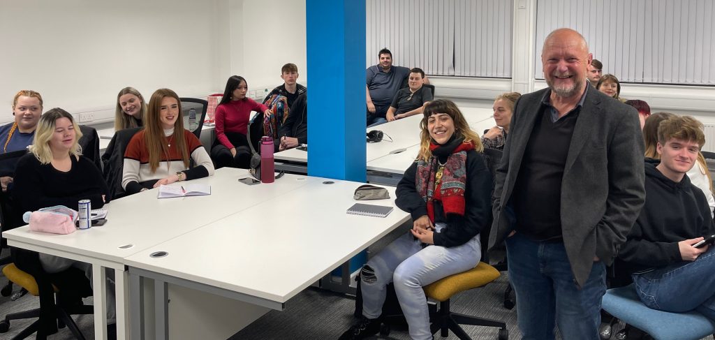
After receiving an email from Rooted in Hull’s CEO Adrian Fisher, stating that their new pizza chef, Sherard, needed some help towards a new company name, logo design, flyer design and pizza packaging, groups of 2 were formed to brainstorm some quick names and logo designs following Sherard’s brief. One design was to include a hammer and sickle or something related and the other design did not have to include the hammer and sickle.

Figure 1: This is the mind map from the groups of 2 discussion regarding Sherard’s query, many company names and concepts were thought about. Included are some rough icon sketches for the logo. This was the start of the design journey to help Sherard.

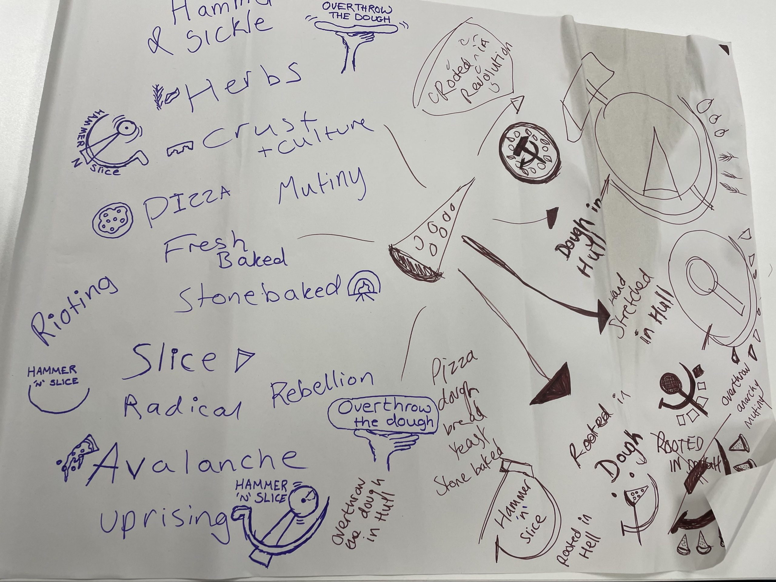
During the 2-person brainstorming session, two names were developed. The first being ‘Hammer ‘N’ Slice’ and the second was ‘Overthrow the Dough’. Rough sketches of logo designs were also created. These names and logo ideas were then taken and digitally evolved, used across the flyer designs and pizza packaging designs.

Figure 2: First designs for Sherard’s pizza company, both are bold outlined variations of the idea and both include power or revolution in some aspect as asked for in Adrian’s email.

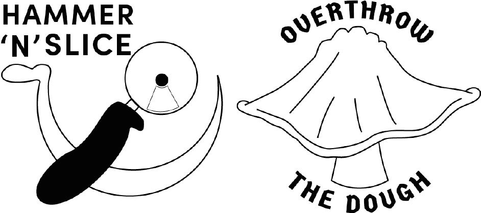
Figure 2 shows the first digitally evolved logo and name designs, taken from the mind map in figure 1. ‘Hammer ‘N’ Slice’ is a play on words for hammer and sickle, the logo design for this name does include a hammer and sickle but the hammer has been changed to look like a pizza cutter which incorporates conceptual design within the logo. ‘Overthrow the Dough’ is the second design that does not include a hammer and sickle but does still have aspects of power and revolution. The idea behind this design is a fist of empowerment stretching out some pizza dough, this could also be classed as conceptual as it also represents the making of a pizza.

Figure 3: First flyer design for both logo ideas, both using the same structure and background design, colour variations have been included to add playfulness to the design.

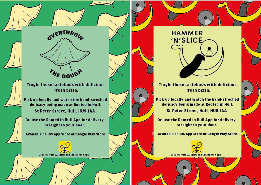
These are the first rough designs of the flyers, both flyers have the same structure, text, and fonts. The ‘Overthrow the Dough’ flyer includes both the coloured variation logo design and the black and white one. Green tones have been used within this flyer to incorporate Rooted in Hull and their urban farm aspect. The ‘Hammer ‘n’ Slice’ flyer has yellow and red colours to represent the revolution aspect stated in the brief. The repetitive background on these flyers makes them seem youthful and playful with the use of colour which will attract the younger generation.

Figure 4: Improved log design for ‘Overthrow the Dough’, this new logo is a lot more detailed and was created using an original image of Sherard throwing pizza dough.
Figure 5: A5 flyer for ‘Overthrow the Dough’ using the new and improved logo design. Using mixed medias such as chalk illustrations and original images of Sherard’s pizza.

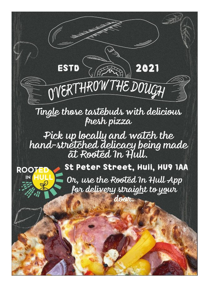
Overthrow the Dough was the chosen logo to enhance even further, this enhanced version is a completely different style. Moving away from the youthfulness of the first designs, this logo is now more detailed and now looks more like a small, family-owned business. Texture has been added using cross-hatching techniques. With this new logo, the whole layout of the flyer has been completely changed, the new and improved flyer design now includes a chalkboard-like background, with illustrations of common ingredients, created using a chalk paint tool within Adobe Illustrator. The text has remained the same but now, with a funkier chalk-like font. Original photos of Sherard’s pizza have been included to give the audience an insight to how the pizza looks.

Figure 6: This is a design concept for pizza packaging, following the design structure of the flyer and using the same illustrations around the edges of the pizza box.

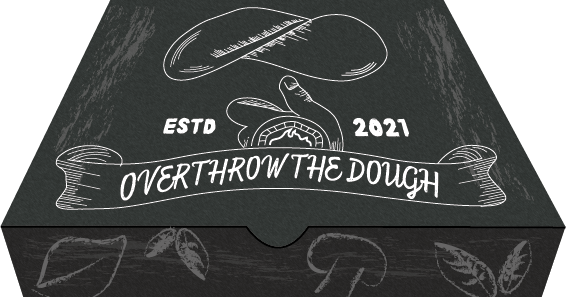
The pizza box design also includes a chalkboard background with chalk-like paint strokes across the whole box to give a smudged chalk effect. The idea is to have the ingredient illustrations across all sides of the box, this adds details but also keeps it from looking less chaotic.

Categories
Development Log

Original Artwork Two (Developed from the Master Plan) – Rooted in Hull App Design

Figure 1: First initial plan for what will be different pages will be offered in the app design and what they all will offer. Included are sketched ideas for the menu icons.
Figure 2: 7 screen design examples for the Rooted in Hull App, showing what they all look like closer together.
Figure 3: Example of what the application icon looks like among a generic iPhone home screen, the icon design is a close-up vector of Rooted in Hull’s logo. (IPhone Home Screen Template, n.d.)
Figure 4: This is the start-up/loading screen, when clicking the icon on the home screen the image will expand with the yellow background and the 4 other icons will appear, these are the icons used for each category on the menu tab at the bottom of the screen.
Figure 5: From the loading screen, you’ll be taken straight to the home screen, here you will be offered to look at the farm’s backstory and how their produce is grown.
Figure 6: This is where groceries can be ordered, the idea behind the shop is like popular takeaway apps, groceries will be delivered within the hour. Original images have been used showing what products they offer.
Figure 7: The offers page in includes a designed loyalty card where all online purchases will be tracked with a stamp, this page also shows discounts that you can use either online or in-store.
Figure 8: The donate page offers hand-drawn artwork, which all proceedings are used as donations. There is also an option to add a donation to your grocery order. (Paypal, n.d.), (Png Mastercard Logo Vector, n.d.), (Visa Debit, n.d.).
Figure 9: Close-up of the hand-drawn postcard, this is a watercolour painting with a Rooted in Hull logo vector in the centre.
Figure 10: This is the help page for the app, showing the ‘Contact Us’ section as an example. Each section will become yellow and larger when clicked on. (Instagram, Facebook, Twitter Logo, n.d.), (Rooted in Hull Google Map, n.d.)

An app design was chosen from the master plan because of the growth in technology throughout today’s society. This app is something that everyone can get involved with and will attract more visitors to the Rooted in Hull farm. This is a great way to fulfil Adrian Fisher’s brief because it will spread more word about what Rooted in Hull do and how they help struggling families. In time, this will hopefully increase donations.

This is a six-screen app design with an example of what the app icon will look like against a generic iPhone home screen. Each screen shows all the different abilities the app offers, including a help page for queries about how the app functions. Other than the app icon and the loading screen, you will see that each page has the same composition. The logo, title and menu bar all have the same placement, this is to keep the design looking as minimal as possible. This also makes the design look very realistic and shows a level of professionalism.

Only three fonts have been used throughout the seven design examples. Sofia Pro Bold has been used for headings and subheadings, Source Sans Pro can be seen for the main body of text and informative sentences. Myriad Pro is the final font used for the iPhone home screen and the menu icons. All three typefaces are sans-serif and are easily readable against all backgrounds used in the design.

The colours used in the app have been limited to fit the Rotted in Hull’s colour palette, with tints of yellow and green, you can also see the colourful original images taken from the Rooted in Hull farm. Limiting the colour usage gives a clear palette and keeps the design from looking too chaotic, this again, enhances the level of professionalism.

Conceptual design can also be found in the design of this app with the ‘Help’ icon, the icon shows a question mark with a leaf growing at the end and roots growing from the bottom, replacing where the tittle would be. This shows what the page is for and adds some of Rooted in Hull’s personality with the growing roots.

All photos used within this design are original images that were taken at the property of Rooted in Hull. In the ‘Shop’ section of the app, there are images for every product advertised, the idea behind this is to show the audience what they are paying for, so they do not become sceptical towards what they are buying. Including a photo of Adrian Fisher gives the costumer an insight to who they are buying from but also makes them feel more included. The purpose of this app design is to not make costumers feel like they are just buying from a brand that thrives in profit, it’s to show people where their produce comes from, how its grown and how the profits of the Farm Shop will be used or donated.

Bibliography

Instagram, Facebook, Twitter Logo. (n.d.). [Online Image] Available at: https://stock.adobe.com/uk/search/images?k=fb+logo [Accessed 17 Dec. 2021].

IPhone Home Screen Template. (n.d.). [Online Image] Available at: https://files.design/templates/ios12gui [Accessed 19 Dec. 2021].

Paypal. (n.d.). [Online Image] Available at: https://logos-download.com/1725-paypal-logo-download.html [Accessed 17 Dec. 2021].

Png Mastercard Logo Vector. (n.d.). [Online Image] Available at: https://www.pngitem.com/middle/hTJJJmR_png-mastercard-logo-vector-transparent-png/ [Accessed 17 Dec. 2021].

Rooted in Hull Google Map. (n.d.). [Online Map] Available at: https://www.google.co.uk/maps/place/Rooted+in+Hull/@53.7445283,-0.3266716,15z/data=!4m5!3m4!1s0x0:0x52d0ba15975c0e3f!8m2!3d53.7445283!4d-0.3266716 [Accessed 17 Dec. 2021].

Rooted in Hull Logo. (n.d.). [Online Image] Available at: https://www.rootedinhull.org.uk/ [Accessed 19 Jan. 2022].

Visa Debit. (n.d.). [Online Image] Available at: https://www.google.co.uk/search?q=visa&sxsrf=AOaemvImglfbF1_vOMejFw_L3TrWWv0urQ:1639760321265&source=lnms&tbm=isch&sa=X&ved=2ahUKEwjxvtybp-v0AhXKVsAKHWXTCl0Q_AUoAnoECAIQBA&biw=1536&bih=754&dpr=1.25#imgrc=9W_dnm08jQfJyM [Accessed 17 Dec. 2021].

Categories
Development Log

Rooted in Hull Graphic Design Master Plan

A master plan is used in design for long-term planning, it’s a document that helps guide the design process to reach its full potential and fit the brief that clients have set out (Worldbank.org, 2009).

CEO of Rooted in Hull, Adrian Fisher stated that he wants a way to ask people who have money for money to donate to the less fortunate and fund veg boxes to them. With this brief, a master plan was created to help start the design journey towards Adrian’s brief.

Figure 1: Photos taken from the group master plan discussion, all students had an input and colour coordinated written ideas.

During a group discussion, many ideas and design concepts were spoke about and the master plan was evolved. Design ideas such as merchandise, app design, stationary packs and web design were discussed. With this group plan, a digital version was created including all the ideas spoke about. Plans and ideas from Adrian’s interview with the Graphic Design students and lecturers were picked apart and reconstructed into this master plan.

Figure 2: First digital redesign of the big group master plan, this digital version shows more organised ideas and becomes a lot easier to read (Rooted in Hull Logo, n.d.).

This is a rough digital redesign of the group master plan. The colours on this digital design are very simple and they remain within the Rooted in Hull’s logo colour palette. The text is white to create contrast with the dark background and is easily readable. The font is a simple sans-serif type face, this again, makes the text easily readable and doesn’t overly complicate the text against the second font used in the background design. This is a chalk-like font to create the effect of a chalkboard which relates again to why the main body of text is white.

Figure 3: Final master plan design containing more personal plans and ideas to help the design process of artwork 2. More colour is included but is still easily readable.

After some further discussions about the design options, a more personal master plan was created. This included individual idea likings from the main group master plan. In this final design, there are four categories which have been personally chosen to extend with more ideas. The initial design for this master plan is a lot funkier with the blotches of colour, it’s a lot more colourful but remains within the Rooted in Hull’s logo colour palette. For each of these four categories more ideas have been developed, two of these categories have sub-categories which show in-depth concepts. App design and merch, the two with sub-categories, are the ideas that want to be enhanced further throughout the design process and are better concepts for what Adrian is asking for.

Bibliography.

Rooted in Hull Logo. (n.d.). [Online Image] Available at: https://www.rootedinhull.org.uk/ [Accessed 19 Jan. 2022].

Worldbank.org. (2009). Master Planning | Urban Regeneration. [online] Available at: https://urban-regeneration.worldbank.org/node/51 [Accessed 19 Jan. 2022].

Categories
Development Log

Rooted in Hull Graphic Standards

What are graphic standards?

Graphic standards are used within companies to provide a structure for using logos, colours, typography, and composition. It shows the correct way a logo should be positioned in every instance, an appropriate colour palette and the fonts used within the company’s visual graphics. Graphic standards should contain information about the branding and should be easily readable (www.usi.edu, n.d.).

Here are 3 A4 pages of Rooted in Hull’s graphic standards manual design, based around original artwork 1 and 2. These 3 pages are informative about colour, typography, composition, and photography. The manual has been designed with the same colour palette as the Rooted in Hull’s logo and uses the same typeface throughout.

Figure 1, Page 1: This is the first page of the graphic standards manual for Rooted in Hull, it looks at the logo design, the primary colours used in the logo and even contains a back story to the design process of the logo (Rooted in Hull Logo, n.d.).

The first page is focused on Rooted in Hull’s logo with information on the story behind their logo design process, which CEO Adrian Fisher told the graphic design students and lecturers during his interview. The colourful blocks around the logo have been deconstructed and placed in the centre of the page to show a close view of what the text below is stating, choosing to talk about the blocks from the logo gives them a lot more personality as many people will just see them as a random design. In the second half of the page there are squares of primary colours used within the logo and the visual graphics of artwork 1 and 2. Included are the HEX codes of these colours, found using Adobe Capture, for other designers to use. There is a small section at the bottom of the page showing Overthrow the Dough’s primary and secondary colours used in Artwork 1.

Figure 2, Page 2: This page of the manual shows the typefaces used for Rooted in Hull and Overthrow the dough’s visual graphics, this page also includes information on where these fonts are used and how they should look.

The second page shows the typography used within Rooted in Hull and Overthrow the Dough’s visual graphics, this includes both logos, 2D designs and digital artwork, which can be found in Artwork 1 and 2. The left side of the page shows the primary fonts of Rooted in Hull in flushed left, on the right side is Overthrow the Dough’s primary fonts in flushed right. All primary font examples show both upper case and lower-case alphabets to show the audience the typeface variations. At the bottom of the page there are coloured blocks containing information on the primary fonts and where they should be used. The fonts you see for Rooted in Hull’s side are similar typefaces used in their logo and web design, these were found using Adobe Capture.

Figure 3, Page 3: The final page gives an overview on good and bad examples of composition when using the two logos, there is also a snippet of the page showing photography, offering photography advice within Rooted in Hull’s property.

The third page shows the importance of composition within the logo placement. The first half of the page shows acceptable and unacceptable variations of the logo placement, this includes useful variations of Rooted in Hull and Overthrow the Dough’s logo. The second half of the page contains information on photography and advice when capturing photos of Rooted in Hull’s staff or their property.

Figure 4: This is an example of how the graphic standards will look in a manual form.

Bibliography

Rooted in Hull Logo. (n.d.). [Online Image] Available at: https://www.rootedinhull.org.uk/ [Accessed 19 Jan. 2022].

www.usi.edu. (n.d.). Importance of Graphic Standards – University of Southern Indiana. [online] Available at: https://www.usi.edu/brand/importance-of-graphic-standards/#:~:text=Graphic%20standards%20provide%20a%20sound [Accessed 20 Jan. 2022].

Categories
Development Log

Press Release

Adrian Fisher
Rooted in Hull, St Peter Street,
Hull, HU9 1AA
Adrian@rootedinhull.org.uk
09010389

CEO of Rooted in Hull, Adrian Fisher meets first cohort of new BA (Hons) Graphic Design programme to discuss new project

On Tuesday 2nd November, the University of Hull’s Graphic Design Students had the pleasure of meeting Adrian Fisher, the CEO of Rooted in Hull. Interviewed by Robert Consoli, BA (Hons) Graphic Design programme leader, lecturer in Digital Media. Adrian gave an insight into who Rooted in Hull who and what they do for the community. Adrian and Robert were accompanied by Jason Hayhurst, Screen Subject Group Director, Lecturer in Digital Media and Terry Westby-Nunn, Lecturer in film studies, TV production specialist.

The 25 Graphic Design students are currently studying 2D Visual Design in the newly refurbished Graphic Design Studio Space in the University of Hull Media Centre. The programme is designed to be flexible enough to integrate real projects into the curriculum whenever possible.

The Hull City Council wanted to bring education within food banks to the city, which led Adrian and his only partner at the time, Mark Cleaver to London where they learnt more about what the council had suggested. During their time in London, they discovered new ideas of teaching children the knowledge on the simplicity of enjoying food. This then led to the establishment of Rooted In Hull in 2014.

During the interview, Adrian stated that the goal of the company is not to try and make Hull a healthier city, they’re not trying to pressure anyone to become vegetarian or vegan. Their main focus is trying to bring people together to enjoy basic, local and fresh food within each other’s company. Rooted in Hull works closely with low-income families, providing them with veg boxes and opportunities with weekly social events, offering hot drinks, sandwiches and fresh soup. Rooted in Hull also offer cooking and crafting workshops and host live music events, these are offered for free so those less fortunate can take part.  

Adrian laid out his ideas and how the students can help. The company would like a way to ask people with a good income for money to help with lower income families, he would also like an honest explanation as to where the money will go and how it will help. The plan that Adrian has set out for the students can now be spread across different design medias. Posters, leaflets and merchandise can be placed across Hull and surrounding areas to promote the charitable donations and attract more custom. Digital media such as advertisement, web design and social media posts can also be created to attract the younger generation.


By Saffron Piercy