Categories
Category: 2D Visual Design
After receiving an email from Rooted in Hull’s CEO Adrian Fisher, stating that their new pizza chef, Sherard, needed some help towards a new company name, logo design, flyer design and pizza packaging, groups of 2 were formed to brainstorm some quick names and logo designs following Sherard’s brief. One design was to include a hammer and sickle or something related and the other design did not have to include the hammer and sickle.
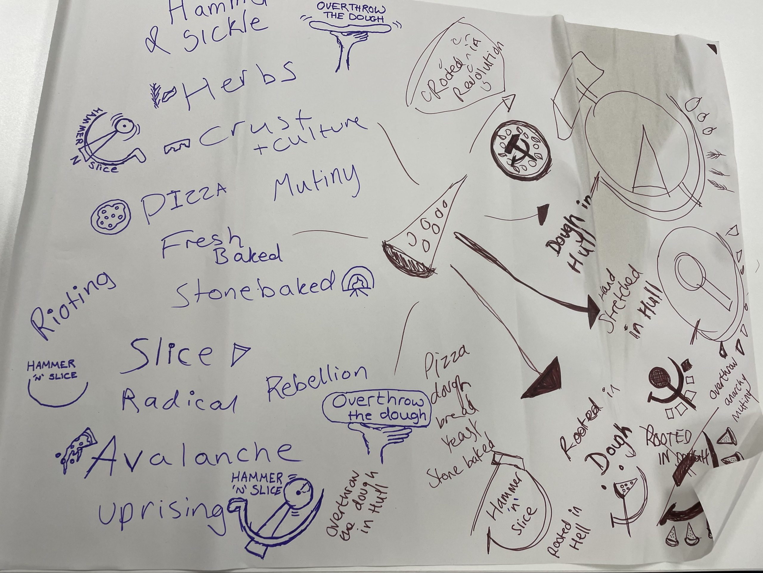
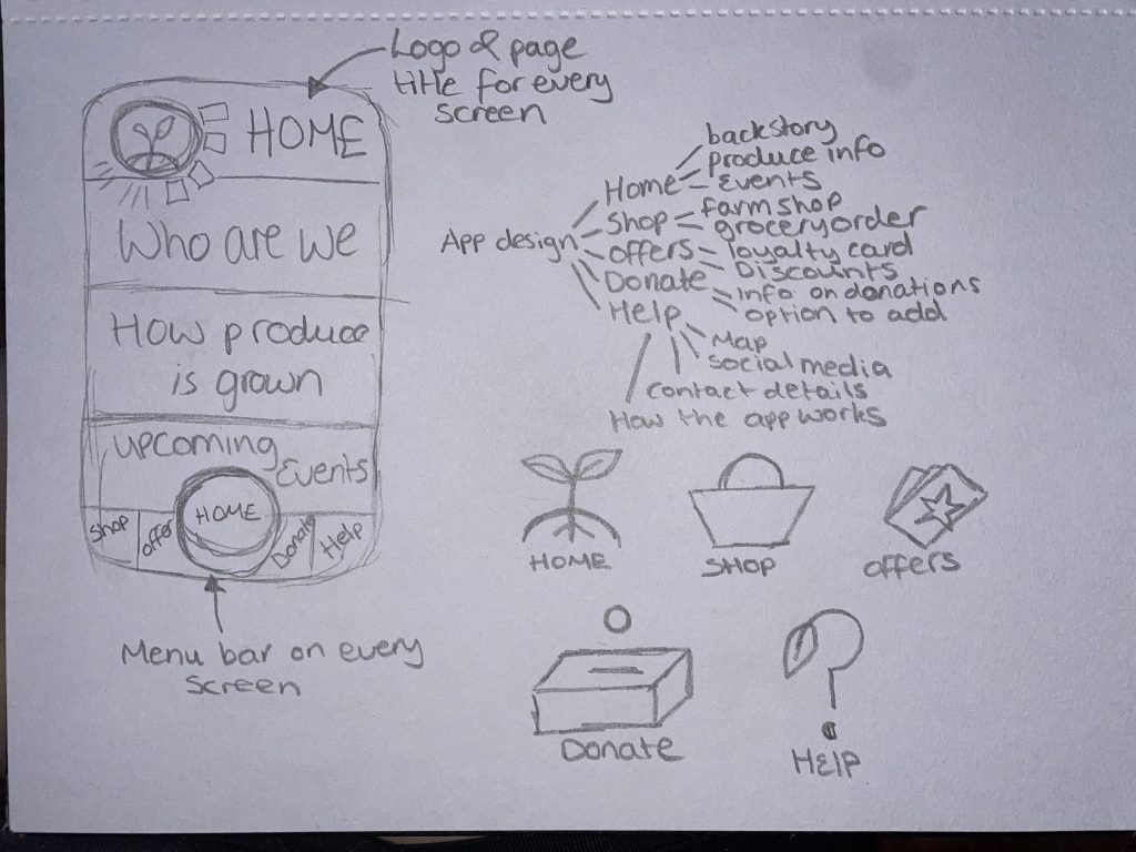
During the 2-person brainstorming session, two names were developed. The first being ‘Hammer ‘N’ Slice’ and the second was ‘Overthrow the Dough’. Rough sketches of logo designs were also created. These names and logo ideas were then taken and digitally evolved, used across the flyer designs and pizza packaging designs.
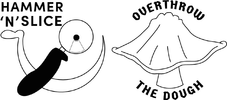
Figure 2 shows the first digitally evolved logo and name designs, taken from the mind map in figure 1. ‘Hammer ‘N’ Slice’ is a play on words for hammer and sickle, the logo design for this name does include a hammer and sickle but the hammer has been changed to look like a pizza cutter which incorporates conceptual design within the logo. ‘Overthrow the Dough’ is the second design that does not include a hammer and sickle but does still have aspects of power and revolution. The idea behind this design is a fist of empowerment stretching out some pizza dough, this could also be classed as conceptual as it also represents the making of a pizza.
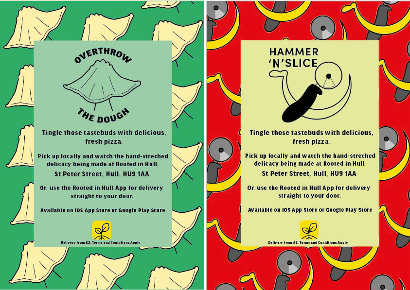
These are the first rough designs of the flyers, both flyers have the same structure, text, and fonts. The ‘Overthrow the Dough’ flyer includes both the coloured variation logo design and the black and white one. Green tones have been used within this flyer to incorporate Rooted in Hull and their urban farm aspect. The ‘Hammer ‘n’ Slice’ flyer has yellow and red colours to represent the revolution aspect stated in the brief. The repetitive background on these flyers makes them seem youthful and playful with the use of colour which will attract the younger generation.
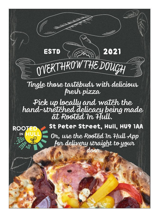
Overthrow the Dough was the chosen logo to enhance even further, this enhanced version is a completely different style. Moving away from the youthfulness of the first designs, this logo is now more detailed and now looks more like a small, family-owned business. Texture has been added using cross-hatching techniques. With this new logo, the whole layout of the flyer has been completely changed, the new and improved flyer design now includes a chalkboard-like background, with illustrations of common ingredients, created using a chalk paint tool within Adobe Illustrator. The text has remained the same but now, with a funkier chalk-like font. Original photos of Sherard’s pizza have been included to give the audience an insight to how the pizza looks.
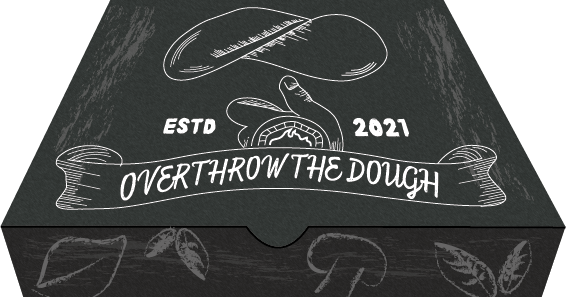
The pizza box design also includes a chalkboard background with chalk-like paint strokes across the whole box to give a smudged chalk effect. The idea is to have the ingredient illustrations across all sides of the box, this adds details but also keeps it from looking less chaotic.
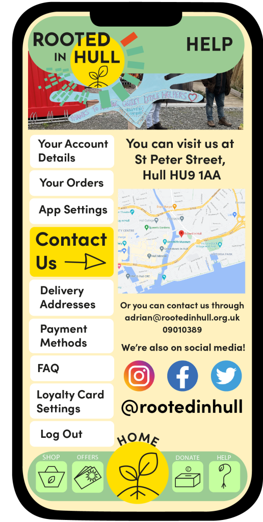
An app design was chosen from the master plan because of the growth in technology throughout today’s society. This app is something that everyone can get involved with and will attract more visitors to the Rooted in Hull farm. This is a great way to fulfil Adrian Fisher’s brief because it will spread more word about what Rooted in Hull do and how they help struggling families. In time, this will hopefully increase donations.
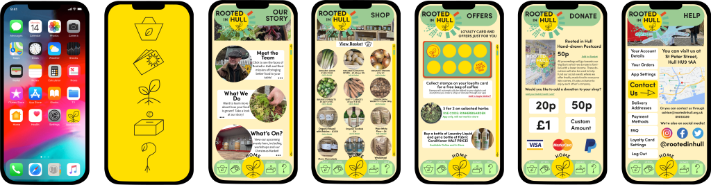
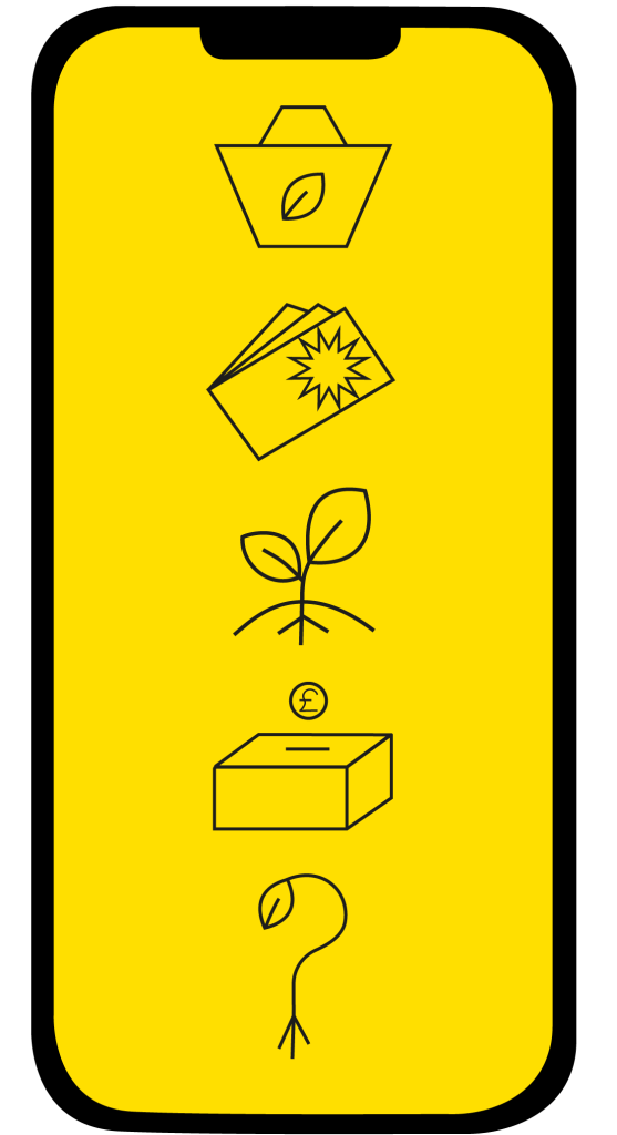
This is a six-screen app design with an example of what the app icon will look like against a generic iPhone home screen. Each screen shows all the different abilities the app offers, including a help page for queries about how the app functions. Other than the app icon and the loading screen, you will see that each page has the same composition. The logo, title and menu bar all have the same placement, this is to keep the design looking as minimal as possible. This also makes the design look very realistic and shows a level of professionalism.
Only three fonts have been used throughout the seven design examples. Sofia Pro Bold has been used for headings and subheadings, Source Sans Pro can be seen for the main body of text and informative sentences. Myriad Pro is the final font used for the iPhone home screen and the menu icons. All three typefaces are sans-serif and are easily readable against all backgrounds used in the design.
The colours used in the app have been limited to fit the Rotted in Hull’s colour palette, with tints of yellow and green, you can also see the colourful original images taken from the Rooted in Hull farm. Limiting the colour usage gives a clear palette and keeps the design from looking too chaotic, this again, enhances the level of professionalism.
Conceptual design can also be found in the design of this app with the ‘Help’ icon, the icon shows a question mark with a leaf growing at the end and roots growing from the bottom, replacing where the tittle would be. This shows what the page is for and adds some of Rooted in Hull’s personality with the growing roots.
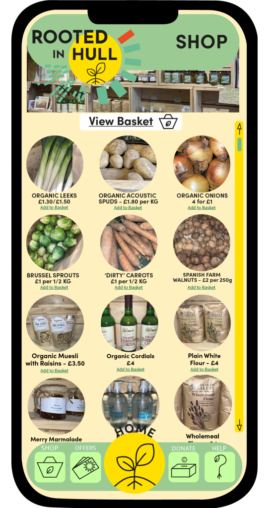
All photos used within this design are original images that were taken at the property of Rooted in Hull. In the ‘Shop’ section of the app, there are images for every product advertised, the idea behind this is to show the audience what they are paying for, so they do not become sceptical towards what they are buying. Including a photo of Adrian Fisher gives the costumer an insight to who they are buying from but also makes them feel more included. The purpose of this app design is to not make costumers feel like they are just buying from a brand that thrives in profit, it’s to show people where their produce comes from, how its grown and how the profits of the Farm Shop will be used or donated.
Bibliography
Instagram, Facebook, Twitter Logo. (n.d.). [Online Image] Available at: https://stock.adobe.com/uk/search/images?k=fb+logo [Accessed 17 Dec. 2021].
IPhone Home Screen Template. (n.d.). [Online Image] Available at: https://files.design/templates/ios12gui [Accessed 19 Dec. 2021].
Paypal. (n.d.). [Online Image] Available at: https://logos-download.com/1725-paypal-logo-download.html [Accessed 17 Dec. 2021].
Png Mastercard Logo Vector. (n.d.). [Online Image] Available at: https://www.pngitem.com/middle/hTJJJmR_png-mastercard-logo-vector-transparent-png/ [Accessed 17 Dec. 2021].
Rooted in Hull Google Map. (n.d.). [Online Map] Available at: https://www.google.co.uk/maps/place/Rooted+in+Hull/@53.7445283,-0.3266716,15z/data=!4m5!3m4!1s0x0:0x52d0ba15975c0e3f!8m2!3d53.7445283!4d-0.3266716 [Accessed 17 Dec. 2021].
Rooted in Hull Logo. (n.d.). [Online Image] Available at: https://www.rootedinhull.org.uk/ [Accessed 19 Jan. 2022].
Visa Debit. (n.d.). [Online Image] Available at: https://www.google.co.uk/search?q=visa&sxsrf=AOaemvImglfbF1_vOMejFw_L3TrWWv0urQ:1639760321265&source=lnms&tbm=isch&sa=X&ved=2ahUKEwjxvtybp-v0AhXKVsAKHWXTCl0Q_AUoAnoECAIQBA&biw=1536&bih=754&dpr=1.25#imgrc=9W_dnm08jQfJyM [Accessed 17 Dec. 2021].
A master plan is used in design for long-term planning, it’s a document that helps guide the design process to reach its full potential and fit the brief that clients have set out (Worldbank.org, 2009).
CEO of Rooted in Hull, Adrian Fisher stated that he wants a way to ask people who have money for money to donate to the less fortunate and fund veg boxes to them. With this brief, a master plan was created to help start the design journey towards Adrian’s brief.
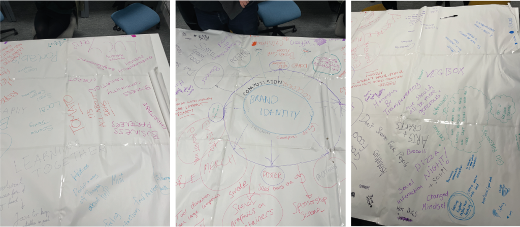
During a group discussion, many ideas and design concepts were spoke about and the master plan was evolved. Design ideas such as merchandise, app design, stationary packs and web design were discussed. With this group plan, a digital version was created including all the ideas spoke about. Plans and ideas from Adrian’s interview with the Graphic Design students and lecturers were picked apart and reconstructed into this master plan.
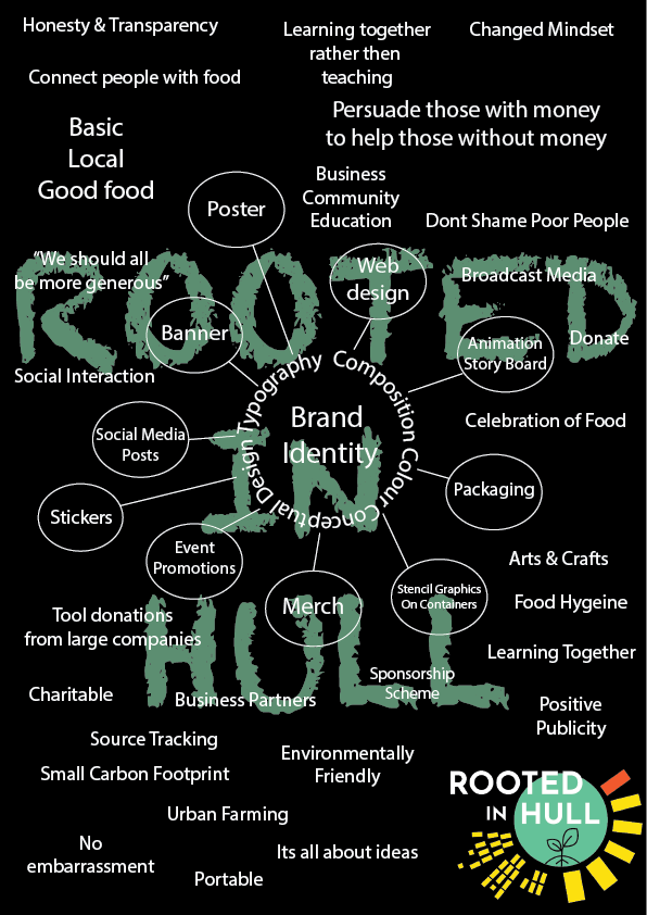
This is a rough digital redesign of the group master plan. The colours on this digital design are very simple and they remain within the Rooted in Hull’s logo colour palette. The text is white to create contrast with the dark background and is easily readable. The font is a simple sans-serif type face, this again, makes the text easily readable and doesn’t overly complicate the text against the second font used in the background design. This is a chalk-like font to create the effect of a chalkboard which relates again to why the main body of text is white.
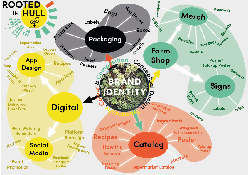
After some further discussions about the design options, a more personal master plan was created. This included individual idea likings from the main group master plan. In this final design, there are four categories which have been personally chosen to extend with more ideas. The initial design for this master plan is a lot funkier with the blotches of colour, it’s a lot more colourful but remains within the Rooted in Hull’s logo colour palette. For each of these four categories more ideas have been developed, two of these categories have sub-categories which show in-depth concepts. App design and merch, the two with sub-categories, are the ideas that want to be enhanced further throughout the design process and are better concepts for what Adrian is asking for.
Bibliography.
Rooted in Hull Logo. (n.d.). [Online Image] Available at: https://www.rootedinhull.org.uk/ [Accessed 19 Jan. 2022].
Worldbank.org. (2009). Master Planning | Urban Regeneration. [online] Available at: https://urban-regeneration.worldbank.org/node/51 [Accessed 19 Jan. 2022].
Categories
Rooted in Hull Graphic Standards
What are graphic standards?
Graphic standards are used within companies to provide a structure for using logos, colours, typography, and composition. It shows the correct way a logo should be positioned in every instance, an appropriate colour palette and the fonts used within the company’s visual graphics. Graphic standards should contain information about the branding and should be easily readable (www.usi.edu, n.d.).
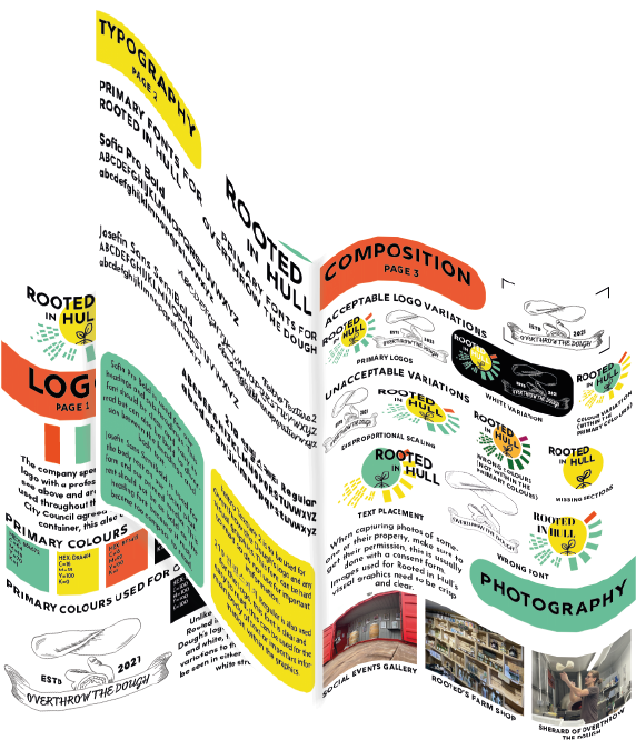
Here are 3 A4 pages of Rooted in Hull’s graphic standards manual design, based around original artwork 1 and 2. These 3 pages are informative about colour, typography, composition, and photography. The manual has been designed with the same colour palette as the Rooted in Hull’s logo and uses the same typeface throughout.
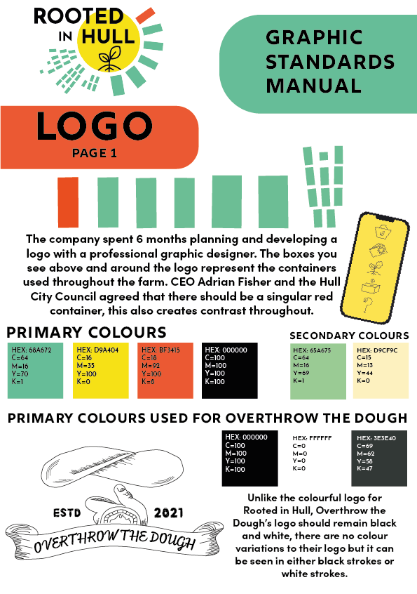
The first page is focused on Rooted in Hull’s logo with information on the story behind their logo design process, which CEO Adrian Fisher told the graphic design students and lecturers during his interview. The colourful blocks around the logo have been deconstructed and placed in the centre of the page to show a close view of what the text below is stating, choosing to talk about the blocks from the logo gives them a lot more personality as many people will just see them as a random design. In the second half of the page there are squares of primary colours used within the logo and the visual graphics of artwork 1 and 2. Included are the HEX codes of these colours, found using Adobe Capture, for other designers to use. There is a small section at the bottom of the page showing Overthrow the Dough’s primary and secondary colours used in Artwork 1.
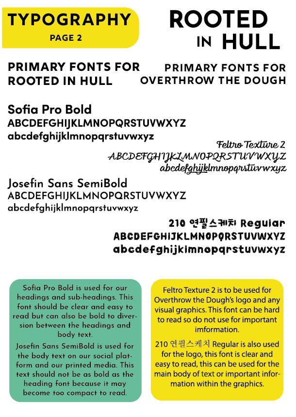
The second page shows the typography used within Rooted in Hull and Overthrow the Dough’s visual graphics, this includes both logos, 2D designs and digital artwork, which can be found in Artwork 1 and 2. The left side of the page shows the primary fonts of Rooted in Hull in flushed left, on the right side is Overthrow the Dough’s primary fonts in flushed right. All primary font examples show both upper case and lower-case alphabets to show the audience the typeface variations. At the bottom of the page there are coloured blocks containing information on the primary fonts and where they should be used. The fonts you see for Rooted in Hull’s side are similar typefaces used in their logo and web design, these were found using Adobe Capture.
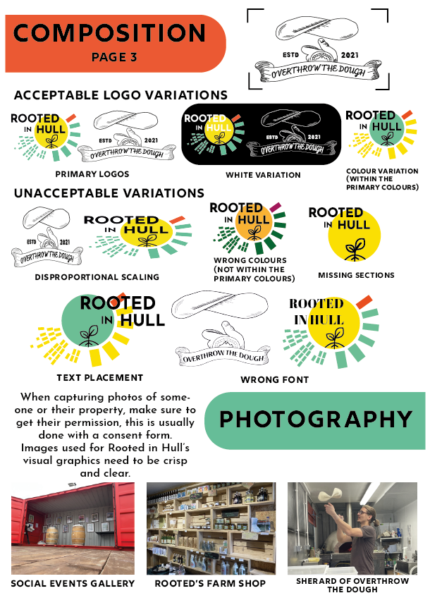
The third page shows the importance of composition within the logo placement. The first half of the page shows acceptable and unacceptable variations of the logo placement, this includes useful variations of Rooted in Hull and Overthrow the Dough’s logo. The second half of the page contains information on photography and advice when capturing photos of Rooted in Hull’s staff or their property.
Bibliography
Rooted in Hull Logo. (n.d.). [Online Image] Available at: https://www.rootedinhull.org.uk/ [Accessed 19 Jan. 2022].
www.usi.edu. (n.d.). Importance of Graphic Standards – University of Southern Indiana. [online] Available at: https://www.usi.edu/brand/importance-of-graphic-standards/#:~:text=Graphic%20standards%20provide%20a%20sound [Accessed 20 Jan. 2022].
Categories
Press Release
Adrian Fisher
Rooted in Hull, St Peter Street,
Hull, HU9 1AA
Adrian@rootedinhull.org.uk
09010389
CEO of Rooted in Hull, Adrian Fisher meets first cohort of new BA (Hons) Graphic Design programme to discuss new project
On Tuesday 2nd November, the University of Hull’s Graphic Design Students had the pleasure of meeting Adrian Fisher, the CEO of Rooted in Hull. Interviewed by Robert Consoli, BA (Hons) Graphic Design programme leader, lecturer in Digital Media. Adrian gave an insight into who Rooted in Hull who and what they do for the community. Adrian and Robert were accompanied by Jason Hayhurst, Screen Subject Group Director, Lecturer in Digital Media and Terry Westby-Nunn, Lecturer in film studies, TV production specialist.
The 25 Graphic Design students are currently studying 2D Visual Design in the newly refurbished Graphic Design Studio Space in the University of Hull Media Centre. The programme is designed to be flexible enough to integrate real projects into the curriculum whenever possible.
The Hull City Council wanted to bring education within food banks to the city, which led Adrian and his only partner at the time, Mark Cleaver to London where they learnt more about what the council had suggested. During their time in London, they discovered new ideas of teaching children the knowledge on the simplicity of enjoying food. This then led to the establishment of Rooted In Hull in 2014.
During the interview, Adrian stated that the goal of the company is not to try and make Hull a healthier city, they’re not trying to pressure anyone to become vegetarian or vegan. Their main focus is trying to bring people together to enjoy basic, local and fresh food within each other’s company. Rooted in Hull works closely with low-income families, providing them with veg boxes and opportunities with weekly social events, offering hot drinks, sandwiches and fresh soup. Rooted in Hull also offer cooking and crafting workshops and host live music events, these are offered for free so those less fortunate can take part.
Adrian laid out his ideas and how the students can help. The company would like a way to ask people with a good income for money to help with lower income families, he would also like an honest explanation as to where the money will go and how it will help. The plan that Adrian has set out for the students can now be spread across different design medias. Posters, leaflets and merchandise can be placed across Hull and surrounding areas to promote the charitable donations and attract more custom. Digital media such as advertisement, web design and social media posts can also be created to attract the younger generation.
By Saffron Piercy
Henri Matisse once said, “Composition is the art of arranging in a decorative manner, the diverse elements at the painter’s command to express his feelings.” (Art with Flo, 2019).
Composition is a term used to describe how the visual elements in design are arranged. Composition is also a key element in paintings, drawings, photographs, or any other form of artwork. Composition brings all the separate elements together to form a whole (Blue Sky – Online Graphic Design School, 2020).
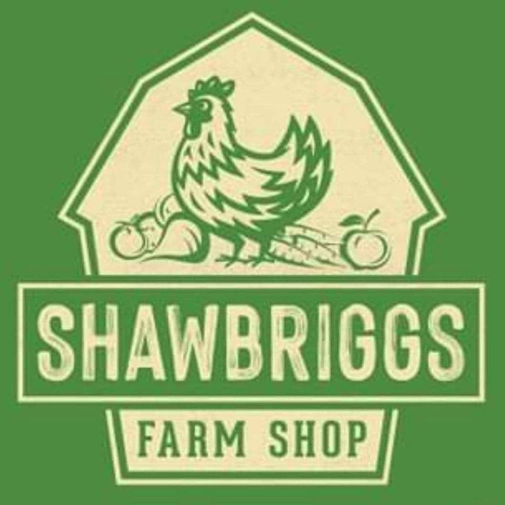
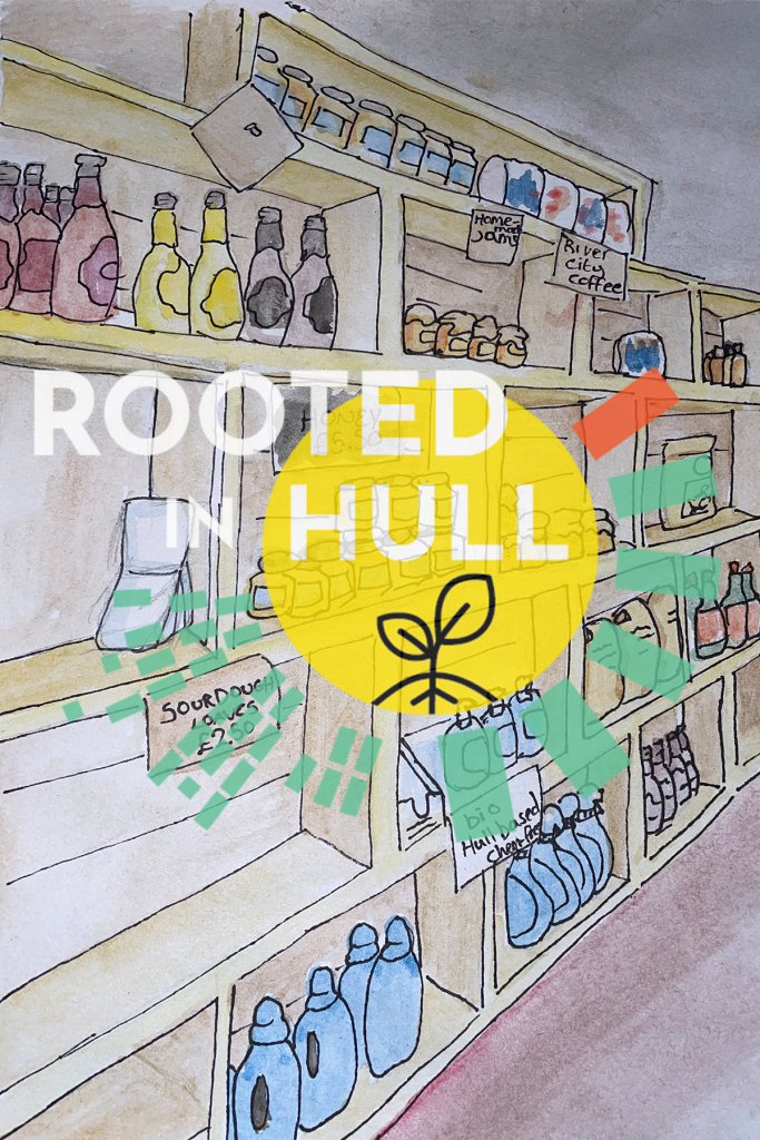
This is the logo for Shawbriggs Farm Shop based in Goxhill, UK. They are a small friendly farm shop that supply a large selection of fresh fruit and veg, as well as jams, chutneys, cheese, and ice-cream. They also offer dairy-free ice-cream and dairy-free chocolate (Facebook, n.d.).
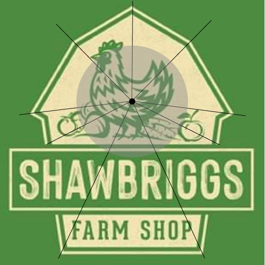
Their logo represents a good example of composition in design. The eye is drawn to the big ‘Shawbriggs’ title, which has been designed in a light tint of yellow; this contrasts nicely with the green background. The title is not completely central, it’s placed in the bottom half of the logo, but because of the use of sizing and contrast it becomes the first thing the audience sees. The next noticeable object in the logo is the chicken standing with fruit and veg. Due to the use of very angular shapes, the chicken, being very round, stands out because it’s not as harsh of a shape. As shown in the diagram above, the angles of the barn point towards the chicken in the centre; this is a good use of composition within this logo because it points the audience in the direction of that chicken. The very thick, bold outlines of the chicken also add to why it stands out more than the words ‘Farm Shop’ under the title. Even without those words, it is very easy to see that this is a logo of a farm shop because of the imagery used.
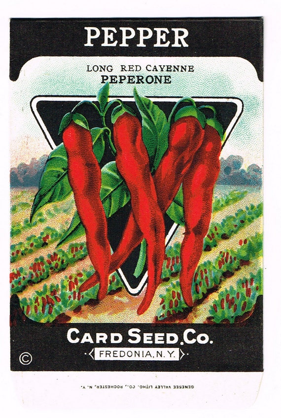
This is a packaging design for pepper seeds for a 1920s vintage brand called ‘Card Seed.Co’, based in Fredonia, New York (www.etsy.com, n.d.). This is a bad example of composition in design because of the layout of the background.
When looking at this packaging design, the first things that the audience will see are the peppers because of their bright red colour and the black triangle behind them. Although the black triangle has been used to make the peppers look more vibrant and appear more in front, it does seem unnecessary and quite an eyesore. The next thing the audience will notice will be the white text against the black borders at the top, then at the bottom. After that it will be the black text above the peppers. If the title of the product became larger, possibly big enough to stretch across the top of the peppers, then perhaps it will be the first noticeable thing. The background of this design is most likely the last thing that people will look at. The pepper plants could be redesigned with a linear perspective, much like La Danse au Moulin Rouge by Henri de Toulouse-Lautrec, with the floorboards leading to La Goulue dancing (Rue Royale Fine Art, n.d.).
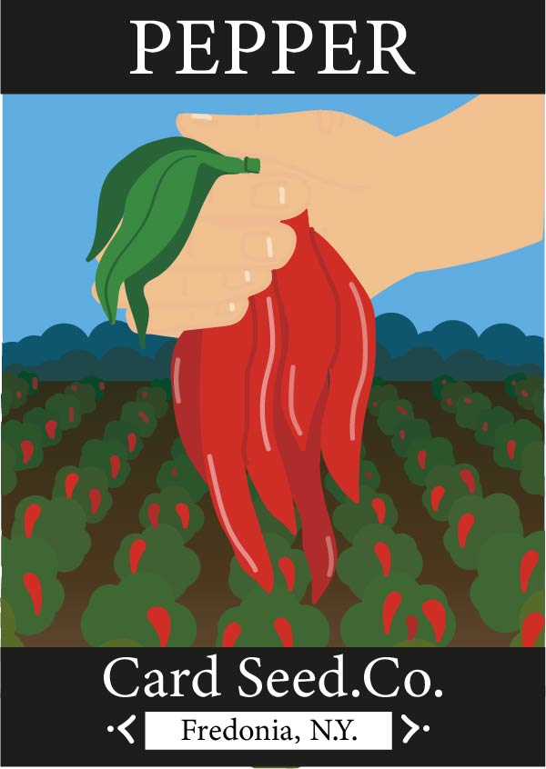
The initial structure of the packaging has remained the same to keep that vintage feel to it. The angle of which the pepper plants were shown has been enhanced to show a more linear perspective, as mentioned previously. The black triangle behind the peppers has been removed and replaced with a hand holding the peppers; this gives more attention to the home-grown farming aspect of the product. The colours have been kept the same because green and red are complimentary colours so each item within the design is easily noticeable. The bushes in the far back of the original packaging design have been kept in the redesign, but have changed to fit the angle of the pepper plants. The reason for keeping these bushes is because they’re similar to the effect that Valentin le Desosse gives off in La Danse au Moulin Rouge (The KAZoART Contemporary Art Blog, 2021), drawing everything to the peppers.
Bibliography
Art with Flo (2019). Composition in Art Explained. YouTube. Available at: https://www.youtube.com/watch?v=VwUZ3PivD6I [Accessed 25 Oct. 2021].
Blue Sky – Online Graphic Design School. (2020). What is composition in design? [online] Available at: https://blueskygraphics.co.uk/what-is-composition-in-design/#:~:text=Composition%20refers%20to%20how%20you [Accessed 25 Oct. 2021].
Cayenne Peperone Card Seed.Co. (n.d.). Available at: https://i.etsystatic.com/5769593/r/il/ddb7d2/1812991930/il_794xN.1812991930_q5j8.jpg [Accessed 28 Oct. 2021].
Facebook. (n.d.). Log into Facebook. [online] Available at: https://www.facebook.com/shawbriggsfarm/about/?ref=page_internal [Accessed 25 Oct. 2021].
The KAZoART Contemporary Art Blog. (2021). Masterpiece in the spotlight: At the Moulin Rouge, the Dance, Toulouse-Lautrec. [online] Available at: https://www.kazoart.com/blog/en/masterpiece-in-the-spotlight-at-the-moulin-rouge-the-dance-toulouse-lautrec/ [Accessed 31 Oct. 2021].
Rue Royale Fine Art. (n.d.). La Danse au Moulin Rouge, Henri de Toulouse-Lautrec. [online] Available at: https://rueroyalefinearts.com/shop/art-nouveau/la-danse-au-moulin-rouge-henri-de-toulouse-lautrec/ [Accessed 25 Oct. 2021].
Shawbriggs Farm Shop Logo. (n.d.). Available at: https://www.facebook.com/shawbriggsfarm/photos/a.1435490893353697/3044204469148990/ [Accessed 28 Oct. 2021].
www.etsy.com. (n.d.). Original Vintage Seed Packet Pack NOS C1920 General Store | Etsy. [online] Available at: https://www.etsy.com/ie/listing/677067004/original-vintage-seed-packet-pack-nos [Accessed 25 Oct. 2021].
What is typography?
“Digital technology radically influenced typographic design, beginning in the early 1980s. The computer enabled designers to create and manipulate letters in new ways, offering new options for crafting letterforms and ‘outputting’ them—whether in the medium of toner particles on paper, or pixels on a screen. Digital tools, at first, necessitated (due to technical constraints), and later explicitly encouraged (due to technical advances) specific kinds of representations that would challenge their historical antecedents. Now, in the late 1990s, the mutation of letters continues. The spatial and temporal opportunities of cyberspace are resulting in even more radical depictions of letterforms that offer expanded formal and stylistic possibilities, while further challenging the norms of reading and writing.” (Staples, 2000)
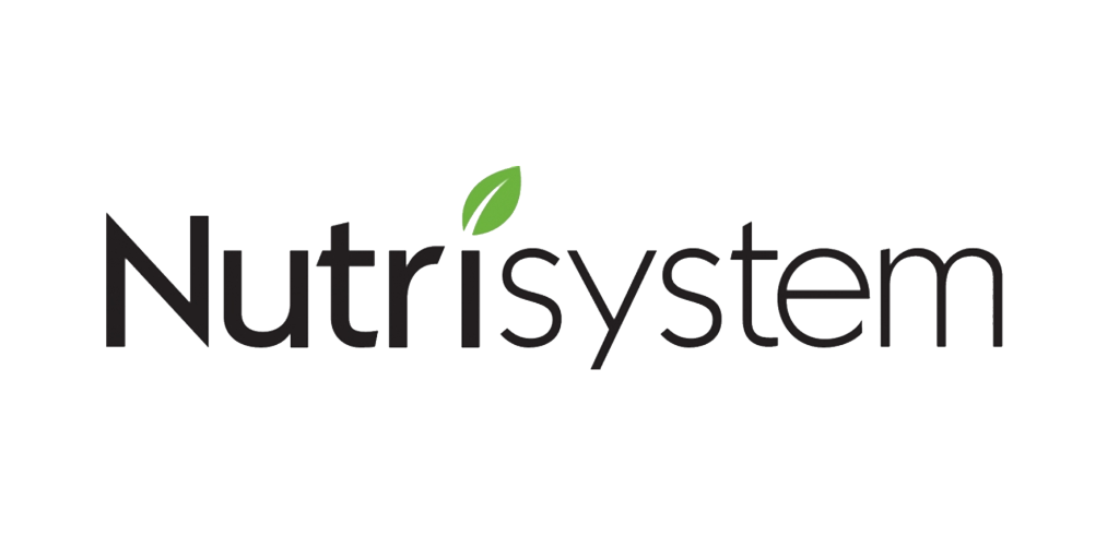
Nutrisystem is a commercial provider of weight loss products and services, with headquarters based in Fort Washington, Pennsylvania (Facebook, 2021). This is a good example of typography used in the subject of healthy eating because of how easily readable the logo is.
Although the spacing between ‘Nutri’ and ‘System’ is very slim, it is still easily identified because of the two types of fonts used. The ‘Nutri’ is a very thick and bold font whereas ‘system’ is quite thin. Both fonts are sans-serif, which make the name look more modern and appeal to the younger generation. All lowercase letters have the same x-height; this indicates a level of professionalism within the name of the brand. The ‘i’ in the title has been designed to look like a leaf, which links to the healthy eating aspect of the company. The font of the title is black, which makes it easily readable against most backgrounds, but also draws more attention to the green leaf. The kerning between the ‘r’ and ‘i’ is quite spacious, but it also draws the eye more towards the title. Although the design is quite professional, the hint of green also adds some playfulness to it, which again is more appealing to the younger crowd.
Raw BonBon is a company that turns healthy snacks into delicious sweet treats. They use eco-friendly ingredients, high quality cacao, premium matcha and vanilla (Raw Bonbon, n.d.b). This is a bad example of typography used due to the unnecessary letter sizing.
The typography behind this logo is not very well thought out. The smaller ‘o’ stacked onto the larger ‘o’ makes it look like a lowercase ‘I’, which does not link to the company in any way and makes this quite hard to read. This could use a subtle change; the position of the two ‘o’s can be swapped around to create an exclamation mark, which would then show some enthusiasm towards the healthy eating lifestyle. The two ‘n’s would look better if they stayed the same size, this would then add more focus towards the two ‘o’s. The capital letters could be changed to lowercase to appear more youthful.
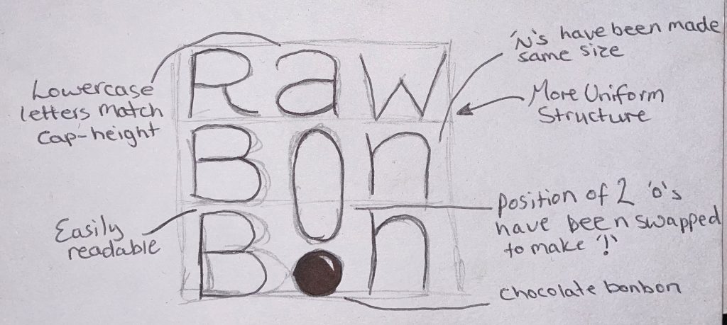
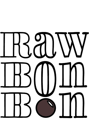
Above is the redesigned logo, which has now been made black to become easily readable and still look clear against most backgrounds. The company stated that they will soon be selling chocolate bonbons, so the second ‘o’ has been made to look like a bonbon to focus on the advertisement of that product. The font used is called LiebeDoni Outline, which is a similar serif font to the original type. The words now have capital letters at the start, but the lowercase x-height now matches the cap-height to keep it looking more uniform and to take away some of the aggressiveness that the capital letters hold (Quora, n.d.), and the 2 ‘o’s have been swapped around to create an exclamation mark.
Bibliography
Facebook. (2021). Log into Facebook. [online] Available at: https://www.facebook.com/Nutrisystem/about/?ref=page_internal [Accessed 28 Oct. 2021].
Nutrisystem. (n.d.). Available at: https://logos.fandom.com/wiki/Nutrisystem?file=Nutrisystem.png [Accessed 11 Oct. 2021].
Quora. (n.d.). Why do capital letters seem aggressive? [online] Available at: https://www.quora.com/Why-do-capital-letters-seem-aggressive [Accessed 31 Oct. 2021].
Raw Bon Bon. (n.d.a). Available at: https://images.squarespace-cdn.com/content/v1/5ca9e9353560c369880c7a40/1554639594635-WIE6I5MZQ5Z53Q6IHB4U/RawBonBon_logo_transparent.png?format=1500w [Accessed 11 Oct. 2021].
Raw Bonbon. (n.d.b). Raw Bonbon. [online] Available at: https://www.rawbonbon.com/ [Accessed 11 Oct. 2021].
Staples, L. (2000). Typography and the Screen: A Technical Chronology of Digital Typography, 1984–1997. Design Issues, 16(3), pp.19–34.
Categories
Colour & Urban Farming
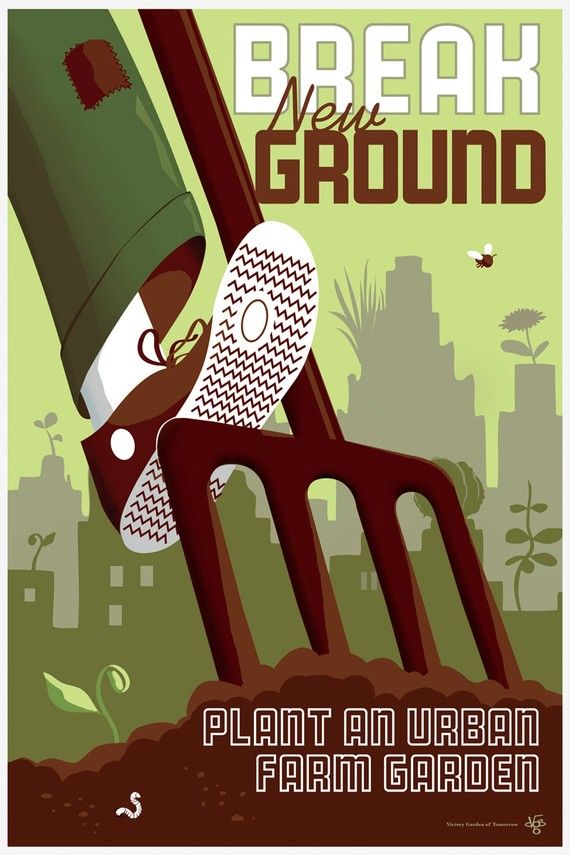
This is a poster found on Pinterest, designed by a company called Wirtheim Design Studio. It’s a self-commissioned poster for The Victory Garden of Tomorrow. This a good example of the use of colour in urban farming because of their earthy colour palette.
The Victory Garden of Tomorrow is a company that sells posters relating to Urban Farming. They represent healthy propaganda, posters and goods that express their desire for better food, better gardens and better communities. The artist and designer of their posters goes by the name of Joe Wirtheim, who has appeared in The New York Times. Their work is mainly produced in Portland, Oregon (The Victory Garden of Tomorrow, n.d.).
The poster chosen has a colour palette of greens and browns which are very earthy tones and relate directly to the farming aspect of urban farming. The different colour tones have been used to create depth with shadows and highlights, and with the background being a very dull, flat tone of green, it adds composition and draws more attention to the foot and pitchfork. The background also contains conceptual design with the plants growing out of the city buildings; this creates a link between urban and farming. The tiny details that have been placed within the poster, such as the patterned sole, the worm in the soil and the fabric patch on the trousers, also shows the audience what is meant to look more forward. Edward Tufte said, “Pure, bright or very strong colors have loud, unbearable effects when they stand unrelieved over large areas adjacent to each other, but extraordinary effects can be achieved when they are used sparingly on or between dull backgrounds” (Gist, n.d.), which correlates with the composition of the poster. The white and brown text at the top and bottom of the poster is very easily readable against the light green sky and the brown soil, and the fonts used make the message of the poster clear and direct to the audience.
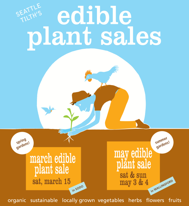
Tilth Alliance works within the community of Washington farmers and gardeners to build a sustainable, healthy and equitable food future (www.tilthalliance.org, n.d.). This is a bad example of the use of colour relating to urban farming because of the choice of colours used.
When looking at this poster no immediate areas stand out: the colours used are blue, orange, brown, white and a dash of green. The brown and the small amount of green are the only colours used that could represent Urban Farming, the blues and oranges do not relate to the subject, and the way the colours have been used make everything look very flat. There are no different tones being used, they are all very different colours. There could have been some depth added with different shades of the colours, which would make certain areas of the poster stand out more to the viewer. The colours used in the text are brown and white, which could have been easily readable if the font chosen was thicker and more spacious, especially all the text in the lower half of the poster.
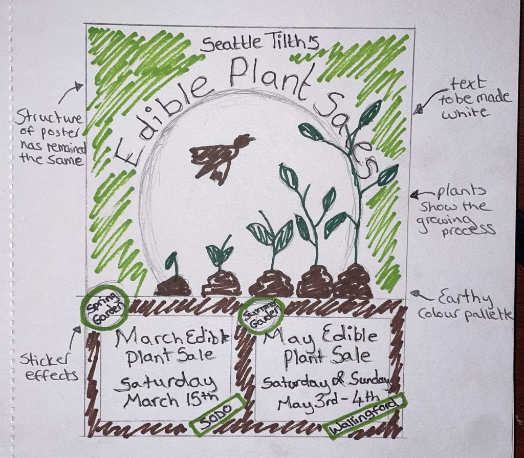
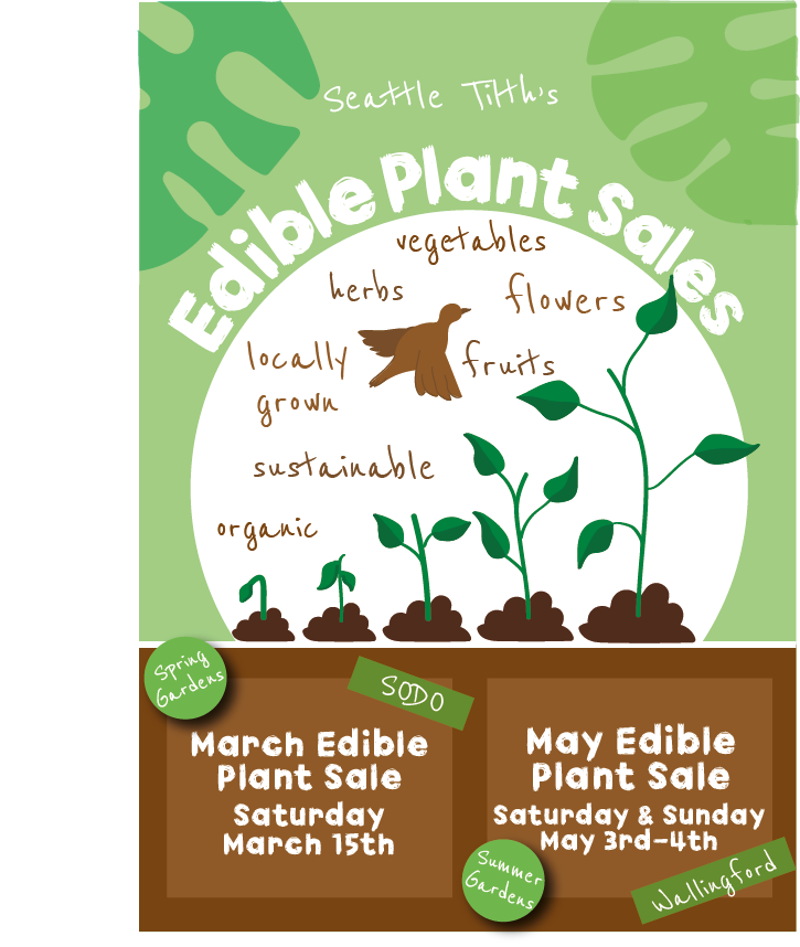
The colour palette used for this poster was inspired by the ‘Break New Grounds’ poster, the greens and browns relating directly to farming and plants. The initial structure of the Tilth poster has remained the same, the blues and oranges have been removed and replaced with shades of green and tints of brown. The shades of green and brown have been used to create shadows on the growing plant and the bird flying above. Most of the text has been replaced with a thicker, white font, which now makes the most important information stand out.
Bibliography
Gist. (n.d.). Edward Tufte on Use of Color. [online] Available at: https://gist.github.com/deadprogram/782074#file-gistfile1-txt [Accessed 31 Oct. 2021].
Tilth Alliance. (n.d.). Available at: https://i.pinimg.com/originals/a2/40/83/a2408387bd4981b8e904f2b52b2135d8.png [Accessed 18 Oct. 2021].
The Victory Garden of Tomorrow. (n.d.). The Victory Garden of Tomorrow. [online] Available at: https://www.victorygardenoftomorrow.com/ [Accessed 18 Oct. 2021].
Wirtheim, J. (n.d.). Break New Grounds. Available at: https://i.pinimg.com/564x/87/94/73/879473f5f095f6986f9ac579aedf69e3.jpg [Accessed 18 Oct. 2021].
www.tilthalliance.org. (n.d.). About Us — Tilth Alliance. [online] Available at: http://www.tilthalliance.org/about [Accessed 18 Oct. 2021].
“Conceptual art has no physical medium: the medium of conceptual art is ideas, and any physical presence is merely the means by which the artist lets us gain access to his ideas…” (CRAY, 2014). Conceptual design is a term used to describe the framework for establishing the underlying idea behind a design and a plan for how it will be expressed visually (99designs, 2021).

This is the logo for Hull United Charities. Within this company there are four separate charities, working together to help the people of Hull (Hull United Charities, n.d.a). This is a good example of conceptual design because two ideas have been combined into one.
Alderman Ferries, Alderman Cogan’s Fund, Alderman Cogan’s School Charity and Almshouse Charity are the four charities within Hull United Charities: each have a separate focus, but they come together to help the people of Hull, which is why this is a good example of conceptual design.
The logo consists of two people holding hands in a way that also shows the Humber bridge, which is a monumental bridge to Hull and surrounding areas. The bridge has two points and that is where the two people holding hands comes in. The use of the green tones could indicate happiness and financial funding, which is what the charities help with. The charities also help with children and schools, which can be shown in the child-like sketching of the design. It’s a very minimal design, but the purpose of the charity is strikingly clear in this logo.
Upon researching the charity, the artist behind the logo was unknown. However, the designer of their webpage had been named — a company called Ghost Digital. The Ghost Digital website states that they provided web design and web hosting services for Hull United Charities, but still no information on the logo design (GHOST DIGITAL, n.d.).
Above is the logo for Mind, a charity that provides advice and support to people struggling with their mental health (Mind, 2019). This is a bad example of conceptual design because there is no meaning behind this logo and no two ideas have been combined to create concept.
Mind in Hull and East Yorkshire offer services such as one-to-one support, group support, accommodation and help with young adults (Mind HEY – Hull & East Yorkshire Mind, n.d.). There is no conceptual design within this logo and there is nothing within the logo to say what the charity does. The blue that has been used defeats the purpose of the charity; the deep blue shade is associated with unpleasant feelings and emotions, much like Picasso’s Blue Period.
The artist behind this logo is called David Jones (The Joneses, n.d.). No information was found about when the logo was created but Jones’ website does state that The Joneses Company was established in 2002.
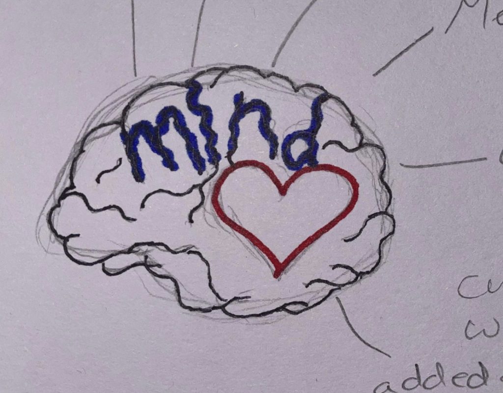
This is a rough redesigned logo for Mind, this new logo shows who the charity is and what they aim to do. The design is quite minimal and has a hand-drawn approach to it, this is so it can still match the aesthetic and iconography of their webpage.
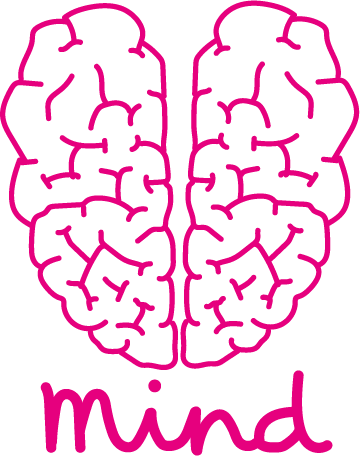
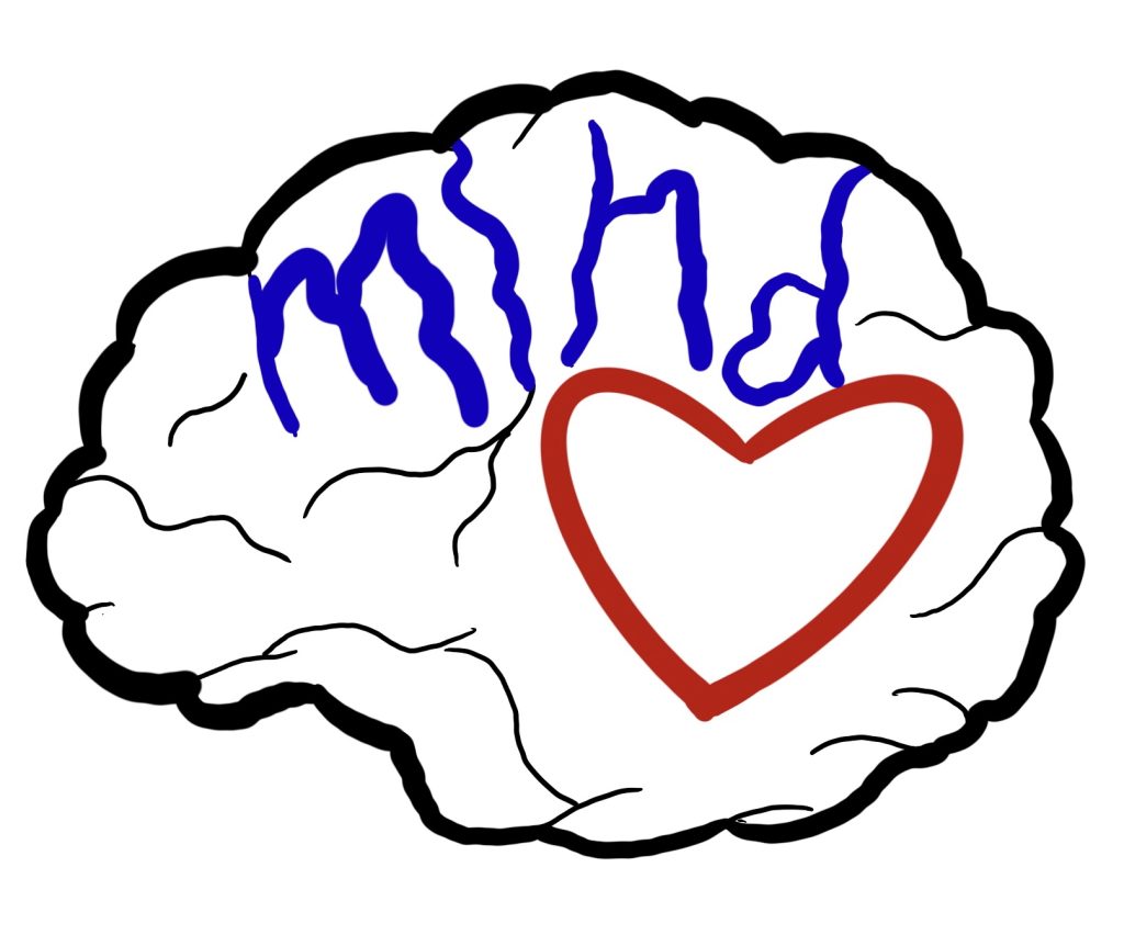
This is a finalised, more refined idea for the Mind logo, the brain has now been changed to a birds-eye view and shows the image of a heart. The brain shows that Mind help with mental health issues and the heart is to show the caring and helping side of the charity. The colour has now been made pink to represent the care they provide and to also make the charity seem more welcoming.
Bibliography
99designs. (2021). What is conceptual design? And how
to wrap your mind around ideation. [online] Available at:
https://99designs.co.uk/blog/tips/conceptual-design/ [Accessed 27 Oct. 2021].
CRAY, W.D. (2014). Conceptual Art, Ideas, and Ontology. The
Journal of Aesthetics and Art Criticism, 72(3), pp.235–245.
GHOST DIGITAL. (n.d.). GRAPHIC DESIGN & BRANDING | GHOST DIGITAL IQ.
[online] Available at: https://www.ghostdigitaliq.co.uk/graphic-design
[Accessed 3 Oct. 2021].
Hull United Charities. (n.d.a). Home.
[online] Available at:
https://www.hullunitedcharities.org.uk/ [Accessed 3 Oct. 2021].
Hull United Charities. (n.d.b).
Available at:
https://www.hullunitedcharities.org.uk/wp-content/uploads/2020/05/Hull-United-Charities.png
[Accessed 3 Oct. 2021].
The Joneses. (n.d.). David Jones archive. [online] Available at:
https://www.thejoneses.co.uk/work/archive/ [Accessed 3 Oct. 2021].
Mind (2019). What we do |
Mind, the mental health charity – help for
mental health problems. [online] Mind.org.uk. Available at:
https://www.mind.org.uk/about-us/what-we-do/ [Accessed 3 Oct. 2021].
Mind HEY – Hull & East
Yorkshire Mind. (n.d.). Hull and East
Yorkshire Mind – We are Hull & East Yorkshire Mind, the mental health
charity. [online] Available at: https://www.heymind.org.uk/
[Accessed 3
Oct. 2021].
Mind. (n.d.). Available at:
https://shop.mind.org.uk/ [Accessed 3 Oct.
2021].