Zaha Hadid web page including both her architecture and furniture designs.
Karimoku Furniture. (n.d.) Design Milk. Available online: https://design-milk.com/zaha-hadid-karimoku-furniture-collaborate-on-an-upcoming-furniture-collection/ [Accessed 23 May 2022].
le-a table. (n.d.) Dezeen. Available online: https://www.dezeen.com/2017/06/18/zaha-hadid-design-le-a-table-based-princess-leia-trademark-buns-leblon-delienne/ [Accessed 23 May 2022].
The Port House. (n.d.) Delabie. Available online: https://www.delabie.co.uk/our-group/trends-the-magazine/what-s-hot/antwerp-zaha-hadid [Accessed 23 May 2022].
Zaha Hadid furniture. (n.d.) Archive Curbed. Available online: https://archive.curbed.com/2017/5/31/15714906/zaha-hadid-best-designs-furniture-decor-objects [Accessed 23 May 2022].
Zaha Hadid. (n.d.) Archinet. Available online: https://archinect.com/news/article/150129653/how-should-zaha-hadid-be-remembered-patrik-schumacher-has-an-idea [Accessed 23 May 2022].
‘Minimal is a design aesthetic that embodies the phrase ‘less is more’.’ (Forsey, n.d.)
Minimalism is a very simple yet sophisticated aspect of design, often minimal design will consist of neutral colours such as white and browns. White can be perceived as a very clean and pure colour so designers tend to focus on using white when designing pieces.
Minimalism can be used in art, fashion, architecture, interior design, graphic design and photography. Keeping artwork minimal doesn’t overstimulate the targeted audience.
An example of minimalism can be seen within Jill Sander’s fashion designs. Jill varies her colour palettes between beiges and black. she also uses very minimal details in her clothing.
(Jil Sander, n.d.)
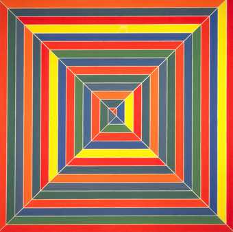
In the world of art, minimalism is seen as ‘an extreme form of abstract art’ (Tate, 2017). A good example of this is Frank Stella’s Hyena Stomp.
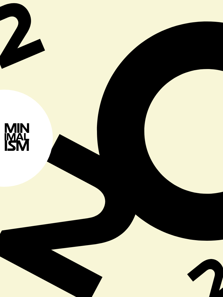
(Stella, n.d.)This is my attempt at a minimal design, created in Adobe XD.
Forsey, C. (n.d.) 27 Striking Examples of Minimal Design That’ll Kickstart Your Creative Process. blog.hubspot.com. Available online: https://blog.hubspot.com/marketing/minimal-design#:~:text=What%20is%20minimalist%20design%3F [Accessed 23 May 2022].
Jil Sander. (n.d.) Jil Sander. Available online: https://www.ft.com/content/5f901892-32e2-11ea-a329-0bcf87a328f2 [Accessed 23 May 2022].
Stella, F. (n.d.) Frank Stella. Tate Kids. Available online: https://www.tate.org.uk/kids/explore/who-is/who-frank-stella [Accessed 23 May 2022].
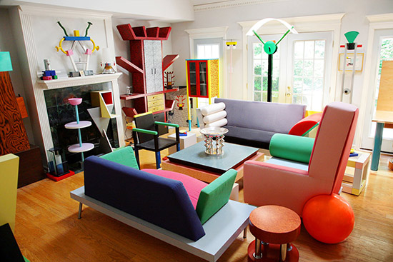
Kitsch is seen as decorative objects or art that are attractive to people who are thought to lack any appreciation of style or beauty (Cambridge Dictionary, 2020). Kitsch is a German word meaning ‘in bad taste’.
Unlike minimalism. kitsch is the excessive use of colours and decorations, these can be seen in interior design.
(From Modernism to Kitsch, n.d.)
An example of artwork that is kitsch is ‘Sunset on Lamplight Lane’ by Thomas Kinkade. This piece almost becomes overwhelming to look at.
(Kinkade, n.d.)
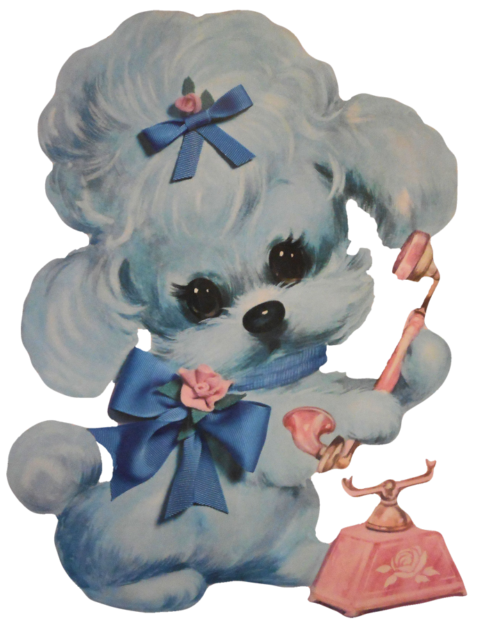
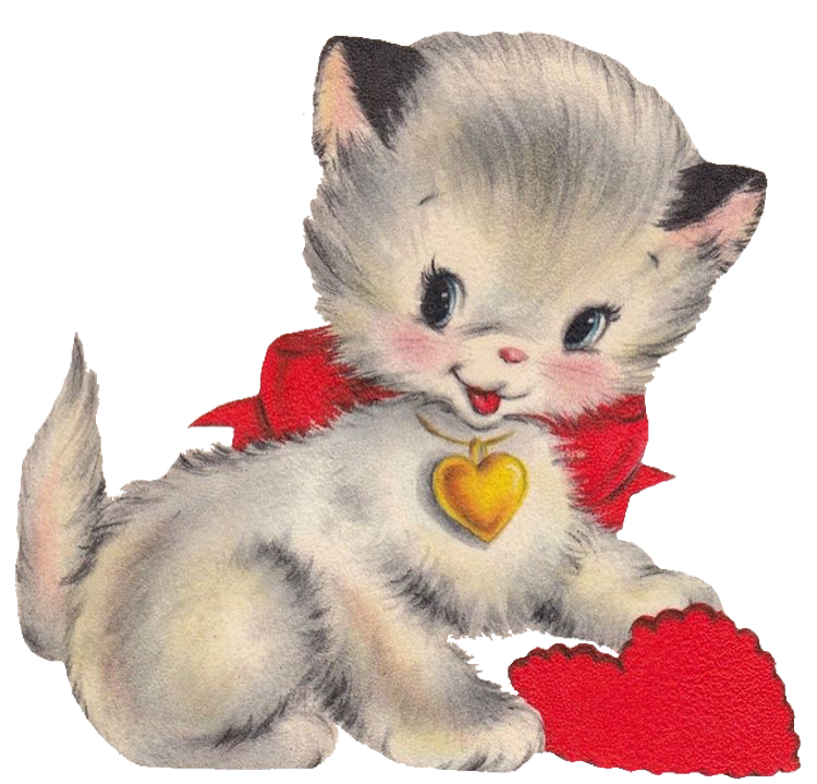
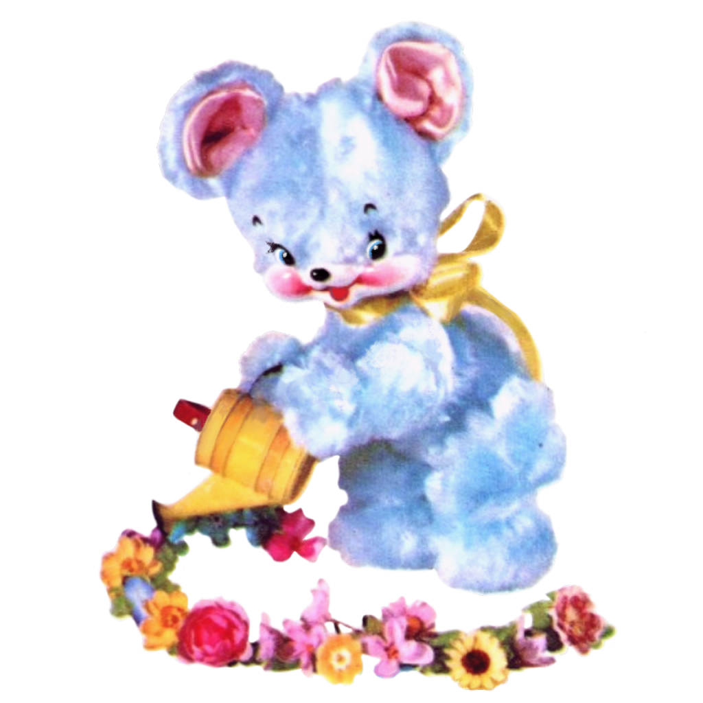
These are some examples of vintage Kitsch design.
(Dorothy Doll’s Graphics, n.d.)(Kitsch Kitten, n.d.)(Girassol, Set 2, n.d.)
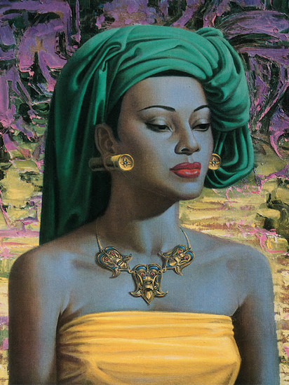
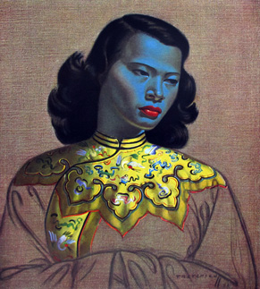
Vladimir Trechikoff’s work can also be considered Kitsch, these are some examples of his work.
(South African Art, n.d.)(Tretchikoff’s Chinese Lady, 2013)
Cambridge Dictionary (2020) KITSCH | meaning in the Cambridge English Dictionary. Cambridge.org. Available online: https://dictionary.cambridge.org/dictionary/english/kitsch [Accessed 23 May 2022].
Dorothy Doll’s Graphics. (n.d.) Pinterest. Available online: https://www.pinterest.co.uk/pin/322288917067192308/ [Accessed 23 May 2022].
From Modernism to Kitsch. (n.d.) Infinite Dictionary. Available online: http://infinitedictionary.com/blog/2016/11/10/from-modernism-to-kitsch-the-memphis-design-group/ [Accessed 23 May 2022].
Girassol, Set 2. (n.d.) Tumblr. Available online: https://kiethia.tumblr.com/post/190879688926/set-2 [Accessed 23 May 2022].
Kinkade, T. (n.d.) Sunset on Lamplight Lane. Thomas Kinkade. Available online: https://thomaskinkade.com/shop/limited-edition-art/bridges/sunset-on-lamplight-lane-limited-edition-art/ [Accessed 23 May 2022].
Kitsch Kitten. (n.d.) PicsArt. Available online: https://picsart.com/i/317511527101211 [Accessed 23 May 2022].
South African Art. (n.d.) In Your Pocket. Available online: https://www.inyourpocket.com/johannesburg/south-african-art-vladimir-tretchikoff_74881f [Accessed 23 May 2022].
Tretchikoff’s Chinese Lady. (2013) Jbay News. Available online: https://www.jbaynews.com/2013-03-25/tretchikoffs-chinese-girl-sells-for-r-13-million [Accessed 23 May 2022].
Black PNG. (n.d.) Download Clipart. Available online: https://www.downloadclipart.net/browse/110119/black-png-transparent-image-clipart [Accessed 23 May 2022].
Decoration Heart Tin. (n.d.) Kitsch Kitchen. Available online: https://www.kitschkitchen.nl/decoration-heart-tin-feather-s/ [Accessed 23 May 2022].
Dorothy Doll’s Graphics. (n.d.) Pinterest. Available online: https://www.pinterest.co.uk/pin/322288917067192308/ [Accessed 23 May 2022].
Girassol, Set 2. (n.d.) Tumblr. Available online: https://kiethia.tumblr.com/post/190879688926/set-2 [Accessed 23 May 2022].
Ink Stain. (n.d.) Pixa Bay. Available online: https://pixabay.com/vectors/ink-stain-black-spot-splatter-24501/ [Accessed 23 May 2022].
Ink. (n.d.) Free PNG. Available online: https://freepngimg.com/png/51254-ink-hd-image-free-png [Accessed 23 May 2022].
Kitsch Green Armchair. (n.d.) Life PNG. Available online: https://www.lifepng.com/photo/13656/kitsch-green-armchair-png-hd/ [Accessed 23 May 2022].
Kitsch Kitchen. (n.d.) Riot Lounge. Available online: https://riotlounge.co.uk/shop/gifts/vases/kitsch-kitchen-senor-vase/ [Accessed 23 May 2022].
Kitsch Kitten. (n.d.) PicsArt. Available online: https://picsart.com/i/317511527101211 [Accessed 23 May 2022].
Lips Phone. (n.d.) We Heart It. Available online: https://weheartit.com/entry/46575028 [Accessed 23 May 2022].
Pink Diamond Heart. (n.d.) Nice PNG. Available online: https://www.nicepng.com/maxp/u2q8r5e6t4w7a9t4/ [Accessed 23 May 2022].
Transparent PNG. (n.d.) Pinterest. Available online: https://www.pinterest.co.uk/pin/835910380823454344/ [Accessed 23 May 2022].
Vintage Image. (n.d.) Download PNG. Available online: https://dlpng.com/png/6782436 [Accessed 23 May 2022].
Vintage PNG. (n.d.) Nice PNG. Available online: https://www.nicepng.com/maxp/u2q8y3w7e6t4o0q8/.
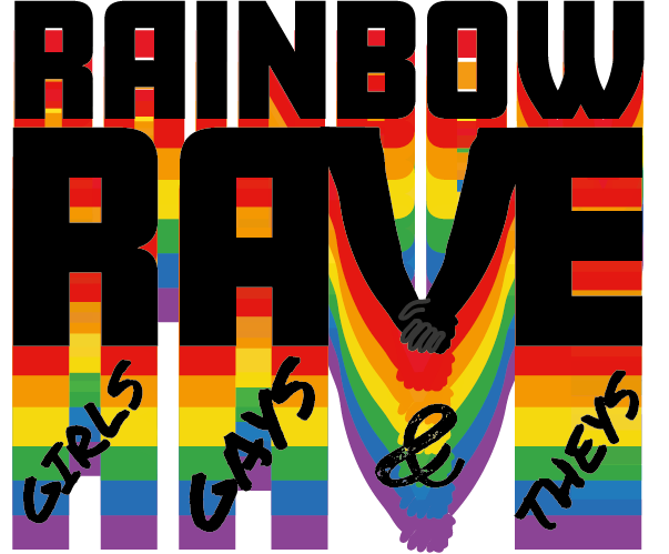
The chosen festival to create a website/app for is called ‘Rainbow Rave: Girls, gays and theys’. This is a LGBTQIA+ only event that will take place in the summertime, during pride month. This event is created to offer a safe space to those who enjoy raving and apart of the LGBTQIA+ community.
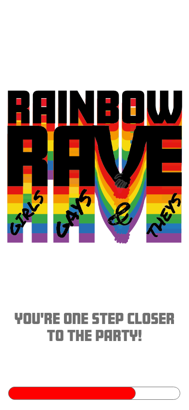
Rough draft of the logo for the chosen festival.
UX (user experience) is the process designed used to create products and services that provide a meaningful and relevant experience to the user (Interaction Design Foundation, 2019).
The UX for the chosen festival should be inviting and exciting yet simple and straight-forward. The call to action for this site will be the ticket purchasing, it should be easy to navigate and memorable for future purchases. When purchasing tickets, the user will be presented with a form to fill for personal and contact details then they will be asked to fill in their bank details, this process is quick and simple which leaves the customer feeling content, adding anything more to the purchasing process could leave the user feeling frustrated and overwhelmed, it also creates risk towards the user stopping the process and leaving the site (Yablonski, n.d.a).
Due to the growth in technology and the internet today, users expect certain tools to be in the same position for every website because we’re so used to websites being similar that it frustrates us when those tools aren’t in the same place. According to Jakob’s Law ‘users spend most of their time on other websites. This means that users prefer your site to work the same way as all the other sites they already know.’ (Yablonski, n.d.b)
The companion application will act as a necessary device while at the festival, it will include all the food and drink stalls so users can order themselves a beverage or meal to collect, this reduces queues and gives customers more time to enjoy the music and atmosphere of the rave, its also something quite unique which could attract more festivalgoers. The UX of the app will also provide feedback reminders for when their favourite artists are performing.
References
Interaction Design Foundation (2019). What is User Experience (UX) Design? [online] The Interaction Design Foundation. Available at: https://www.interaction-design.org/literature/topics/ux-design [Accessed 1 Mar. 2022].
Yablonski, J. (n.d.a). Hick’s Law. [online] Laws of UX. Available at: https://lawsofux.com/hicks-law/ [Accessed 1 Mar. 2022].
Yablonski, J. (n.d.b). Jakob’s Law. [online] Laws of UX. Available at: https://lawsofux.com/jakobs-law/ [Accessed 1 Mar. 2022].
The focus of the UX for the chosen festival is to make everything on the website navigable, every single available page on the site should be memorable and accessible but the call to action, that being the ticket purchasing process, is something that should be the top priority for accessibility.
The other requirements to think about when looking at the UX for the site and companion app is the information, location, accessibility options for those with disabilities, who’s performing, date and time and reviews on the previous events. These are the main goals for the site and companion app, but the app will focus more on when the customer is at the festival, offering click and collect for food and drink stalls, options to add reminders for when their preferred artists are performing, ticket storage that can be easily scanned for quick access into the venue and options to alert an onsite medical professional if the user feels uncomfortable or unsafe. This concept is quite unique, which will attract more customers and will spread awareness of the event.
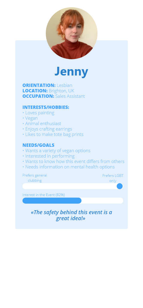
The target audience for the website and app will be 18+ but aimed more for young people who are new to the LBGT clubbing scene and people in the LGBT community who feel uncomfortable in generic clubs and bars because of judgement, drug spiking or risks of assault. One of the main focuses of this event is the user’s safety which is why the site will also offer online live chats for any queries onsite or any UX/UI related problems.
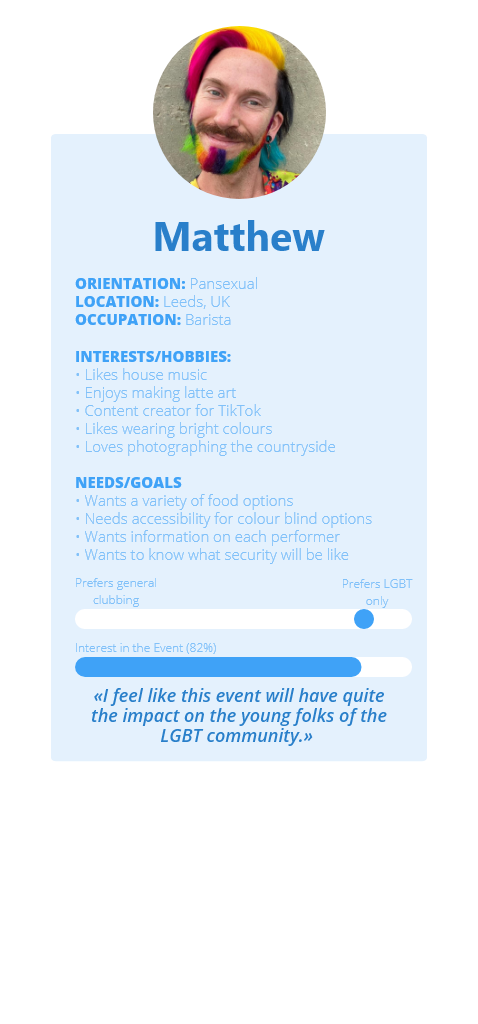
Personas
Personas of two different types of people that the festival is aimed at. (Free, 2021), (Twitter, n.d.)
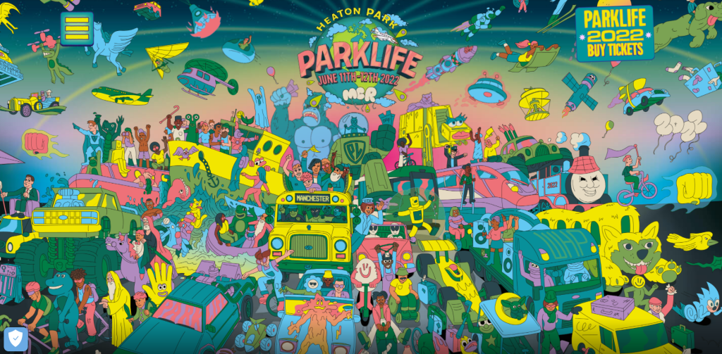
Like the Parklife website (Parklife, 2019), the website for ‘Rainbow Rave’ should include some nice visual graphics to intrigue the user even more and give them something satisfying to look at while browsing the page but within the Parklife website, the visuals are quite chaotic and overwhelming, making it hard to navigate certain options.
(Parklife, 2019)
Free, C. (2021). Rainbow House. The Washington Post. Available at: https://www.washingtonpost.com/lifestyle/2021/04/28/rainbow-house-paint-neighbor/ [Accessed 2 Mar. 2022].
Parklife. (2019). Parklife 2019. [online] Available at: https://parklife.uk.com/ [Accessed 2 Mar. 2022].
Twitter, F. (n.d.). @flowersofsappho. [Online Image] Twitter. Available at: https://twitter.com/FlowersOfSappho/status/1325194178012147712 [Accessed 2 Mar. 2022].
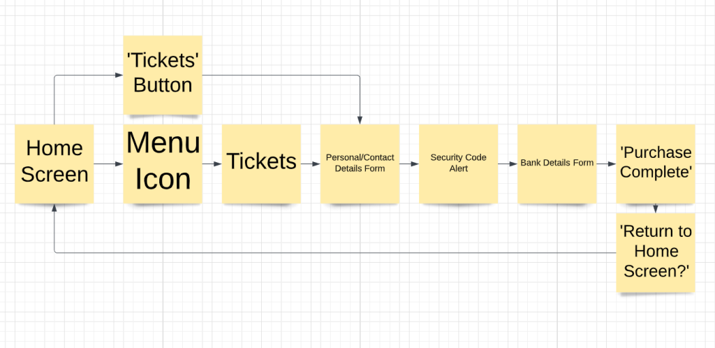
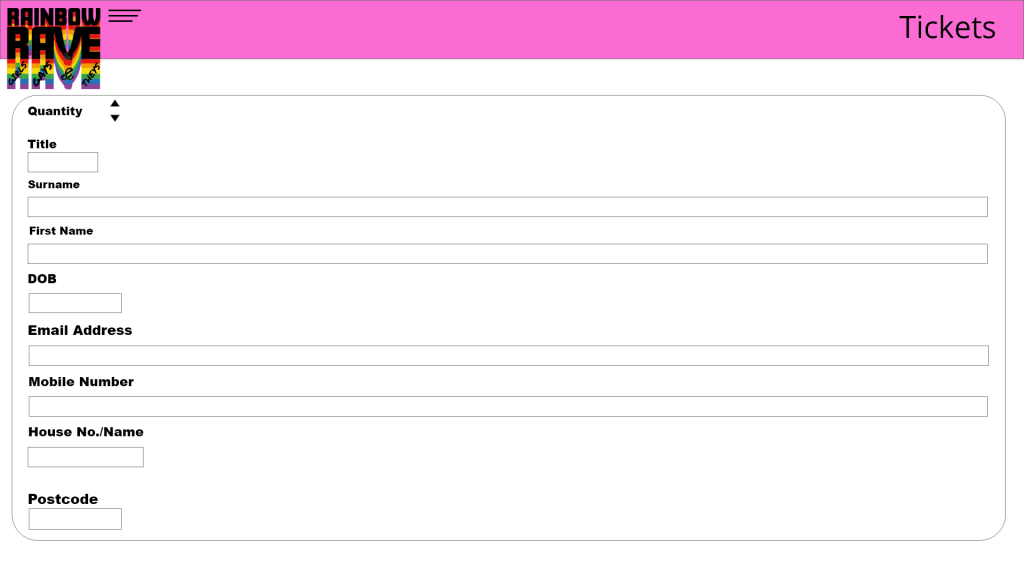
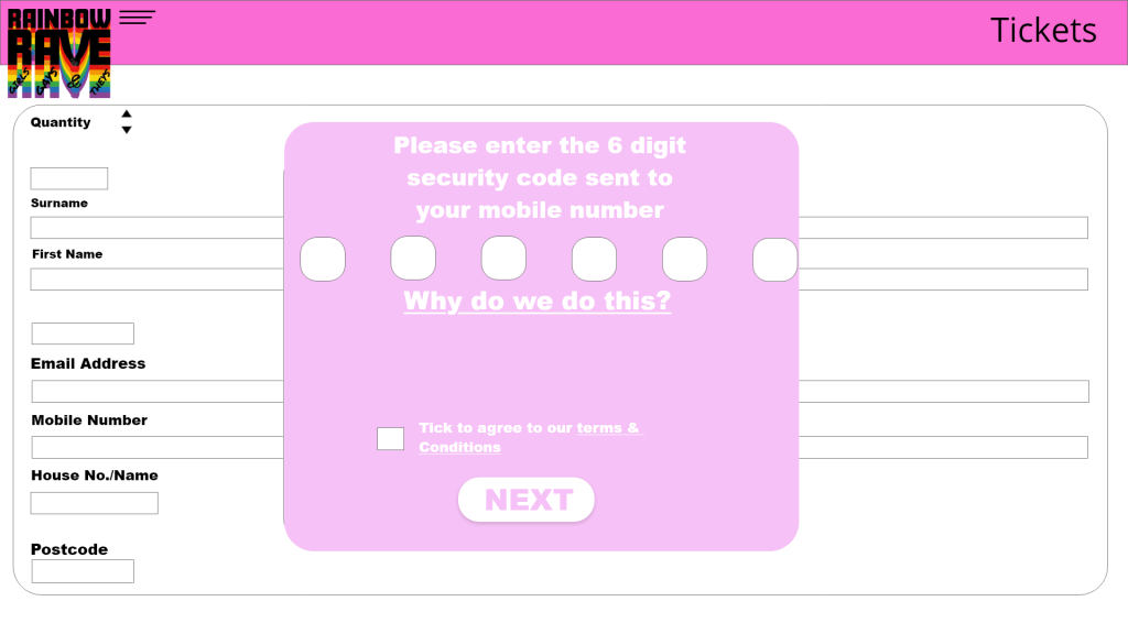
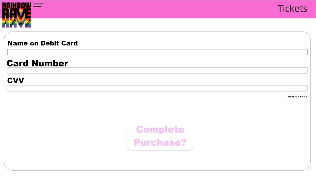
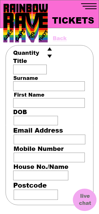
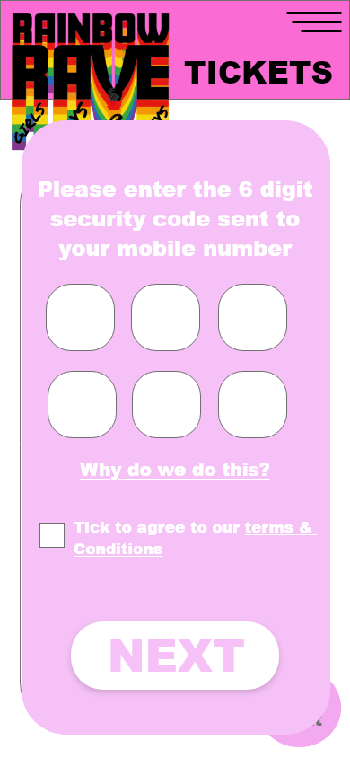
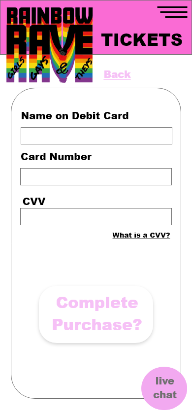
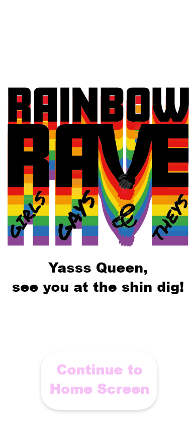
The call-to-action process will be quick and easy with only 2 short forms to fill, this will be the personal/contact details form and a bank details form. Once the user has input their mobile number or email address on the first form, they will receive a security code via text or email, they will then be asked to put that code into the website before proceeding to the bank details form. This may be frustrating to the user with them having to switch from the site to their texts/emails, but it provides a sense of security and privacy to their details. Once both forms have been completed, they will be presented with a ‘Purchase Complete’ screen and an option to ‘Return to the Home Screen’.
This is the step-by-step process behind the call-to-action, this being the ticket purchasing.
When using Hick’s Law ‘the more stimuli (or choices) users face, the longer it will take them to make a decision’ (Soegaard, 2021), meaning the process for the call-to-action should remain simple to keep the user engaged in the site, if the user is presented with too many things to put their details into, it increases the risk of them leaving the site and having an uncomplete purchase. It can also leave the user feeling frustrated and stressed which influences the idea of not wanting to go to the event.
Feedback will be used within the website to alert the user of any errors and positive actions. A negative alert will be used when the user has input the incorrect information and an upbeat chime-like sound will be used when the user has completed the purchase or created an account. Within the companion app the same feedback will be there but with added reminder alerts which the user can customize themselves for when they want to be reminded of when certain acts are performing or when their click and collect food order is ready.
Soegaard, M. (2021). Hick’s Law: Making the choice easier for users. [online] The Interaction Design Foundation. Available at: https://www.interaction-design.org/literature/article/hick-s-law-making-the-choice-easier-for-users#:~:text=Hick [Accessed 14 Mar. 2022].
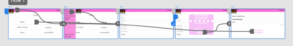
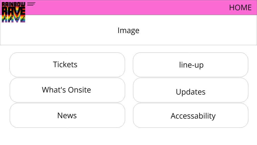
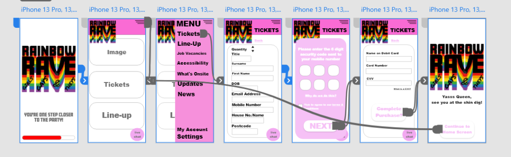
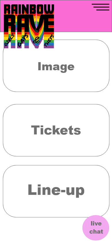
This is a low fidelity prototype for the chosen festival’s call to action on the web page, this has been rejected due to the use of negative space and the placements of certain options.
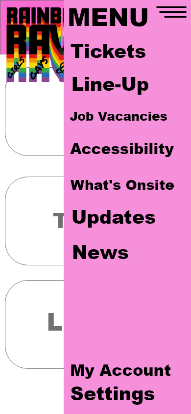
The menu icon has been placed on the left-hand side of the web page, next to the logo. When using Jakob’s law, users will not want the menu icon in a different position to most other websites, this confuses the user and increases the risk of them leaving the site. Bringing in the law of proximity ‘the principle of proximity states that items close together are likely to be perceived as part of the same group – sharing similar functionality or traits’(Experience, n.d.). The menu icon of this design is too close to the logo and on most websites, when clicking on the logo it’ll take the user back to the home page so having the menu icon so close to another button may cause frustration for the stakeholder if accidentally clicking on the opposite option to what they wanted.
The amount of negative space used on this web design leaves the pages bare and simply quite boring, this can be improved by adding in some visual graphics or illustrations to enlighten the user when scrolling through the site. The top banner could include a live countdown to when the event starts, this can excite the user and give them a sense of urgency to purchase the tickets, so they don’t miss out. Live countdowns can be seen on websites such as Download festival.
(Download Festival, n.d.)
Another reason this design has been rejected is the fact it looks like an extended version of an app design. The text, titles and icons are too small for a web page, these should be evaluated for those who have vision impairments.
Download Festival. (n.d.). [Online Screenshot] Download Festival. Available at: https://downloadfestival.co.uk/ [Accessed 14 Mar. 2022].
Experience, W.L. in R.-B.U. (n.d.). Proximity Principle in Visual Design. [online] Nielsen Norman Group. Available at: https://www.nngroup.com/articles/gestalt-proximity/#:~:text=Definition%3A%20The%20principle%20of%20proximity [Accessed 14 Mar. 2022].
‘We often make use of low-fi prototyping (most commonly paper prototyping) when in need of quick feedback on our concepts, ideas, or flows, along with quickly communicating the aforementioned to colleagues and clients’ (Amsterdam, 2016).
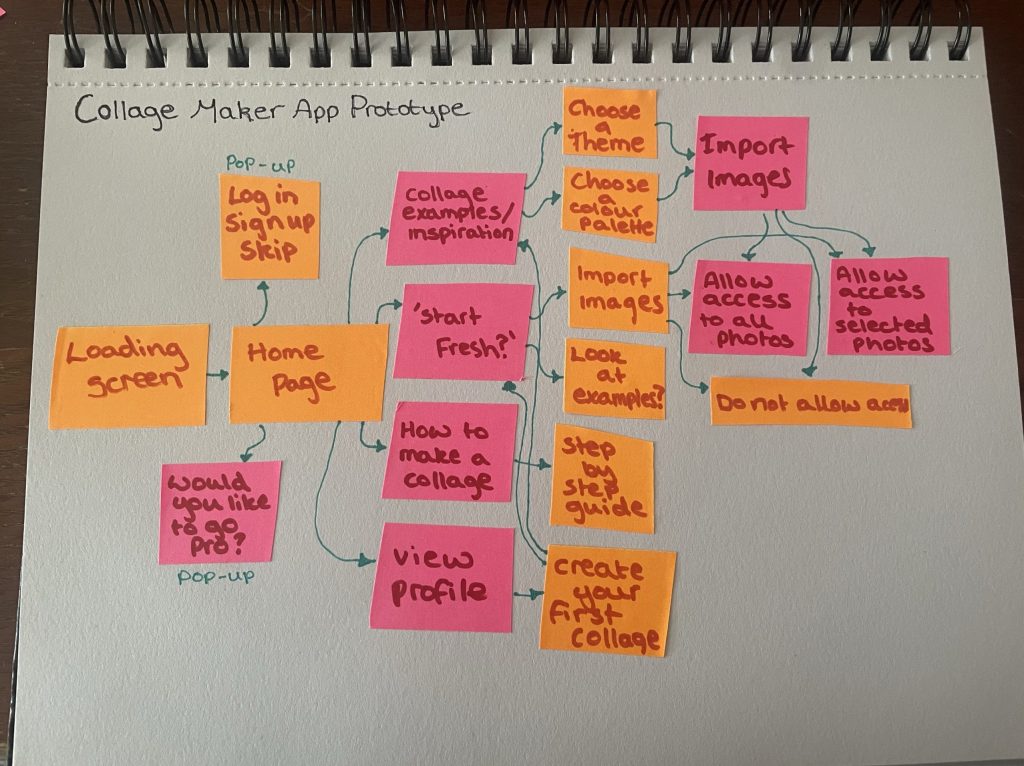
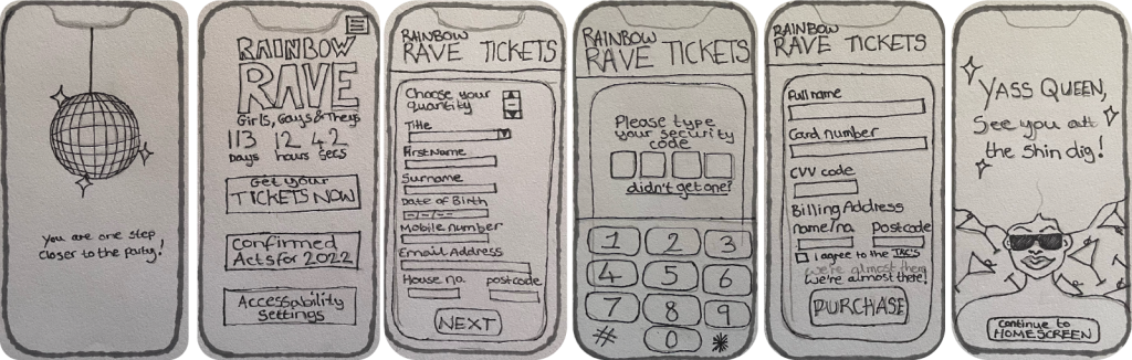
Paper prototype of the call-to-action process for the chosen festival, Rainbow Rave.Enhanced wireframe prototype showing the call-to-action process for the chosen festival, including the rough logo design.
This low fidelity paper prototype shows the process of the ticket purchasing, this includes a loading screen and the screen the user will be presented with when the purchase is complete. The prototype shows the app format for the festival.
This is a rough layout for how the app will look and how it will work. When transitioning from the contact details screen to the bank details screen, a pop-up will appear, asking the user to input a security code sent via text. This added step provides additional security for the user, making sure other users aren’t stealing their identity and contact details to make a purchase.
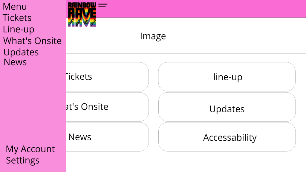
When looking back at the rejected design for the web page, the menu icon and drop-down menu have been moved to the right-hand side of the page, creating distance from the logo which reduces the risk of the user accidentally clicking what they didn’t want to. Another option that has now been included is the floating live chat icon in the bottom right corner, the idea behind the live chat option is for user to be able to enquire about any queries regarding the festival and the navigation of the web and app design. The titles on the top banner have now been increased in size, minimizing the negative space and are now easily readable for those with vision impairments.
When the purchase is complete, the user will be presented with a screen that includes visual illustrations and a message that includes commonly used slang within the LGBTQIA+ community. The aim of this is to make the user feel satisfied with their purchase.
References
Amsterdam, A.I. (2016). Low-fi prototyping: What, Why and How? [online] Medium. Available at: https://blog.prototypr.io/low-fi-prototyping-what-why-and-how-24f77d9f4995 [Accessed 14 Mar. 2022].