“Designers use storytelling to get insight into users, build empathy and reach them emotionally. Designers create personas to represent target users and add conflict to stories that reflect their user journeys and problems. Crafting stories, designers can better understand what users want from a solution.” (What is Storytelling?, 2013).
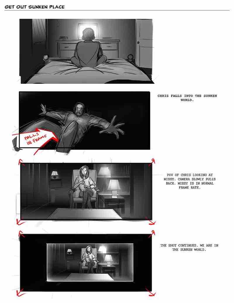
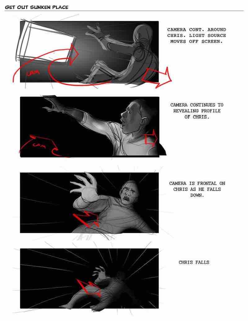
Get Out Sunken Place by Eric Yamamoto. Example of a storytelling visual for film (Yamamoto, n.d.).
The storyboard example above shows four scenes within a film. The script on the right of the illustration’s states the angle and positioning of the camera during these scenes. Like graphic design, visuals are needed in the process of any storytelling because it helps developers understand the end result that designers or writers want. These two storyboards are scenes from Jordan Peele’s ‘Get Out’, a very popular psychological horror.
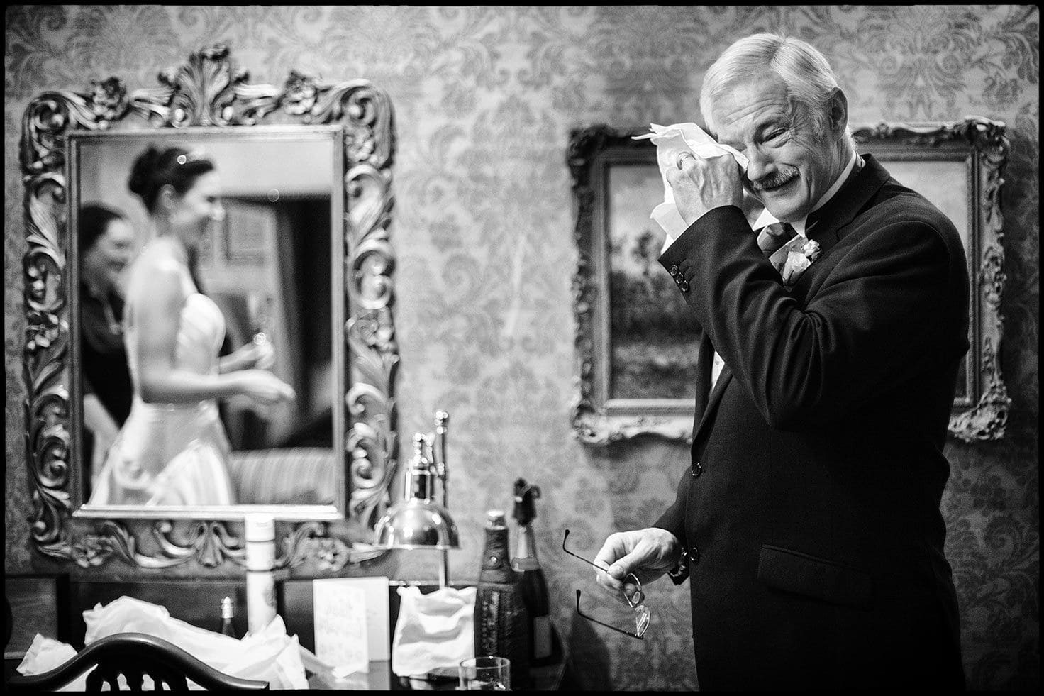
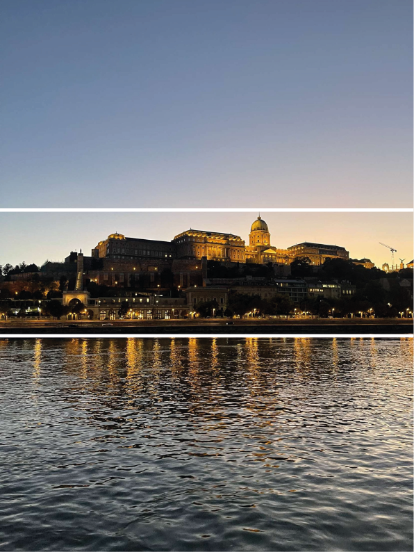
An example of storytelling in photography (Atkins, n.d.).
Storytelling doesn’t need numerous scenes to get the message across to an audience. The example above is by a wedding photographer, Simon Atkins, his main focus is to tell a story within his photographs. As you can see the man on the left is teary while looking at his presumed daughter in her wedding dress. This tells a beautiful story of happiness and joy within a family.
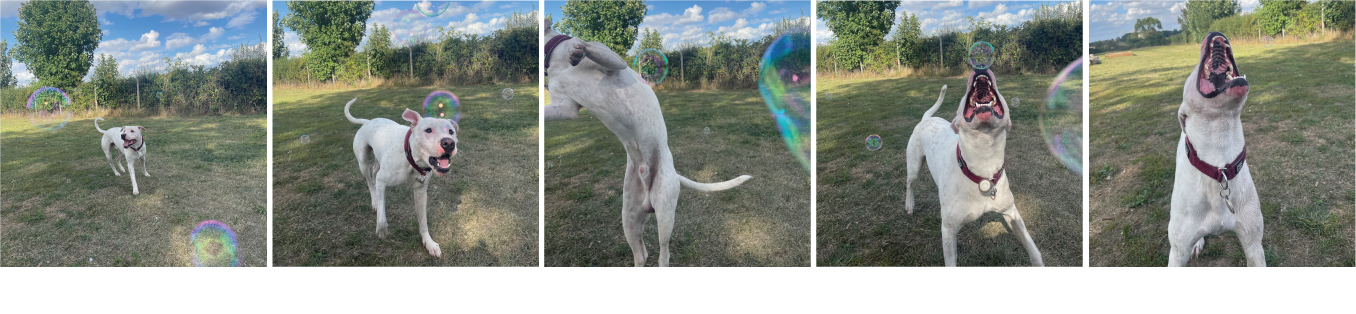
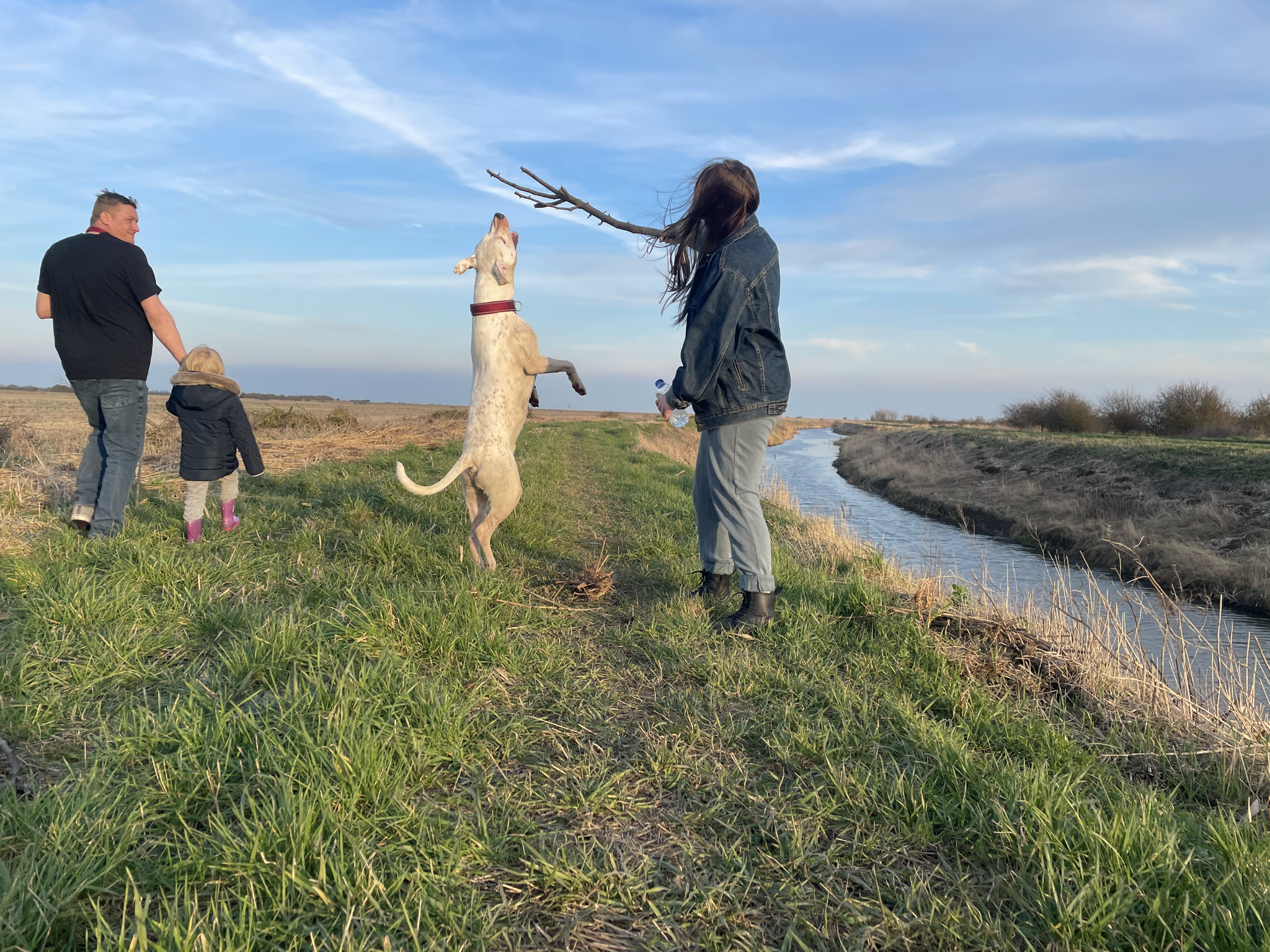
My example of storytelling through photography with added script.
Above is my own version of storytelling through photography. This is five images of my dog that create a narrative sequence of him trying to eat a bubble. Included is a script stating what the dog is doing and how the camera is angled, this was inspired by Eric Yamamoto’s Get Out storyboard.
Bibliography
Atkins, S. (n.d.) Storytelling Wedding Photographer. Available online: https://www.weddingphotojournalist.co.uk/storytelling-wedding-photography/ [Accessed 20 Oct. 2022].
What is Storytelling? (2013) The Interaction Design Foundation. Available online: https://www.interaction-design.org/literature/topics/storytelling [Accessed 20 Oct. 2022].
Yamamoto, E. (n.d.) Get Out Sunken Place. Available online: https://www.studiobinder.com/blog/storyboard-examples-film/ [Accessed 20 Oct. 2022].
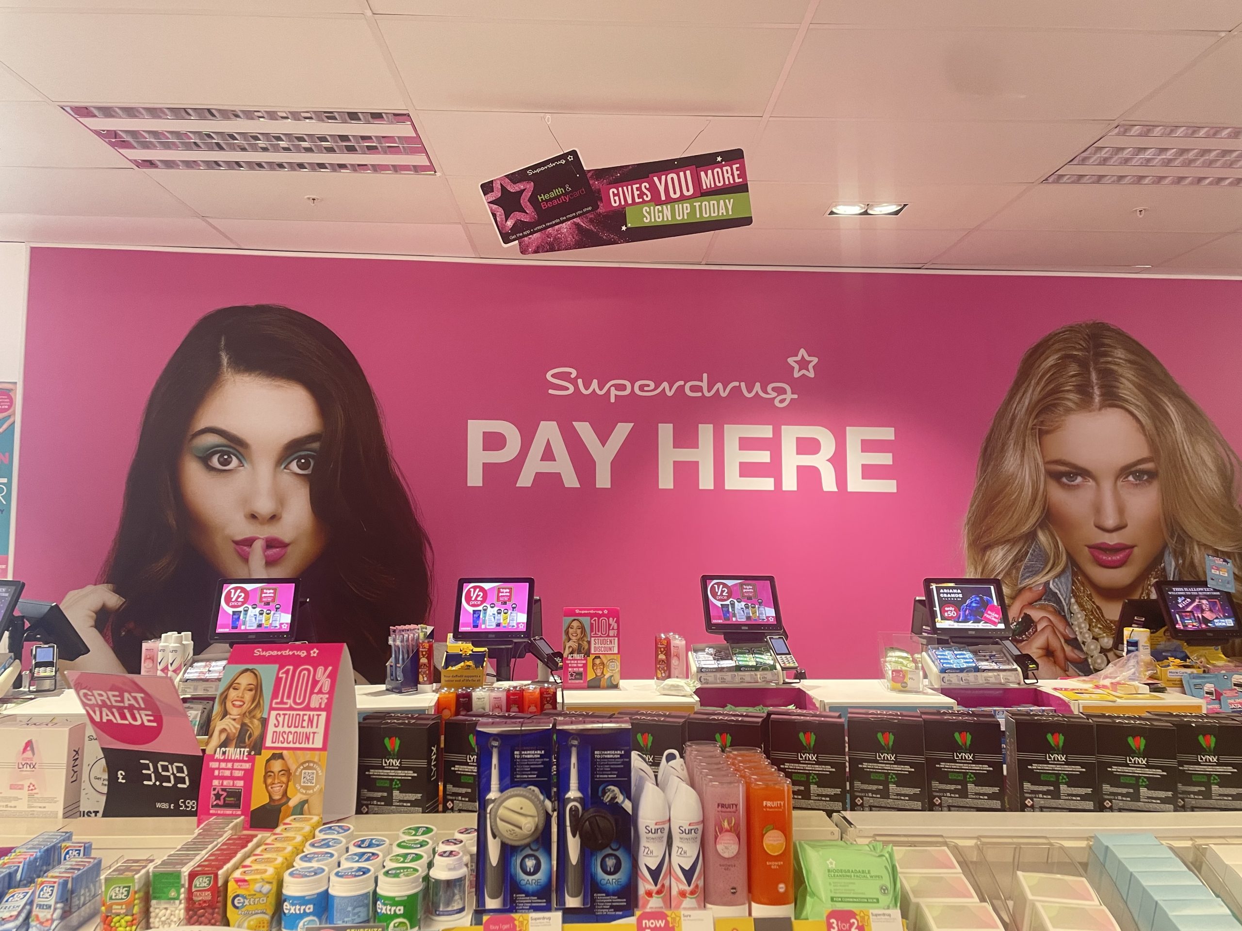
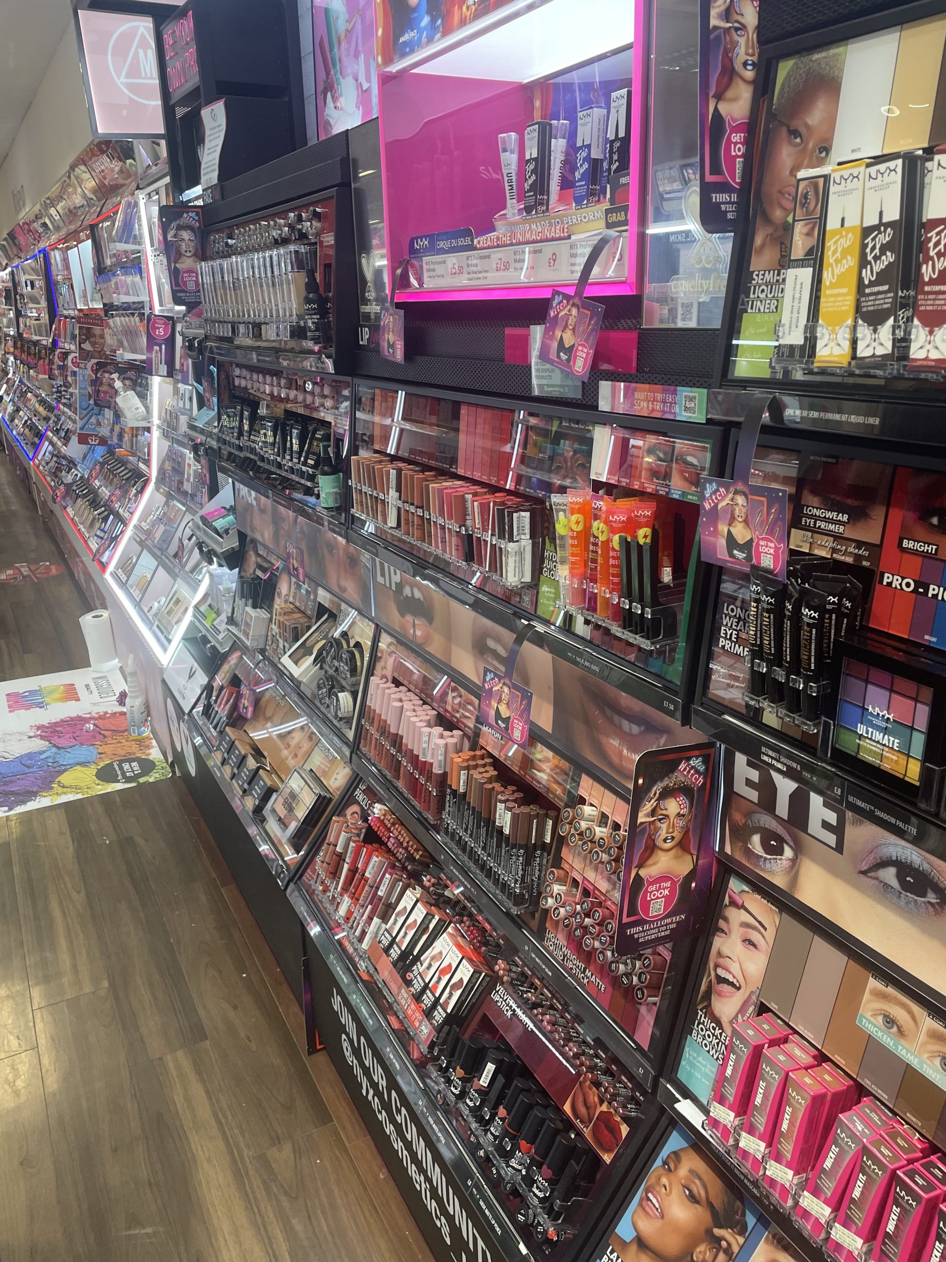
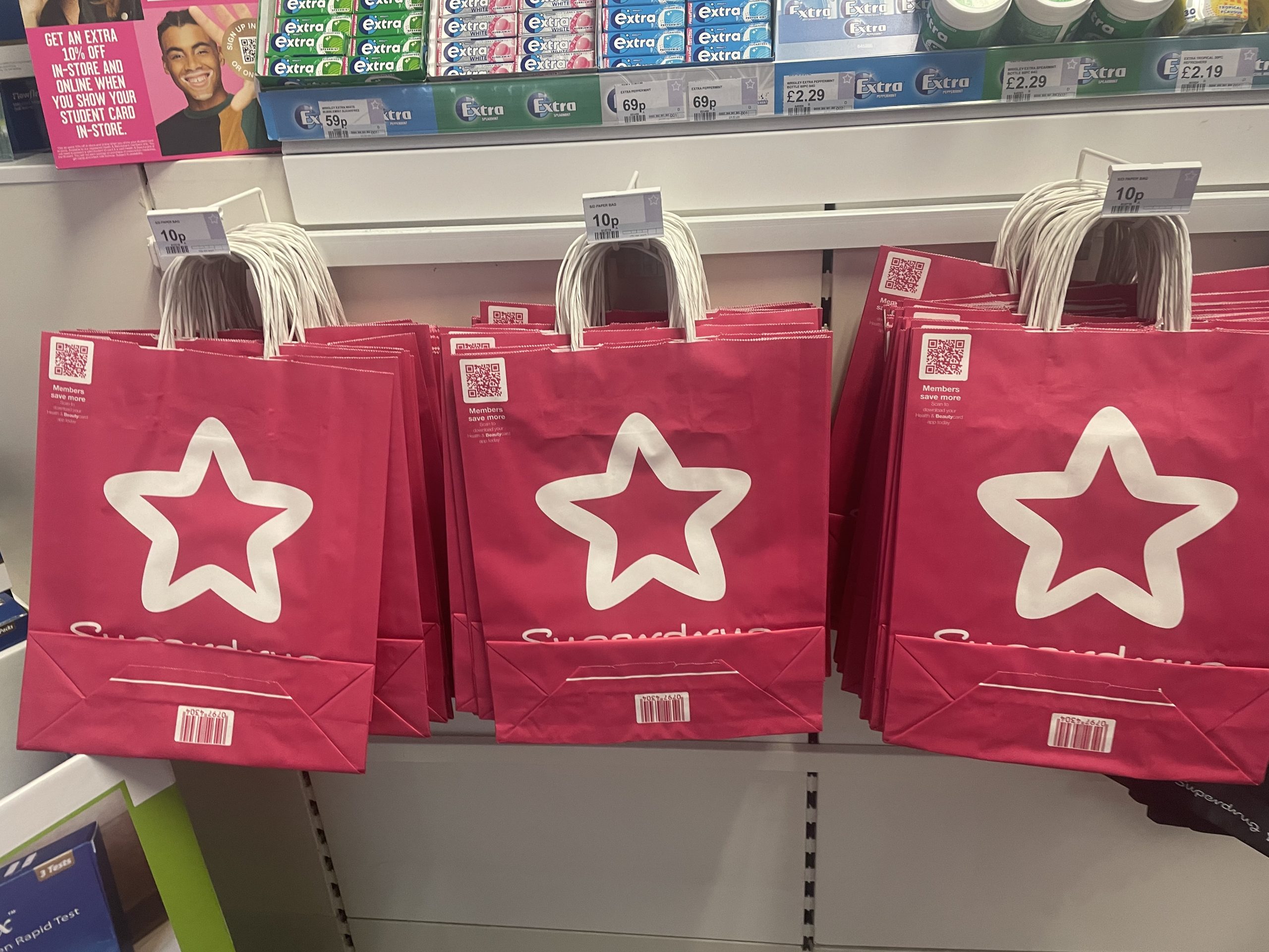
Multichannel User Experience is when a company uses multiple medias to engage with users. An example of a company using a multichannel is Superdrug, below are some images taken in-store.
Figure 1: Image of in-store wall art designs, directing customers to the till area.Figure 2: Image of the make-up aisle showing the designs and images used for the NYX Cosmetics stand.
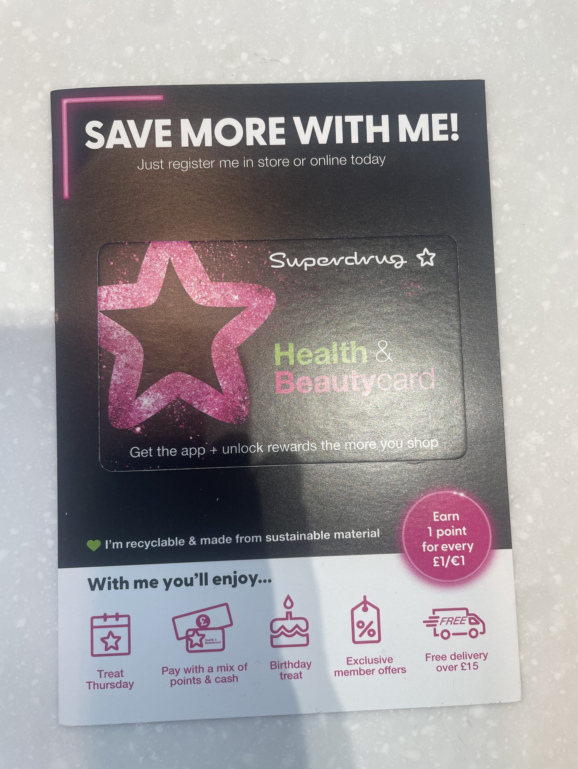
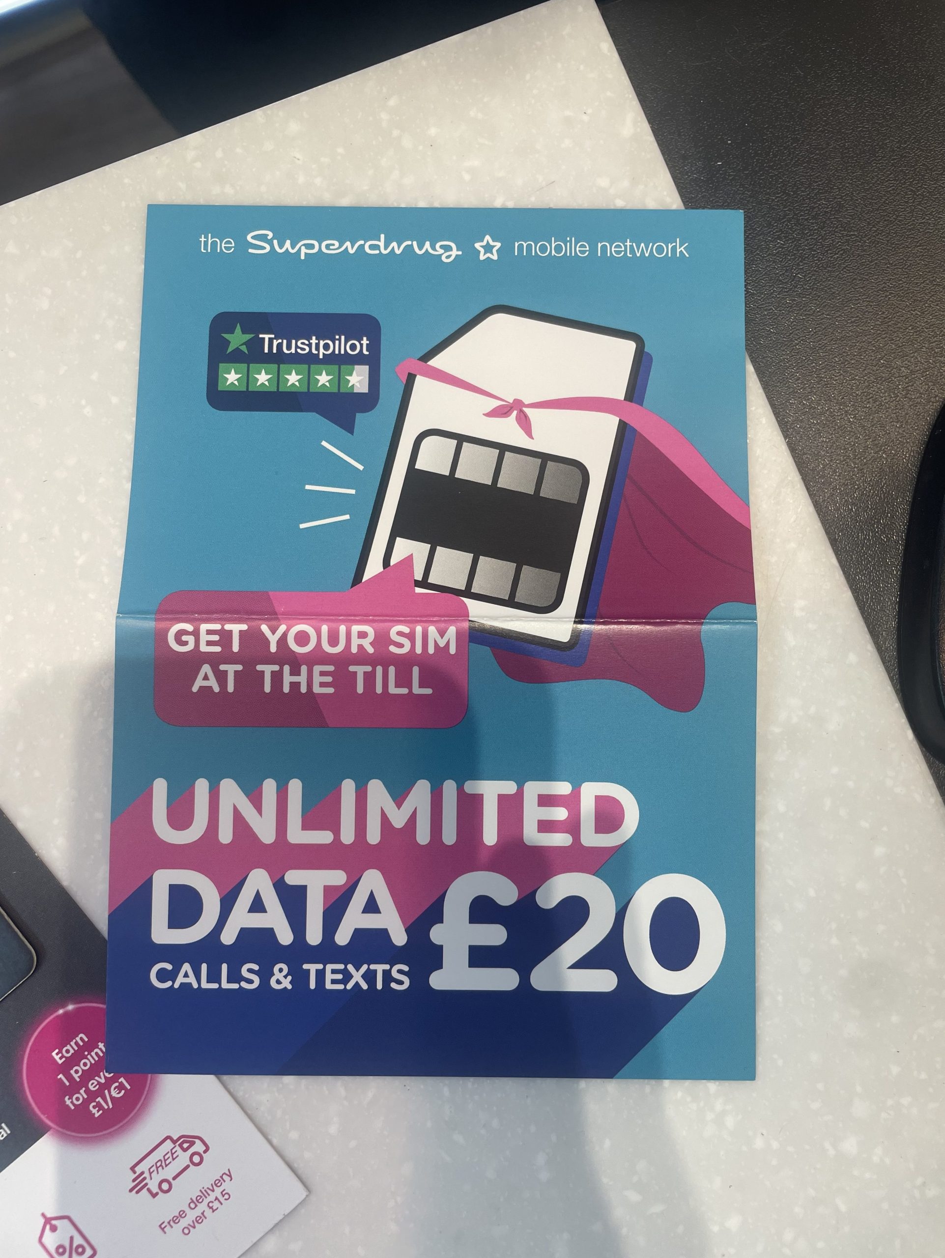
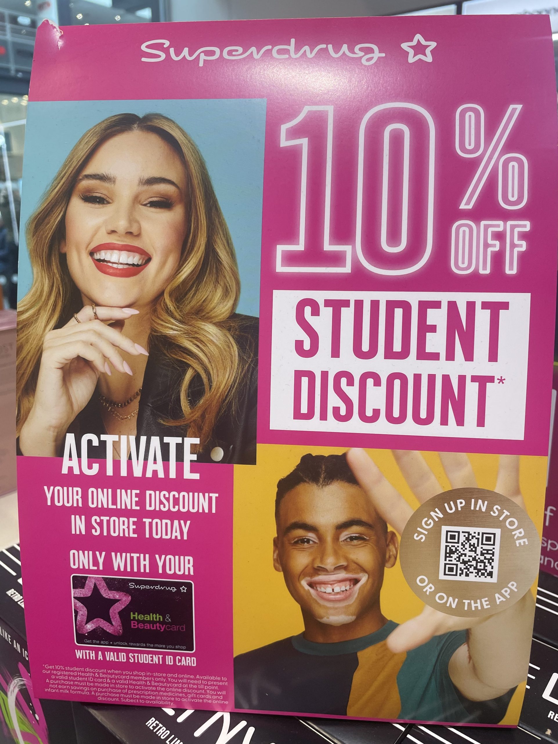
Superdrug has used multiple designs around the store, including leaflets for their sim deals, posters showing student discount with an interactive QR code for their digital health and beauty membership card and posters showing different promotions for certain products.
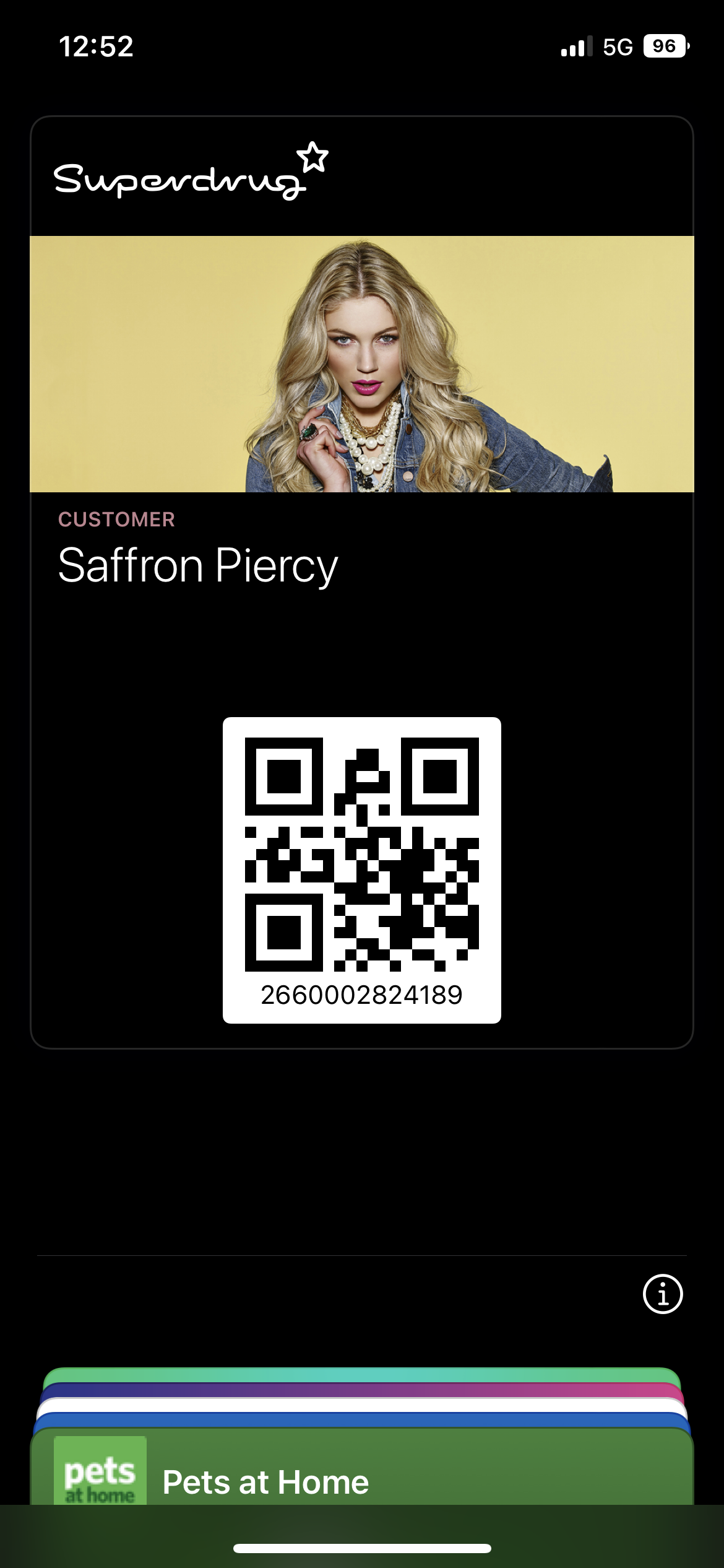
Figure 3: The design used for the Health and Beauty membership card.Figure 4: Design for the Superdrug mobile sim deals.Figure 5: Poster design for student discount with interactive QR code for the digital membership card.Figure 6: Photo showing the paper bag package design.
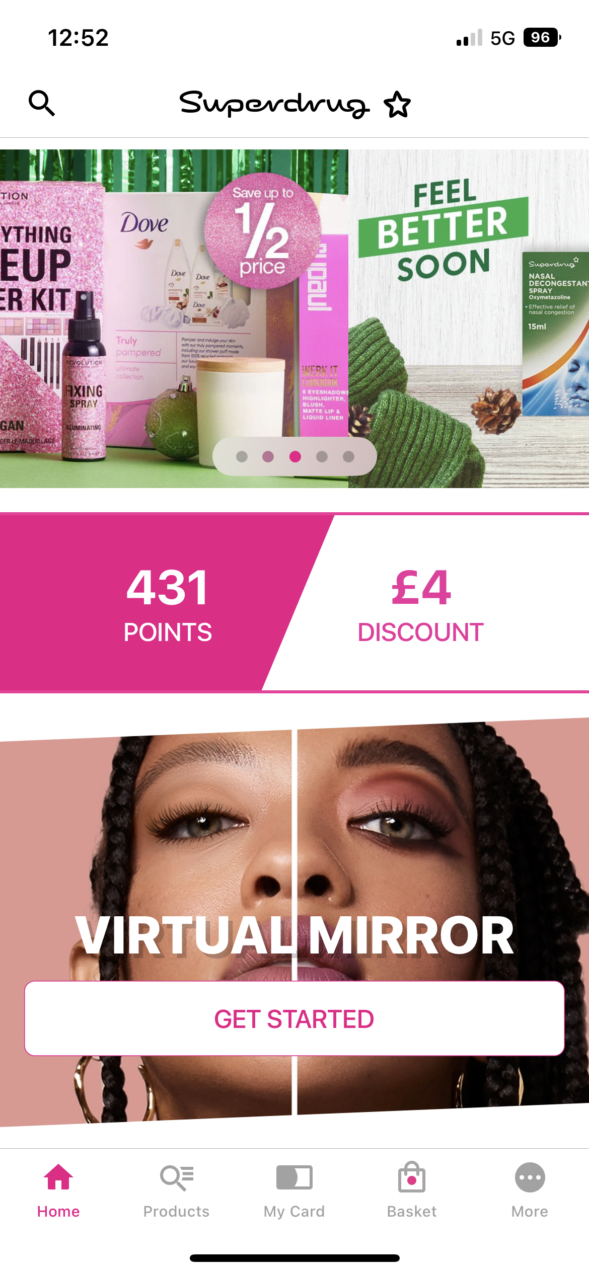
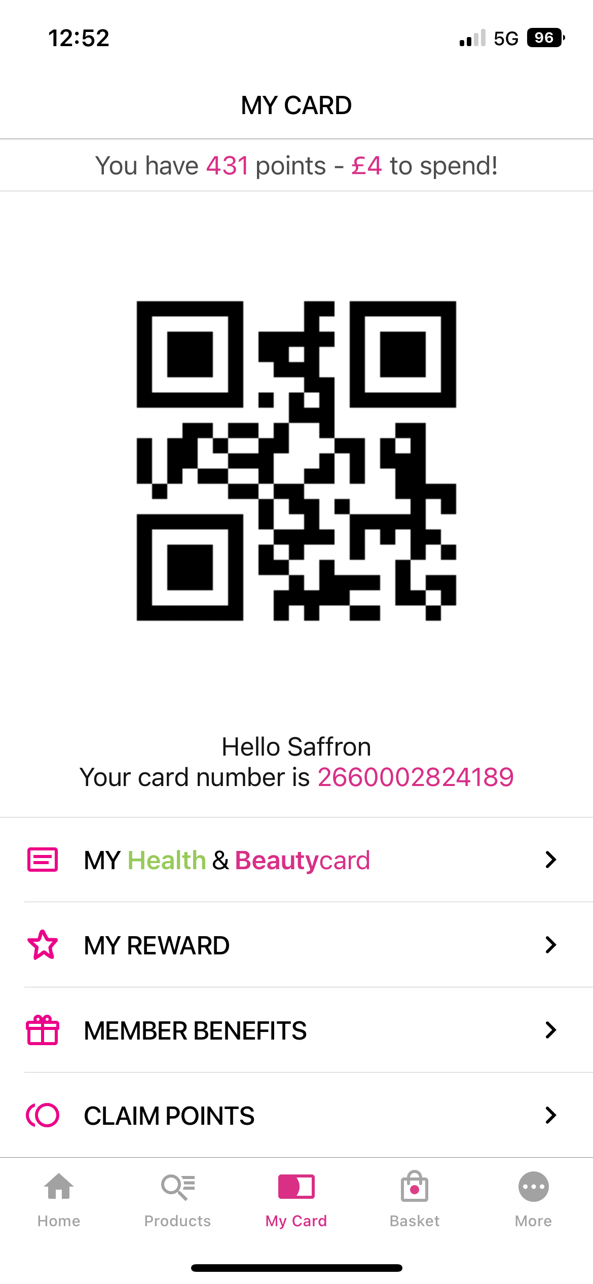
Moving on to their digital side of things. Superdrug have an app and website where users can order products to their door or to their nearest store. Both the website and app also store a digital version of the membership card, this is convenient for the younger generation of users that use their phone more often.
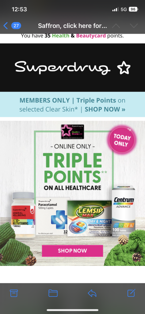
Figure 7: Screenshot of the Superdrug website showing the digital UX.Figure 8: Screenshot of Superdrug app showing current offers and membership points.Figure 9: Screenshot showing digital membership card with QR ready to scan for points.Figure 10: Membership card stored in the Apple Wallet for faster access.Figure 11: Screenshot of an email from Superdrug showing the UX.
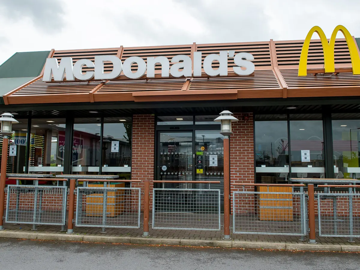
Another company that uses Multichannel UX is fast food chain, Mcdonald’s. Mcdonald’s use many different designs throughout their restaurant such as their food packaging, wall art and the posters used for their trays.
Figure 12: Photo of a Mcdonalds Restaurant showing in-store UX. (Partridge, 2020)
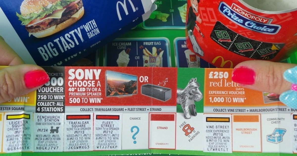
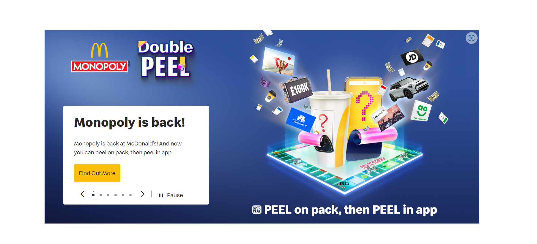
Another example of design used within the restaurant chain is their yearly Monopoly. Recently they have switched the Monopoly to digital but a few years ago they would give customers a foldable Monopoly board for users to add their stickers. Below is a comparison of the 2.
Figure 13: Image of the old Mcdonald’s Monopoly Board showing the design and usability. (Mcdonalds Monopoly, n.d.)Image taken from the Mcdonalds website Figure 14: showing the new digital Monopoly board, it’s now quick and efficient for those that know technology. (Mcdonald’s Website, n.d.)
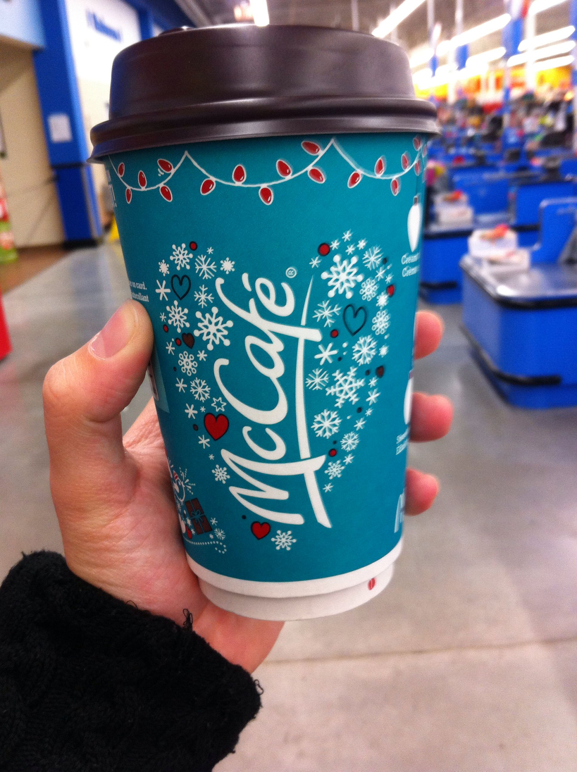
Another good example of Mcdonald’s use of multichannel UX is the packaging used for Christmas time. The design is different and includes illustrations to fit the theme of Christmas, this is a good marketing scheme to convince the user to try their yearly Christmas menu.
Figure 15: Photo showing the Christmas design of the Mcdonald’s hot drinks cup. (Mcdonald’s Christmas Cup, n.d.)
Mcdonald’s Website. (n.d.) Available online: https://www.mcdonalds.com/gb/en-gb.html#carousel-e3792f9941-item-4f61fb3085 [Accessed 12 Oct. 2022].
Mcdonalds Monopoly. (n.d.) Available online: https://qsrmedia.co.uk/promotions/news/monopoly-returns-mcdonalds-uk-thirteenth-year [Accessed 12 Oct. 2022].
Partridge, J. (2020) Mcdonald’s to reopen. Available online: https://www.theguardian.com/business/2020/may/01/mcdonalds-to-reopen-some-restaurants-for-deliveries-during-coronavirus-lockdown [Accessed 12 Oct. 2022].
Superdrug. (2019) Superdrug.com. Available online: https://www.superdrug.com/ [Accessed 12 Oct. 2022].
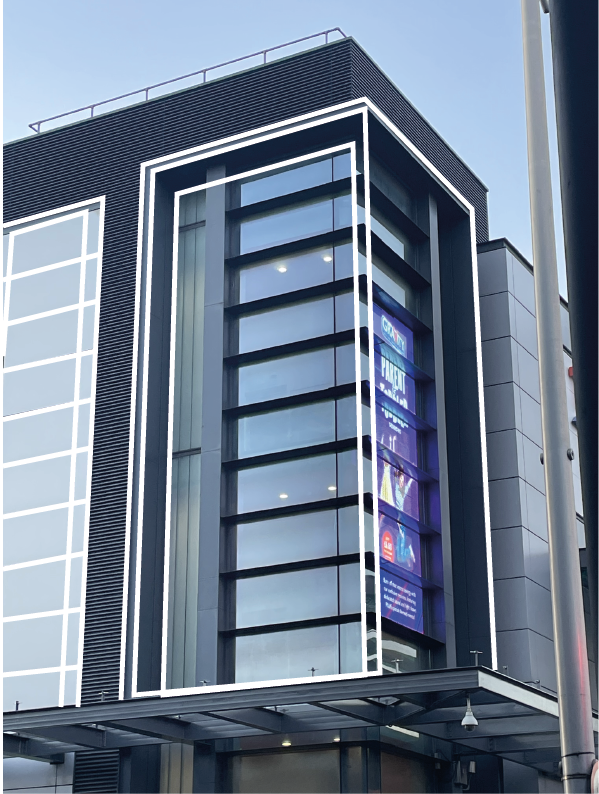
Grids and frames are the foundation to any design, using a grid brings accuracy to a design, it helps the structure become straight, clean and uniform. Grids are commonly used in architecture, whether that be the blueprints or the actual build itself. If you were to strip back a building, you would see that within the walls there are wooden frames in a grid like layout.
Figure 1.Figure 2.Figure 3.Figure 4.
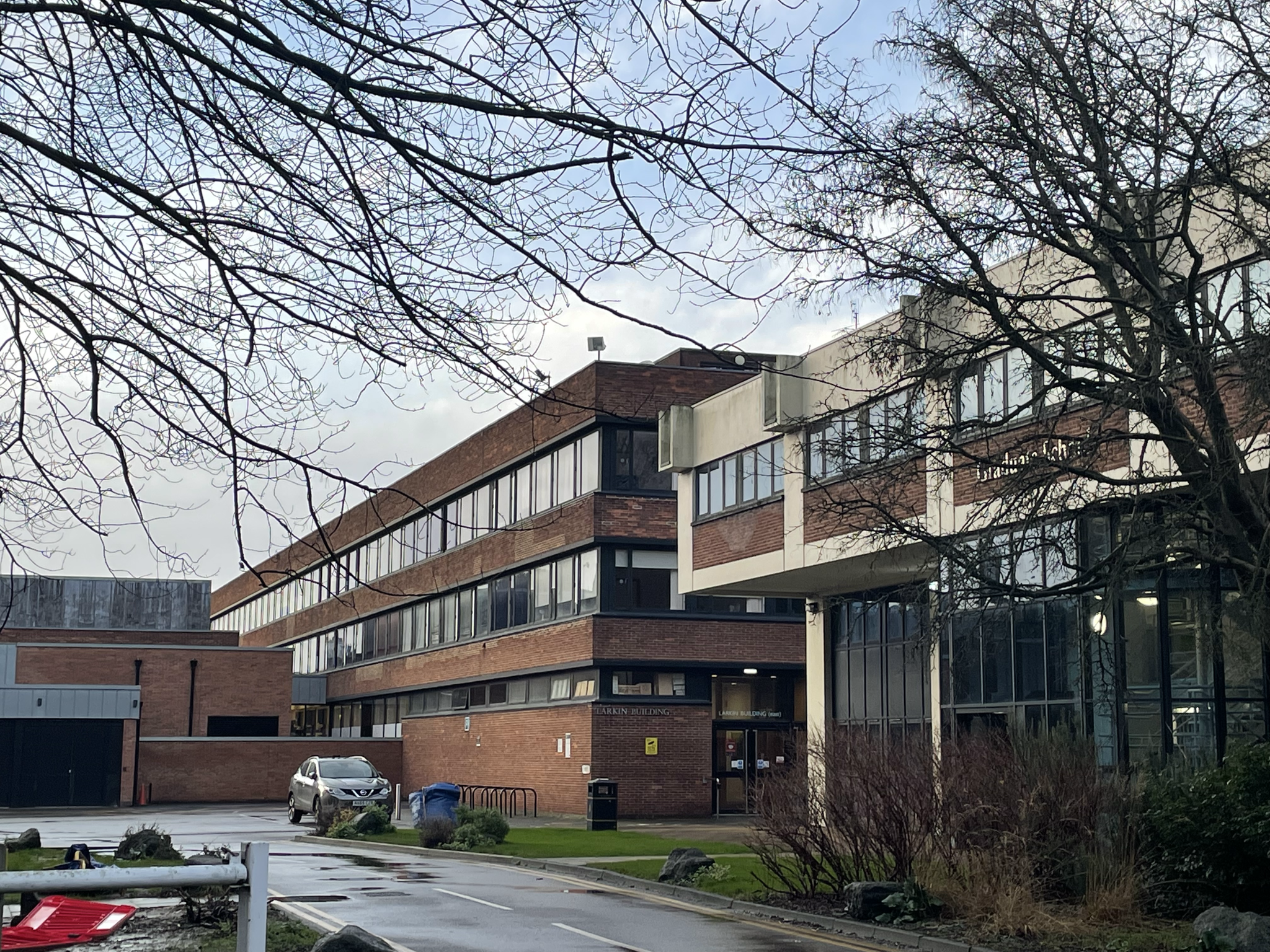
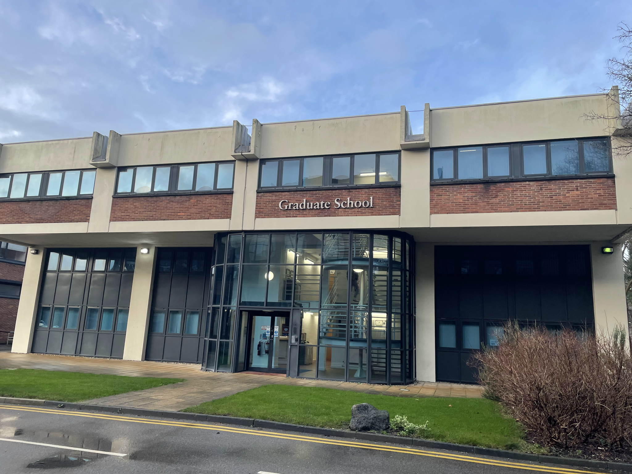
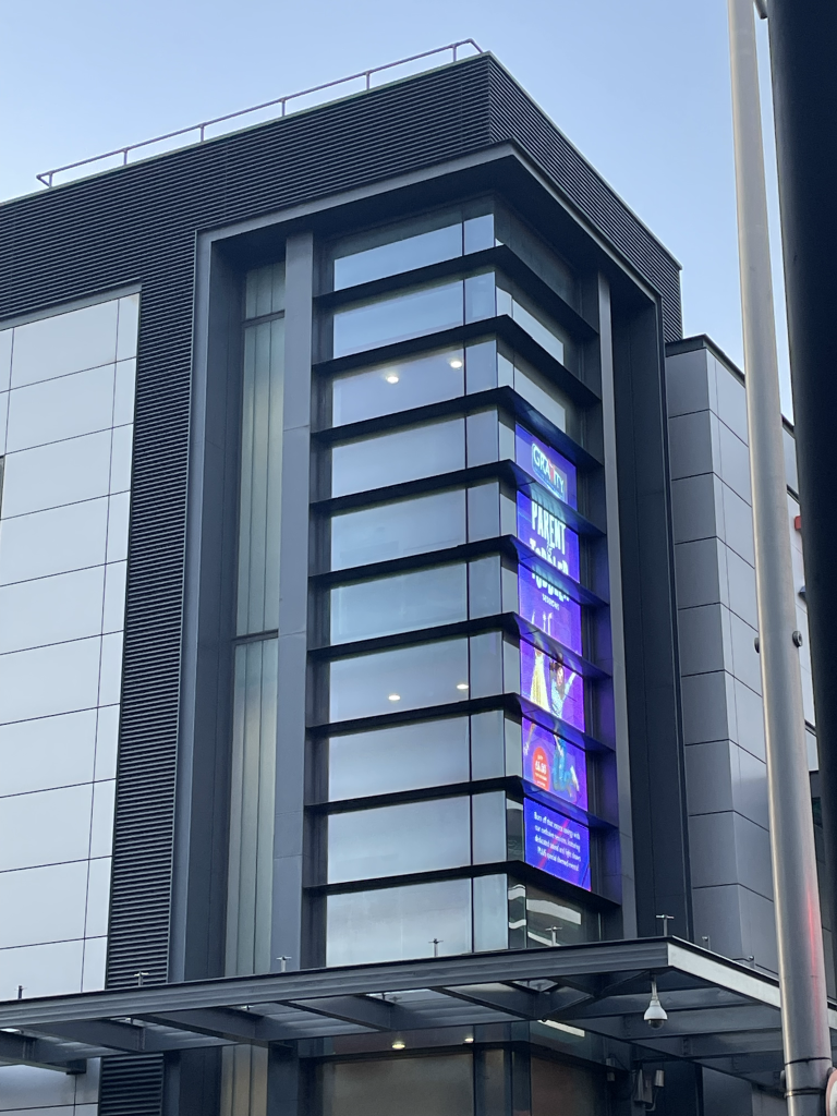
Above are some photos of buildings, these structures show examples of how grids can be used in architectural design. As well as the cubic structure of these buildings, the windows also create a grid layout with the same placement and size. The window frames also show very grid-like designs. Each of these four buildings show a modular grid within their structure.
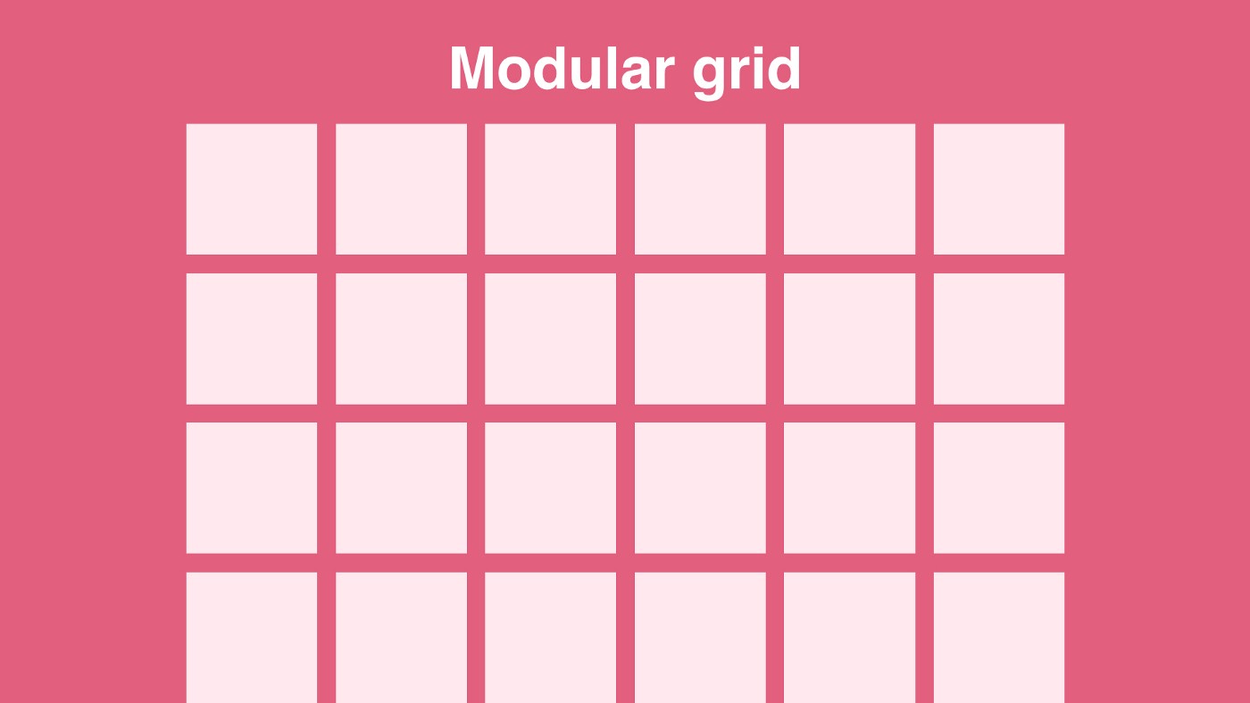
Figure 5: Example of Modular Grid (Galvan, 2021).Figure 6.Figure 7.
Figures six and seven are again showing how grids are used within architecture.
Figure 8.Figure 9.
Another grid to look at is the ‘rule of three’ grid. This is typically used within photography and above is an example of how this grid is used to make photos and designs look a lot cleaner and more professional. Grid layouts can normally be found within camera apps on smartphones for this reason. Another example of this grid can be seen below.
Figure 10.Figure 11.Figure 12.Figure 13.
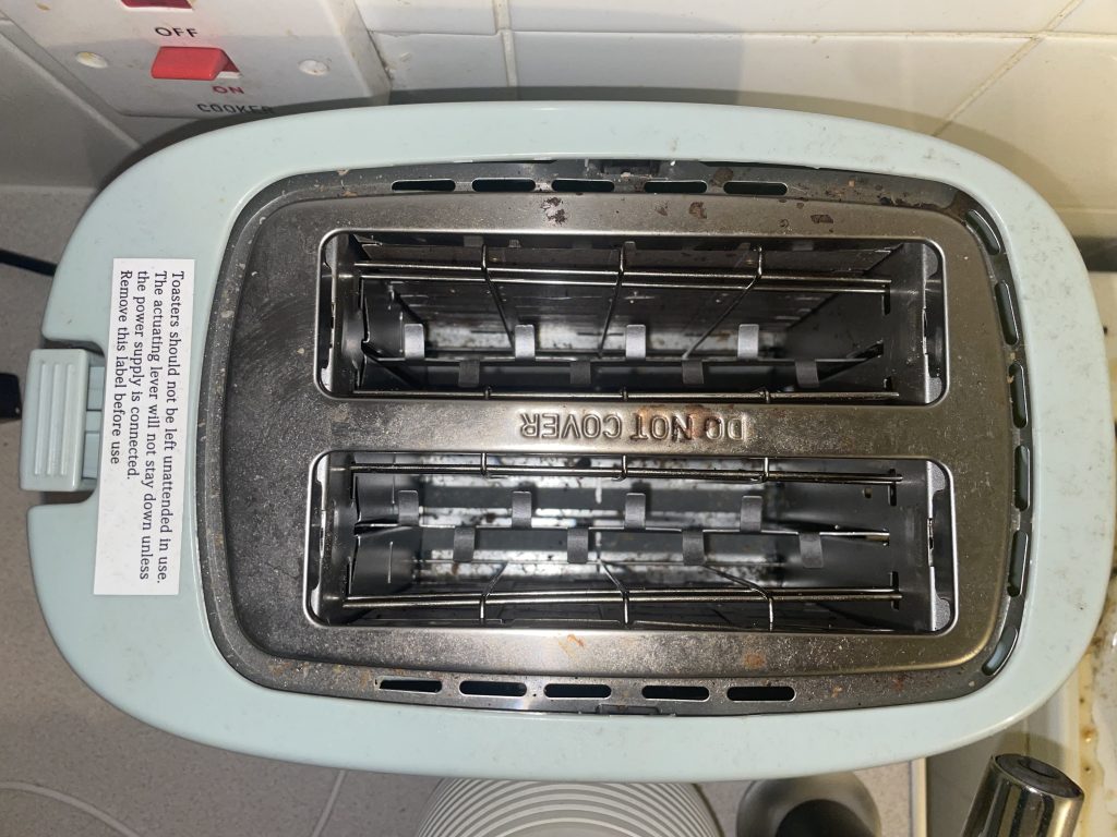
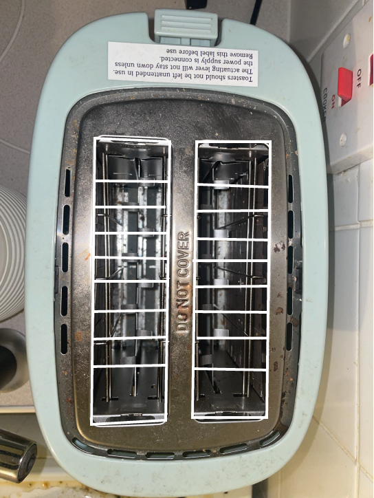
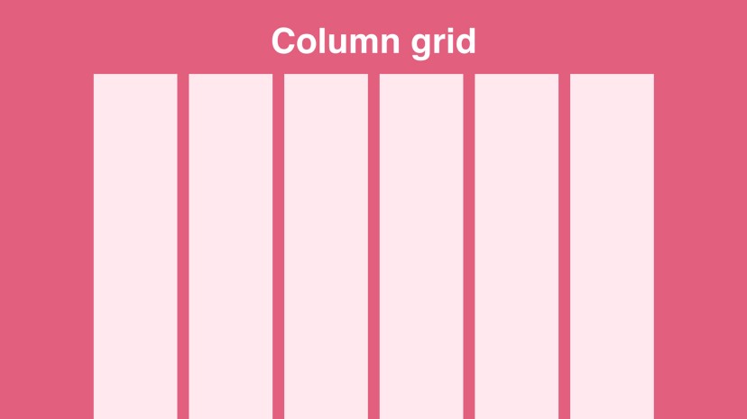
Grids and frames can also be found in everyday essentials, such as the toaster shown below. An example of a column grid can be seen within this toaster.
Figure 14Figure 15.Figure 16: An example of a column grid (Galvan, 2021).
Bibliography
Galvan, M. (2021) Getting started with grids in digital design. Medium. Available online: https://uxplanet.org/getting-started-with-grids-in-digital-design-7aa3bcc8c881 [Accessed 6 Oct. 2022].
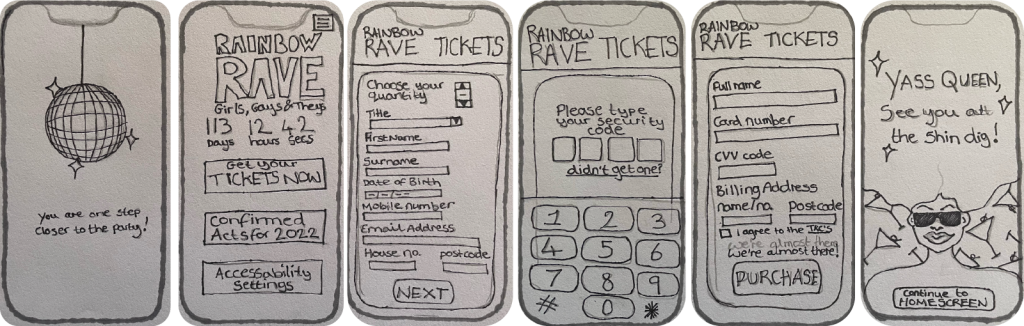
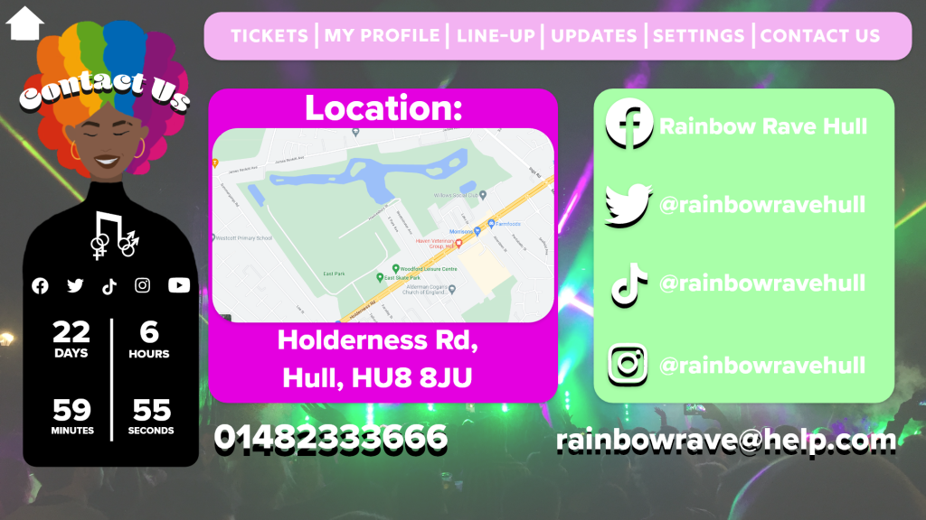
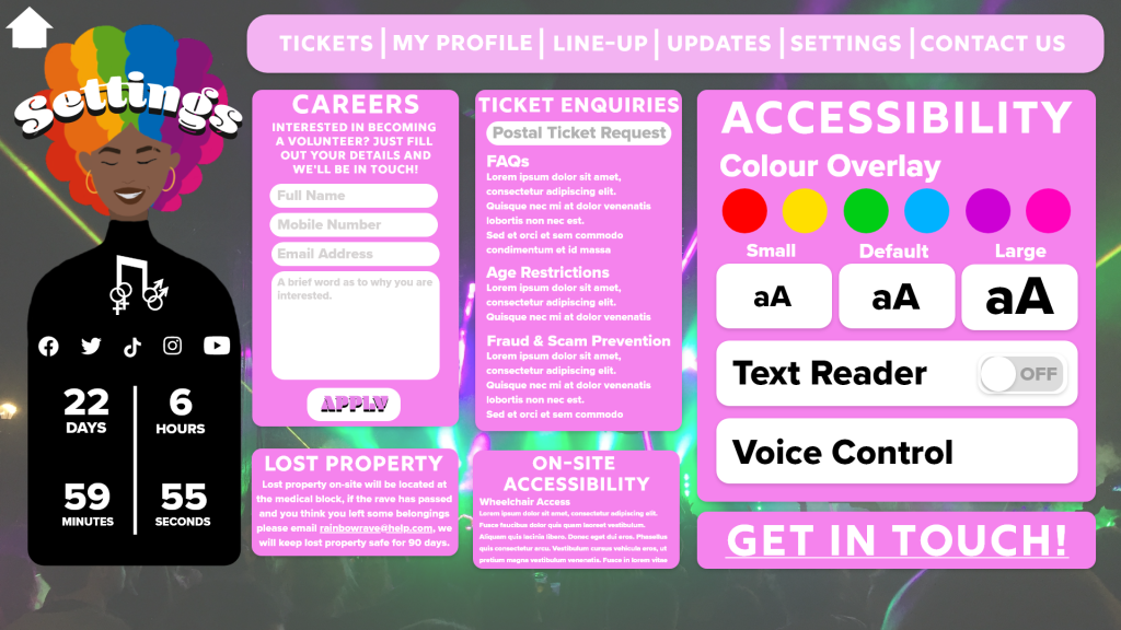
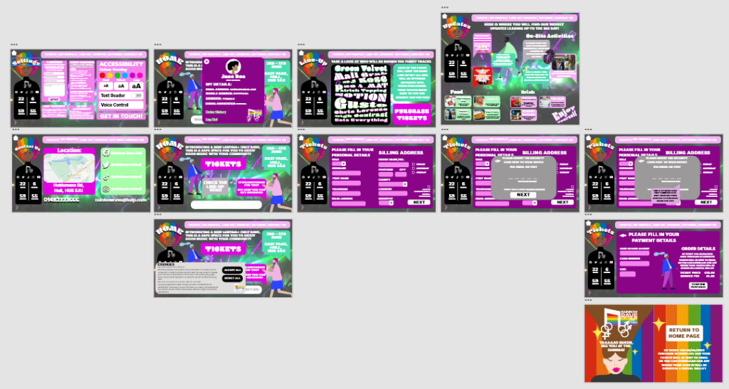
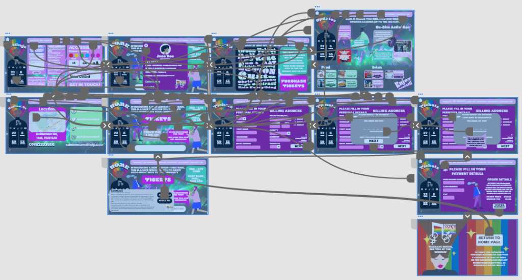
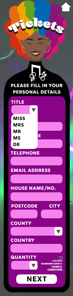
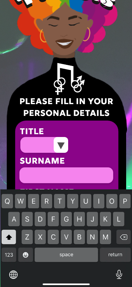
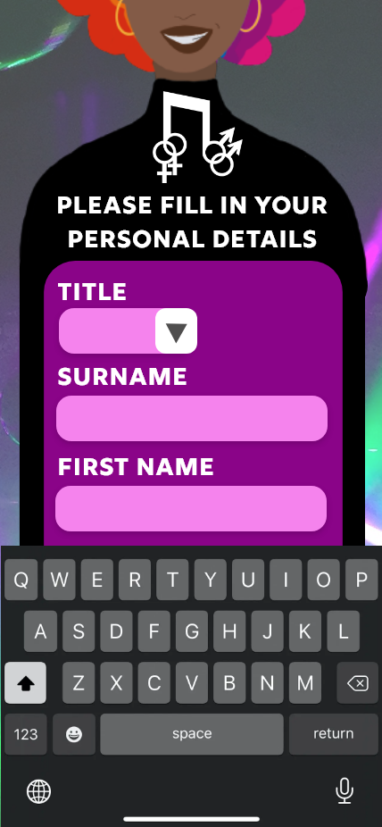
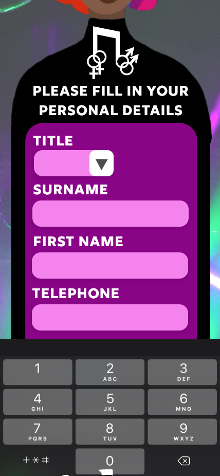
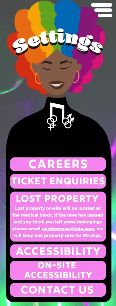
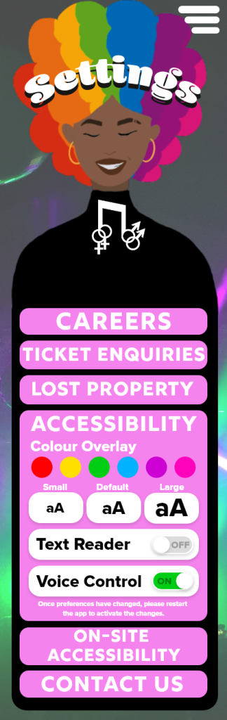
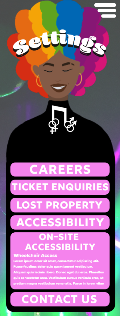
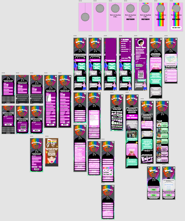
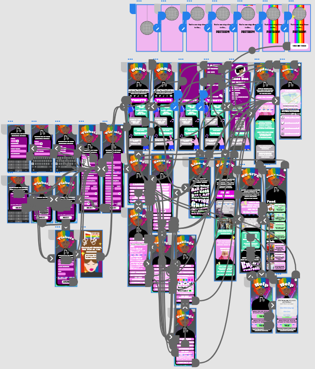
Home Pg.1Home Pg.2Profile PageTickets Pg.1 Tickets Pg.2Tickets Pg.3Tickets Pg.4Confirmation PageLine-Up PageUpdates PageContact Us PageSettings PageDesign Process ArtboardsPrototype Process Artboards
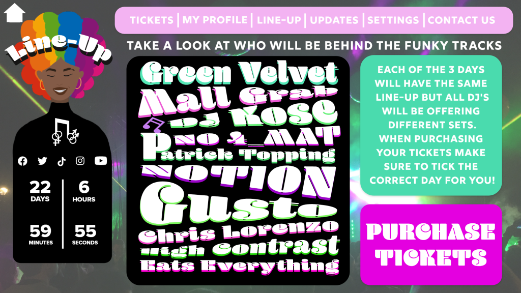
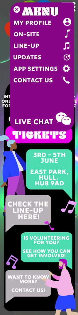
The web design consists of 12 artboards, showing each screen and their purposes. The website is designed to purchase tickets, see updates, view the line-up, and access your profile. The banner at the top of each screen is the menu, having the menu bannered across the screen makes it easily accessible and navigable as it will be available on every screen. After researching into other festival websites, the menu categories were chosen. Websites such as Leeds Festival (Leeds Festival Menu, n.d.) and Download Festival (Download Festival Menu, n.d.) show similar categories to the Rainbow Rave one, the idea to add an updates page came from the ‘News’ categories of the Leeds Festival menu and the Download Festival menu.
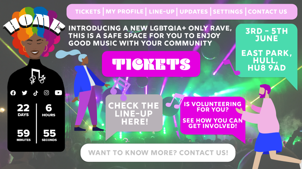
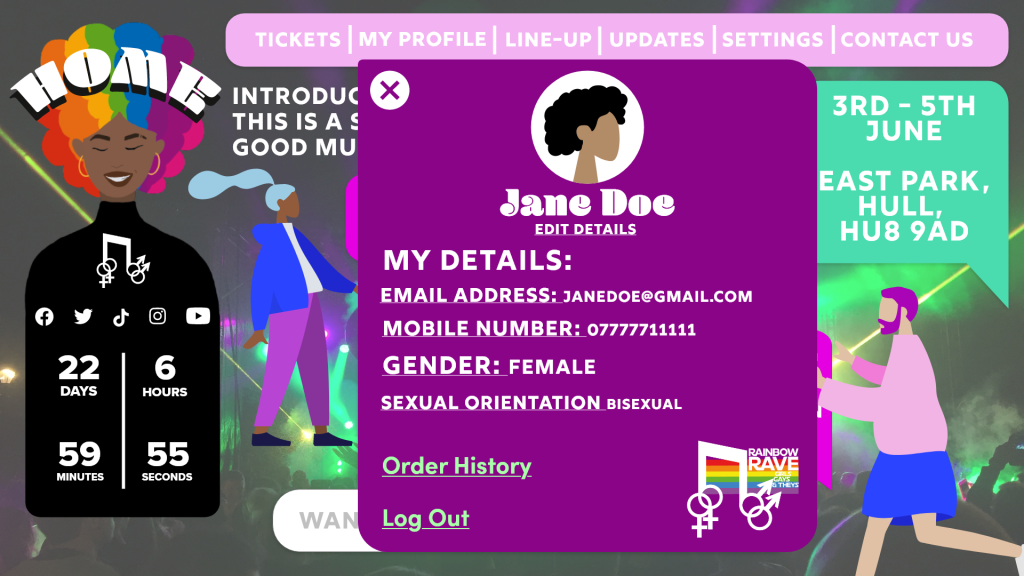
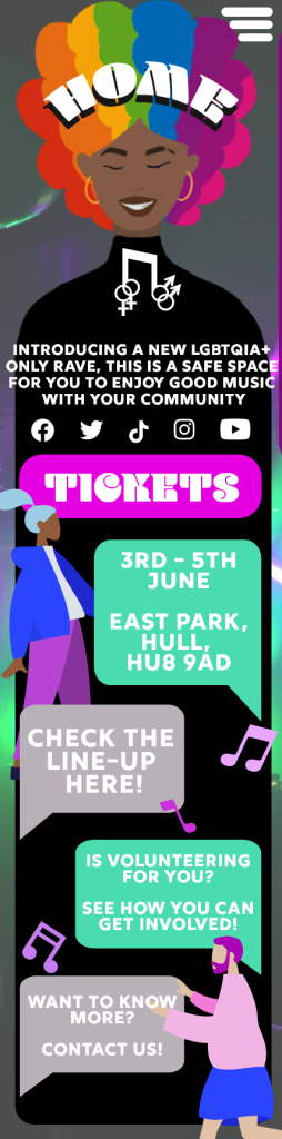
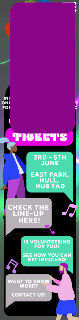
On the left-hand side of each screen is the Rainbow Rave logo, a countdown to the event and social media links have been incorporated into the logo, this reduces negative space within each page. The countdown also increases the user’s excitement but can also cause a sense of urgency to purchase tickets for the event.
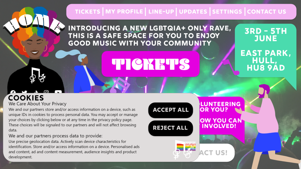
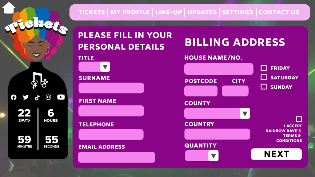
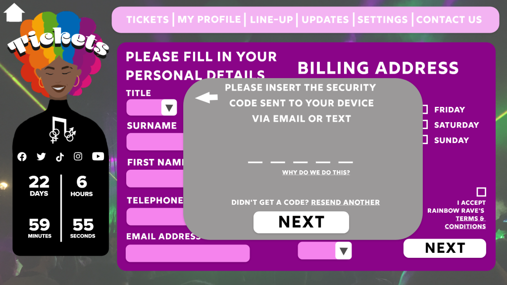
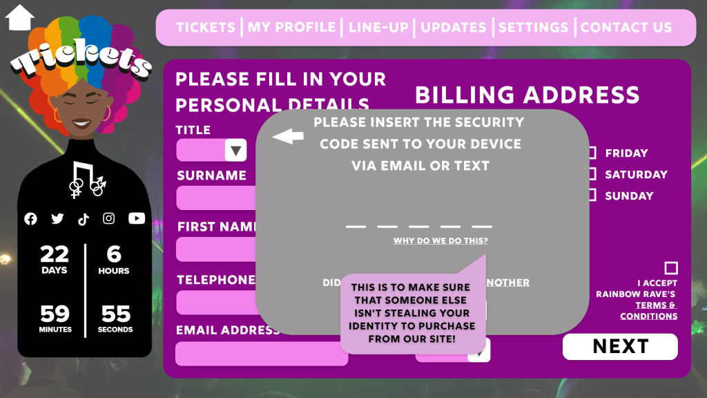
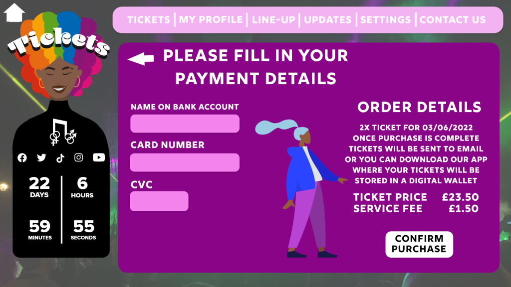
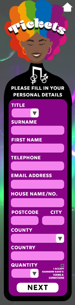
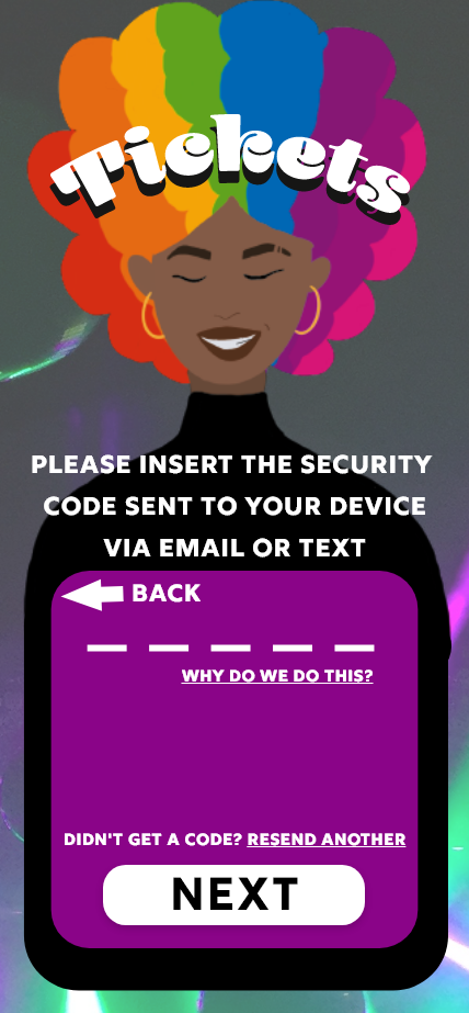
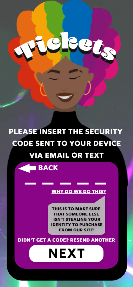
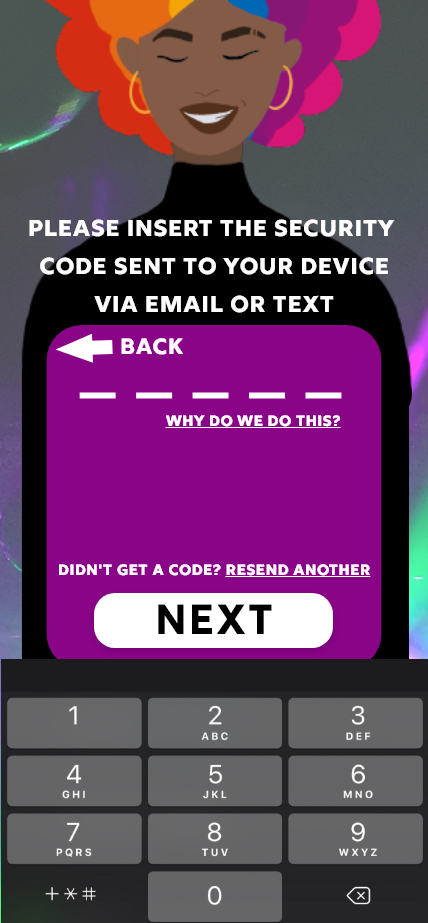
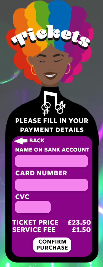
Smaller details have been added throughout the design to add to the level of professionalism that the design creates. One the first page you can see the cookies pop-up, these pop-ups can be seen on almost every website you use so including these adds a touch of realism to the design. Other smaller details that you may find are the terms and condition tick box on the personal details page of the ticket purchasing process, the option to find out why we ask for a security code and the option to request a new security code. These are all things you would find within websites that include the purchasing of an item.
Illustrations of people have been added throughout the website, this is to reduce the negative space. More information could have been added where there was negative space, but the idea was to keep the pages minimal, too much text could overwhelm or bore the user whereas the illustrations keep it looking minimal but also adds some youthfulness to the design.
The website design is accessible to all desktop and tablet screen sizes, blocks of text have been used so they can be easily moved when dealing with certain screen sizes but still look perfectly fine and still easily readable. Because of the use of negative space within the design, nothing will be affected when using smaller screen sizes because the negative small will decrease but the blocks of text will still be perfectly in tact.
Download Festival Menu. (n.d.) Download Festival. Available online: https://downloadfestival.co.uk/ [Accessed 22 May 2022].
Leeds Festival Menu. (n.d.) Leeds Festival. Available online: https://www.leedsfestival.com/ [Accessed 22 May 2022].
Asus Widescreen Monitor. (n.d.) Amazon. Available online: https://www.amazon.co.uk/Asus-Widescreen-Monitor-1920×1080-DVI-D/dp/B0058UUR6E [Accessed 22 May 2022].
IPhone 13 Screen. (n.d.) Apple. Available online: https://www.apple.com/uk/iphone-13/.
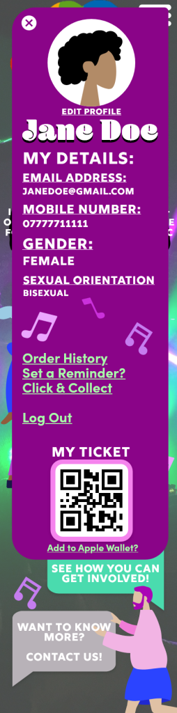
The companion app for the chosen festival ‘Rainbow Rave has many similarities to the web design but is focused more on the on-site purposes. Like the website design, the user will be able to purchase tickets, view the line-up, check for updates and access information about the event. The call-to-action will be the same process, but the app offers the storage of the digital ticket and the option to add it to the smartphone’s wallet, making it environmentally friendly and the entry process will be a lot quicker. The app design is based around Apple’s IOS, so the option is there to ‘add to Apple Wallet’.
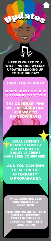
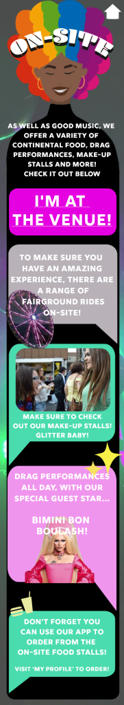
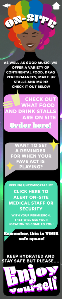
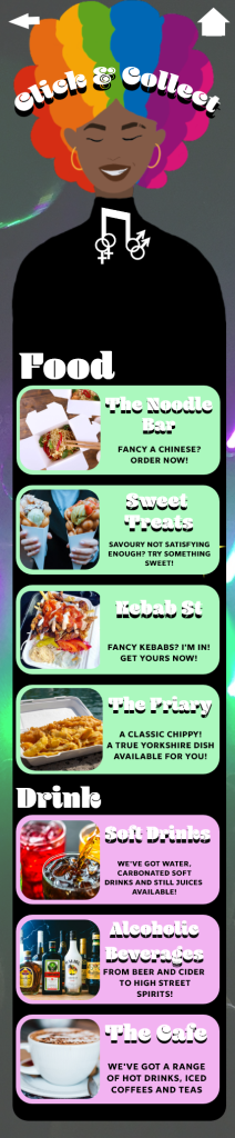
Another unique option that the companion app will offer is the chance to order food and drink while at the venue from the food stalls and bar tents, the user will then be notified to collect their order when it’s ready. This decreases queues and allows the festival goer to spend as much time enjoying the event and not worrying about a queuing system.
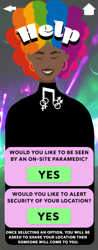
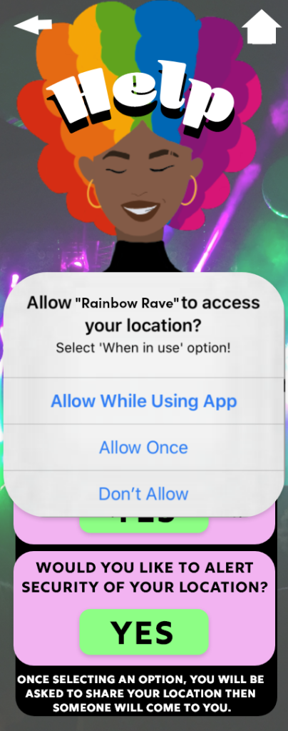
The user will also be offered to set reminders for when their favourite act is about to perform. There is also an option to alert on-site security or a medical professional of the user’s location within the venue for when the user seeks medical attention or is feeling uncomfortable because the main goal of the festival is to be a safe space for the LGBTQIA community.
Moving onto the design of the companion app, the flow of the design has been kept similar between each screen, all screens but the loading screen will include the same background image, the same primary colours, and the same primary fonts, this allows the design to remain simple and increases the memorabilia and navigation of the app.
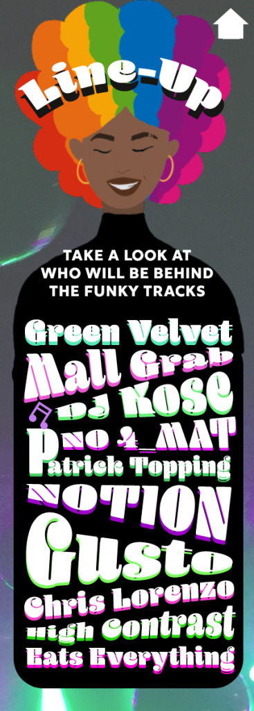
Blenny Black has been used for screen titles and subheadings throughout the artboards, but underlying colours have also been included to add a playful 3D effect to the titles. This can also be seen for the line-up to make it look more exciting and inviting. An icon plug-in has been used for the menu to show what that category will be about; this is to include those who are more visual learners and again increases memorabilia.
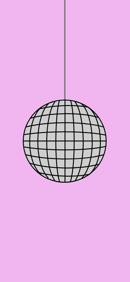
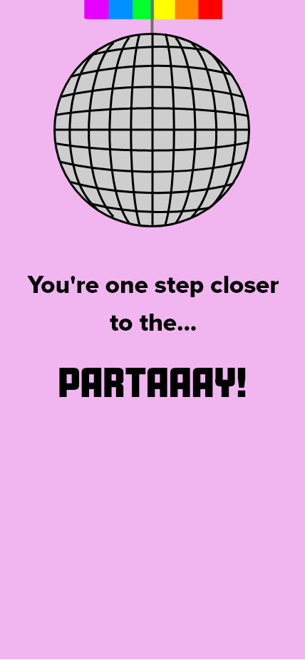
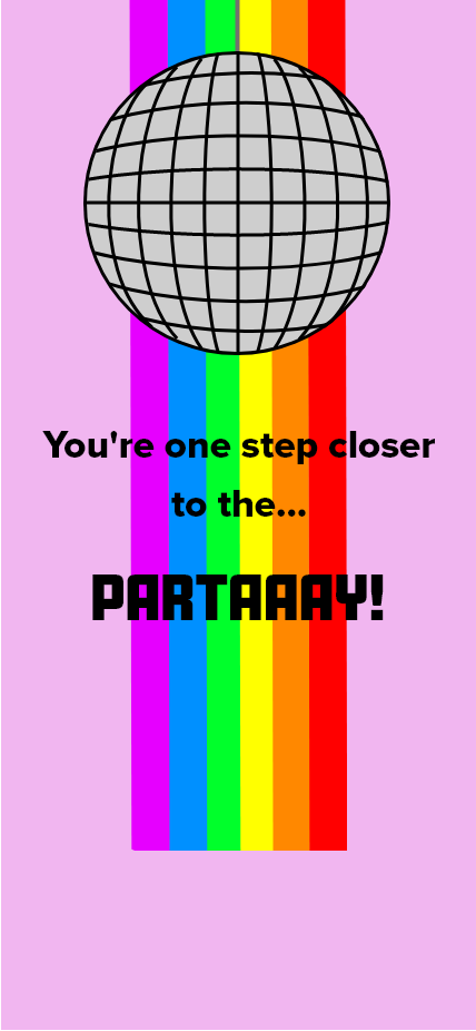
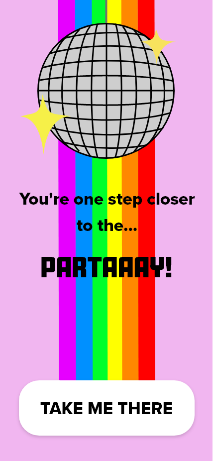
The start-up screen has been evolved into an animation of the disco ball rising and an LGBTQIA flag rolling down, the idea behind this was to again, create some excitement but to also keep the user occupied while the app is loading, plain loading screens may create more risk of the user leaving and not purchasing any tickets where as this colourful, fun animated screen will make the user want to join the party even more.
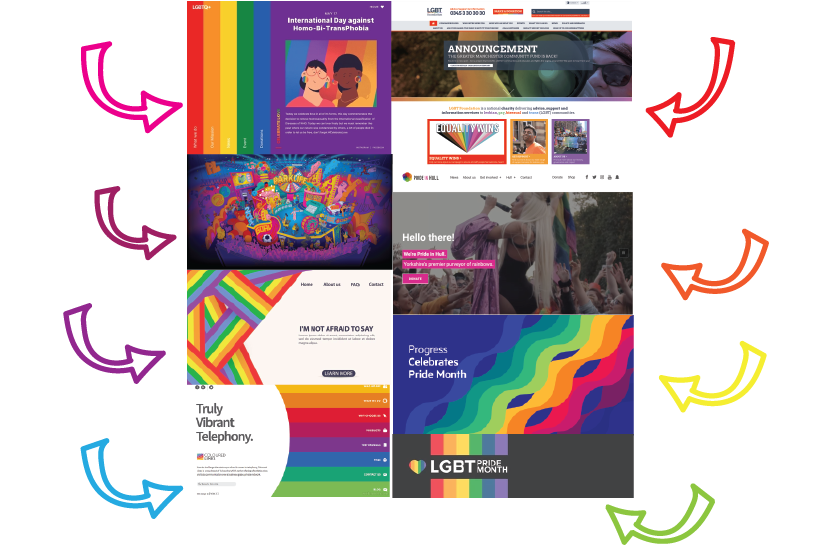
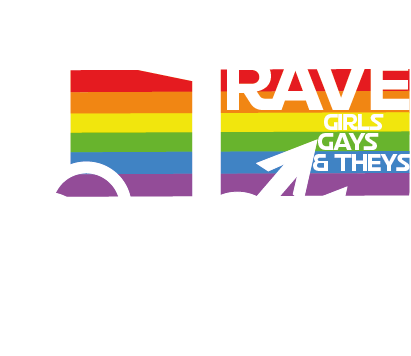
A mood board showing a selection of website designs that include the colours of the LGBTQIA flag. (Flamboyant Navigational Aids, n.d.), (Pride at Progress, n.d.), (Pride in Hull, n.d.), (Parklife, 2019)
The initial idea behind the Rainbow Rave design plan was to include the distinctive LGBTQIA flag colours which are the colours of the rainbow. After doing some research into other LGBTQIA themed websites, the designs are very minimal because of the rainbows featuring throughout. Most of these websites, shown on the mood board diagram above, have a plain white or dark coloured background with rainbows appearing through.
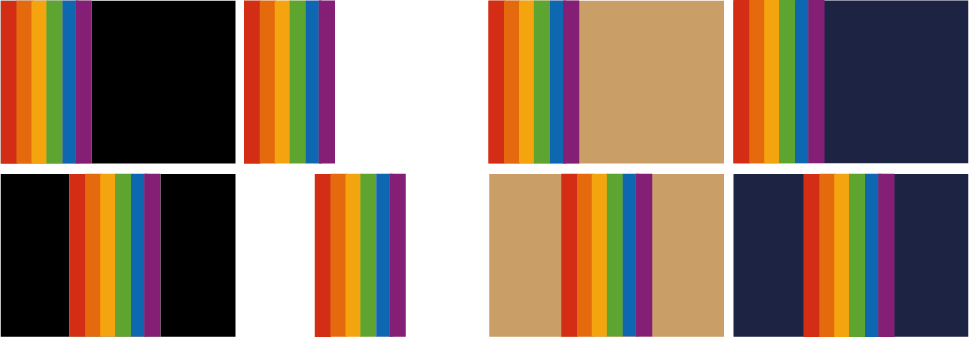
After doing some research it is said that neutral colours have the best effect when designing with the colours of the rainbow. ‘You can achieve some amazing visual effects by combining neutral colors with rainbow-influenced colors. The rainbow colors balance the neutral colors providing a magical touch to the design. Graphic designers tend to use the effect in dark designs to give it a special hypnotic charm.’ (Jansen, 2021). Below are some designs testing which backgrounds work best with rainbows.
The colours of the rainbow against a black, white, beige and navy background. Included are some variations of the placement of the rainbow strip.
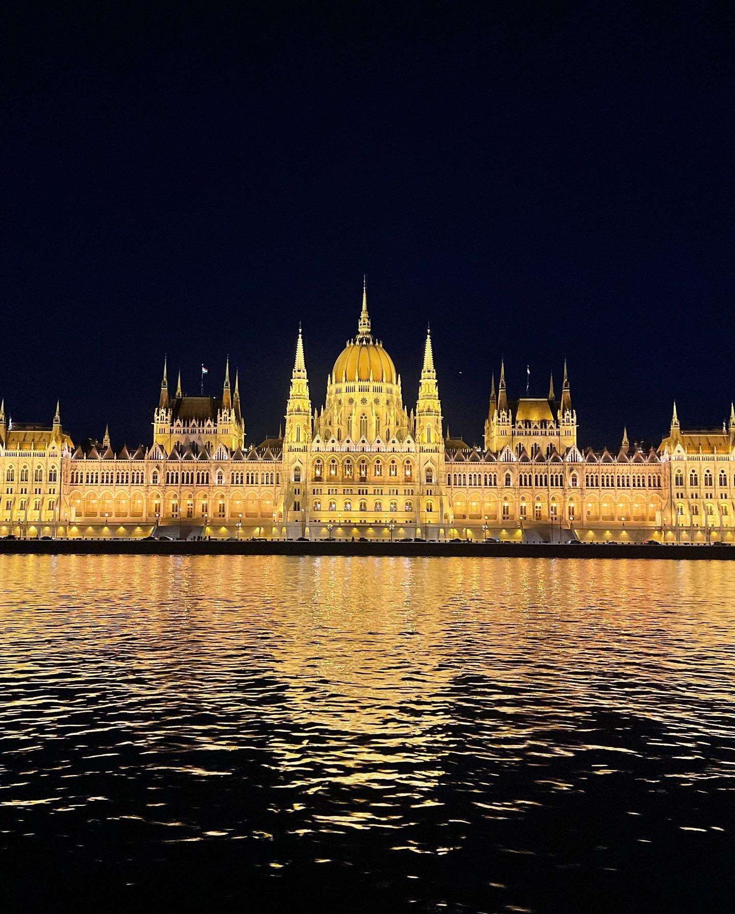
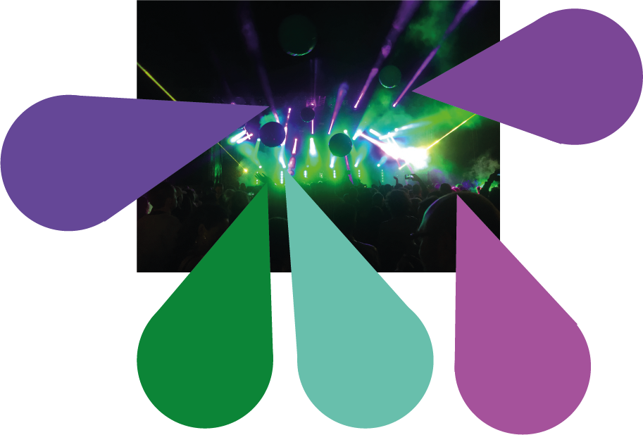
The final decision was to use an original image as the background and use the colour palette from that photo for the app design, shown below there is the original photo and samples of those colours taken from the photo.
Original Image used for the background of the app and web design, including some chosen colour samples to use within the design.
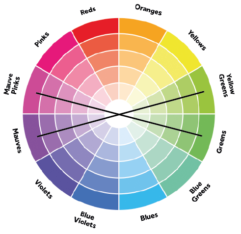
After looking into this colour combination, it was decided that the design’s colour palette would lean more towards the complimentary colours of the colour wheel, as seen below the yellow toned greens compliment the mauve tones and the greens compliment the pink toned mauves. This was the final colour palette chosen for the app and web design.
Colour wheel with added diagram to show the complimentary colours of the greens and purples.
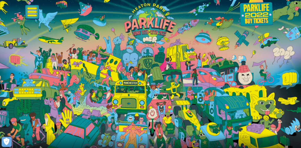
Another goal for the initial design was to include original illustrations. A lot of inspiration came from the Parklife web design with chaotic illustrations, the visual designs bring a lot of excitement to the customers and shows there will be a lot happening just from the first page. Sketched illustrations also add some personality to the design and can create a closer relationship with the stakeholders.
Parklife web design, demonstrating the use of illustrations throughout the first screen (Parklife, 2019).
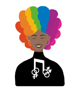
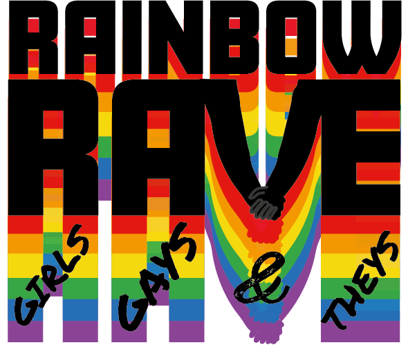
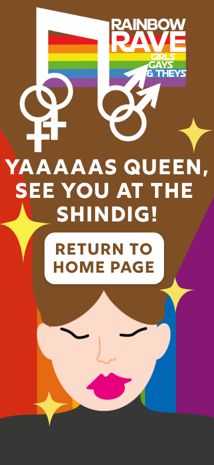
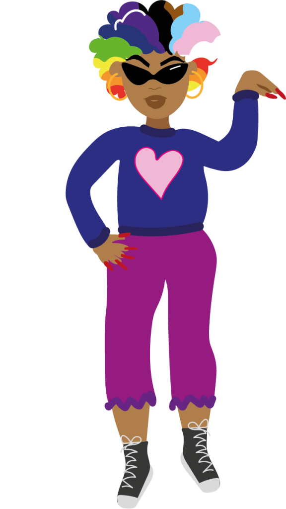
The illustration on the left is a rejected design for the Rainbow Rave logo, there is no relationship between the colours, the design is quite complicated and there seems to be too much happening for it to become a logo. The design in the centre was a completely different concept, it was decided to combine both music with LGBTQIA aspects, thus turning it into a conceptual design. The slogan ‘Girls, Gays and They’s’ has been added back to the design, this is a simple, memorable design. The logo on the left is another variation for the middle concept, it was decided to only include the top half of the woman in black clothing and brightly rainbow coloured hair. The text has been removed, simplifying the design, this creates less chaos with the chosen colour palette and background image.
First design for the Rainbow Rave logo.Simplified design for the Rainbow Rave logo.A combination of the two first logo design but with an improved illustration of the first idea.
Flamboyant Navigational Aids. (n.d.) DesignMantic. Available online: https://www.designmantic.com/blog/wp-content/uploads/2016/09/Flamboyant-Navigational-aids.jpg [Accessed 21 May 2022].
Jansen, M. (2021) 14 Ways to Use the 7 Colors of the Rainbow In Graphic Design. DesignBro. Available online: https://designbro.com/blog/inspiration/7-colors-of-rainbow-graphic-design/ [Accessed 20 May 2022].
Parklife. (2019). Parklife 2019. [online] Available at: https://parklife.uk.com/ [Accessed 2 Mar. 2022].
Pride at Progress. (n.d.) Progress. Available online: https://www.progress.com/blogs/pride-progress-promoting-inclusivity-june-beyond [Accessed 21 May 2022].
Pride in Hull. (n.d.) Pride in Hull. Available online: https://prideinhull.co.uk/ [Accessed 21 May 2022].
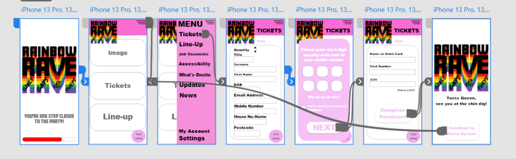
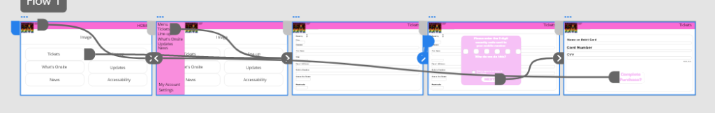
Above is a reminder of the first few steps of the design development towards the Rainbow Rave App and Website, these can be seen in the Development Research Blog. These are low-fidelity and mid-fidelity prototype of the call-to action process, from there the progress has developed and increased.
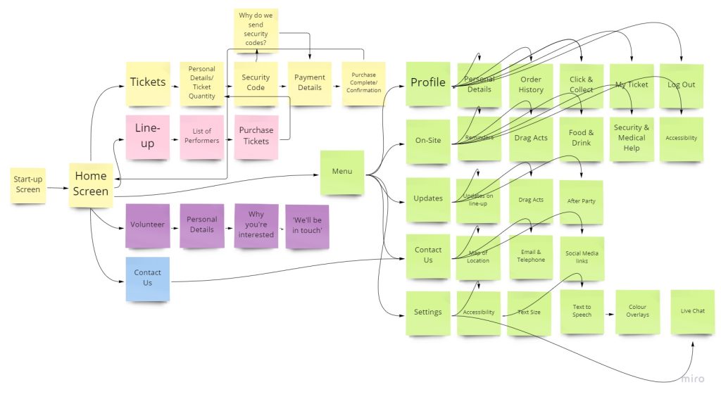
The two images above show further development progress for the app design, as you can see the prototypes now include the entire user interface for the final app design. The digital mind map has been coloured co-ordinated to show the categories and sub-categories. With the mind-map planning the artboards could be progressed further but smaller details like the logo, colour palette and the use of fonts needed to be explored further. As you can see above there is a logo for Rainbow Rave, this was the very first logo developed but it didn’t feel complete, so more logos were designed and evolved to create the ones you see in post 3.
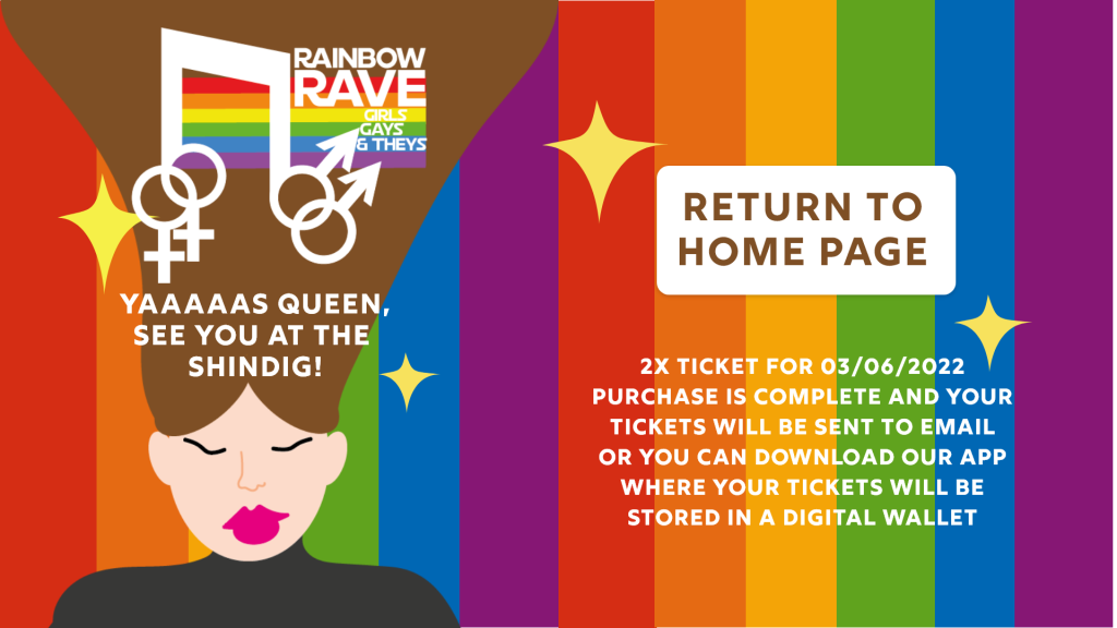
Once the logo was developed, the design was starting to come together. The idea was to use an original image from a previous festival and decipher the colour palette from that image which resulted in the purple and green tones you see. It was then decided to use text bubbles as informative blocks of text, this was to attract the younger generation who are more likely to use technology and send text messages between friends. The idea of the design was to feel like a conversation with a friend, so slang has been used throughout the designs such as ‘yaaaas queen’ which is a phrase that can be heard within the LGBTQIA community. The goal was to make the user feel as comfortable as possible while exploring the app or website. Keeping the user calm while viewing the app or website increases the chances of ticket purchasing.
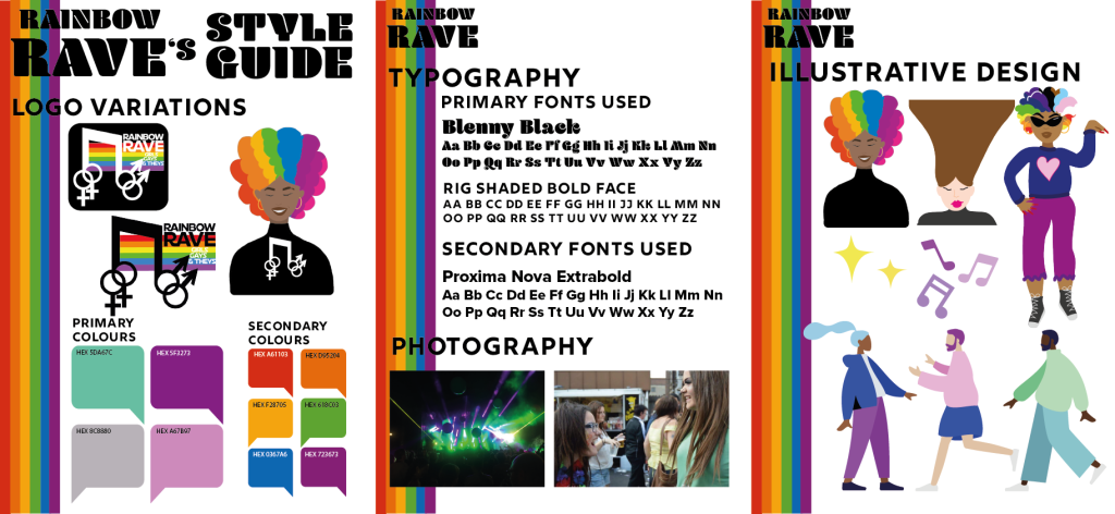
This is the style guide for rainbow rave, showing the colours, typography and photography used. Style guides are used to show designers what certain aspects are used within company’s web/app designs. The style guide also needs to be designed and look professional for the company’s benefit.
The first page of the style guide shows the logo variations and the colours used throughout the app and web design. As you can see the logo can be used in three forms, the first and second being a black and white version of the finalised logo and the third is a separate design with no text included. The idea behind using a logo with no text is to make it easier for the memorabilia of the company. ‘Your logo is important to your business because it communicates ownership, quality, and values. It’s imprinted on your products, your business card, website, social media, and most importantly, in the minds of your clients.’ (Why A Good Logo Is Important For Your Small Business › Design Powers, n.d.). On the bottom half of the first page, it shows the primary and secondary colours used within the app and web design. The primary colours are the main, most-used colours throughout the design, for example, the headings, sub-headings, borders etc. The secondary colours are the smaller fragments of that colour used, in this concept it’s the rainbow colours which can be seen on the loading screen, the ticket confirmation screen and the logo.
Page 2 of the style guide takes you through the typography and photography used in the designs. Like the colours, the app and web have primary and secondary fonts used. The most-used fonts (primary) are again, used for headings and sub-headings but also informative text. The secondary fonts can be used for pop-ups, drop-down options, and less informative text. The photography portion of the page shows the original images used in the designs; the left image can be seen as the background design.
The third and final page shows illustrative designs that have been used, the logo can again be seen within this page as well a rejected logo design, small decorative illustrations have also been added to show that they do make a difference in visual design. The bottom section of this page includes pre-made human illustrations called ‘Humaaans’ by Pablo Stanley, this is a plug-in feature for Adobe XD. The pre-made illustrations have been altered slightly to match the theme of the colour palette and to show certain personas. Using these original and pre-made illustrations add personality to the design, it can also increase attention to the younger generation because it is visually pleasing to view.
Why A Good Logo Is Important For Your Small Business › Design Powers. (n.d.) Design Powers. Available online: https://www.designpowers.com/blog/why-a-good-logo-is-important-for-your-small-business [Accessed 21 May 2022].
Collage’s can be created using mixed media, ranging from photographs, typography, fabrics, pieces of paper and other materials. These are then arranged and stuck down on a supporting surface.
“For me, a big part of this work is about technique. It’s about figuring out how to manipulate your materials in such a way that it can get really thick and layered and contain the colours.” – Raquel Van Haver (Artland Magazine, 2019).
Artwork by Raquel Van Haver – ‘Bogota, Columbia, B. 1989’.
This may look like an ordinary oil painting on a textured surface but this is actually one of Van Haver’s collages. Although this has been created using layers of paint, Van Haver has also included materials like tar, resin, hair, cigarettes, party streamers, balloons and jewellery. Throughout her work, Van Haver portrays the people that are outcasts to society, exploring race and identity (Jack Bell Gallery, n.d.).
Artwork by Raquel Van Haver.
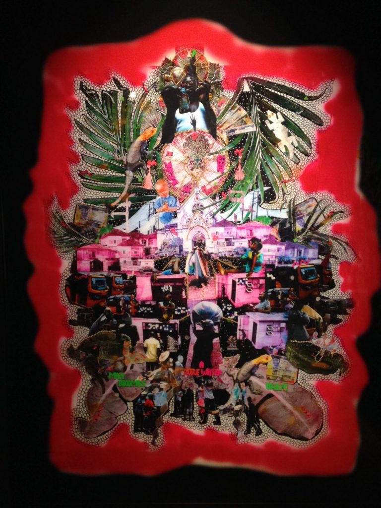
This is another collage by Raquel Van Haver. While visiting London, Amsterdam, Nigeria and South America, Van Haver got to know people who she would live with and develop and understanding of their day-to-day life, she would then photograph these people and use them in her studies towards her final paintings, the artwork you see above is one of her studies. In these studies, she weaves together the photographs she’s taken of the people and places she has come across on her daily travels (Artland Magazine, 2019).
Part 2: Cristiana Couceiro
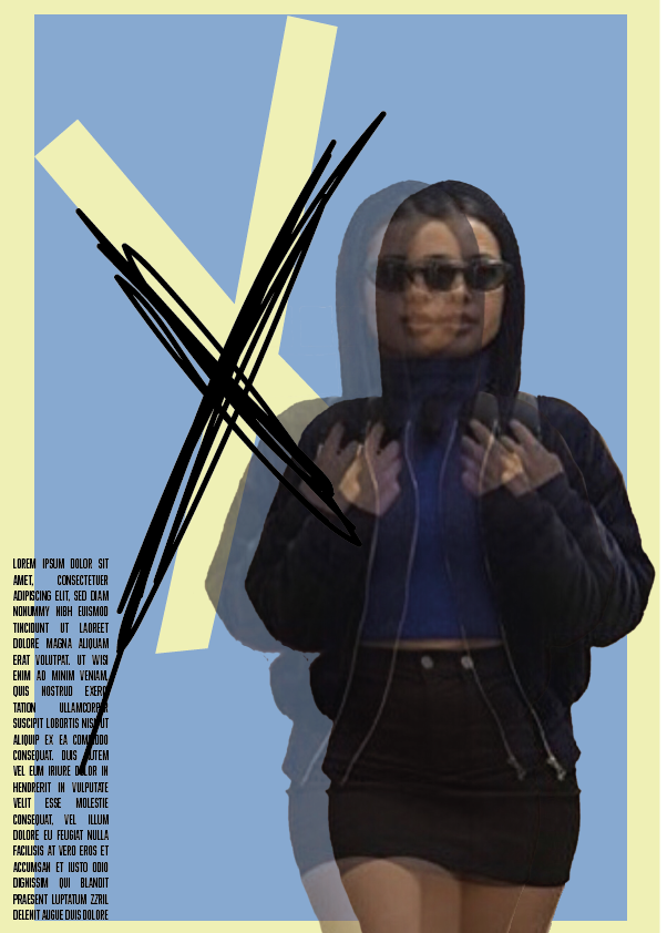
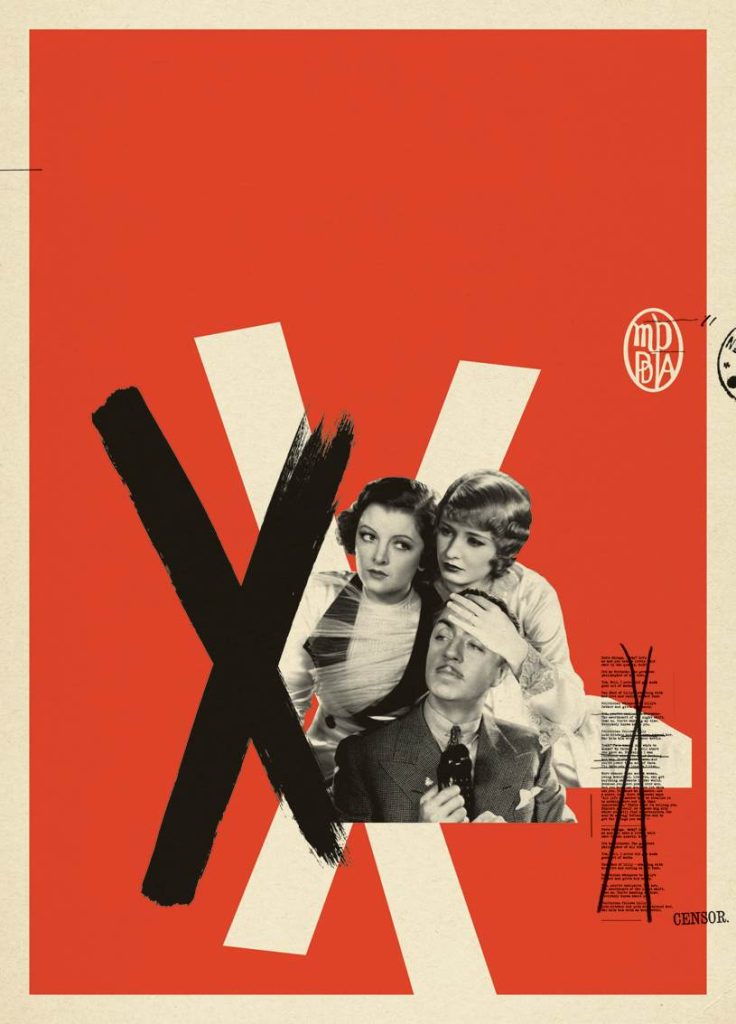
My collage attempt inspired by Cristiana Couceiro (Alexa Demie, n.d.).Cristiana Couceiro’s artwork – Unknown name (Cristiana Couceiro, n.d.).
Bibliography
Alexa Demie. (n.d.) Star Style. Available online: http://www.starstyle.com/alexa-demie-euphoria-bonnie-clyde-sp565985/ [Accessed 23 May 2022].
Artland Magazine. (2019). 5 Contemporary Collage Artists Adding New Layers. [online] Available at: https://magazine.artland.com/5-contemporary-collage-artists/ [Accessed 10 Feb. 2022].
Cristiana Couceiro. (n.d.) Cristiana Couceiro. Available online: https://cristianacouceiro.com/ [Accessed 23 May 2022].
Jack Bell Gallery. (n.d.). Raquel van Haver – Overview. [online] Available at: https://www.jackbellgallery.com/artists/66-raquel-van-haver/ [Accessed 10 Feb. 2022].
