Categories
Development Log

Dev Blog 10 – AI and manipulating Images

Artificial intelligence is used to create unique image manipulation. No two images are the same. AI is the simulation of human intelligence created by computer systems. Images can be created when prompted with key words or images.

An example of how AI works is a website called Nightcafe (https://creator.nightcafe.studio/), I input the key words ‘purity’ and ‘pollution’ into the AI generator.

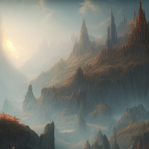
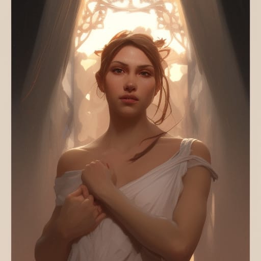
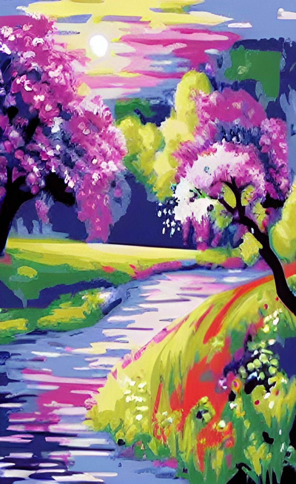
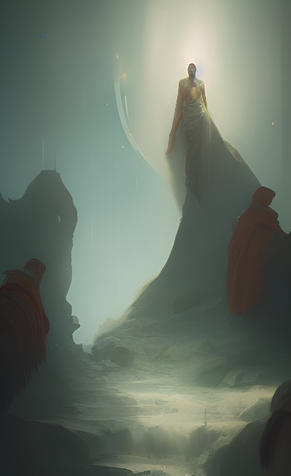
I then downloaded the mobile app ‘Dream’ by Wombo and experimented with the AI styles. These are the images created when using the key word ‘Purity’.

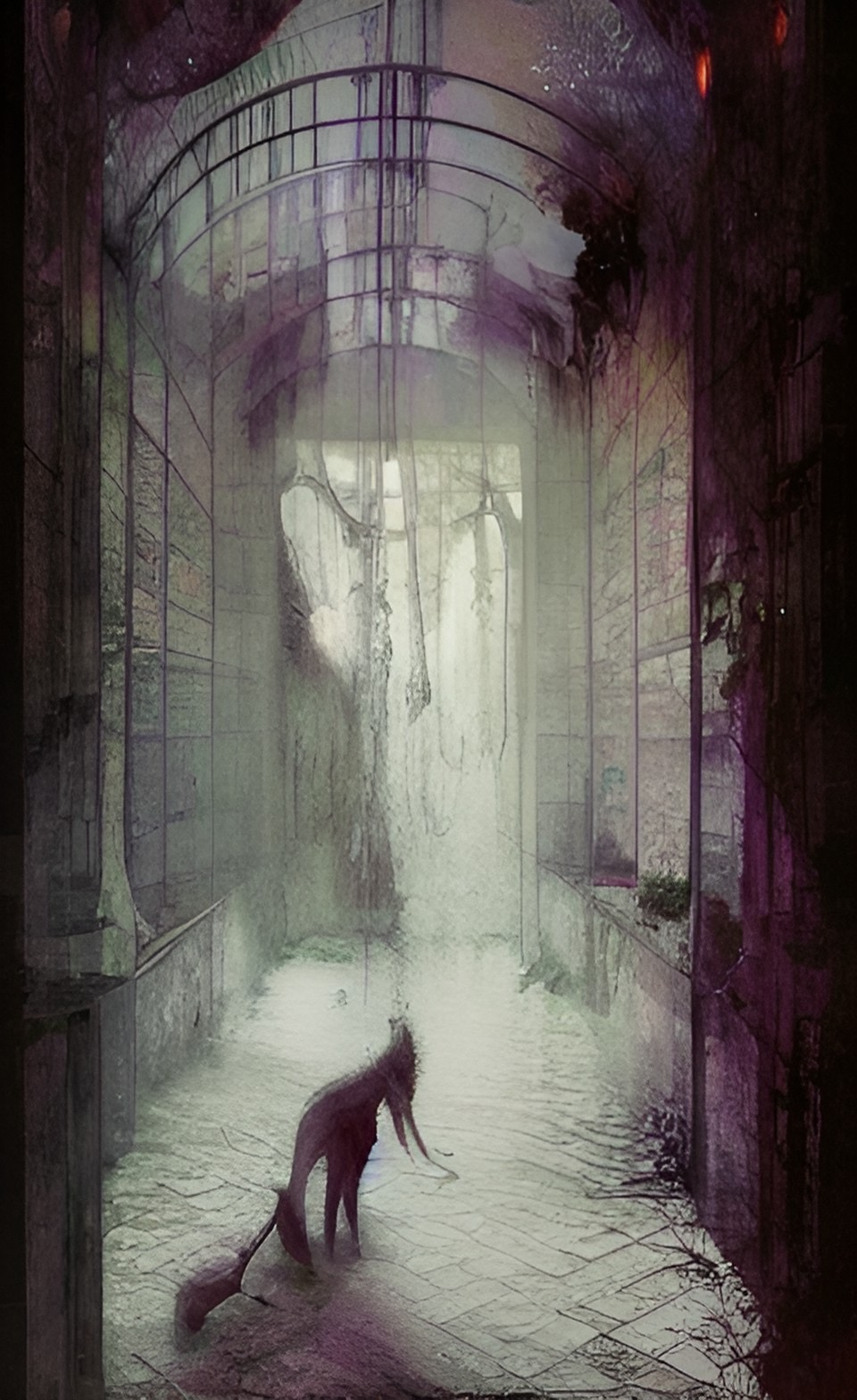
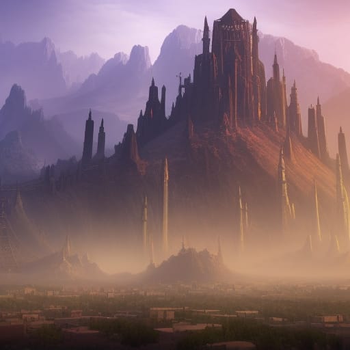
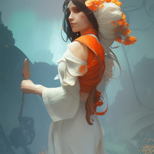
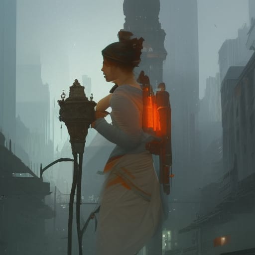
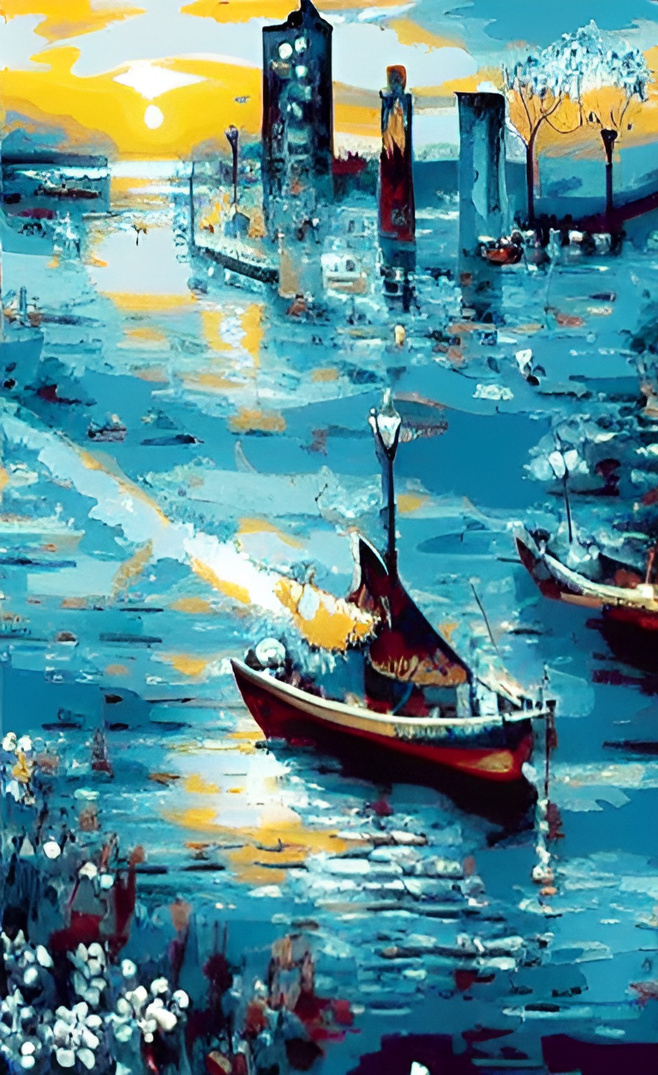
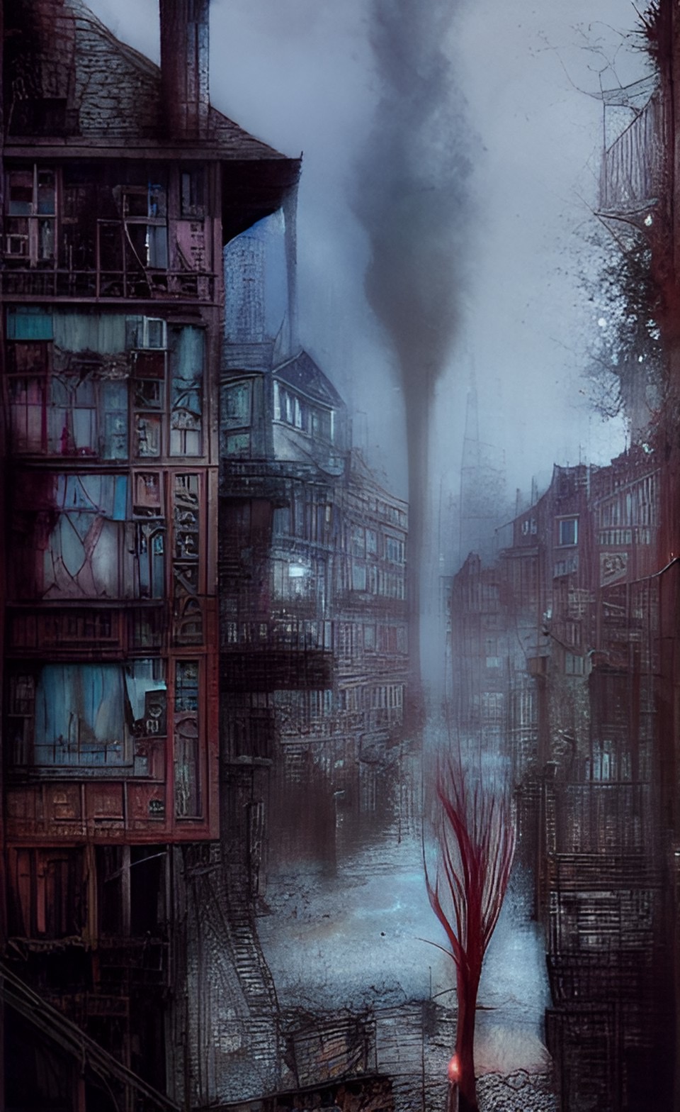
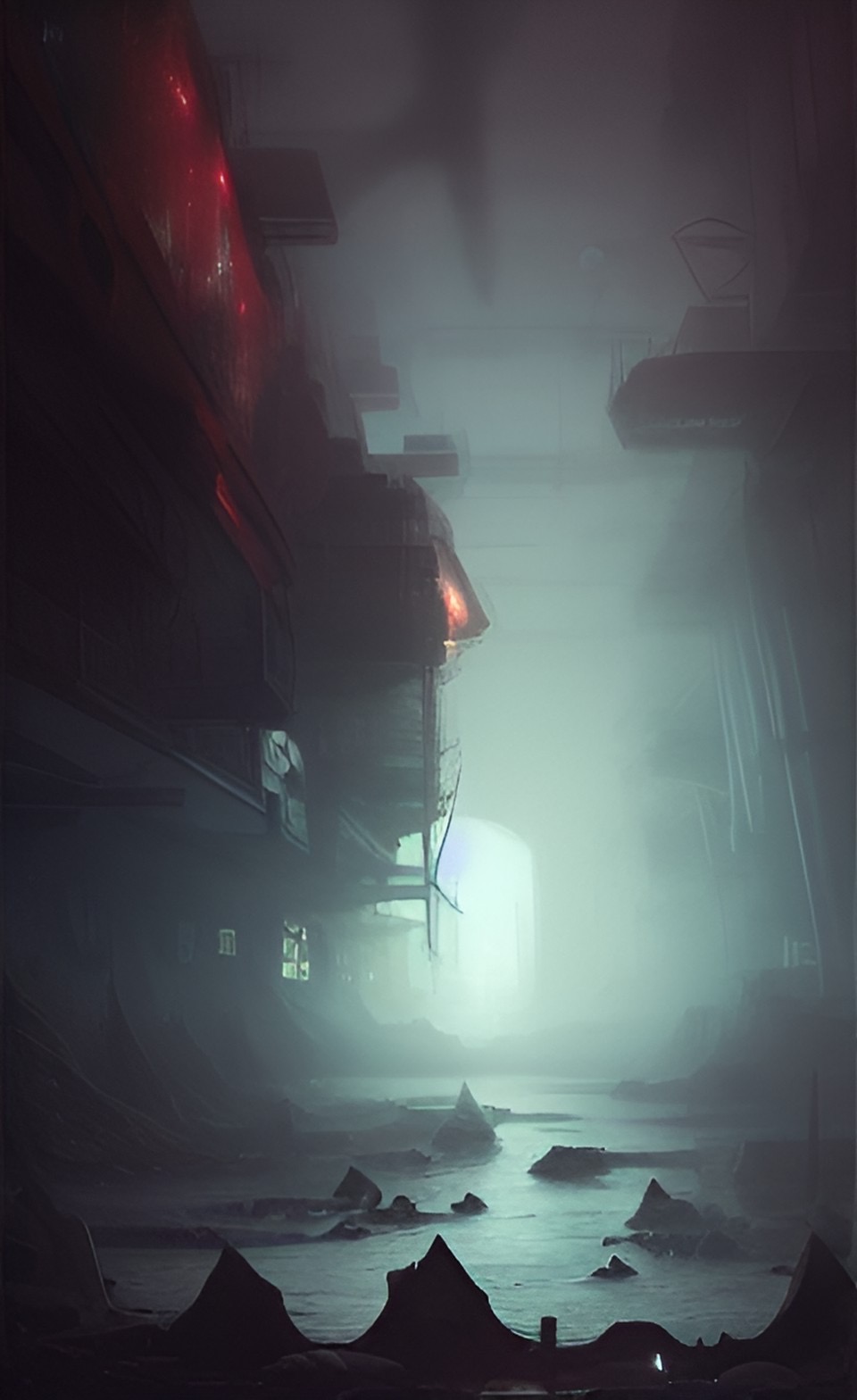
And these were the image results when I used the key word ‘Pollution’.

The series of AI images created using the word ‘purity’ all look very clean and minimal, which does imply the sense of purity without seeing the words used to create the images.

The gallery showing the images created using the word ‘pollution’ all have a common theme with blue and grey tones. All images look very busy and chaotic. A cold feeling is presented when viewing these images.

Figure 13: Screen recording showing the AI manipulated images being used for web design in Elementor.

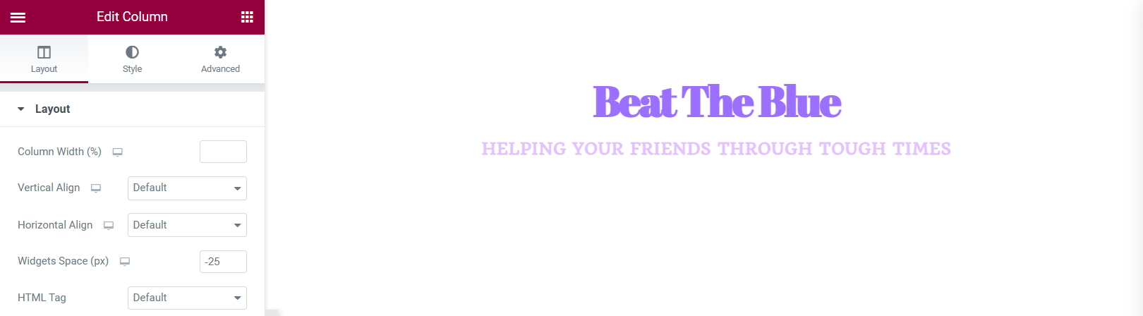
When using these images in Elementor, I created a hover effect, as instructed. The first presented images in all three widgets are the purity images from gallery 4 and when you hover over them with a cursor, it displays the AI manipulated images from gallery 5.

References

🖼 AI Art Generator, Photo to Painting App. (n.d.) NightCafe Creator. Available online: https://creator.nightcafe.studio/ [Accessed 22 Jan. 2023].

Definition of purity | Dictionary.com. (n.d.) www.dictionary.com. Available online: https://www.dictionary.com/browse/purity [Accessed 22 Jan. 2023].

Dream by WOMBO. (n.d.) dream.ai. Available online: https://dream.ai/ [Accessed 22 Jan. 2023].

the definition of pollution. (2018) www.dictionary.com. Available online: https://www.dictionary.com/browse/pollution [Accessed 22 Jan. 2023].

Categories
Development Log

Dev Log 12 – Social Media Campaign

Campaigns tend to use marketing techniques across social media platforms to promote their products or services. It’s becoming very popular with the growth of social media and technology.

I decided to take a look at an event of cultural significance, Pride in Hull. Pride in Hull do already have accounts across social media platforms but after doing some research, I noticed that they are no longer active at the moment, they stopped posting when 2020’s pride had occurred.

As you can see, their Instagram page has become very quiet. Pride in Hull is an event that occurs every year so posting on their social media’s actively can increase the interest of their event.

I decided to redesign their Instagram and Facebook page to show how they can become more active.

I decided to redesign their Instagram page, using edited images. I decided to introduce an ongoing theme to make the Instagram page look more aesthetically pleasing to view. The rainbow border used across their images gives more personality into the page. Posting an image like this weekly can increase their page views and interaction to the actual event they host annually.

Like the Instagram redesign, this Facebook design shows the activeness they could achieve on their social media platforms. Again, using the bordered images creates an aesthetic and also creates a sense of memorability.

To further develop the redesign of their social media platforms, the artistic rainbow border could be created as a photo filter which users and event attenders could use to show their experience at the event, this would also create more profile interaction.

Figure 15: Reworked design for the Pride in Hull logo, adjusted to fit the social media profile pictures.

References

Freepik (2019) Freepik – Free Graphic resources for everyone. Freepik. Available online: https://www.freepik.com/ [Accessed 23 Jan. 2023].

Instagram Redesign – Free XD Resource. (2020) Adobe XD Elements. Available online: https://adobexdelements.com/instagram-redesign-2/ [Accessed 23 Jan. 2023].

Social Media Feed Mockup and Templates. (2022) Xd File. Available online: https://xdfile.com/social-media-feed-mockup-and-templates/ [Accessed 23 Jan. 2023].

Categories
PSAD:WT

EX5 – Design testing and evaluating

Video review of my site being tested.

The 8 tasks I had given myself were:
1. Find out more about the designer
2. Locate a post from Year 1
3. Locate the references
4. Expand an image
5. Locate the caption to an image
6. Test a video within the site
7. Save a media file
8. Locate the Get in contact

The tasks were achieved except no.8, their was nowhere within the site that had ‘get in touch’ information, this evaluation was taken into account and information on how to get in touch with the designer has now been added to the bottom of the home page.

Screenshot of the home page with added ‘get in touch’ details including an email, phone number and location of the designer.
Categories
PSAD:WT

EX4 – Design for Live broadcasting using OBS

Final webinar video showing an example on how to create an animation in Adobe XD.
Video of the animated logo before being trimmed and place at the beginning and ending of the final video. This animation was used in Scene 1 and 5.
Selfie cam footage used in Scene 2.
Closing selfie cam footage used in Scene 4.

For the webinar video, five scenes were created using OBS Live Broadcasting. Scene 1 and 5 show the logo animations, scene 2 and 4 show selfie cam footage and scene 3 shows the OBS desktop recording of the animation example.

Once the broadcast was complete the video was then put into a video editing app where the background music was added, the background music adds some playfulness to the video and keeps the watcher engaged.

References

Joy, V. (2013) Riptide. Liberation Records. Available online: https://youtu.be/uJ_1HMAGb4k [Accessed 4 Jan. 2023].

Categories
PSAD:WT

EX3 – Video production, design and editing using Premiere

Final video, edited in Adobe Premiere Pro.

In the first clip, my name appears in the bottom right corner, the text is being typed, this effect was created using a screen recording from my phone of me typing my name out against a green background.

Cropped screen recording from IPhone showing the name being typed out.
The process of the text being isolated and the background colour being removed using the Ultra Key.

Above shows the process of removing the background colour, leaving the text and a transparent background. In the final video, I added the video of myself and used the edited text video as an overlay.

The process of how the music was added from a video.

This video shows the process of adding the audio for the final video. The audio was taken from a screen recording on an IPhone, the visual were then deleted, leaving just the audio which was added as an overlay to the video.

References

Southstar (2022) 3 Suspects. Record Jet. Available online: https://youtu.be/-ZpRvR9JQHQ [Accessed 4 Jan. 2023].

Categories
PSAD:WT

EX 2 – Web and graphic design using the Elementor Plugin for WordPress 

This is the mood board created for the campaign concept ‘Beat The Blue’ a mental health campaign to help friends of those who may be having a tough time, the idea behind the campaign is to provide tips for people who want to support their friends. The images used were found on Pinterest.
Colour palette chosen for the campaign, inspired by the mood board above.

The colour palette has been chosen for the campaign to show the contrast between ‘sad’ colours and ‘happy’ colours. The aim of this chosen colour palette is to make the user feel as though they have achieved something.

Screenshot of the chosen colours being added to the Elementor site settings.
Screenshot of a spacer being added and an example of how the heading looks with the primary font.
An example of the widget spacer being adjusted because there was too much space between the heading and slogan.
Preview of how the website looks on a desktop, the site looks very minimal but the colours are very complimentary of each other.

After experimenting with Elementor on WordPress, this is the site that was built. The site shows the initial idea of how the colour palette and chosen fonts will be used. the pale yellow background compliments the blue headings and sub-headings. This design is very minimal and simplistic which can come across as aesthetic but in the final design I would like the site to be a bit more youthful as the aimed audience for my campaign will be the younger generation.

Categories
PSAD:WT

EX1 – Backups, Security and Encryption

Below is a PDF file showing a ‘How to’ manual on how to backup and install security and encryption within a WordPress site.

PNG version of the ‘How to’ manual.
PNG version showing a booklet perspective of the ‘How to’ manual.

The design of the manual is quite quirky and youthful, the idea behind this was to make the information within the manual seem more interesting, the youthfulness of the design will keep the reader more intrigued.

The colour palette used contains tones of blue and grey, this was decided so the design remained easily readable and professional. The arrow illustrations were added to again, add youthfulness. The design is aimed for a younger audience because due to the growth of technology and social media, the attention span of the younger generation can be quite short so this design keeps them engaged. The speech bubbles have been used for the information because they can be perceived as text messages which relates and includes the younger generation.

References

WordPress (2019) Blog Tool, Publishing Platform, and CMS – WordPress. WordPress. Available online: https://wordpress.org/ [Accessed 4 Jan. 2023].

Categories
Design Research Blog

RP6 – Social Media Channels

RP6 Presentation Video

In today’s society, everybody has easy access to social media, and because of this, companies will use social media such as Facebook, Twitter, Instagram and Tiktok to advertise and campaign their causes. Marketers have took the opportunity to use social media to show users their message.

A good example of social media marketing is Cadbury’s ‘Secret Santa’ campaign. Around the UK there are Cadbury Postal Services dotted around so you can secretly send a Cadbury’s chocolate bar for free. The idea behind this campaign is to put a smile on people who may be having a tough time and with the cost of living crisis within the UK, Cadbury’s are helping the less fortunate to still send a little gift.

Cadbury’s have also used Facebook and Instagram to boost their campaign, their Facebook and Instagram posts have links straight to their website for more details on how to send the chocolate bar. On their instagram they also have a ‘highlights’ section which shows celebrities using their postal service.

Another good example of social media marketing is the brand Absolut Vodka, Absolut have introduced a campaign called ‘Born to Mix’ which raises the importance of body positivity, self-love and equal rights.

The ‘#borntomix’ has created a movement on Instagram, users have been using the hashtag to show off their body positivity. Over 5000 people have used their hashtag which further spreads their message across the social media platform.

The final campaign to discuss is J & B Scotch, this isn’t a good example however, I’d like to discuss the potential of using social media to market their campaign,

J & B Scotch Christmas 2022 Advertisement

The Christmas advert shows the campaign for trans rights, it shows an older man practicing make-up on himself so he can give his trans granddaughter a make-over on Christmas. Below are some screenshots of their Facebook and Instagram, as a brand, they are not very active on social media platforms.

To boost this campaign, they could start actively posting on Facebook and Instagram, many young trans people will find comfort in this advertisement so their social media platforms could become a safe space for them. Actively posting about this campaign on social media is great marketing strategy because it gains more attention towards the LGBTQIA community which could increase sales.

References

Absolut Vodka | Swedish Vodka. (n.d.) www.absolut.com. Available online: https://www.absolut.com/ng/ [Accessed 15 Dec. 2022].

J&B – She, un cuento de J&B, English subs (‘She, a tale by J&B’, Diageo, Xmas, 2022). (n.d.) www.youtube.com. Available online: https://youtu.be/oOVVgEtuybk [Accessed 15 Dec. 2022].

Send Chocolate secretly to someone you love. (n.d.) secretsanta.cadbury.co.uk. Available online: https://secretsanta.cadbury.co.uk/ [Accessed 15 Dec. 2022].

Categories
Design Research Blog

RP5 – Websites that break the ‘rules’

‘Brutalism in web design is a crude, plain, and transparent style that prioritizes functionality over form and effectivity over aesthetics.’ (How to Use Brutalism in Web Design + 7 Great Examples, 2022)

The websites previewed on brutalistwebsites.com vary from extremely chaotic to very basic and boring. An example of an extremely chaotic webpage is m-o-l-l-y.com, when you click on this website you are presented with a background video and a dancing woman layered over the video. Straight away it’s very busy and it takes a couple of minutes to load.

When you click on ‘Design – Writing’ you are presented with the above image on the right. This page could not load properly when first clicked on but after refreshing the collage style layout was presented but the background video could not play. The images can be moved, rotated and do present bigger when clicked on. After reading Molly’s interview they stated that they designed the website themselves but used Wix, which is a website designing brand (HOME, n.d.).

Another example of an extremely chaotic web design is ‘Studio Job’ (https://www.studio-job.com/), below is the home page the user is first presented with. It’s animated and full of life. There are no negative spaces within this web design. Studio Job are contemporary artists and their web design really do represent their art and personality (Studio Job, n.d.).

Moving on to quite a timid and basic website, Kostas Murkudis (http://kostasmurkudis.org/ss2018) is a website showing photography collections.

As you can see this website is very timid compared to the two other examples shown above. On the left half of the website there is a block of text stating the collection names and dates, this runs throughout the whole website so the content shown can only be seen on the right half of the page. When the user scrolls up, they will be presented with an ‘about me’ page and when they scroll down the website will go through the collections throughout the years. In the interview with Kostas Murkudis, they state that their design focuses on the content with no effects. The design is very clean and pure but could struggle to keep a user engaged, it lacks in colour and the font used is very basic. (Kostas Murkudis, n.d.).

Bibliography

Brutalist Websites. (n.d.) brutalistwebsites.com. Available online: https://brutalistwebsites.com/ [Accessed 4 Nov. 2022].

HOME. (n.d.) molly. Available online: https://www.m-o-l-l-y.com/ [Accessed 4 Nov. 2022].

How to Use Brutalism in Web Design + 7 Great Examples. (2022) Elementor. Available online: https://elementor.com/blog/brutalism-in-web-design/#:~:text=Conclusion- [Accessed 4 Nov. 2022].

Kostas Murkudis. (n.d.) Kostas Murkudis. Available online: https://kostasmurkudis.org/ [Accessed 4 Nov. 2022].

Studio Job. (n.d.) www.studio-job.com. Available online: https://www.studio-job.com/ [Accessed 4 Nov. 2022].

Categories
Design Research Blog

RP4 – Visual Responsive Websites

A visual responsive website is a web development that creates changes within the appearance of the design, depending on the size of the screen (Experience, n.d.).

Starting off with a good example of a responsive website/application, the two images below show the Netflix webpage and their application.

Netflix’s website, showing the dynamic change of appearance compared to their application (Netflix, n.d.).
Preview of Netflix’s app showing a similar layout to their website.

The two screen designs have very similar layouts, the website has allowed more than two thirds of the page to be an advert for a new film/series. The app also does this but the once the website has loaded the advert will play straight away whereas the app is just an image, promoting a new film/series. The menu that is across the top of the website wouldn’t be found on the app design because it has been developed into categories that automatically recommend films/series for you.

Web design for Wayfair, showing the layout of their home page (Wayfair, n.d.).
This is also the web design for Wayfair but shown an a IPhone screen.

The two images above show the homepage of Wayfair, the web design looks very busy, there is a lot to look at whereas the mobile sized version looks very zoomed in, yet minimal.

On the larger sized screen there is a lot of options on show from the first screen, but the smaller size has just about 3 options in view. This is a good example of responsive websites because the spacing in the larger area has been used to add in more options.

Screenshot of Snapchat as a desktop layout (Snapchat, n.d.).

Snapchat was first created as an application for mobile and was not able to be accessed as a website, so this was going to be a bad example of a responsive website, but it turns out that Snapchat have now created a website with the same purpose as the app, you can still take pictures and chat with contacts through the website. There is still a lot of negative space on the web design but that is because the camera in the middle of the screen is still the size of a mobile so it can be shown on other mobiles.

Bibliography

Experience, W.L. in R.-B.U. (n.d.) Responsive Web Design (RWD) and User Experience. Nielsen Norman Group. Available online: https://www.nngroup.com/articles/responsive-web-design-definition/#:~:text=Responsive%20web%20design%20(RWD)%20is [Accessed 26 Oct. 2022].

Netflix. (n.d.) Available online: https://www.netflix.com/browse [Accessed 26 Oct. 2022].

Snapchat. (n.d.) Available online: https://web.snapchat.com/?lang=en-GB [Accessed 26 Oct. 2022].

Wayfair. (n.d.) Available online: https://www.wayfair.co.uk/?refid=GX587302180078.Wayfair%7Ee&position=&network=g&pcrid=587302180078&device=c&targetid=kwd-297288814273&gclid=Cj0KCQjwteOaBhDuARIsADBqReg8nx9XdZAsUNDTn9lTYq9GZ-9q6fsIej6vRhxwhBgHk5Pr3sSxhzgaAhrxEALw_wcB [Accessed 26 Oct. 2022].