Categories
Design Portfolio

Animation Storyboard

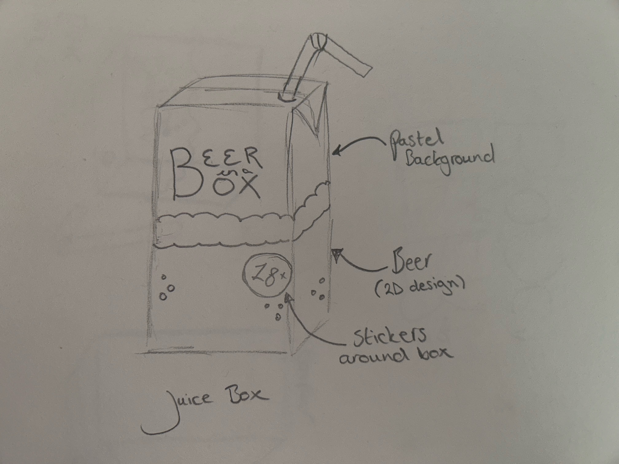
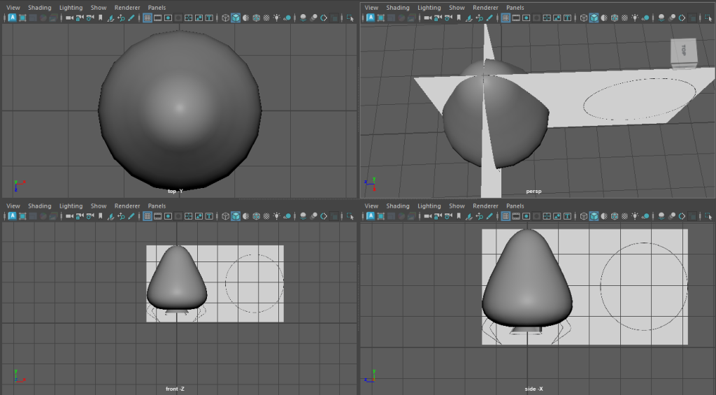
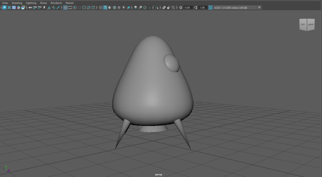
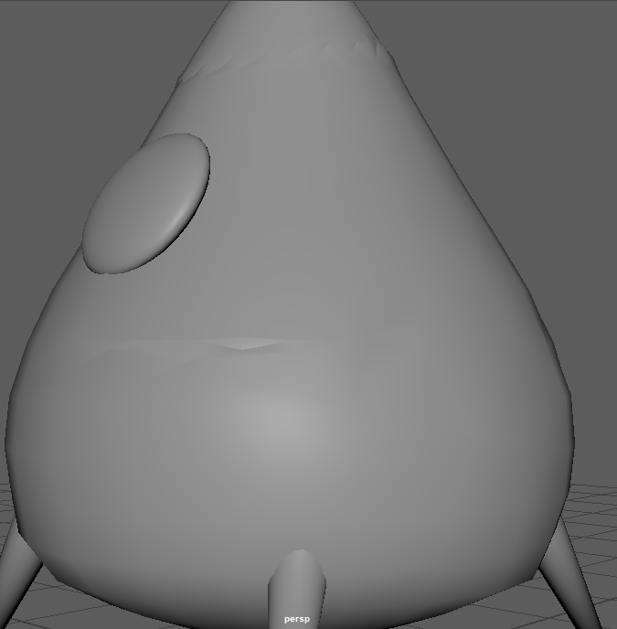
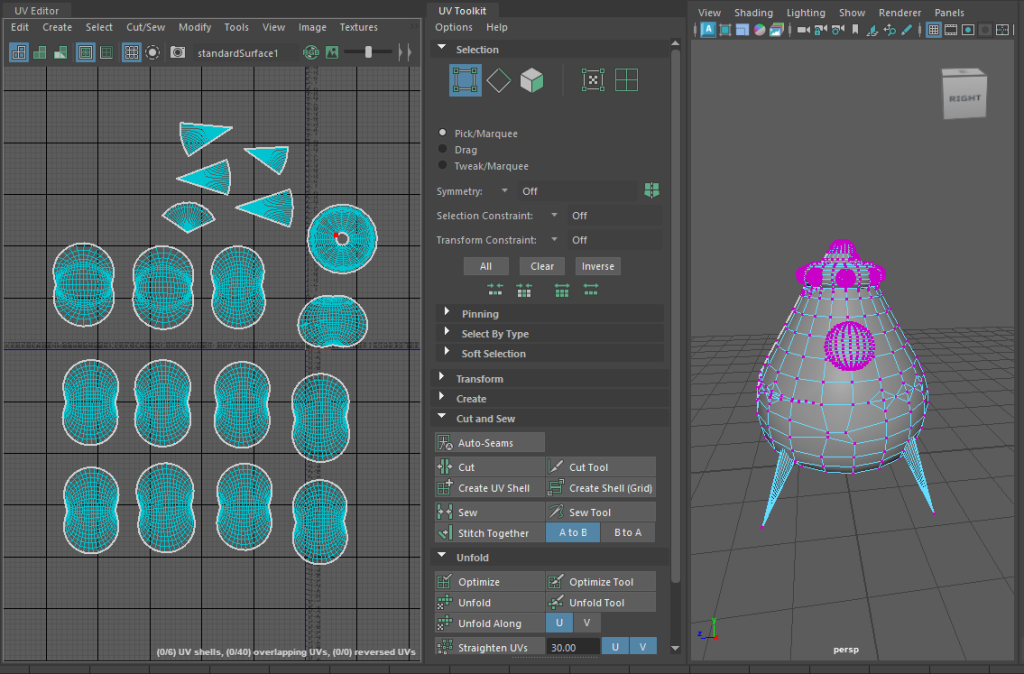
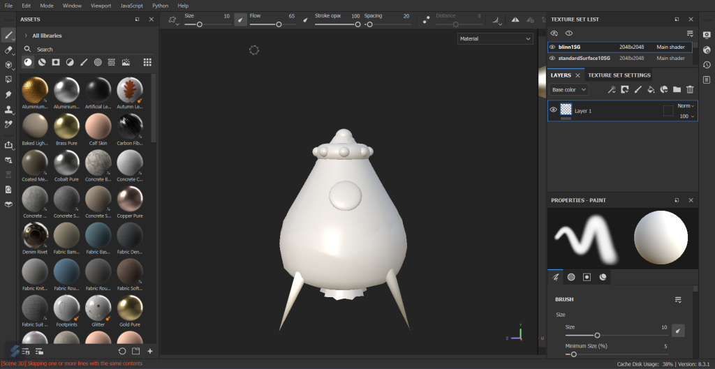
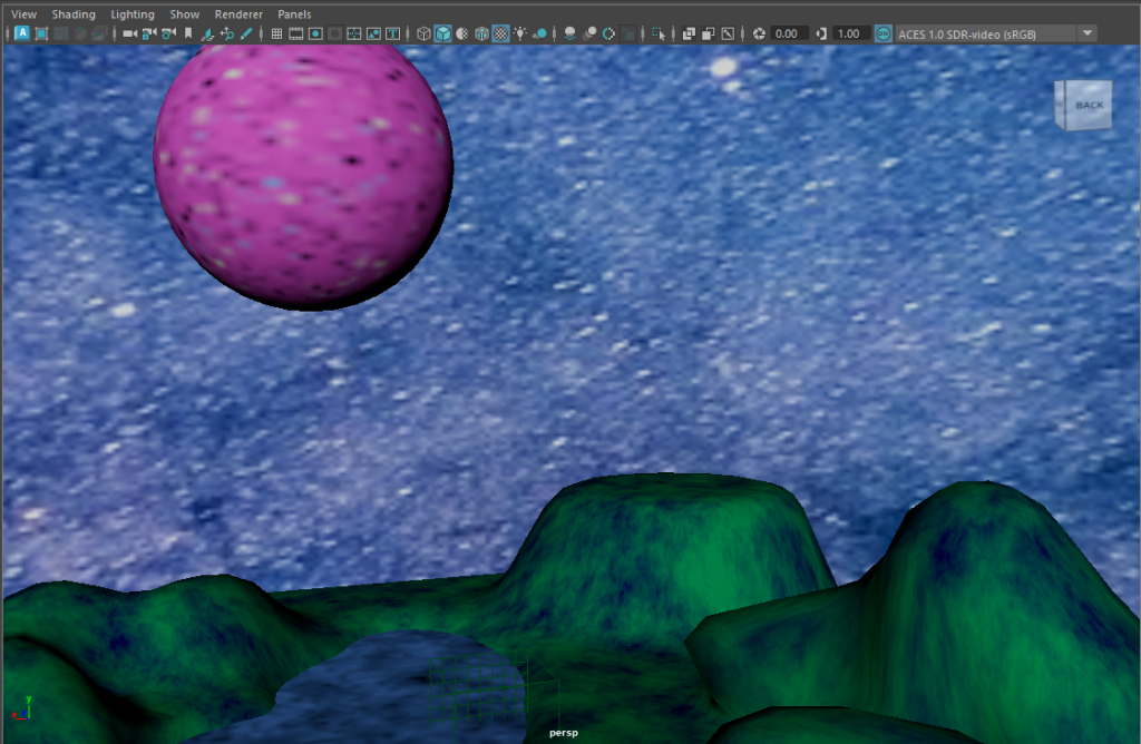
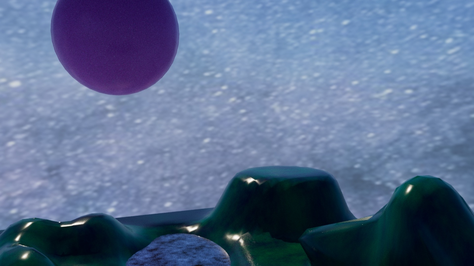
To create an animation based on the planetary structure designed in the first blog post, a storyboard was needed to visualise the final piece and to create guidance for the actual animation.

‘The storyboard is essentially a series of sketches that map the key events of the narrative, presented chronologically. This provides a visual bridge between the script or overall concept and the finished animation.’ (“How to Storyboard for Animation | Storyboarding Tips | Adobe”)

It is important as graphic designs to be able to visualize the results of a project and being able to create a storyboard for an animated piece adds a steppingstone to the design process. Storyboarding is also a great way to present the visuals happening within the mind.

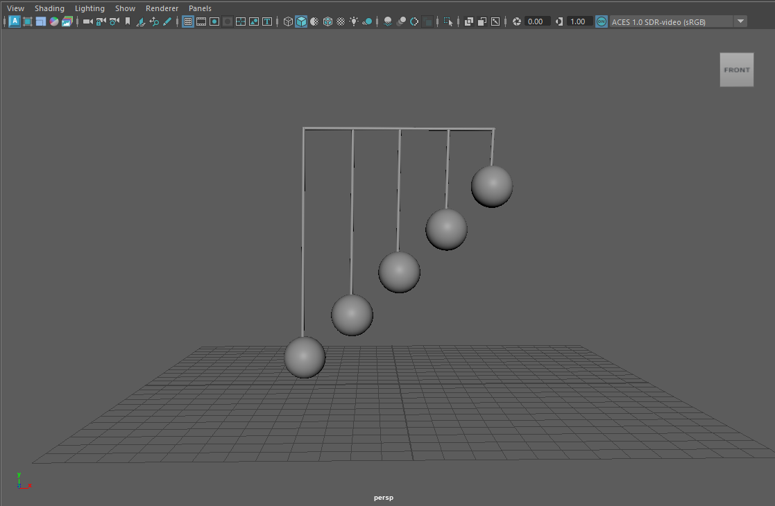
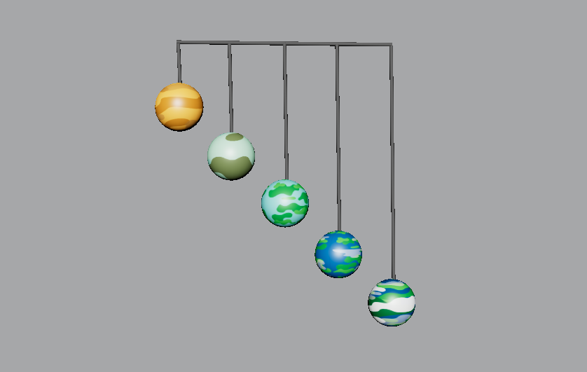
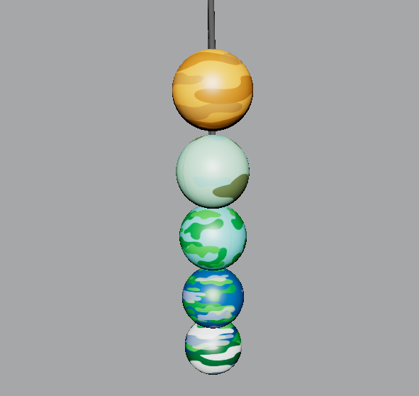
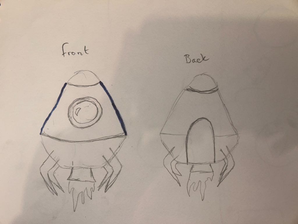
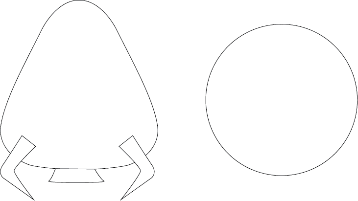
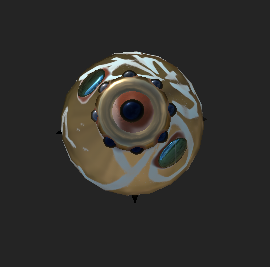
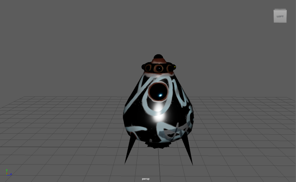
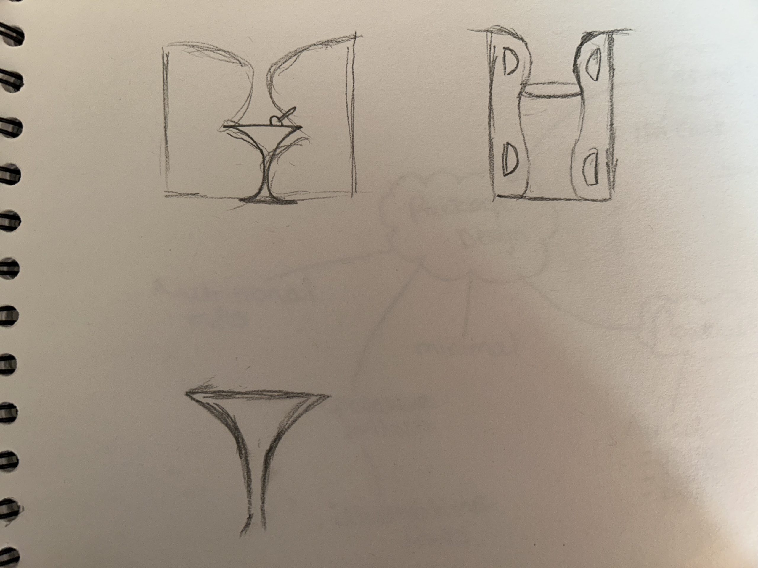
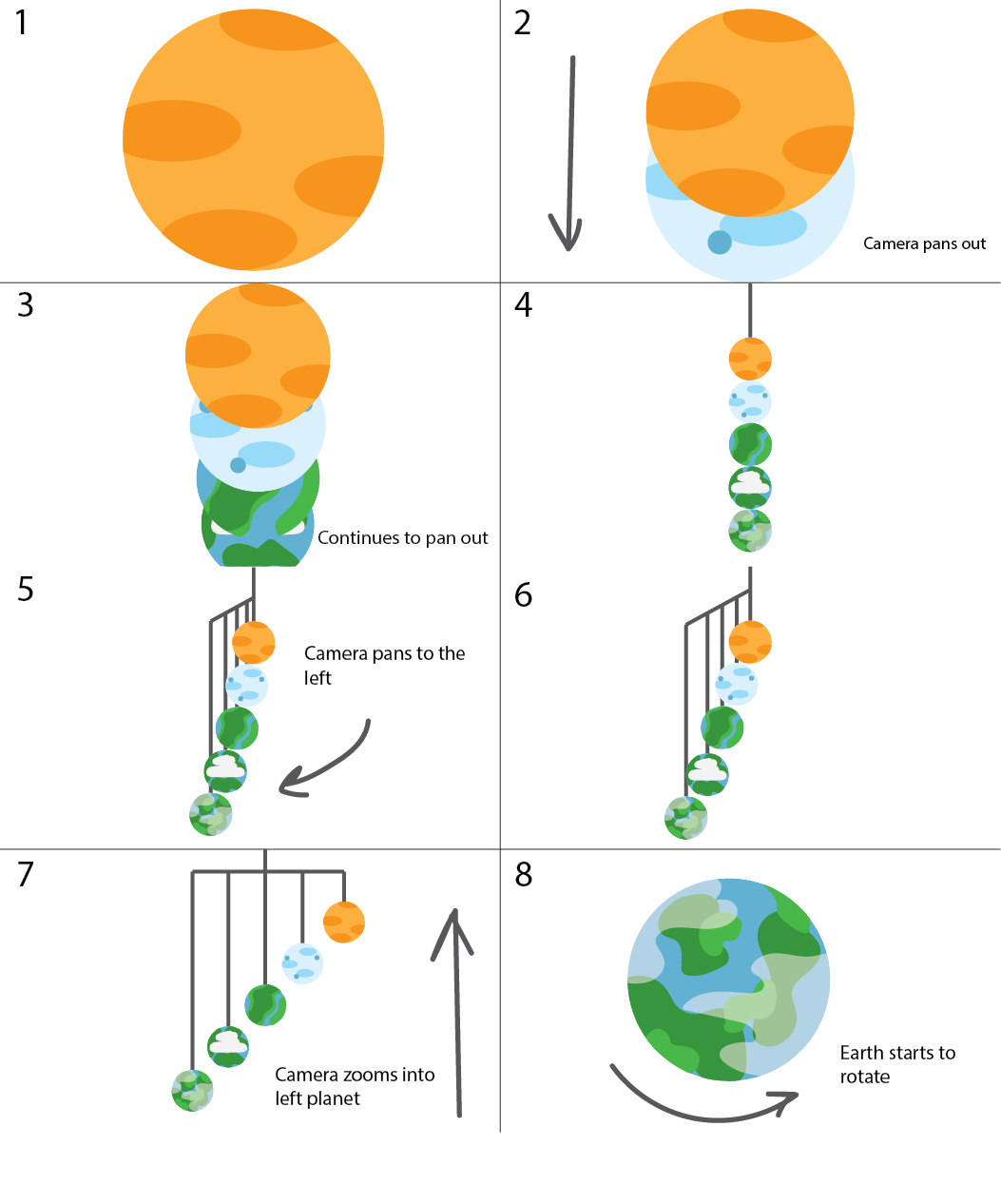
This is the illustrated storyboard showing how the final animation will look, the storyboard shows eight scenes and annotations describing the camera angles throughout those 30 seconds. The animation will start zoomed into the first variation of Planet Earth from 3.8 billion years ago. The camera will then start to zoom out and pan down to reveal the other four Earth variations in a vertical chronological order. Once all Earth variations are in view, the camera will then pan to the left to reveal the full structure of all five Earth variations. In the last two scenes, the camera will then zoom into the left Earth variation, this being the modern-day earth we know. This animation will represent the timeline of the appearance of Planet Earth.

Illustrated storyboard visualizing the final animation based on the planetary structure.

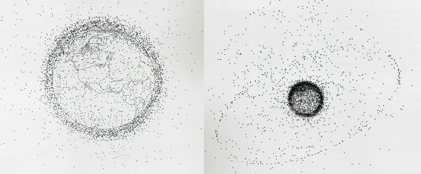
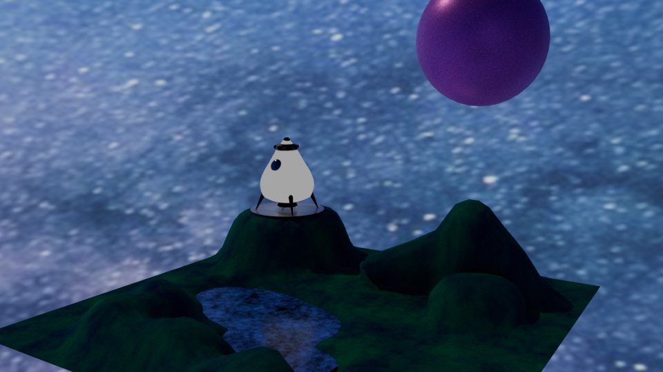
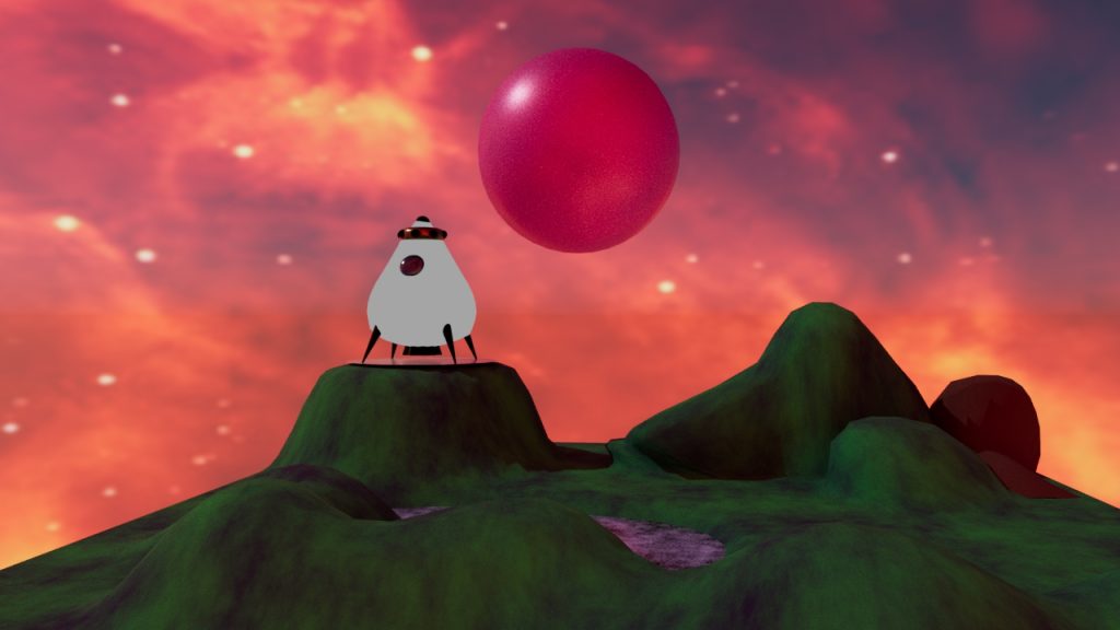
The video below is an example of the inspiration behind the animation. This animation shows the main object only through camera panning and zooming. This animation is also a good example of how the different Earth variations will look texture wise. Throughout the video the camera zooms into multiple planets which is a good way to visualize how the starting and closing scenes will look in this final animation.

Planetary animation showing how camera panning can be used to focus on the main object. (“Solar System 3D Animation | Planets Animation”)

References

“How to Storyboard for Animation | Storyboarding Tips | Adobe.” Www.adobe.com, www.adobe.com/uk/creativecloud/animation/discover/animation-storyboarding.html#:~:text=The%20storyboard%20is%20essentially%20a. Accessed 27 July 2023.

“Solar System 3D Animation | Planets Animation.” Www.youtube.com, 10 June 2021, youtu.be/nqPV8K6Zqfw. Accessed 27 July 2023.

Categories
Design Portfolio

Visual Design Treatment

Use of Colour

‘Note the effectiveness and elegance of small spots of intense, saturated colour for carrying information.’ (262588213843476)

Edward Tufte’s theory on the use of colour has been incorporated into this product via the initial design of the planetary structure and the storyboard for the final animation. The five Planet Earth variations each have their own colours and style.

Colour is crucial when it comes to design, it’s used to provide key information without any text. Tufte’s examples of this are maps which are colour coded for the correct information. Within the design of the planetary structure, only the earth variations have colour, the wired structure is grey because its not so important. The eye of the audience needs to be caught by those five planets because that’s the main piece of information that is trying to be portrayed.

The five different Earth variations showing the use of colour.

The use of small multiples

Tufte believes that the consistency of small multiples can pass off more information to the audience with just a glance. The multiples can all have slight differences, but the brain can be tricked into seeing these differences because there are multiple versions of the main attraction.

Using this theory in the planetary structure, there are five variations of Planet Earth, taking the audience through a timeline. There are multiples of Planet Earth, each differing in colour and style. With just a glance the audience can see that this is portraying a timeline in the appearance changes of Earth.

Narrative of space and time

Just like the use of small multiples, this planetary structure shows the narrative of time throughout the history of Earth. The narrative of space and time also portrays information to the viewer without any text. The timeline of the planets starts from billions of years ago and ends with the appearance of today’s earth as we all know it.

This theory will also be used throughout the animation as it will portray the timeline through camera panning, the planets will reveal one by one, this emphasises the anticipation and appearance.

Layering and Separation

Tufte’s layering and separation theory can be used to show the minimalism within a design. Keeping a design minimal and reducing unnecessary factors allows the audience to focus on informative areas. This theory is relevant to the planetary structure because the design is very minimal and only provides key information through the visuals.

Micro/Macro Readings

‘Enormous amount of data is being generated every day by us. The visual graphics should be designed in such a way that it is data rich and the data is presented in a more tabular, contrast way so that it is easily captured by the human eye.’ (Sampathkumar)

Micro readings are mainly used within graphs or charts to convey large quantities of information, this is normally portrayed in very minute details. An example of this is this diagram of Earth’s Orbital Pollution. Each tiny speck represents the debris that’s revolving around Earth.

Earth’s Orbital Pollution showing 7000 pieces of debris revolving around the Earth. (Sampathkumar)

This theory could be incorporated into the planetary structure. Although the design is not presenting a mass of information, the designs of the little Earth variations each show where grassy area’s are or the air pollution in the sky.

References

262588213843476. “Edward Tufte on Use of Color.” Gist, gist.github.com/deadprogram/782074. Accessed 27 July 2023.

Sampathkumar, Shruthi. “Micro / Macro Readings.” Medium, 7 Feb. 2019, medium.com/@shurisk96/micro-macro-readings-cd987ce6bc63. Accessed 27 July 2023.

Categories
Design Portfolio

Final Design

Now that all the plans had been put into place, it was time to further develop the animation of the planetary structure. To include the work of Alexander Calder, a 3D mobile model was created in the modelling software, Maya.

Image of basic model structure.

After creating the basic structure, UV maps needed to be made so each shape within the structure could be texturized. Each shape had to be unfolded to get a 2D shape, thus creating the UV map.

Screenshot showing the UV mapping of each shape used within the structure.

Tufte’s use of colour theory has been incorporated into this final animation piece. As spoken about in the previous post. Each of the five Earth variations have been designed to look cartoon like, they’re vibrant and all different in style. The use of colour on these planets emphasises the type of information being told. A timeline is being told and having each sphere look different but also having similarities creates the story of history. This can also be linked to Tufte’s theory on small multiples. Using this theory means the story can be told with just a glance because each small multiple has slight differences.

Another one of Tufte’s theories used is the narrative of space and time. A big focus within this animation is the way the camera is panning around the structure, zooming in and out of the spheres. In the opening scene, the planets drop down to reveal themselves one by one. This creates a narrative for the story of the timeline.

Categories
Design Portfolio

3D Animation (Planetary Structure)

Categories
Practical Exercises

Adobe Animate

With the brief of creating a nightclub advertisement/infographic, it was decided that the theme of this animation was going to be underground and grunge. The chosen colour palette used within the design process was going to be red, black and grey.

With the theme and colour palette thought out, it was time to design the logo concept. To keep the grunge theme, the name/logo of the fictional nightclub was going to include the old English font. This font has become very popular in alternative and gothic communities. The name of the nightclub will be ‘After Hours’, this name was decided because it fit perfectly with the aspect of a gothic/grunge nightclub, it felt vampiric which was very desirable.

Logo variations against a light and dark background showing the drastic differences the neon effect has.

To include the aspect of conceptual design to this logo, it was decided to swap out the ‘U’ in ‘hours’ and replace it with a crescent moon, still giving the desired U-shape to still be easily readable. After some experimenting in Adobe Illustrator the neon sign effect was created.

Final logo design against a dark background, this is the desired background colour for the final animation.

The background in the animation was created using multiple layers of squares so it could move smoothly. The idea of it being zoomed in almost creates an optical illusion, drawing the viewer in. The dancers on either side of the screen and the arms that enter the screen later were added to show users what this nightclub can offer without the animation becoming chaotic by using a lot of text.

Pop-up illustrations which include informative text, this will be presented in the final animation.

In a separate animation document, the pop-ups were created and edited. This was done by inputting certain codes to create the button that triggers the pop-up. In the video, there’s a demonstration of both buttons being clicked so the pop-up can play, then clicked again to close the pop-up.

Final animation for the fictional nightclub ‘After Hours’. This video demonstrates the use of the interactive spotlight buttons. Audio is royalty free from Pixabay.
Categories
Practical Exercises

Adobe Substance 3D Stager

The aim of this task is to sell something in a box. Using creative thinking and Adobe Substance 3D stager to make this mystery box very appealing. Taking a different approach with this task, ‘Beer in a Box’ was created, this is an alcoholic lager served in a juice box for adults that want to feel a little childhood nostalgia.

These are the first initial sketches of the logo and packaging design. The aim for the logo is to have it looking very clean and uniform. It was decided that only one ‘B’ will be used, this adds a playful touch while still appearing professional and remaining easily readable.

Digitally enhanced variety of logo designs for ‘Beer in a Box’.

After digitally experimenting with the logo designs, these were the three that were developed and the logo below is the final design to be used within the packaging. Conceptual design has been included with a pint of pint placed inside the ‘B’. The ‘in a’ in between the two bigger words has been created using handwriting and the brush tool in Adobe Illustrator. This adds to the childish effect of the concept.

Finalised logo design which will be used for the packaging design.

This is the final design for the carton. Using the juice carton template from Substance 3D Stager and exporting the UV map, the final packaging design was developed. Remaining with the child-like theme, the colour scheme is very light and cheerful, and sticker illustrations have been placed around the design.

2D version of the final packaging design.

Here are five rendered images from Substance Stager, after importing the design back onto the 3D model. Each image shows the carton against different background and environments, even when spilled.

After animating a turntable showcasing the product design, each key frame was rendered. For a six second turntable animation, 180 images were rendered. Those images were then taken into Adobe Premiere to be placed in a 0.01 second sequence, thus creating the smooth animation shown below.

Final turntable animation of the ‘Beer in a Box’ juice carton.
Categories
Practical Exercises

Maya Modelling

Maya is a professional software used to create realistic models for game design and animation. It’s a 3D software that delivers good quality graphics (www.autodesk.co.uk, n.d.).

Starting off with some rough sketches showcasing the desired appearance of the final escape pod model. The sketch is simple with only four legs, two windows and an engine at the bottom.

Rough sketch of the desired model shape, showing the front and back view.

It was best to use a template to get the best shape possible, so a basic template was created, showing a 2D illustration of the front and top view of the model. This template was then imported into Maya multiple times and positioned into the desired area.

The template created to help get the precise shape in Maya.

This is a screenshot showing how the template had been imported, from here a basic body model was created using the sphere tool. The sphere was then manipulated into the pear-shaped pod shown.

Screenshot of the template being used and the body model against the template.

The template was then taken away and the extra parts were developed. The legs were created using the cone tool, the engine was also created using the bottom end of a cone, the cone was then manipulated using every other vector and brought inwards, creating the star shape.

Using the vector tool again for the body, small dents were created around the model. These dents created an old and worn effect.

Final model displayed in different camera angles.

This is the final untextured model in Maya. Each camera angle has been displayed to show each side of the model. Smaller details have been added to decrease the simplicity of the model.

Completed model after being assigned a new material.

Each section of the model had now been assigned a new material and was now ready to create the UV maps to be textured.

References

www.autodesk.co.uk. (n.d.). Maya Software | Get Prices & Buy Official Maya 2022. [online] Available at: https://www.autodesk.co.uk/products/maya/overview?term=1-YEAR&tab=subscription.

Categories
Practical Exercises

Maya Texturing and Concept Rendering

The model has now been placed in the vertex face mode to check that all faces and edges are in the correct position and that nothing looks out of place or distorted.

Maya model in vertex face mode, used to correct any out of place faces.

Once the vertex faces had been checked, the UV maps can be developed. There was an option to automatically create the UV maps, but this screenshot is the aftermath of manually cutting and unfolding each object. The UVs were then laid out and exported, ready for texturing.

Screenshot showing the completion of the UV mapping.

After importing the UV maps into Adobe Substance 3D Painter, this is how it looked, everything worked beautifully. Each object had their own layer, so it was very easy to add materials and textures without them bleeding over to a different section of the model.

Screenshot of Maya model imported into Substance Painter.

After experimenting with different textures and add-ons, this was the result created. The design is very metallic with rust painted around the top and legs. The rust, dents and added graffiti gave the illusion that this escape pod had been abandoned.

After finalising the texturing, it was time to export them and import them back into Maya. This step was complicated as the textures had to be added through different layers, the colour, metallic, roughness and bump mapping.

Screenshot showing the textured model after being imported back into Maya.

This was the result after importing the textures back in, as you can see it doesn’t match the complete model in Substance Painter. Each step was followed, and lighting was added but unfortunately, this could not be resolved.

Categories
Practical Exercises

Maya Animation and Lighting

After texturing the space pod, it was now time to create some scenery. A plot of land was designed with added height in certain areas and spots of water. One heightened area has a flatter surface area, this will be used as the pod’s landing zone.

Screenshot of the scenery created which will be used in final animation.

The image below shows the experimentation of using lights, although this image looks very well lit, it made the so called ‘grassy’ area look too shiny and unrealistic.

Rejected concept using certain lighting.

This is how the scene looked with the space pod now in view, a wooden stage has been added to emphasis the landing area. The blue/purple tones created a very sci-fi aesthetic but something seemed missing.

Image showing the finished scenery with the space pod in view.
Finished scenery, ready to be animated.

Adding a different background and changing the colour of the planet in the background created this warm, burning aesthetic to the scene. This looked a lot more fitting then the previous scene.

Final animation video of the designed space pod and surrounding scenery.
Categories
Development Log

Conceptual Energy Drink Brand Logo

When researching energy drink brands, not many of the popular brands contain any conceptual design within their logo but the two images below show fantastic examples of conceptual design within a brand logo.

The logo design for the energy drink brand ‘Reign’ shows two ‘R’s with a crown sat on top of them. The ‘R’s have been manipulated in a way that creates the shape of a knight’s helmet, with them wearing a crown. This creates a brilliant example of conceptual design because the word ‘reign’ means to control and show power.

Energy drink brand ‘Reign’ displaying a good example of conceptual design. (Reign Total Body Fuel Energy Drink, n.d.)

Another good example of conceptual design is the logo for the energy drink brand ‘Bang’. The logo shows a lowercase ‘b’ and a target that has been incorporated into the counter of the ‘b’. Many people do associate the word ‘bang’ with some sort of gunshot, thus creating a good example of conceptual design.

Energy drink brand ‘Bang’ showing another good example of conceptual design. (Bang Energy Drink, n.d.)

The energy drink brand created will be called ‘Boomer’s Brew’. The given brief was to aim the energy drink to over 60’s which relates to the word ‘boomer’, this word is commonly used amongst the younger generation as a nickname for the older generation. Having an alliteration within the name makes the brand more memorable and easier to pronounce. Now that the name has been chosen and finalised, it was time to develop the logo.

Here are some rough sketched ideas for the ‘Boomer’s Brew’ logo. The logo consists of the two ‘B’s, one has been horizontally flipped and when placed together and slightly manipulated, it creates the perfect shape for common cocktail glass. It was a passing thought to have the energy drink contain alcohol so with this logo in mind, it was decided to make it a caffeinated seltzer. With further enhancement of the logo, a conceptual design was created and matched perfectly with the alcoholic aspect.

First sketches of the Boomer’s Brew logo concept.
Digitally enhanced variations of the Boomer’s Brew logo, containing conceptual design.

Rejected Ideas

Many brand name concepts consisted of the alliteration such as ‘Nana’s Nourishments’, the idea behind this name was to create a cosy feeling that grandparents tend to have. One of the logo designs was a hot cup of tea and the conceptual aspect of this design would be the hot stream creating the word ‘nana’. Another logo design for this name was to have the brand name knitted. Knitting is a very common hobby for the elder generation so this concept would have enticing towards the specific audience.

Another rejected idea that did become more enhanced was the name ‘Rewind’, the logo design contained the rewind icon within the ‘R’ and ‘E’. The name ‘Rewind’ was chosen at first because it is likely that people over 60 do wish to rewind time so this name would have worked well with the audience but after some further research, it was found that this was already a brand with a similar logo concept.

First initial ideas for the brand name ‘Rewind’ that later became a rejected design.
Digitally enhanced version of the first concept for the brand name ‘Rewind’.
Example showing the ‘Rewind’ concept already in use. (Signature Brew Rewind, n.d.)

References

Bang Energy Drink. (n.d.) Body Shocker. Available online: https://bodyshocker.co.uk/product/bang-energy-drink-12-x-500ml/ [Accessed 12 Apr. 2023].

Reign Total Body Fuel Energy Drink. (n.d.) Protein Pick and Mix. Available online: https://www.proteinpickandmix.co.uk/reign-total-body-fuel-energy-drink/ [Accessed 12 Apr. 2023].

Signature Brew Rewind. (n.d.) eEbria Trade. Available online: https://www.eebriatrade.com/products/beer/signature-brew/35228-rewind [Accessed 12 Apr. 2023].