Henri Matisse once said, “Composition is the art of arranging in a decorative manner, the diverse elements at the painter’s command to express his feelings.” (Art with Flo, 2019).
Composition is a term used to describe how the visual elements in design are arranged. Composition is also a key element in paintings, drawings, photographs, or any other form of artwork. Composition brings all the separate elements together to form a whole (Blue Sky – Online Graphic Design School, 2020).
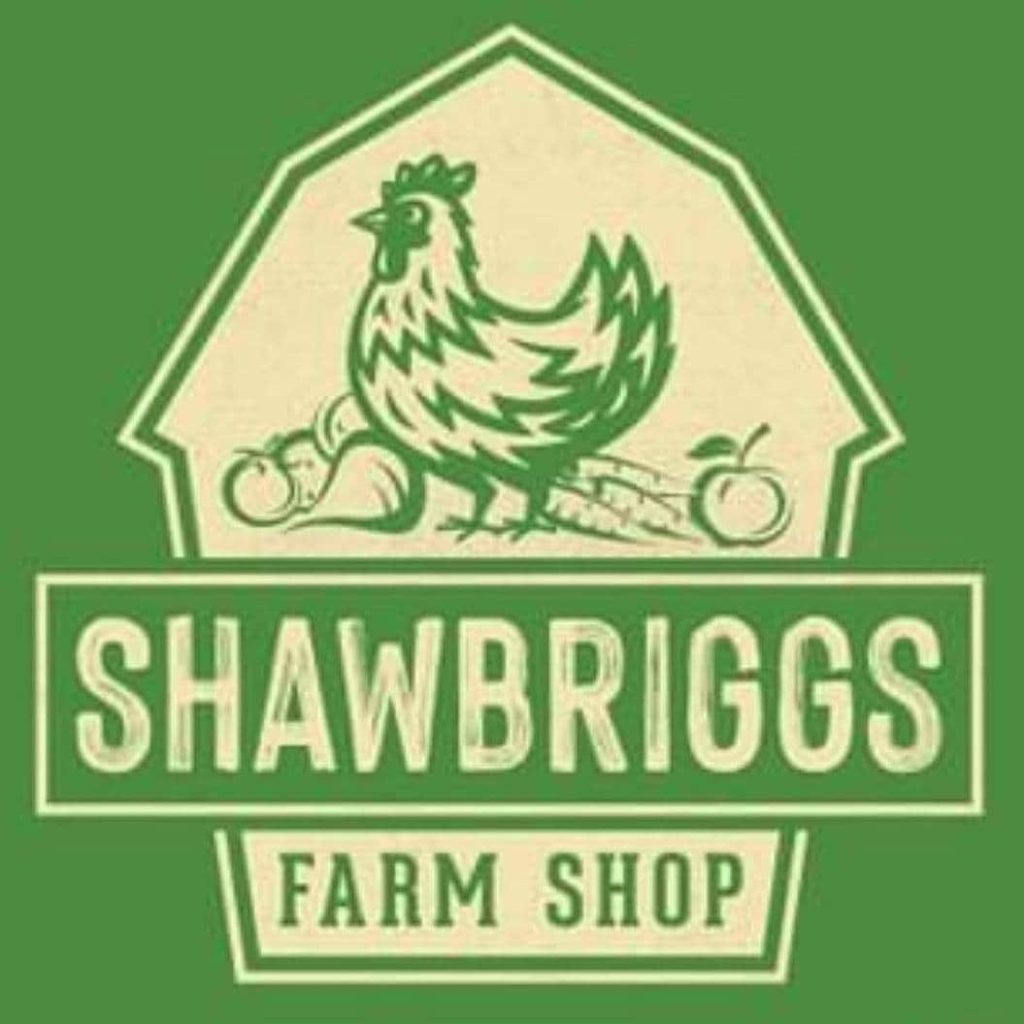
This is the logo for Shawbriggs Farm Shop based in Goxhill, UK. They are a small friendly farm shop that supply a large selection of fresh fruit and veg, as well as jams, chutneys, cheese, and ice-cream. They also offer dairy-free ice-cream and dairy-free chocolate (Facebook, n.d.).
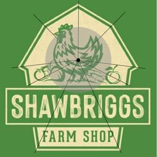
Their logo represents a good example of composition in design. The eye is drawn to the big ‘Shawbriggs’ title, which has been designed in a light tint of yellow; this contrasts nicely with the green background. The title is not completely central, it’s placed in the bottom half of the logo, but because of the use of sizing and contrast it becomes the first thing the audience sees. The next noticeable object in the logo is the chicken standing with fruit and veg. Due to the use of very angular shapes, the chicken, being very round, stands out because it’s not as harsh of a shape. As shown in the diagram above, the angles of the barn point towards the chicken in the centre; this is a good use of composition within this logo because it points the audience in the direction of that chicken. The very thick, bold outlines of the chicken also add to why it stands out more than the words ‘Farm Shop’ under the title. Even without those words, it is very easy to see that this is a logo of a farm shop because of the imagery used.
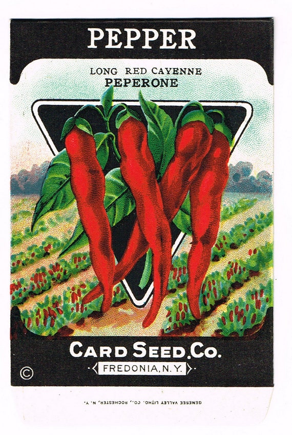
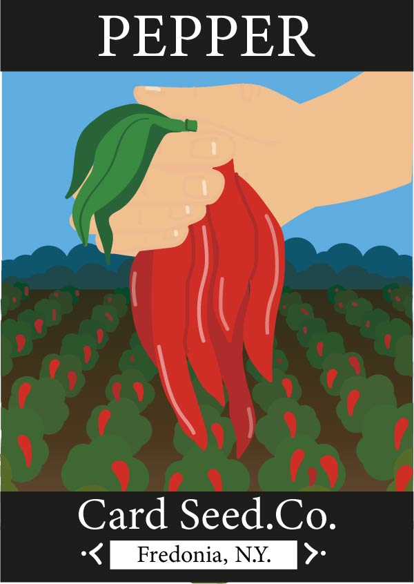
This is a packaging design for pepper seeds for a 1920s vintage brand called ‘Card Seed.Co’, based in Fredonia, New York (www.etsy.com, n.d.). This is a bad example of composition in design because of the layout of the background.
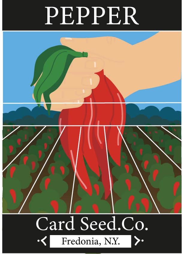
When looking at this packaging design, the first things that the audience will see are the peppers because of their bright red colour and the black triangle behind them. Although the black triangle has been used to make the peppers look more vibrant and appear more in front, it does seem unnecessary and quite an eyesore. The next thing the audience will notice will be the white text against the black borders at the top, then at the bottom. After that it will be the black text above the peppers. If the title of the product became larger, possibly big enough to stretch across the top of the peppers, then perhaps it will be the first noticeable thing. The background of this design is most likely the last thing that people will look at. The pepper plants could be redesigned with a linear perspective, much like La Danse au Moulin Rouge by Henri de Toulouse-Lautrec, with the floorboards leading to La Goulue dancing (Rue Royale Fine Art, n.d.).
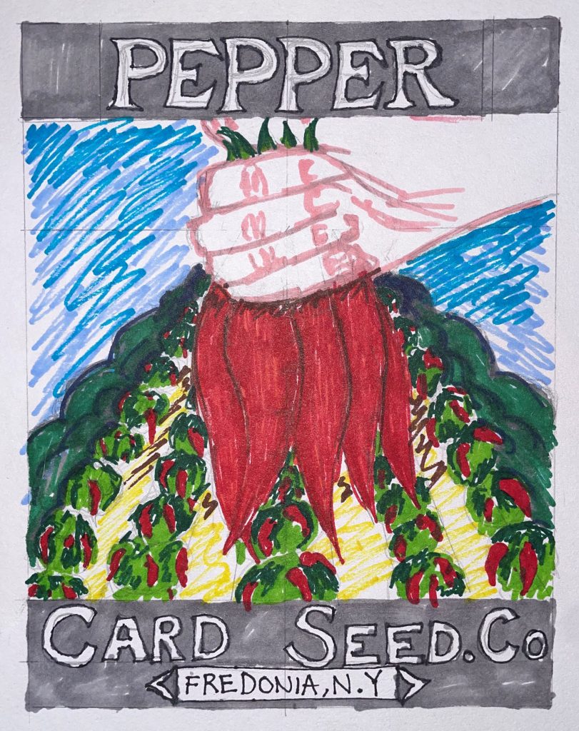
The initial structure of the packaging has remained the same to keep that vintage feel to it. The angle of which the pepper plants were shown has been enhanced to show a more linear perspective, as mentioned previously. The black triangle behind the peppers has been removed and replaced with a hand holding the peppers; this gives more attention to the home-grown farming aspect of the product. The colours have been kept the same because green and red are complimentary colours so each item within the design is easily noticeable. The bushes in the far back of the original packaging design have been kept in the redesign, but have changed to fit the angle of the pepper plants. The reason for keeping these bushes is because they’re similar to the effect that Valentin le Desosse gives off in La Danse au Moulin Rouge (The KAZoART Contemporary Art Blog, 2021), drawing everything to the peppers.
Bibliography
Art with Flo (2019). Composition in Art Explained. YouTube. Available at: https://www.youtube.com/watch?v=VwUZ3PivD6I [Accessed 25 Oct. 2021].
Blue Sky – Online Graphic Design School. (2020). What is composition in design? [online] Available at: https://blueskygraphics.co.uk/what-is-composition-in-design/#:~:text=Composition%20refers%20to%20how%20you [Accessed 25 Oct. 2021].
Cayenne Peperone Card Seed.Co. (n.d.). Available at: https://i.etsystatic.com/5769593/r/il/ddb7d2/1812991930/il_794xN.1812991930_q5j8.jpg [Accessed 28 Oct. 2021].
Facebook. (n.d.). Log into Facebook. [online] Available at: https://www.facebook.com/shawbriggsfarm/about/?ref=page_internal [Accessed 25 Oct. 2021].
The KAZoART Contemporary Art Blog. (2021). Masterpiece in the spotlight: At the Moulin Rouge, the Dance, Toulouse-Lautrec. [online] Available at: https://www.kazoart.com/blog/en/masterpiece-in-the-spotlight-at-the-moulin-rouge-the-dance-toulouse-lautrec/ [Accessed 31 Oct. 2021].
Rue Royale Fine Art. (n.d.). La Danse au Moulin Rouge, Henri de Toulouse-Lautrec. [online] Available at: https://rueroyalefinearts.com/shop/art-nouveau/la-danse-au-moulin-rouge-henri-de-toulouse-lautrec/ [Accessed 25 Oct. 2021].
Shawbriggs Farm Shop Logo. (n.d.). Available at: https://www.facebook.com/shawbriggsfarm/photos/a.1435490893353697/3044204469148990/ [Accessed 28 Oct. 2021].
www.etsy.com. (n.d.). Original Vintage Seed Packet Pack NOS C1920 General Store | Etsy. [online] Available at: https://www.etsy.com/ie/listing/677067004/original-vintage-seed-packet-pack-nos [Accessed 25 Oct. 2021].