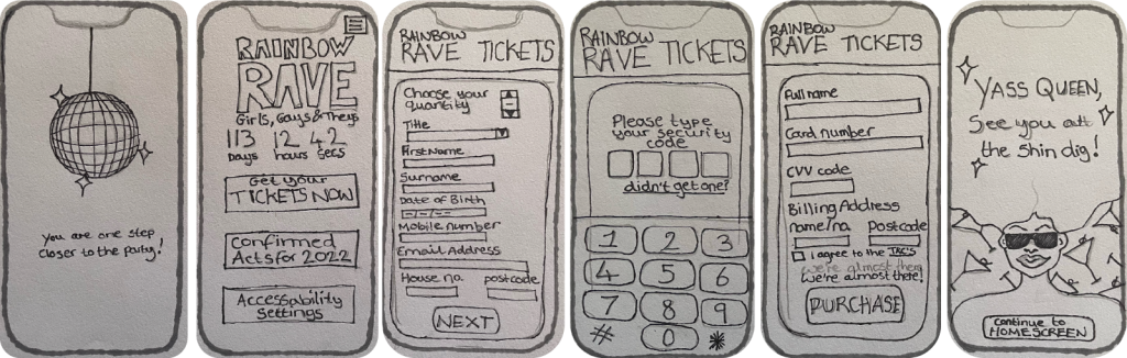
Above is a reminder of the first few steps of the design development towards the Rainbow Rave App and Website, these can be seen in the Development Research Blog. These are low-fidelity and mid-fidelity prototype of the call-to action process, from there the progress has developed and increased.
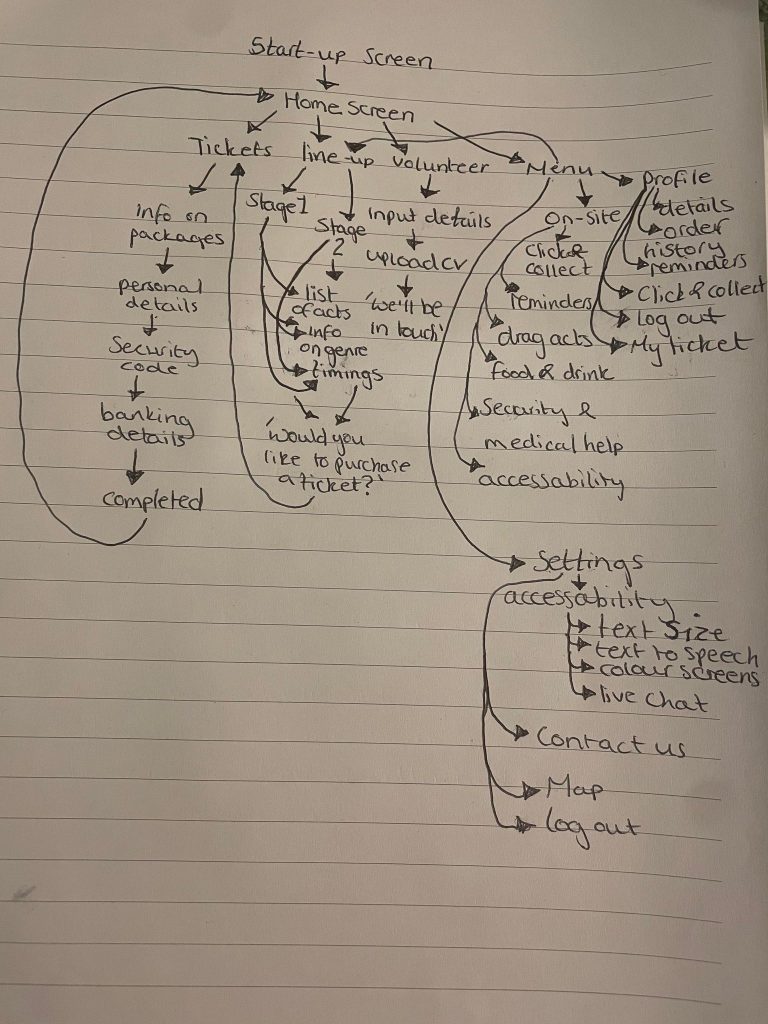
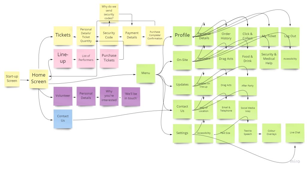
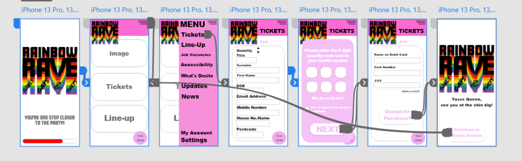
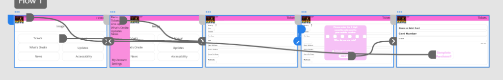
The two images above show further development progress for the app design, as you can see the prototypes now include the entire user interface for the final app design. The digital mind map has been coloured co-ordinated to show the categories and sub-categories. With the mind-map planning the artboards could be progressed further but smaller details like the logo, colour palette and the use of fonts needed to be explored further. As you can see above there is a logo for Rainbow Rave, this was the very first logo developed but it didn’t feel complete, so more logos were designed and evolved to create the ones you see in post 3.
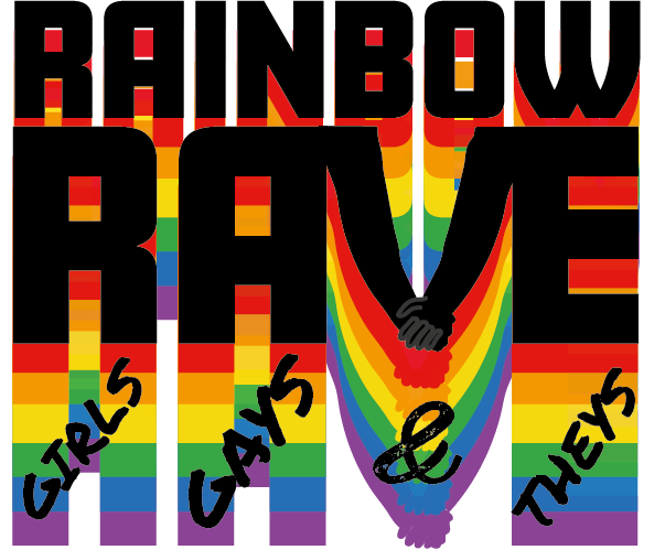
Once the logo was developed, the design was starting to come together. The idea was to use an original image from a previous festival and decipher the colour palette from that image which resulted in the purple and green tones you see. It was then decided to use text bubbles as informative blocks of text, this was to attract the younger generation who are more likely to use technology and send text messages between friends. The idea of the design was to feel like a conversation with a friend, so slang has been used throughout the designs such as ‘yaaaas queen’ which is a phrase that can be heard within the LGBTQIA community. The goal was to make the user feel as comfortable as possible while exploring the app or website. Keeping the user calm while viewing the app or website increases the chances of ticket purchasing.