What is typography?
“Digital technology radically influenced typographic design, beginning in the early 1980s. The computer enabled designers to create and manipulate letters in new ways, offering new options for crafting letterforms and ‘outputting’ them—whether in the medium of toner particles on paper, or pixels on a screen. Digital tools, at first, necessitated (due to technical constraints), and later explicitly encouraged (due to technical advances) specific kinds of representations that would challenge their historical antecedents. Now, in the late 1990s, the mutation of letters continues. The spatial and temporal opportunities of cyberspace are resulting in even more radical depictions of letterforms that offer expanded formal and stylistic possibilities, while further challenging the norms of reading and writing.” (Staples, 2000)
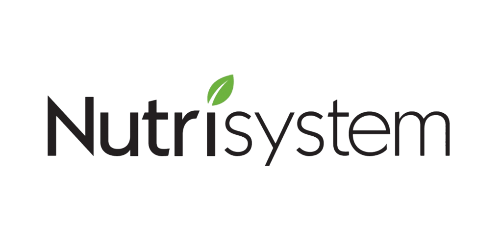
Nutrisystem is a commercial provider of weight loss products and services, with headquarters based in Fort Washington, Pennsylvania (Facebook, 2021). This is a good example of typography used in the subject of healthy eating because of how easily readable the logo is.
Although the spacing between ‘Nutri’ and ‘System’ is very slim, it is still easily identified because of the two types of fonts used. The ‘Nutri’ is a very thick and bold font whereas ‘system’ is quite thin. Both fonts are sans-serif, which make the name look more modern and appeal to the younger generation. All lowercase letters have the same x-height; this indicates a level of professionalism within the name of the brand. The ‘i’ in the title has been designed to look like a leaf, which links to the healthy eating aspect of the company. The font of the title is black, which makes it easily readable against most backgrounds, but also draws more attention to the green leaf. The kerning between the ‘r’ and ‘i’ is quite spacious, but it also draws the eye more towards the title. Although the design is quite professional, the hint of green also adds some playfulness to it, which again is more appealing to the younger crowd.
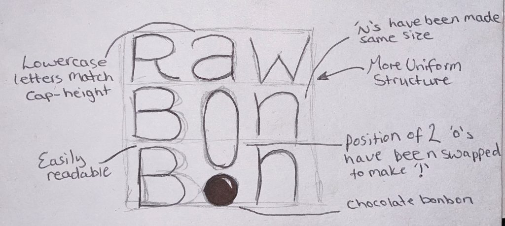
Raw BonBon is a company that turns healthy snacks into delicious sweet treats. They use eco-friendly ingredients, high quality cacao, premium matcha and vanilla (Raw Bonbon, n.d.b). This is a bad example of typography used due to the unnecessary letter sizing.
The typography behind this logo is not very well thought out. The smaller ‘o’ stacked onto the larger ‘o’ makes it look like a lowercase ‘I’, which does not link to the company in any way and makes this quite hard to read. This could use a subtle change; the position of the two ‘o’s can be swapped around to create an exclamation mark, which would then show some enthusiasm towards the healthy eating lifestyle. The two ‘n’s would look better if they stayed the same size, this would then add more focus towards the two ‘o’s. The capital letters could be changed to lowercase to appear more youthful.
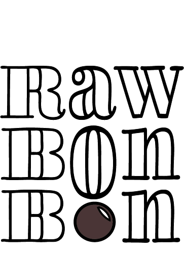
Above is the redesigned logo, which has now been made black to become easily readable and still look clear against most backgrounds. The company stated that they will soon be selling chocolate bonbons, so the second ‘o’ has been made to look like a bonbon to focus on the advertisement of that product. The font used is called LiebeDoni Outline, which is a similar serif font to the original type. The words now have capital letters at the start, but the lowercase x-height now matches the cap-height to keep it looking more uniform and to take away some of the aggressiveness that the capital letters hold (Quora, n.d.), and the 2 ‘o’s have been swapped around to create an exclamation mark.
Bibliography
Facebook. (2021). Log into Facebook. [online] Available at: https://www.facebook.com/Nutrisystem/about/?ref=page_internal [Accessed 28 Oct. 2021].
Nutrisystem. (n.d.). Available at: https://logos.fandom.com/wiki/Nutrisystem?file=Nutrisystem.png [Accessed 11 Oct. 2021].
Quora. (n.d.). Why do capital letters seem aggressive? [online] Available at: https://www.quora.com/Why-do-capital-letters-seem-aggressive [Accessed 31 Oct. 2021].
Raw Bon Bon. (n.d.a). Available at: https://images.squarespace-cdn.com/content/v1/5ca9e9353560c369880c7a40/1554639594635-WIE6I5MZQ5Z53Q6IHB4U/RawBonBon_logo_transparent.png?format=1500w [Accessed 11 Oct. 2021].
Raw Bonbon. (n.d.b). Raw Bonbon. [online] Available at: https://www.rawbonbon.com/ [Accessed 11 Oct. 2021].
Staples, L. (2000). Typography and the Screen: A Technical Chronology of Digital Typography, 1984–1997. Design Issues, 16(3), pp.19–34.