Colour plays a major role in photography so it would be simple to combine the two together but the way I would like to do this for my major project is through a photobook or magazine.
The aim of the photobook is to have the viewer experience a rollercoaster of thoughts and feelings when flicking through the pages. Throughout the book I want to portray different times of the day on different days to really get the full effect of how the colour of the weather can impact emotions. It will showcase sunny days, rainy days and everything in-between. I want to tell a story through a timeline.
To include the graphic design aspect to this photobook, I will be designing the pages in a grunge-like manner. I aim to include text, handwritten words or just simple decals to some pages, making it niche.
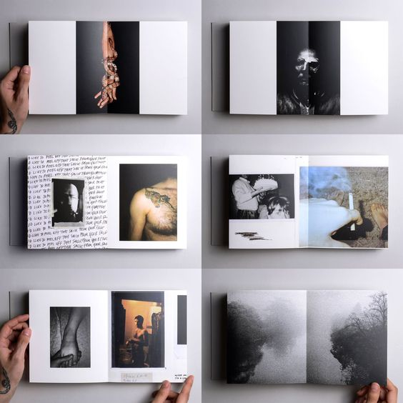
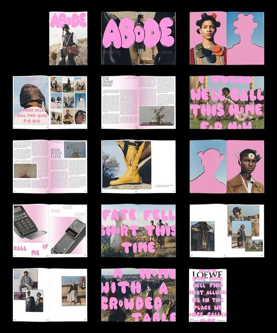
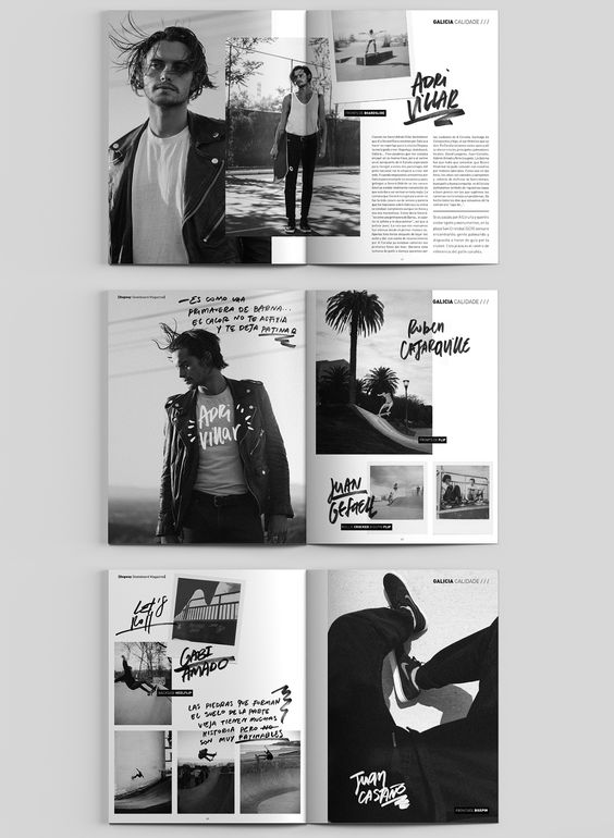
These are some examples of photobooks to further explain my thought process and visions I have for future productions.

The first example above shows the layout for a photobook designed by an artist named ‘Void’. This is a good example of how I would like my final photobook to look. The photographs seen in the image have different sizes and are have unique placements throughout the pages. This niche way of layout design is appealing and refreshing because it differs to the stereotypical photobook, this inspires me to design something niche.

This magazine has been included as a good inspiration towards my final photobook because it shows how typography can be intertwined with photography to create something grunge-like. The same pink tone has been used throughout all the pages which adds character and connects every page. Like the first example, the photos are all sized differently and the pages are very editorial which makes this magazine very aesthetic to view.

Although this last example lacks colour, the layout of these magazine pages really caught my eye. The use of handwritten text is very modern and is similar to the work I intend to produce. The photography layout is has been carefully thought out, there is no negative space and the placement of the text used is edgy and artistic.
References
“ABoDE Magazine Layout & Design.” Pinterest, www.pinterest.co.uk/pin/15199717486382244/. Accessed 2 Nov. 2023.
“Dogway Skateboard Magazine.” Behance, 2014, www.behance.net/gallery/33229605/Dogway-Skateboard-Magazine-Redesign. Accessed 2 Nov. 2023.
“Oyster — Marco Marzocchi.” Pinterest, www.pinterest.co.uk/pin/559361216236812874/. Accessed 2 Nov. 2023.