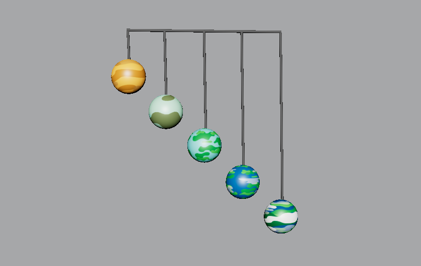
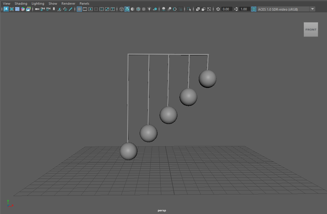
Now that all the plans had been put into place, it was time to further develop the animation of the planetary structure. To include the work of Alexander Calder, a 3D mobile model was created in the modelling software, Maya.
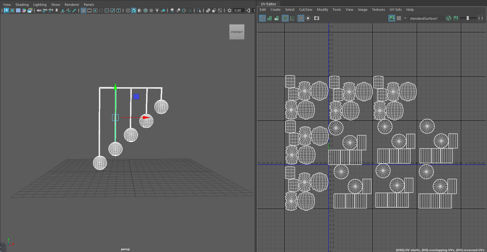
After creating the basic structure, UV maps needed to be made so each shape within the structure could be texturized. Each shape had to be unfolded to get a 2D shape, thus creating the UV map.
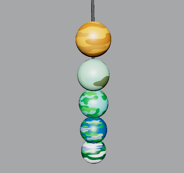
Tufte’s use of colour theory has been incorporated into this final animation piece. As spoken about in the previous post. Each of the five Earth variations have been designed to look cartoon like, they’re vibrant and all different in style. The use of colour on these planets emphasises the type of information being told. A timeline is being told and having each sphere look different but also having similarities creates the story of history. This can also be linked to Tufte’s theory on small multiples. Using this theory means the story can be told with just a glance because each small multiple has slight differences.
Another one of Tufte’s theories used is the narrative of space and time. A big focus within this animation is the way the camera is panning around the structure, zooming in and out of the spheres. In the opening scene, the planets drop down to reveal themselves one by one. This creates a narrative for the story of the timeline.