Use of Colour
‘Note the effectiveness and elegance of small spots of intense, saturated colour for carrying information.’ (262588213843476)
Edward Tufte’s theory on the use of colour has been incorporated into this product via the initial design of the planetary structure and the storyboard for the final animation. The five Planet Earth variations each have their own colours and style.
Colour is crucial when it comes to design, it’s used to provide key information without any text. Tufte’s examples of this are maps which are colour coded for the correct information. Within the design of the planetary structure, only the earth variations have colour, the wired structure is grey because its not so important. The eye of the audience needs to be caught by those five planets because that’s the main piece of information that is trying to be portrayed.

The use of small multiples
Tufte believes that the consistency of small multiples can pass off more information to the audience with just a glance. The multiples can all have slight differences, but the brain can be tricked into seeing these differences because there are multiple versions of the main attraction.
Using this theory in the planetary structure, there are five variations of Planet Earth, taking the audience through a timeline. There are multiples of Planet Earth, each differing in colour and style. With just a glance the audience can see that this is portraying a timeline in the appearance changes of Earth.
Narrative of space and time
Just like the use of small multiples, this planetary structure shows the narrative of time throughout the history of Earth. The narrative of space and time also portrays information to the viewer without any text. The timeline of the planets starts from billions of years ago and ends with the appearance of today’s earth as we all know it.
This theory will also be used throughout the animation as it will portray the timeline through camera panning, the planets will reveal one by one, this emphasises the anticipation and appearance.
Layering and Separation
Tufte’s layering and separation theory can be used to show the minimalism within a design. Keeping a design minimal and reducing unnecessary factors allows the audience to focus on informative areas. This theory is relevant to the planetary structure because the design is very minimal and only provides key information through the visuals.
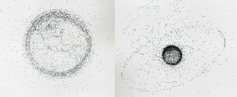
Micro/Macro Readings
‘Enormous amount of data is being generated every day by us. The visual graphics should be designed in such a way that it is data rich and the data is presented in a more tabular, contrast way so that it is easily captured by the human eye.’ (Sampathkumar)
Micro readings are mainly used within graphs or charts to convey large quantities of information, this is normally portrayed in very minute details. An example of this is this diagram of Earth’s Orbital Pollution. Each tiny speck represents the debris that’s revolving around Earth.
This theory could be incorporated into the planetary structure. Although the design is not presenting a mass of information, the designs of the little Earth variations each show where grassy area’s are or the air pollution in the sky.
References
262588213843476. “Edward Tufte on Use of Color.” Gist, gist.github.com/deadprogram/782074. Accessed 27 July 2023.
Sampathkumar, Shruthi. “Micro / Macro Readings.” Medium, 7 Feb. 2019, medium.com/@shurisk96/micro-macro-readings-cd987ce6bc63. Accessed 27 July 2023.