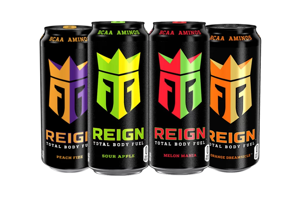
When researching energy drink brands, not many of the popular brands contain any conceptual design within their logo but the two images below show fantastic examples of conceptual design within a brand logo.
The logo design for the energy drink brand ‘Reign’ shows two ‘R’s with a crown sat on top of them. The ‘R’s have been manipulated in a way that creates the shape of a knight’s helmet, with them wearing a crown. This creates a brilliant example of conceptual design because the word ‘reign’ means to control and show power.
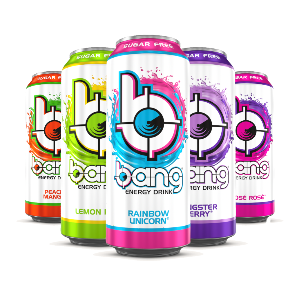
Another good example of conceptual design is the logo for the energy drink brand ‘Bang’. The logo shows a lowercase ‘b’ and a target that has been incorporated into the counter of the ‘b’. Many people do associate the word ‘bang’ with some sort of gunshot, thus creating a good example of conceptual design.
The energy drink brand created will be called ‘Boomer’s Brew’. The given brief was to aim the energy drink to over 60’s which relates to the word ‘boomer’, this word is commonly used amongst the younger generation as a nickname for the older generation. Having an alliteration within the name makes the brand more memorable and easier to pronounce. Now that the name has been chosen and finalised, it was time to develop the logo.
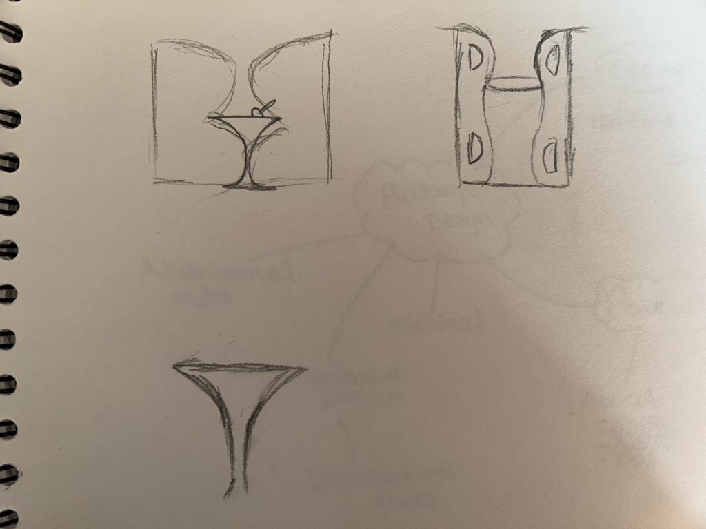
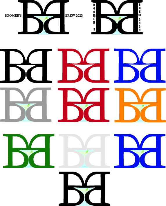
Here are some rough sketched ideas for the ‘Boomer’s Brew’ logo. The logo consists of the two ‘B’s, one has been horizontally flipped and when placed together and slightly manipulated, it creates the perfect shape for common cocktail glass. It was a passing thought to have the energy drink contain alcohol so with this logo in mind, it was decided to make it a caffeinated seltzer. With further enhancement of the logo, a conceptual design was created and matched perfectly with the alcoholic aspect.
Rejected Ideas
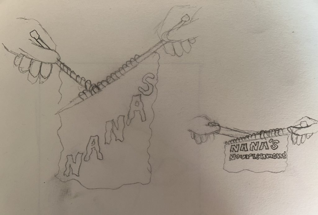
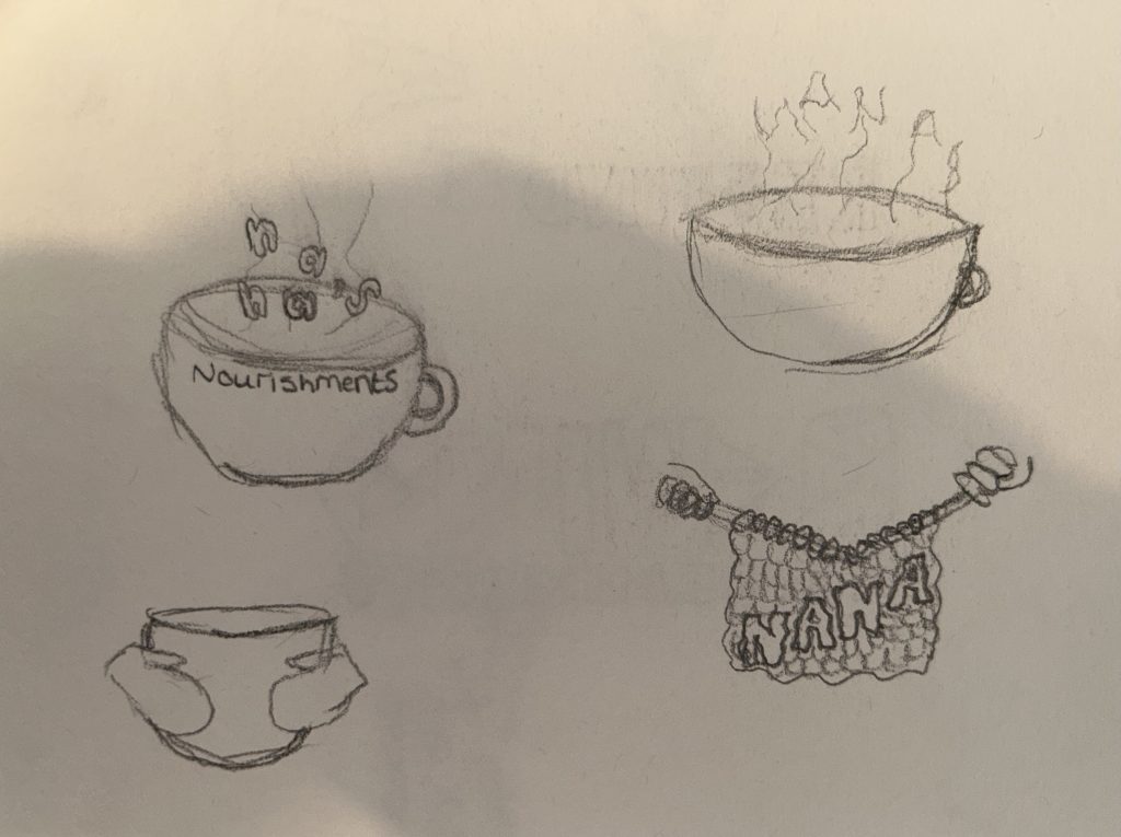
Many brand name concepts consisted of the alliteration such as ‘Nana’s Nourishments’, the idea behind this name was to create a cosy feeling that grandparents tend to have. One of the logo designs was a hot cup of tea and the conceptual aspect of this design would be the hot stream creating the word ‘nana’. Another logo design for this name was to have the brand name knitted. Knitting is a very common hobby for the elder generation so this concept would have enticing towards the specific audience.
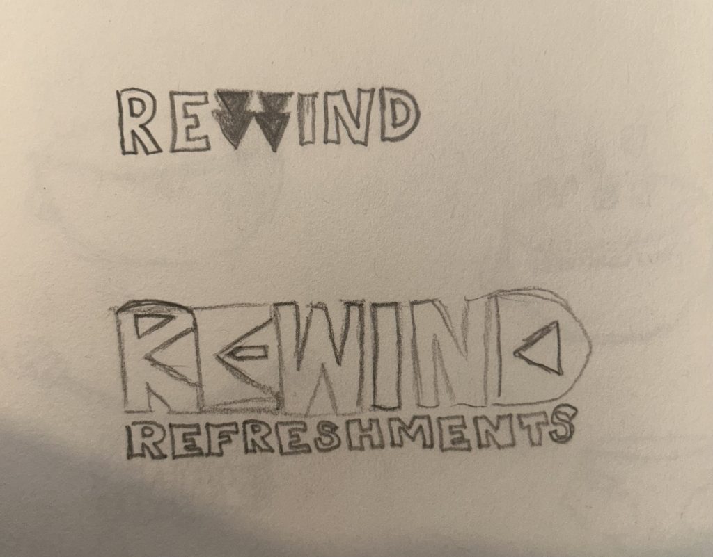
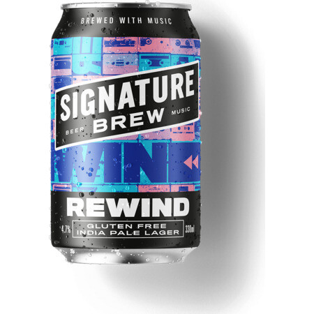
Another rejected idea that did become more enhanced was the name ‘Rewind’, the logo design contained the rewind icon within the ‘R’ and ‘E’. The name ‘Rewind’ was chosen at first because it is likely that people over 60 do wish to rewind time so this name would have worked well with the audience but after some further research, it was found that this was already a brand with a similar logo concept.

References
Bang Energy Drink. (n.d.) Body Shocker. Available online: https://bodyshocker.co.uk/product/bang-energy-drink-12-x-500ml/ [Accessed 12 Apr. 2023].
Reign Total Body Fuel Energy Drink. (n.d.) Protein Pick and Mix. Available online: https://www.proteinpickandmix.co.uk/reign-total-body-fuel-energy-drink/ [Accessed 12 Apr. 2023].
Signature Brew Rewind. (n.d.) eEbria Trade. Available online: https://www.eebriatrade.com/products/beer/signature-brew/35228-rewind [Accessed 12 Apr. 2023].