As instructed, I delved into the English spelling resource website, Spellzone. Spellzone is an online learning resource, tailored for students to learn at their own pace.
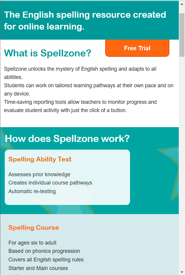
Once the website had loaded, my first initial thought was that the home page looked very bland and simplistic.
Straight away there are two bright orange buttons indicating the call-to-action process. The log in button for if you’re already registered with Spellzone and the free trail button to entice new users in.
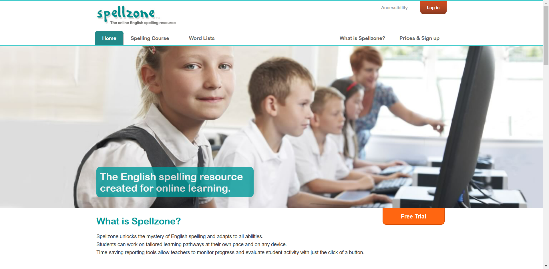
The onboarding aspect of the first page is very simple. without scrolling any further, we are presented with what Spellzone is and a photo of school students.
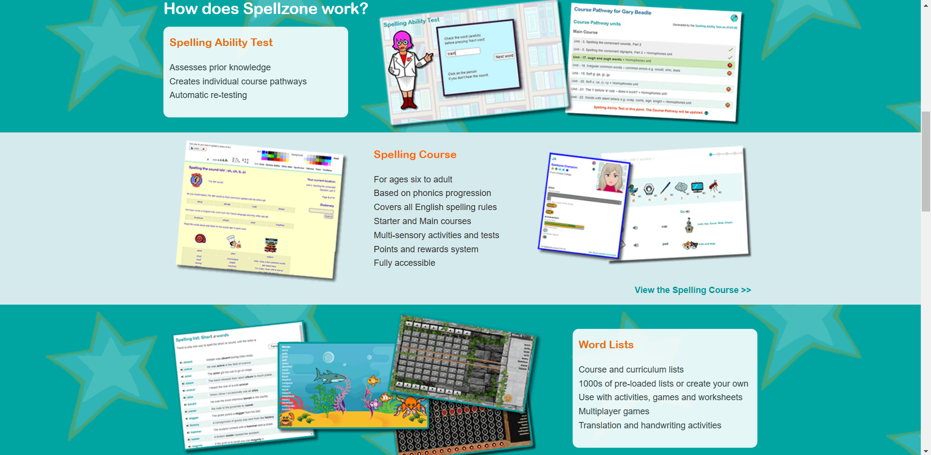
This is what we are presented with when we scroll further down the home page, figure 1 and figure 2 are both very different in style choices. They look like two very different websites. Figure 1’s appearance looks more aimed towards an older generation where as figure 2 appears more child-like and enticing towards students and the younger generation.
Within this three rows, presented in figure 2, there are photos of what seems like mini games. I assume these mini games are to help the process of learning to spell. We are also shown what the website consists of, the ability test, spelling course and the word lists.
The unique background gives character to the website, which will encourage younger children to want to discover more about Spellzone.
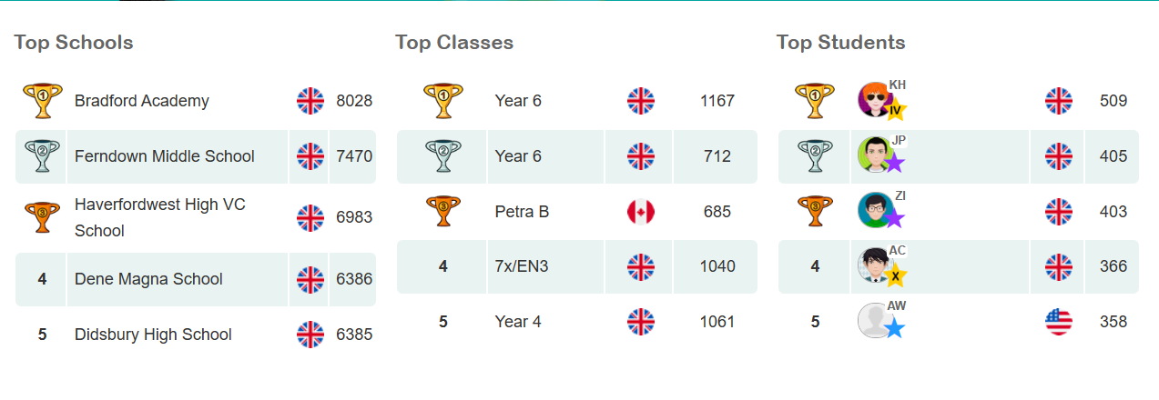
Figure 3 is a brilliant concept on the website, this is a unique way of enticing children to learn. Children can become very competitive so introducing a leader board gives children a sense of purpose.
Overall, considering this website is still active, it seems a little outdated in appearance, so I have taken some aspects of the website and created a more modern looking design.
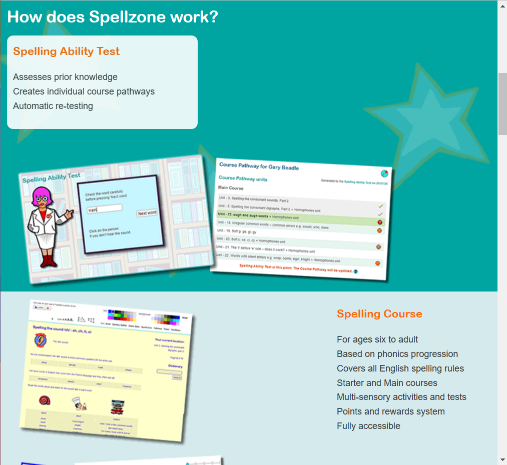
I decided to experiment with the responsiveness of the Spellzone webpage. Figure 4 shows how the website would respond to a tablet screen and figure 5 shows how it would respond to a mobile screen. The responsiveness of this website is fairly poor. When decreased in size to a tablet view, the images get bigger but sit themselves underneath the small heading, thus creating negative space. When reduced to a mobile view, the photos disappear completely. This could be improved by increasing the size of the heading and body of text. The images can remain in the mobile version and would sit nicely underneath the body of text. More images of the mini games could be added to the tablet format to reduce the unnecessary spacing.
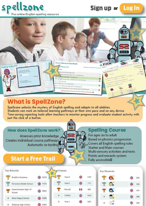
Figure 4 shows my redesign of the Spellzone website, it remains very similar but the opening page, which would be the top half of this A4 page, is now a lot more enticing towards the younger audience, the images of the mini games have been placed in a position that almost creates a border at the bottom of the photograph. I decided to include this robot character from the website as a repetitive website mascot. Having a character like this throughout the entire website makes the UX more memorable.
I’ve included similar stars to the background shown in figure 2 across the home page to reduce any negative space and again, keep the younger generation more engaged. Text boxes with bigger fonts have been introduced to make the information easier to read.
The call-to-action buttons have remained in similar positions as I thought this was a good aspect in the original design. The positioning of the leader board has been brought higher to increase the onboarding process as I think this concept with entice a lot more students to want to get involved.