‘Brutalism in web design is a crude, plain, and transparent style that prioritizes functionality over form and effectivity over aesthetics.’ (How to Use Brutalism in Web Design + 7 Great Examples, 2022)
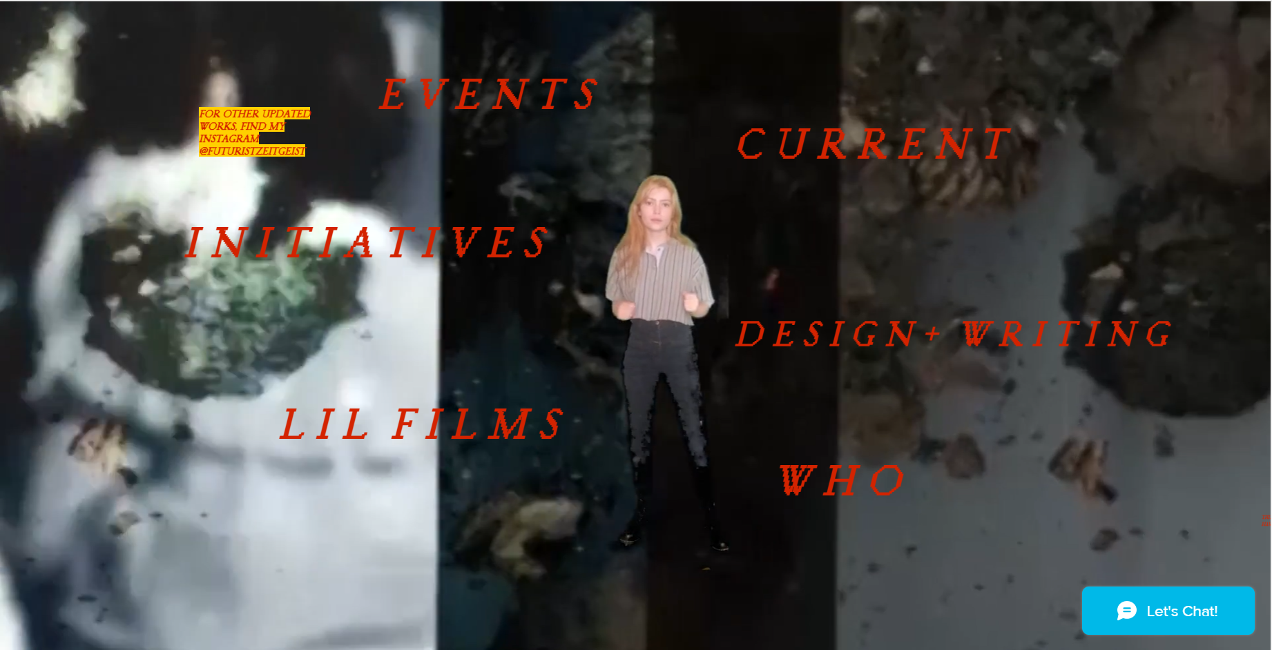
The websites previewed on brutalistwebsites.com vary from extremely chaotic to very basic and boring. An example of an extremely chaotic webpage is m-o-l-l-y.com, when you click on this website you are presented with a background video and a dancing woman layered over the video. Straight away it’s very busy and it takes a couple of minutes to load.
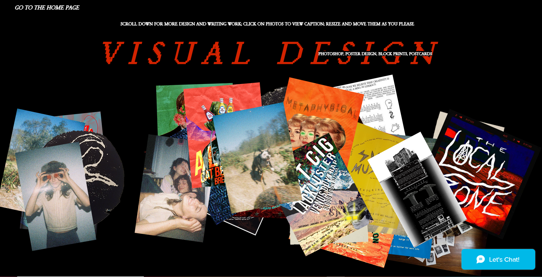
When you click on ‘Design – Writing’ you are presented with the above image on the right. This page could not load properly when first clicked on but after refreshing the collage style layout was presented but the background video could not play. The images can be moved, rotated and do present bigger when clicked on. After reading Molly’s interview they stated that they designed the website themselves but used Wix, which is a website designing brand (HOME, n.d.).
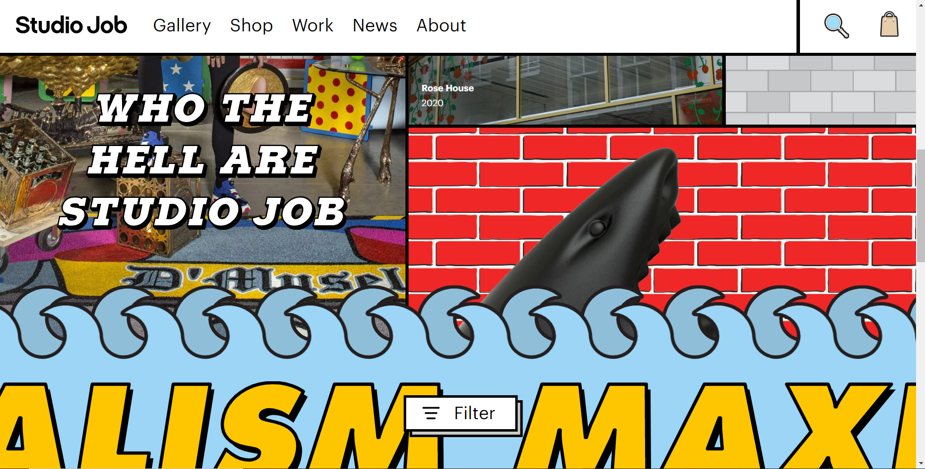
Another example of an extremely chaotic web design is ‘Studio Job’ (https://www.studio-job.com/), below is the home page the user is first presented with. It’s animated and full of life. There are no negative spaces within this web design. Studio Job are contemporary artists and their web design really do represent their art and personality (Studio Job, n.d.).
Moving on to quite a timid and basic website, Kostas Murkudis (http://kostasmurkudis.org/ss2018) is a website showing photography collections.
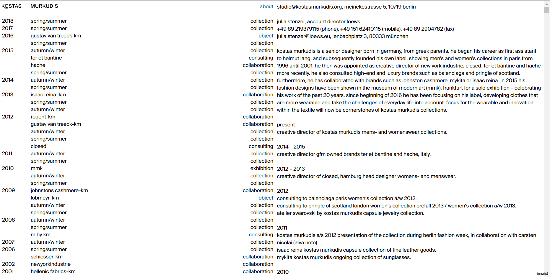
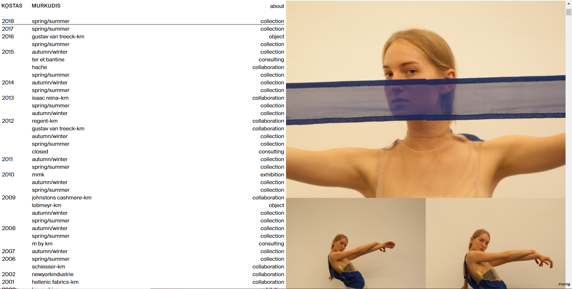
As you can see this website is very timid compared to the two other examples shown above. On the left half of the website there is a block of text stating the collection names and dates, this runs throughout the whole website so the content shown can only be seen on the right half of the page. When the user scrolls up, they will be presented with an ‘about me’ page and when they scroll down the website will go through the collections throughout the years. In the interview with Kostas Murkudis, they state that their design focuses on the content with no effects. The design is very clean and pure but could struggle to keep a user engaged, it lacks in colour and the font used is very basic. (Kostas Murkudis, n.d.).
Bibliography
Brutalist Websites. (n.d.) brutalistwebsites.com. Available online: https://brutalistwebsites.com/ [Accessed 4 Nov. 2022].
HOME. (n.d.) molly. Available online: https://www.m-o-l-l-y.com/ [Accessed 4 Nov. 2022].
How to Use Brutalism in Web Design + 7 Great Examples. (2022) Elementor. Available online: https://elementor.com/blog/brutalism-in-web-design/#:~:text=Conclusion- [Accessed 4 Nov. 2022].
Kostas Murkudis. (n.d.) Kostas Murkudis. Available online: https://kostasmurkudis.org/ [Accessed 4 Nov. 2022].
Studio Job. (n.d.) www.studio-job.com. Available online: https://www.studio-job.com/ [Accessed 4 Nov. 2022].