
Colours can be such a wide spectrum to explore but I would like to venture into the emotions we feel when viewing or using certain colours. ‘We might also like certain colours because of their emotional connotations. Yellow, for example, is often seen as a ‘happy’ colour, while darker colours can be more mellow and reflective.’ (Jarrett). A lot of the emotions we feel from colours can be influenced from our childhood and growing up. Seeing yellow as a happy colour could be because of the sun, we make some of our fondest memories in the sunshine and brighter blue tones can be paired with that happy colour because of the blue skies we witness on sunnier days. ‘Feeling blue’ is a popular term used when we are experiencing more negative emotions, this could be because darker blue tones can be associated with more drab, dull weather.
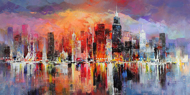
William Haenraet’s ‘City Scrapes’ is a great example of how colour can be used in fine art to show how the weather and city streets may look throughout times of the day. This painting looks as though it is split into two. The left-hand side looks sunny and bright, full of life. The golden sun shines on the city buildings, leaving yellow and orange reflections. This side of the painting makes me feel warm, it makes me want to be there basking in the sun. On the right-hand side, it appears duller, as though it has started raining and heavy clouds are hovering over the buildings. This side gives off feelings of emptiness or sadness and now I don’t want to be there. This painting was quite the eye-catcher when researching artists and their use of colours because it is full of so much life and emotion. The reaction I have towards this painting is how I want to portray my work for the major project.
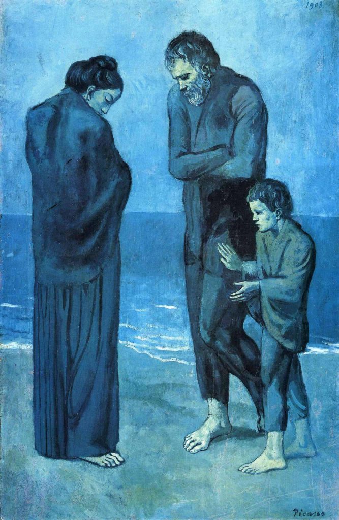
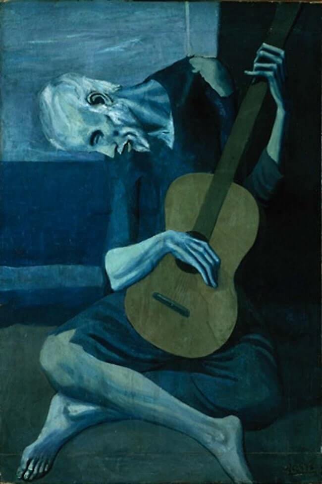
Moving on to something that portrays much darker emotions, Picasso’s ‘Blue Period’. This time of Picasso’s career is very well known but the reasoning behind these sad paintings might not be. Picasso’s ‘Blue Period’ started when he lost a friend to suicide (PabloPicasso.org), thus leaving very negative thoughts and feelings. These emotions have been portrayed through these paintings. Although the paintings show people with very depressing facial expressions and body language, the emotions still very much came from the colours used. These shades of blue have been depicted carefully to help portray the feelings that Picasso was experiencing so deeply, if these blue and green tones were any brighter, it would not be as upsetting to view. Picasso’s palette started to brighten when he met his mistress, thus creating the ‘Rose Period’. During this time, his paintings became full of life because his personal emotions started becoming brighter.
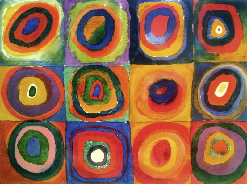
I wanted to include Wassily Kandinsky’s ‘Squares with Concentric Circles’ because this painting doesn’t involve any form of object or person, so it is harder to depict any form of emotion created from this artwork. I do think that there is no possibility of feeling any negative thoughts from this bright selection of colours. In area’s where darker, duller colours have been used, they’ve been counteracted with a brighter, fuller colour.
References
Colour Branding: The Importance of Colour Choice. 4 Mar. 2021, waterfront.digital/colour-branding-the-importance-of-colour-choice/. Accessed 2 Nov. 2023.
Georgiy. Ten Artists, Who Conquered Colour, 22 May 2016, art-bydens.blogspot.com/2016/05/ten-artists-who-conquered-color.html#.Wz_QENJKhPY. Accessed 2 Nov. 2023.
Jarrett, Christian. “Why Do We Have Favourite Colours?” Www.sciencefocus.com, www.sciencefocus.com/science/why-do-we-have-favourite-colours. Accessed 2 Nov. 2023.
Pablo Picasso Blue Period. www.masterworksfineart.com/artists/pablo-picasso/blue-period. Accessed 2 Nov. 2023.
Pablo Picasso Rose Period. www.masterworksfineart.com/artists/pablo-picasso/rose-period. Accessed 2 Nov. 2023.
PabloPicasso.org. “Pablo Picasso’s Blue Period.” PabloPicasso.org, 2009, www.pablopicasso.org/blue-period.jsp. Accessed 2 Nov. 2023.
Wassily Kandinsky. www.wassilykandinsky.net/work-370.php. Accessed 2 Nov. 2023.