Categories
Proposal

Synthesis – Combination of Colour & Photography

Colour plays a major role in photography so it would be simple to combine the two together but the way I would like to do this for my major project is through a photobook or magazine.

The aim of the photobook is to have the viewer experience a rollercoaster of thoughts and feelings when flicking through the pages. Throughout the book I want to portray different times of the day on different days to really get the full effect of how the colour of the weather can impact emotions. It will showcase sunny days, rainy days and everything in-between. I want to tell a story through a timeline.

To include the graphic design aspect to this photobook, I will be designing the pages in a grunge-like manner. I aim to include text, handwritten words or just simple decals to some pages, making it niche.

These are some examples of photobooks to further explain my thought process and visions I have for future productions.

First example of a photobook layout that inspires the final major project photobook (“Oyster — Marco Marzocchi”).

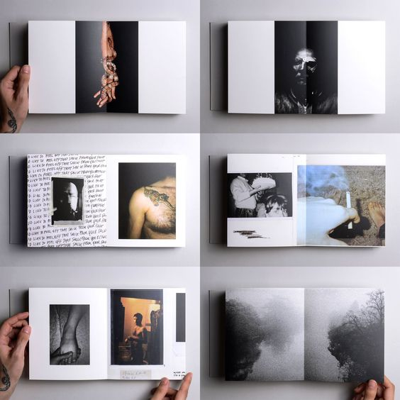
The first example above shows the layout for a photobook designed by an artist named ‘Void’. This is a good example of how I would like my final photobook to look. The photographs seen in the image have different sizes and are have unique placements throughout the pages. This niche way of layout design is appealing and refreshing because it differs to the stereotypical photobook, this inspires me to design something niche.

Adobe magazine layout that showcases similar design styles that will be used in the major project photobook (“ABoDE Magazine Layout & Design”).

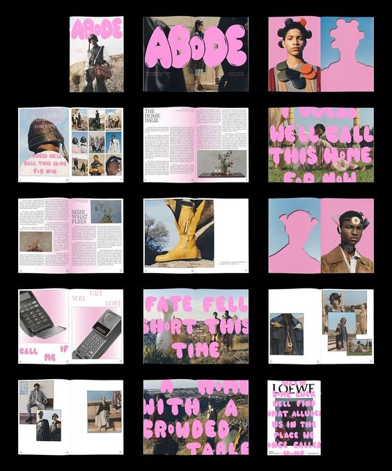
This magazine has been included as a good inspiration towards my final photobook because it shows how typography can be intertwined with photography to create something grunge-like. The same pink tone has been used throughout all the pages which adds character and connects every page. Like the first example, the photos are all sized differently and the pages are very editorial which makes this magazine very aesthetic to view.

Dogway Skateboard magazine showing a good example of how photography can be arranged to keep the attention of the reader (“Dogway Skateboard Magazine”).

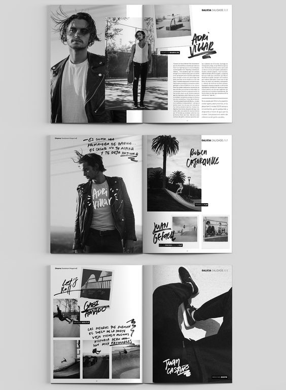
Although this last example lacks colour, the layout of these magazine pages really caught my eye. The use of handwritten text is very modern and is similar to the work I intend to produce. The photography layout is has been carefully thought out, there is no negative space and the placement of the text used is edgy and artistic.

References

“ABoDE Magazine Layout & Design.” Pinterest, www.pinterest.co.uk/pin/15199717486382244/. Accessed 2 Nov. 2023.

“Dogway Skateboard Magazine.” Behance, 2014, www.behance.net/gallery/33229605/Dogway-Skateboard-Magazine-Redesign. Accessed 2 Nov. 2023.

“Oyster — Marco Marzocchi.” Pinterest, www.pinterest.co.uk/pin/559361216236812874/. Accessed 2 Nov. 2023.

Categories
Proposal

Schedule – Future production

Now that the basics if this design idea have been discussed, it’s time to consider the future production of my photobook. From now (November 2023) to next May, the final product has to be complete, as well as any minute design ideas such as a logo for the photobook, the typography included and the finish of the entire book. Are the pages going to be glossy or have a matte finish?

A chart created to help plan the future development of my final major project.

I created this chart to help me through the designing, this helps me specifically calculate the time I have to complete everything and can be a reminder if I’m ever feeling lost throughout the process.

From November to January, I will continue to research into photobook layouts and look for any inspiration towards the editing side of photography. I then want to delve into some multimedia techniques that can be added into the photobook, like the Dogway magazine, spoken about in the previous post. I want to be able to add my own handwritten text onto my photos to make my finished product more appealing to the younger generation.

A gantt chart to further show the thought process of what is to come over the next few months.

Using this gantt chart can help me with future planning. This planning style gives me exact times to have tasks completed by. With photography being quite a new topic for me to explore, I want to spend most of the seven months taking photographs, I intend to take multiple photos for each hour of the day so I can have a detailed option in choosing the most fitting one for the book. Having multiple photos for one particular thing can also increase good editing and layout options.

A rough sketch of the design layout for the final photobook.

As shown in this rough sketch, I want to use each page to showcase every hour of the day, the photos may not be from the same day because I want to include different types of weather/seasons. The aim of this photobook is to tell a story, I want to be able to feel many emotions when looking at each photograph. From here, the next step is to start taking photographs and exploring the creative side of this project.