Categories
PSAD:WT

EX3 – Video production, design and editing using Premiere

Final video, edited in Adobe Premiere Pro.

In the first clip, my name appears in the bottom right corner, the text is being typed, this effect was created using a screen recording from my phone of me typing my name out against a green background.

Cropped screen recording from IPhone showing the name being typed out.
The process of the text being isolated and the background colour being removed using the Ultra Key.

Above shows the process of removing the background colour, leaving the text and a transparent background. In the final video, I added the video of myself and used the edited text video as an overlay.

The process of how the music was added from a video.

This video shows the process of adding the audio for the final video. The audio was taken from a screen recording on an IPhone, the visual were then deleted, leaving just the audio which was added as an overlay to the video.

References

Southstar (2022) 3 Suspects. Record Jet. Available online: https://youtu.be/-ZpRvR9JQHQ [Accessed 4 Jan. 2023].
Categories
PSAD:WT

EX 2 – Web and graphic design using the Elementor Plugin for WordPress 

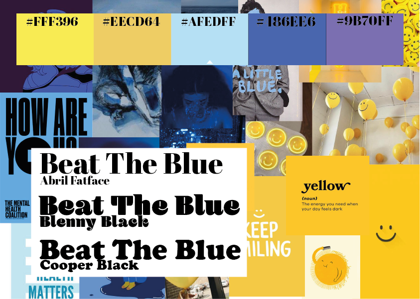
This is the mood board created for the campaign concept ‘Beat The Blue’ a mental health campaign to help friends of those who may be having a tough time, the idea behind the campaign is to provide tips for people who want to support their friends. The images used were found on Pinterest.
Colour palette chosen for the campaign, inspired by the mood board above.

The colour palette has been chosen for the campaign to show the contrast between ‘sad’ colours and ‘happy’ colours. The aim of this chosen colour palette is to make the user feel as though they have achieved something.

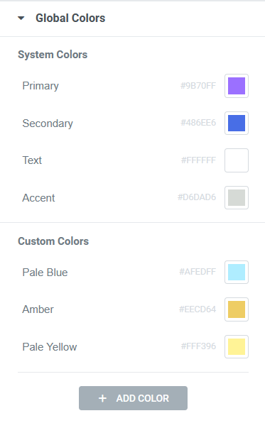
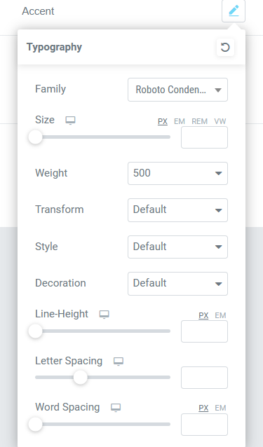
Screenshot of the chosen colours being added to the Elementor site settings.
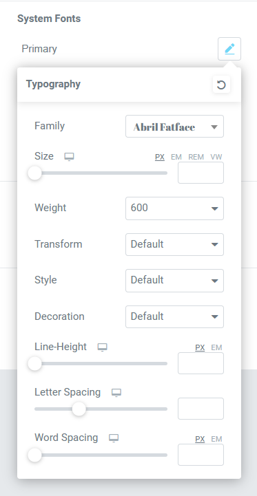
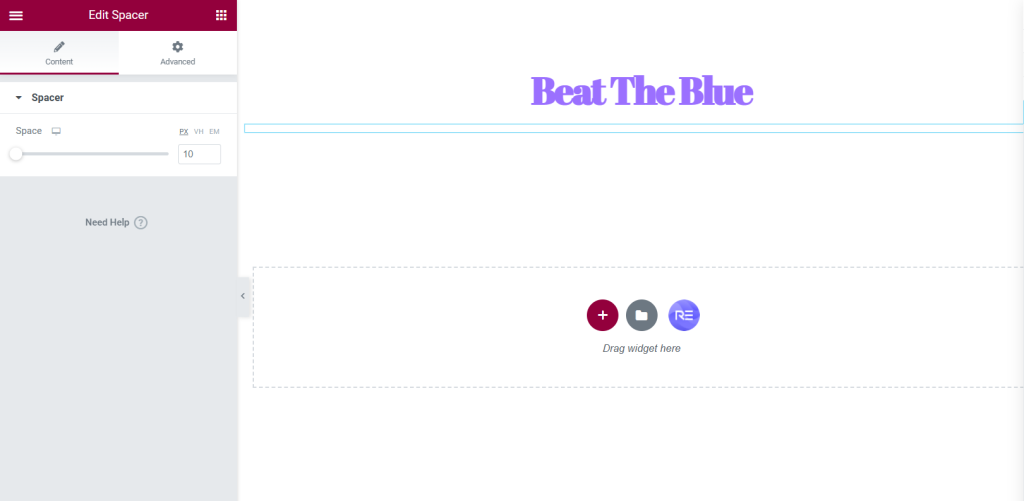
Screenshot of a spacer being added and an example of how the heading looks with the primary font.
An example of the widget spacer being adjusted because there was too much space between the heading and slogan.
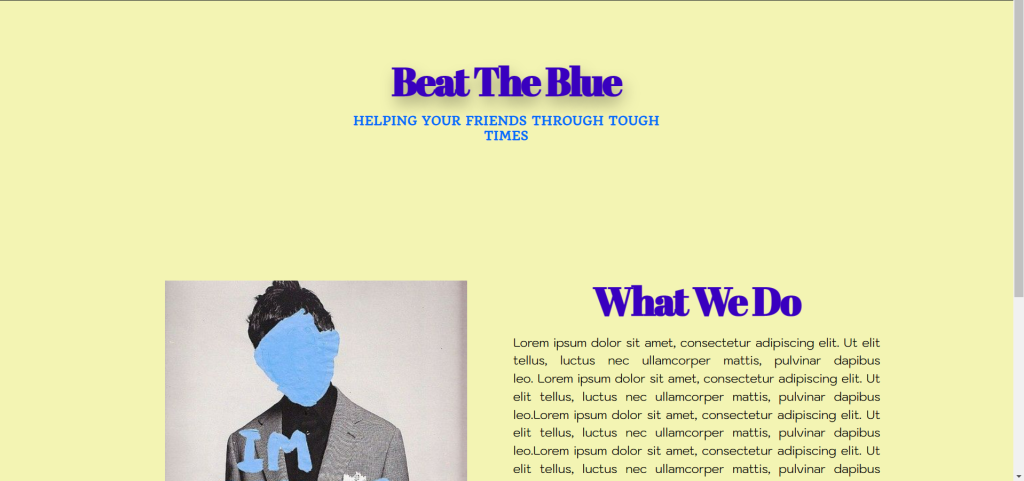
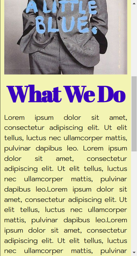
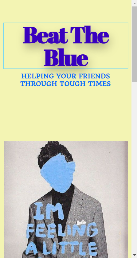
Preview of how the website looks on a desktop, the site looks very minimal but the colours are very complimentary of each other.

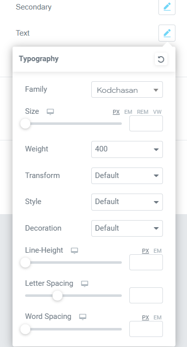
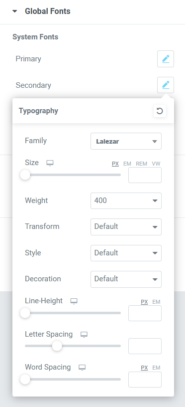
After experimenting with Elementor on WordPress, this is the site that was built. The site shows the initial idea of how the colour palette and chosen fonts will be used. the pale yellow background compliments the blue headings and sub-headings. This design is very minimal and simplistic which can come across as aesthetic but in the final design I would like the site to be a bit more youthful as the aimed audience for my campaign will be the younger generation.