For this activity we were asked to develop the onboarding sequence for a niche range of greeting cards to be sold online.
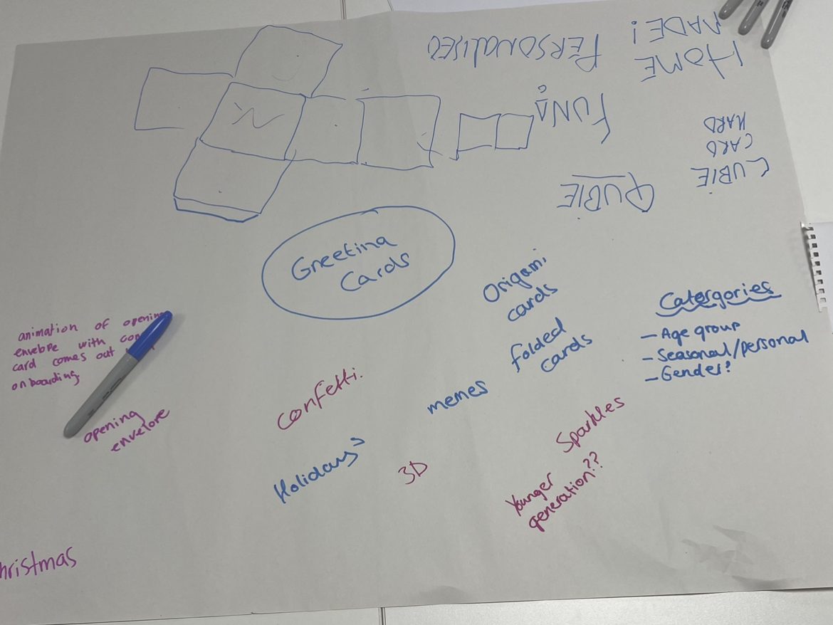
In a group of three, we took this brief and started to jot down our ideas onto a mind map. One of the first ideas we discussed as a group was to create origami cards, this concept would include the customer receiving the card unfolded and they would use origami (with included instructions) to piece together the chosen photo/text that the sender added online.
Figure 1: Mind map showing the different concepts from each member of the group. The group included myself, Chris Farrow and Sydney Jackson.
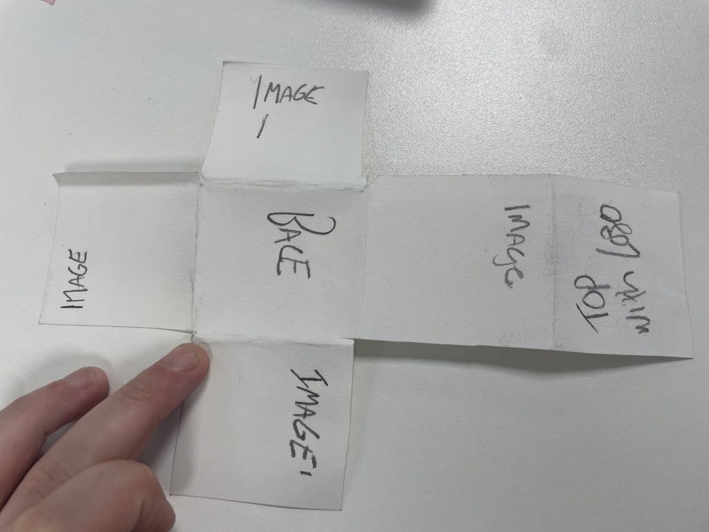
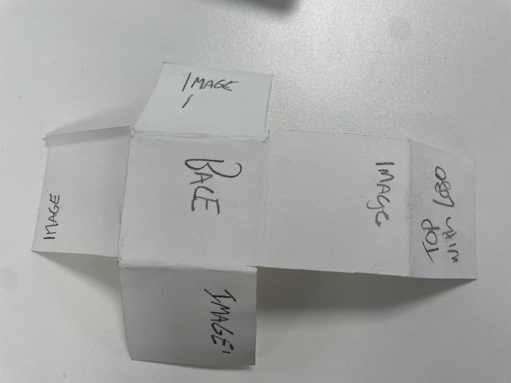
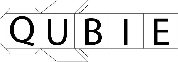
After discussing further, we all agreed that the origami aspect was a good concept but we decided that the entire range would be based on a cube. The idea behind the cube was to have the user insert images and text onto every face of the cube which can also be used as a memorable and sentimental ornament.
Figure 2Figure 3Model design of our cube concept for the range of greeting cards.
After experimenting with the model design and brand names, we collectively agreed on the name ‘Qubie’. Sydney then created a digital logo for ‘Qubie’.
Figure 4: Digital design for the brand logo and name, created by Sydney.
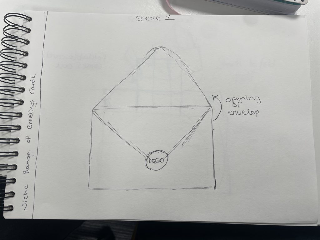
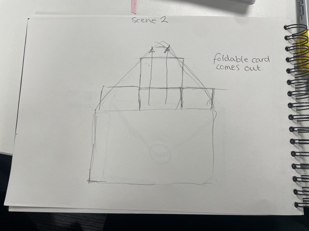
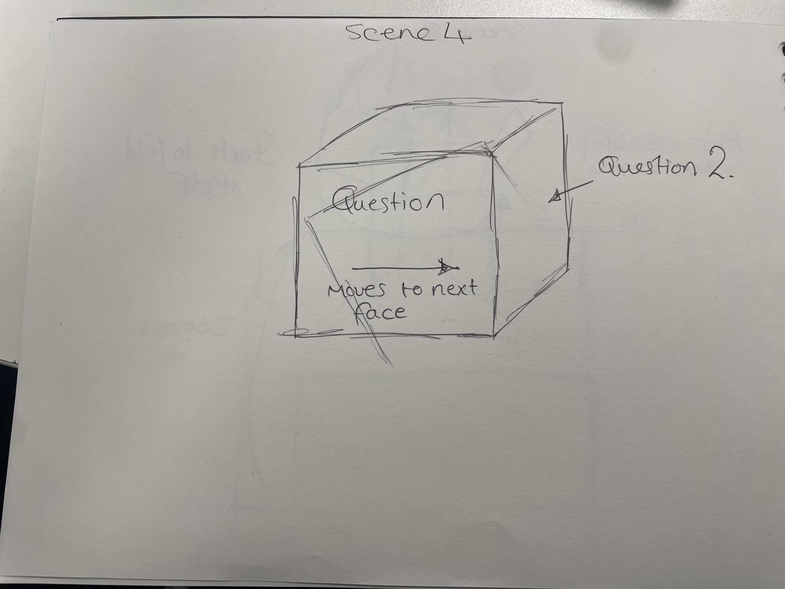
After we decided on the concept and name for the range of greeting cards, I took on the role of developing an animation for the onboarding sequence.
Figure 5Figure 6Figure 7Figure 8Sketches I drew to show the process of the onboarding sequence.
The sketches show four different scenes for the onboarding sequence, the idea was to show the net for the cube slowly come out of the envelope and start to fold itself into the cube. This would be the loading screen for when the user had finished adding their chosen images and text, showing what their Qubie would look like to the receiver.
Figure 9: Digital step by step version of the onboarding process, this would have then been created as an animation for the online store.
In conclusion, working in the group of different people really challenged my creative thinking, having different ideas bounce from one another created something unique and different to something I would normally decide on. Myself, Chris and Sydney made a great team and we were all very respectful to each others ideas.
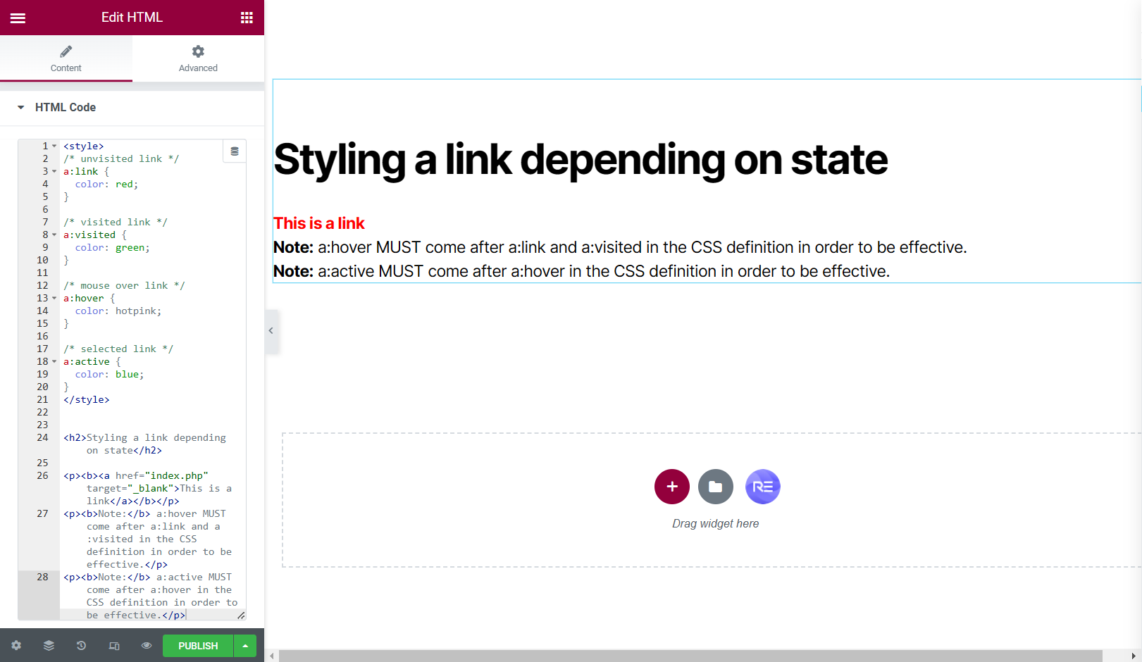
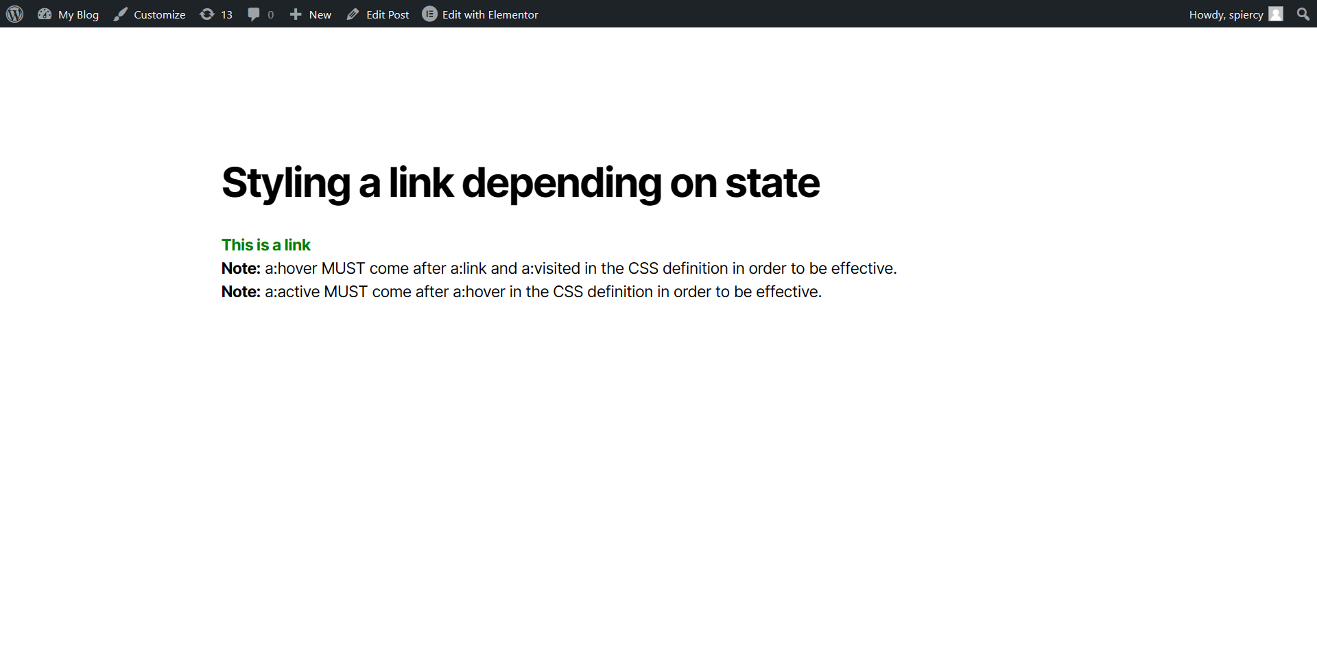
This blog post includes some basic steps on how to insert Hyper Text Markup Language, better known as HTML. In the brief we were given a simple code to input into our WordPress site.
The HTML:
<style> /* unvisited link */ a:link { color: red; }
/* visited link */ a:visited { color: green; }
/* mouse over link */ a:hover { color: hotpink; }
/* selected link */ a:active { color: blue; } </style>
<h2>Styling a link depending on state</h2>
<p><b><a href=”index.php” target=”_blank”>This is a link</a></b></p> <p><b>Note:</b> a:hover MUST come after a:link and a:visited in the CSS definition in order to be effective.</p> <p><b>Note:</b> a:active MUST come after a:hover in the CSS definition in order to be effective.</p>
We were also instructed to add a HTML widget into our WordPress site so we could input the coding.
Figure 1: Screen capture of the code being added to the WordPress site via Elementor.Figure 2: Screen capture showing the preview of how the HTML looked to an outside user.
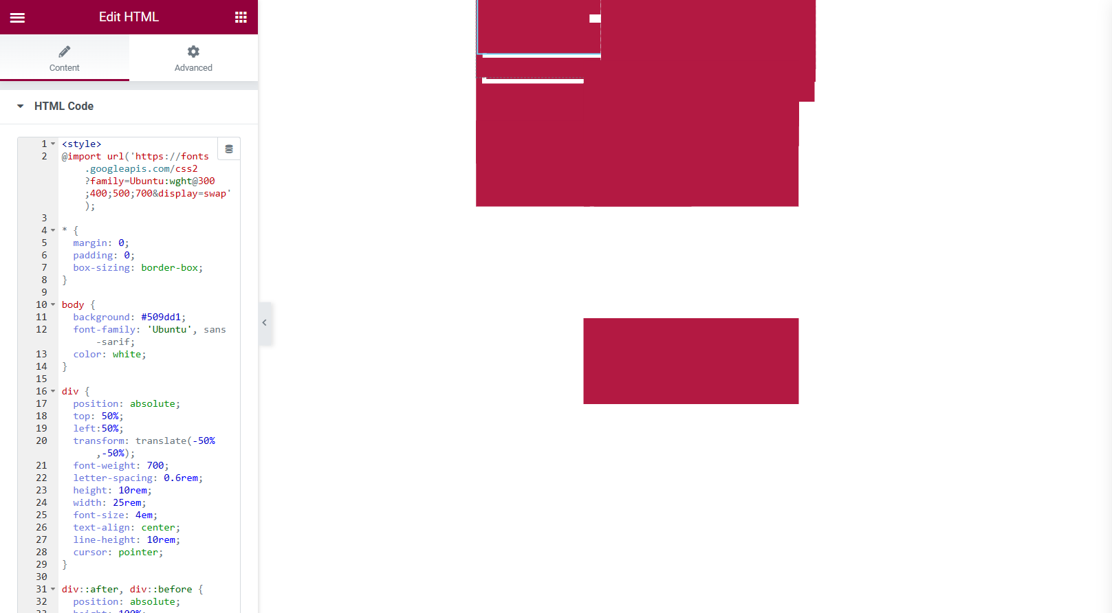
This was a very simple step-by-step task but then we delved deeper into CSS coding and animation, we were asked to look into a website called Codepen.
Codepen had some fantastic CSS animations, designed by frequent users. These animations also have the HTML, CSS and Java Script so i was able to use these animations within my own work.
The first example of me testing the HTML and CSS from a codepen designer shows the input of the coding and the preview of the blog post, testing to see if the HTML works.
Unfortunately, I couldn’t access BBedit from my home PC as instructed but I was still able to achieve the testing of certain animations using the HTML widget in Elementor.
Figure 3: Screen capture of how the animation looked before being previewed.Figure 4: Screen capture of how the animation looked during preview.
The animation was very simple but would bring a lot of life into buttons used throughout a website, the buttons shown do click and change tone of colour when the cursor is hovering over them. I didn’t have much hope for how it would look, judging by the first screen capture but once I preview the blog post I was rather happy with the results.
Figure 5: Screen capture of another animation example taken from Codepen.Figure 6: Screen capture of the preview screen, showing the animation.
This was another example of an animation taken from the website ‘Codepen’. The logo spins around throughout the entire site and the preview screen showed the same thing, I really liked this style of HTML and it was very easy for me to input into the widget.
Next, I looked into adding HTML to my already designed website to see if it would dramatically alter the web design or if it looked suitable to keep on the design.
Figure 7: Screen capture of the HTML being added to a complete design. Figure 8: Screen capture showing the background being removed.
I started with something small and basic, just in case it did alter my web design drastically. I inserted the HTML and CSS into the widget on the left hand side but did not enjoy the look of the white background, it was quite the eyesore so I did some experimenting with the code and found a way to remove the white background. I was ecstatic with these results, the added HTML now looks professionally designed.
Google Chrome Experiments
It was a wonderful experience to test some of the designs within Google Chrome Experiments. To see how certain designers use web technology and creativity was inspiring. There were certain interactive animations that really stood out to me.
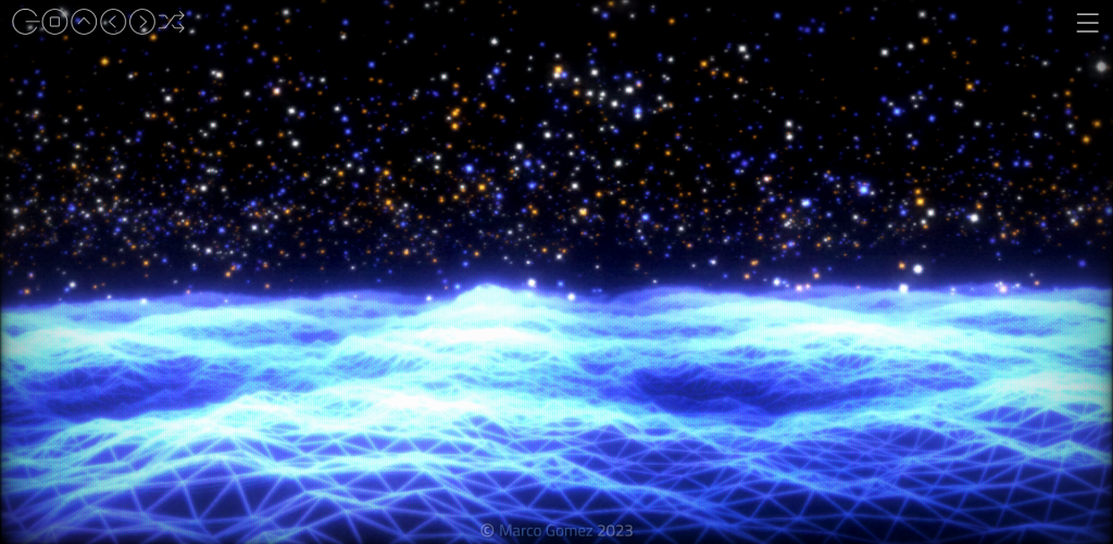
Figure 9: Scene 1 from this animation.Figure 10: Scene 4 from this animation.Figure 11: Scene 5 from this animation.(VinylAndParticles at WebGL Lab – Marco Gomez, n.d.)
The first interactive animation I came across was the one you see above. It became interactive with the cursor and with a song that was attached to the animation, which could be played and paused. There were multiple scenes you could flick through but all of them had a very similar colour palette and a futuristic design to them.
Figure 12: Screen recording of the testing of ‘Autodraw’, an interactive game-like experiment (Autodraw, 2019).
This second example was extremely fun and captivating. It appears to take what you have drawn as the user and suggests what you were trying to draw. As you can see in the video I drew a heart shape and was presented with a heart shaped box of chocolates. In my second attempt, I drew the basic shape of a house and was presented with a lot more suggestions. I think this is a great experiment for those that may struggle to digitally draw or would be a good idea to be included in certain games, like Pictionary.
Figure 13: Screen recording showing ‘a road trip through West USA’ (A road trip through west USA, n.d.).
This experiment consisted of a video where someone is driving through West USA but the timeline at the bottom shows all the areas in which the car drives to, these can also be clicked on, skipping the video to that certain area of West USA. I found this very intriguing as the roads and area’s end up looking very different form on another.
Figure 14: Screen recording show the interactive game within this experiment, called Tilt (Tilt, n.d.).
This experiment was in the style of a game you might possibly find in a mobile app store, the responsiveness of this experiment wasn’t very good, it seemed to have loaded as a mobile web browser which left a lot of negative space but other than the sizing, it was very creative and engaging. There were levels throughout so it seems like its a game that would continue for a long period of time but in the video I only played three levels.
In conclusion, there is a lot that can be done with HTML. Looking at the difference between Codepen and Google Chrome Experiments, there is certain amount of knowledge and skills a designer would need to achieve both styles of animation. It was exciting to experiment with both websites.
References
A road trip through west USA. (n.d.) tempo-l.ch. Available online: https://tempo-l.ch/experiments/roadtrip/ [Accessed 19 Jan. 2023].
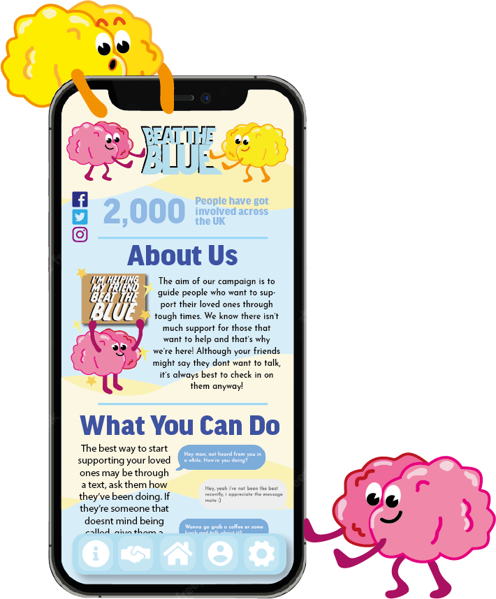
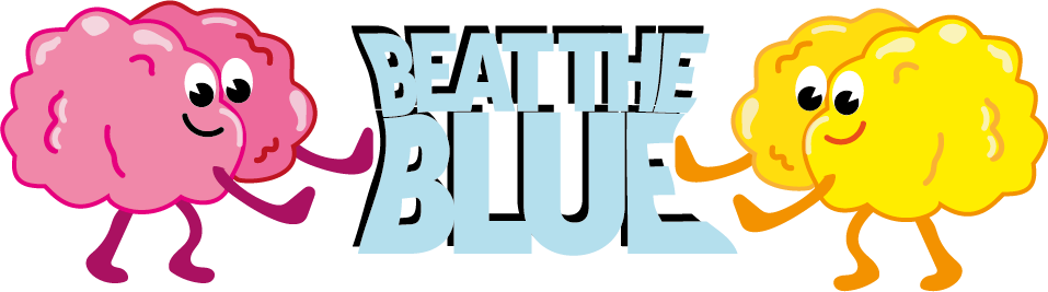
The aim of our campaign is to guide people who want to support their loved ones through tough times. We know there isn’t much support for those that want to help and that’s why we’re here! Although it might be difficult to know when your loved ones aren’t feeling themselves, it’s always best to check up on them and notice the signs that they might be struggling.
We’ll take you through our tips and tricks to help you be there for others.
We know it might be hard on you, not knowing how to help someone but don’t worry, with our guidance you’ll be able to make sure your loved ones know they have you to come to when they’re not feeling so good!
What You Can Do
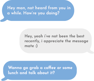
The best way to start supporting your loved ones may be through a text, ask them how they’ve been doing. If they’re someone that doesn’t mind being called, give them a ring! You can escalate the conversation further by asking if they want to meet up for a walk or grab a coffee! It’s always good to get out of the house.
Keep an eye one how distant your loved one is being and see if anything has changed in their behaviour.
Show Your Support
Previous
Next
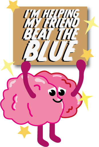
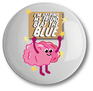
Beat The Blue Badge£2.50
A discreet way to show your support towards us and your loved ones.
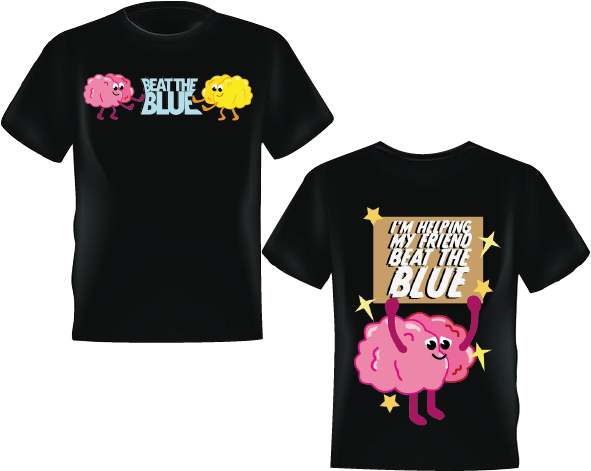
Beat The Blue T-Shirt£15
Walk the streets with pride knowing you've helped someone through a tough time with this black tee! Fabulous front and back design available.
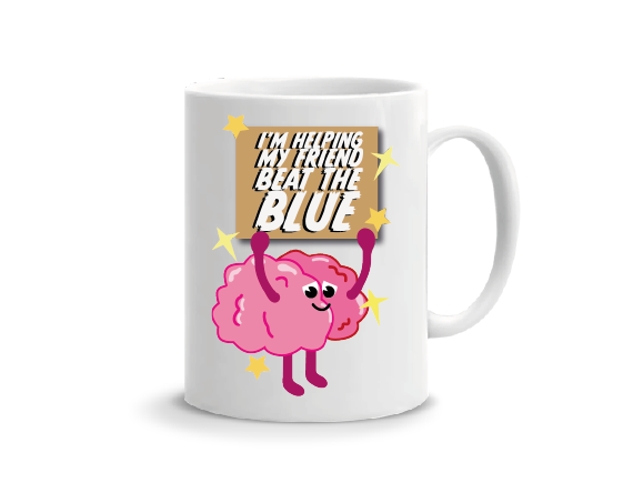
Beat The Blue Mug£4
You can't beat a hot drink when you're feeling low, why not surprise a friend with this great gift idea!
We Have An App Too!
We also have a Beat the Blue app for your mobile or tablet!
Use Beat the Blue on the go if you need some urgent advice for your loved ones.
You can also set up daily reminders through our app so you can remember to check in on those that need it.
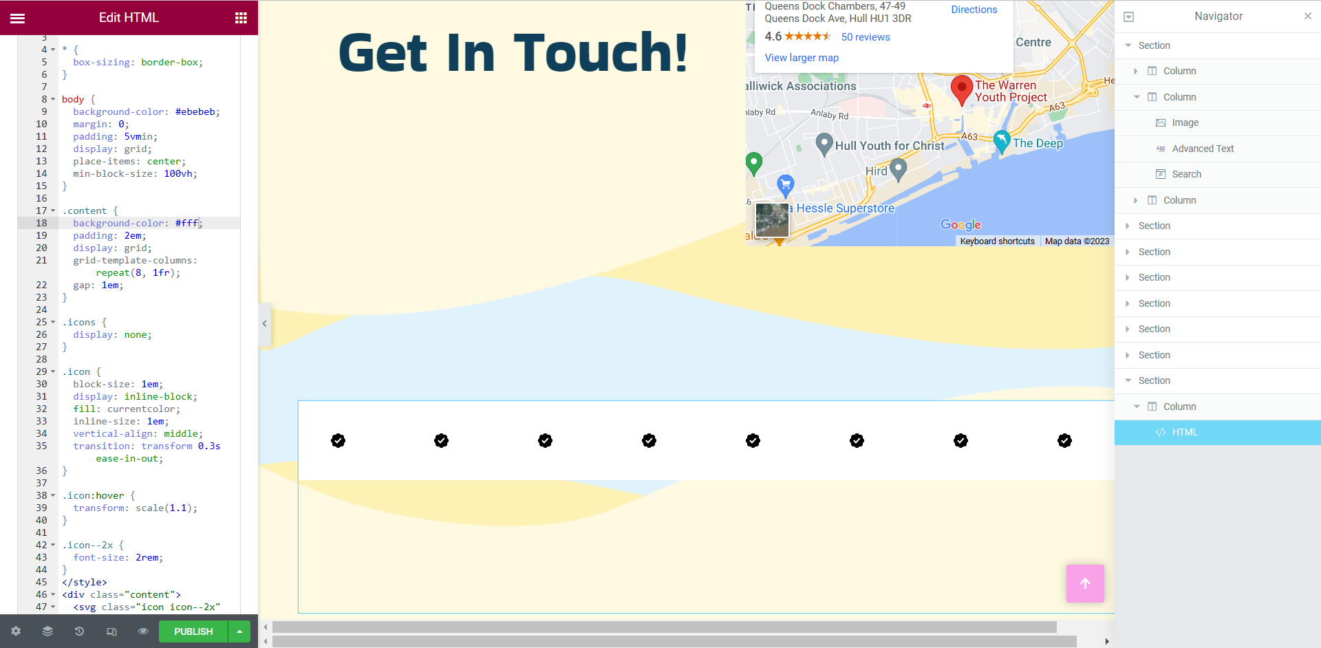
For this development blog I will be discussing responsive design and showing the progress of how to achieve a good responsive site within Elementor.
Responsive design is when developers use dynamic changes to the design of the site, it’s used to create the different sizes seen on commonly used screens, such as the desktop, tablet and mobile screen sizes (Experience, n.d.).
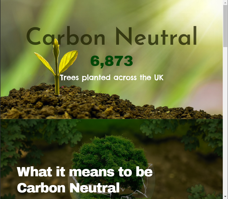
Using the WordPress plugin Elementor, I developed a web page on the topic of ‘carbon neutral’ as instructed. I included some basic widgets to create a very simple web design to show the responsiveness in my design.
Figure 1: Screen recording showing the desktop run through of the web page.
The video above shows how the web page would look on an average 1366×768 screen size. While designing the web page I did remain on the desktop screen size when including the widgets, this was to ensure that the negative space within the desktop design was kept to a minimum.
When I was happy with the results of the desktop design, I took a look into the tablet and mobile responsiveness. Decreasing the web page size to an average tablet screen size did lose the spacing between the two photos shown in the top two widgets of the design.
Figure 2Figure 3
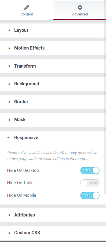
To resolve this issue, I manually inserted a spacer widget to let the white background peep back through. After inserting the spacer and checking the responsiveness towards this new widget in the desktop and mobile designs, I noticed that there was now too much space between the first and second widgets. This issue was resolved using the advanced settings of the spacer widget. In the ‘responsive’ section there were options to hide this widget in the three different sizes, after tinkering with these settings, the problem was fixed and I was happy with the tablet design.
Figure 4: Screen recording showing the responsive design within the tablet screen size.
After inserting the spacer and having a percentage of the white background back, I noticed that it looked a little too bare so I inserted a progress bar which I edited to only be viewed within the tablet screen viewing.
Figure 5: Screen recording showing the mobile web browser of the Carbon Neutral web page.
The mobile design remained very similar to the other two screen sizes but I decided to add a testimony widget, with a star rating, just above the ‘contact’ block.
The testimony widget was the perfect size for the mobile preview but looked out of place within the other two sizes, on the desktop size there was too much negative space surrounding the widget so I decided to only have the widget on the mobile design to creates a diverse user experience within the three screen sizes.
References
European Parliament (2019) What is carbon neutrality and how can it be achieved by 2050? Europa.eu. Available online: https://www.europarl.europa.eu/news/en/headlines/society/20190926STO62270/what-is-carbon-neutrality-and-how-can-it-be-achieved-by-2050 [Accessed 20 Jan. 2023].
Experience, W.L. in R.-B.U. (n.d.) Responsive Web Design (RWD) and User Experience. Nielsen Norman Group. Available online: https://www.nngroup.com/articles/responsive-web-design-definition/#:~:text=Responsive%20web%20design%20(RWD)%20is [Accessed 26 Oct. 2022].
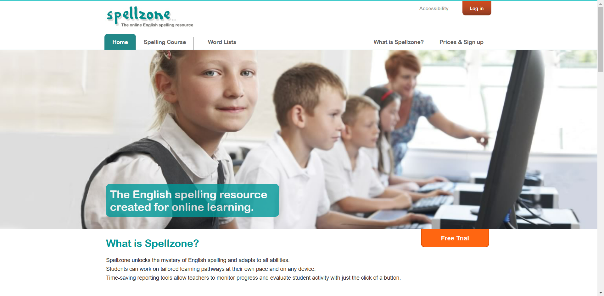
As instructed, I delved into the English spelling resource website, Spellzone. Spellzone is an online learning resource, tailored for students to learn at their own pace.
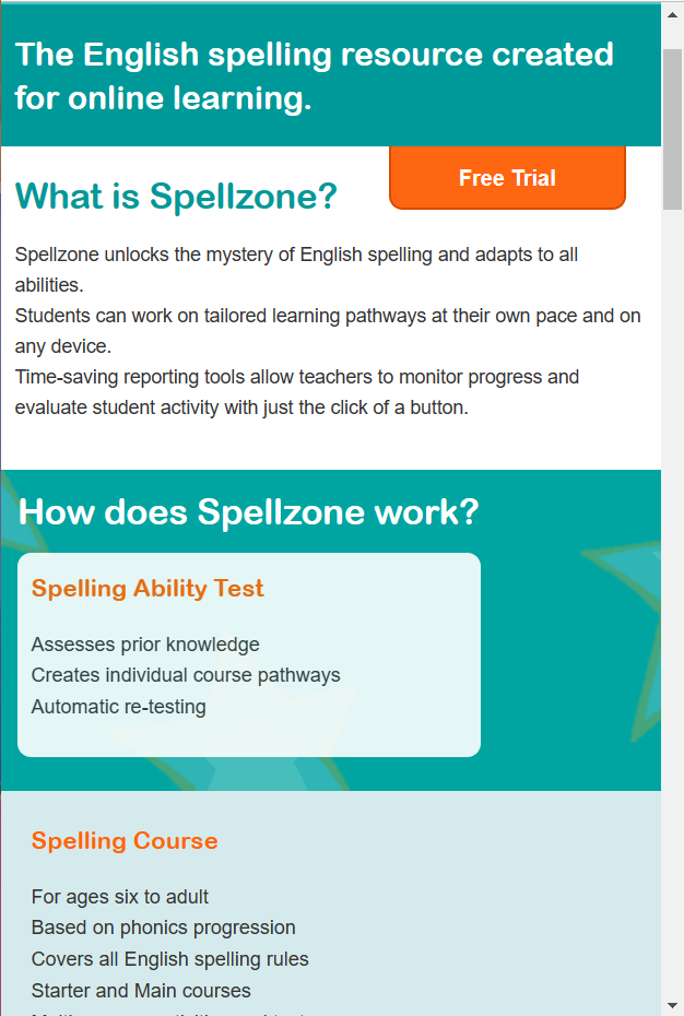
Once the website had loaded, my first initial thought was that the home page looked very bland and simplistic.
Figure 1: Screen capture of the home page to Spellzone.
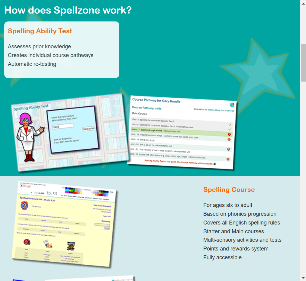
Straight away there are two bright orange buttons indicating the call-to-action process. The log in button for if you’re already registered with Spellzone and the free trail button to entice new users in.
The onboarding aspect of the first page is very simple. without scrolling any further, we are presented with what Spellzone is and a photo of school students.
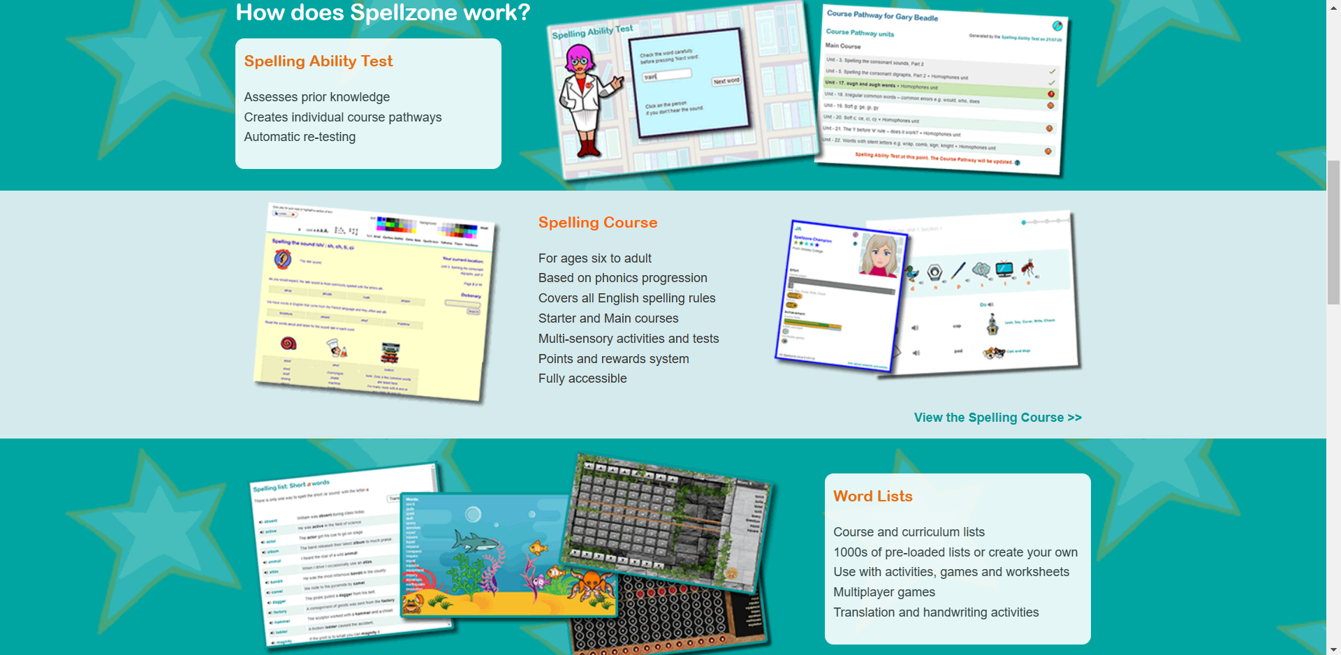
Figure 2: Screen capture of the home page when scrolling down.
This is what we are presented with when we scroll further down the home page, figure 1 and figure 2 are both very different in style choices. They look like two very different websites. Figure 1’s appearance looks more aimed towards an older generation where as figure 2 appears more child-like and enticing towards students and the younger generation.
Within this three rows, presented in figure 2, there are photos of what seems like mini games. I assume these mini games are to help the process of learning to spell. We are also shown what the website consists of, the ability test, spelling course and the word lists.
The unique background gives character to the website, which will encourage younger children to want to discover more about Spellzone.
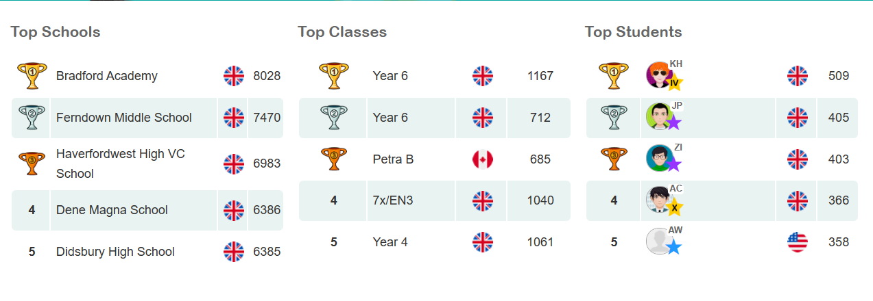
Figure 3: Screen capture of a leader board which is presented further down the home page.
Figure 3 is a brilliant concept on the website, this is a unique way of enticing children to learn. Children can become very competitive so introducing a leader board gives children a sense of purpose.
Overall, considering this website is still active, it seems a little outdated in appearance, so I have taken some aspects of the website and created a more modern looking design.
Figure 4: Screen capture showing the responsiveness of the webpage when decreased in size.Figure 5: Screen capture showing the responsiveness when further decreased in size, similar to a mobile screen.
I decided to experiment with the responsiveness of the Spellzone webpage. Figure 4 shows how the website would respond to a tablet screen and figure 5 shows how it would respond to a mobile screen. The responsiveness of this website is fairly poor. When decreased in size to a tablet view, the images get bigger but sit themselves underneath the small heading, thus creating negative space. When reduced to a mobile view, the photos disappear completely. This could be improved by increasing the size of the heading and body of text. The images can remain in the mobile version and would sit nicely underneath the body of text. More images of the mini games could be added to the tablet format to reduce the unnecessary spacing.
Figure 4: An A4 page reworked design for Spellzone.
Figure 4 shows my redesign of the Spellzone website, it remains very similar but the opening page, which would be the top half of this A4 page, is now a lot more enticing towards the younger audience, the images of the mini games have been placed in a position that almost creates a border at the bottom of the photograph. I decided to include this robot character from the website as a repetitive website mascot. Having a character like this throughout the entire website makes the UX more memorable.
I’ve included similar stars to the background shown in figure 2 across the home page to reduce any negative space and again, keep the younger generation more engaged. Text boxes with bigger fonts have been introduced to make the information easier to read.
The call-to-action buttons have remained in similar positions as I thought this was a good aspect in the original design. The positioning of the leader board has been brought higher to increase the onboarding process as I think this concept with entice a lot more students to want to get involved.
The parallax effect in design involves a background that moves in a different pace to the foreground content, the visual technique creates the illusion of depth (17 unique websites with parallax scrolling effects | Webflow Blog, n.d.).
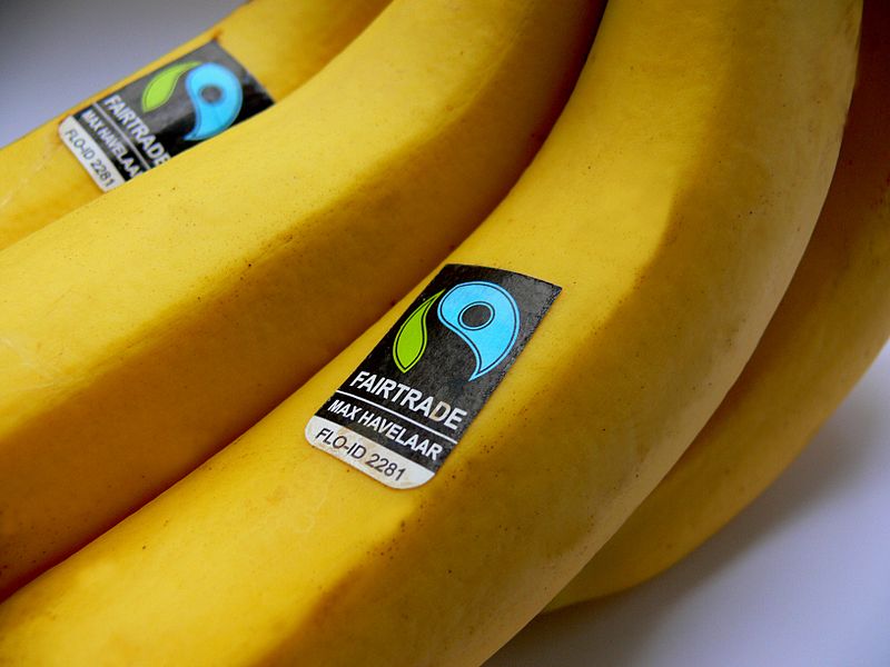
For this activity I created a webpage, promoting a range of fair trade products, as instructed. After completing step-by-step tasks on how to create the parallax effect within Elementor, I felt confident enough to create the Fair Trade webpage.
Figure 1: Screen recording of the webpage design, showcasing the use of Parallax.
Using this visual technique creates a sense of professionalism within web design. Having simple animations throughout a website can increase the onboarding aspect for a user experience. Like the video above, showing different images through a parallax animation is enticing to the user, it can make the user want to interact more with the animation.
I’m very glad to have learnt this technique and will be exploring it further for my design portfolio campaign piece.
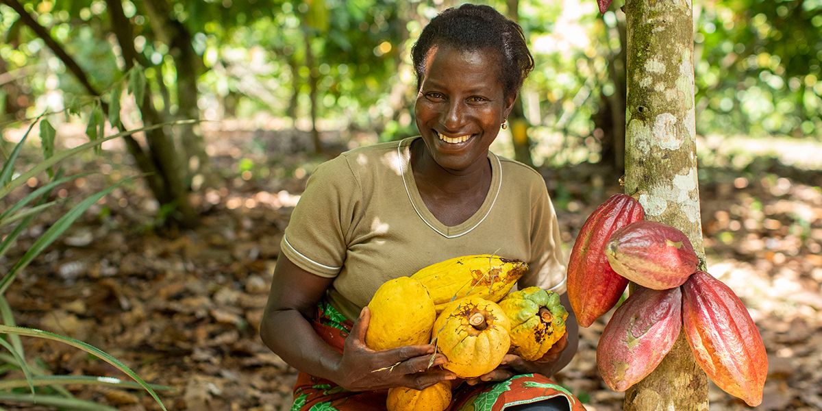
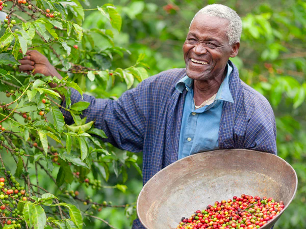
Figure 2.Figure 3.Figure 4.Figure 5.Gallery of photographs used within the Fair Trade web design.
References
17 unique websites with parallax scrolling effects | Webflow Blog. (n.d.) Webflow. Available online: https://webflow.com/blog/parallax-scrolling#:~:text=What%20is%20a%20parallax%20effect [Accessed 21 Jan. 2023].
Fair Trade Facts for Kids. (n.d.) Available online: https://planbee.com/blogs/news/fair-trade-facts-for-kids [Accessed 21 Jan. 2023].
Fair Trade Labels: The Complete Guide. (n.d.) Available online: https://www.traidcraftshop.co.uk/the-thing-about-fair-trade-labels [Accessed 20 Jan. 2023].
Fairtrade Foundation (2021) What is Fairtrade? Fairtrade Foundation. Available online: https://www.fairtrade.org.uk/what-is-fairtrade/ [Accessed 20 Jan. 2023].
Fairtrade Logo. (n.d.) Available online: https://greensouthwell.org.uk/2022/04/29/fairtrade-matters/ [Accessed 20 Jan. 2023].
Fairtrade reflects people’s personal values. (2019) Available online: https://www.sustainweb.org/news/may19_fairtrade_survey/ [Accessed 20 Jan. 2023].
Honey, H. (n.d.) Hilltop Honey Tesco. Available online: https://www.tesco.com/groceries/en-GB/products/301234925 [Accessed 20 Jan. 2023].
Mars launches Fairtrade certified Malteasers in the UK. (2017) Available online: https://www.confectionerynews.com/Article/2012/06/20/Mars-launches-Fairtrade-certified-Malteasers-in-UK [Accessed 20 Jan. 2023].
Pearce, E. (2021) Everything you need to know about Fairtrade. Available online: https://www.coop.co.uk/blog/everything-you-need-to-know-about-fairtrade [Accessed 20 Jan. 2023].
Smith, S. (2015) 11 Best Fairtrade Food and Drink. Available online: https://www.independent.co.uk/extras/indybest/food-drink/chocolate/best-fairtrade-food-and-drink-organic-sainsburys-coconut-oil-waitrose-10065562.html [Accessed 20 Jan. 2023].
Artificial intelligence is used to create unique image manipulation. No two images are the same. AI is the simulation of human intelligence created by computer systems. Images can be created when prompted with key words or images.
An example of how AI works is a website called Nightcafe (https://creator.nightcafe.studio/), I input the key words ‘purity’ and ‘pollution’ into the AI generator.
Figure 1: AI generated image of the word ‘purity’ using the suggested ‘nightcafe’ style.Figure 2: AI generated image of the word ‘pollution’ using the suggested ‘nightcafe’ style.Gallery 1: Nightcafe Figure 3: AI generated image of the word ‘purity’ using the suggested ‘artistic portrait’ style.Figure 4: AI generated image of the word ‘pollution’ using the suggested ‘artistic portrait’ style.Gallery 2: Artistic PortraitFigure 5: AI generated image of the word ‘purity’ using the suggested ‘Bon voyage’ style.Figure 6: AI generated image of the word ‘pollution’ using the suggested ‘Bon voyage’ style.Gallery 3: Bon Voyage
I then downloaded the mobile app ‘Dream’ by Wombo and experimented with the AI styles. These are the images created when using the key word ‘Purity’.
The series of AI images created using the word ‘purity’ all look very clean and minimal, which does imply the sense of purity without seeing the words used to create the images.
The gallery showing the images created using the word ‘pollution’ all have a common theme with blue and grey tones. All images look very busy and chaotic. A cold feeling is presented when viewing these images.
Figure 13: Screen recording showing the AI manipulated images being used for web design in Elementor.
When using these images in Elementor, I created a hover effect, as instructed. The first presented images in all three widgets are the purity images from gallery 4 and when you hover over them with a cursor, it displays the AI manipulated images from gallery 5.
References
🖼 AI Art Generator, Photo to Painting App. (n.d.) NightCafe Creator. Available online: https://creator.nightcafe.studio/ [Accessed 22 Jan. 2023].
Definition of purity | Dictionary.com. (n.d.) www.dictionary.com. Available online: https://www.dictionary.com/browse/purity [Accessed 22 Jan. 2023].
Dream by WOMBO. (n.d.) dream.ai. Available online: https://dream.ai/ [Accessed 22 Jan. 2023].
the definition of pollution. (2018) www.dictionary.com. Available online: https://www.dictionary.com/browse/pollution [Accessed 22 Jan. 2023].
Campaigns tend to use marketing techniques across social media platforms to promote their products or services. It’s becoming very popular with the growth of social media and technology.
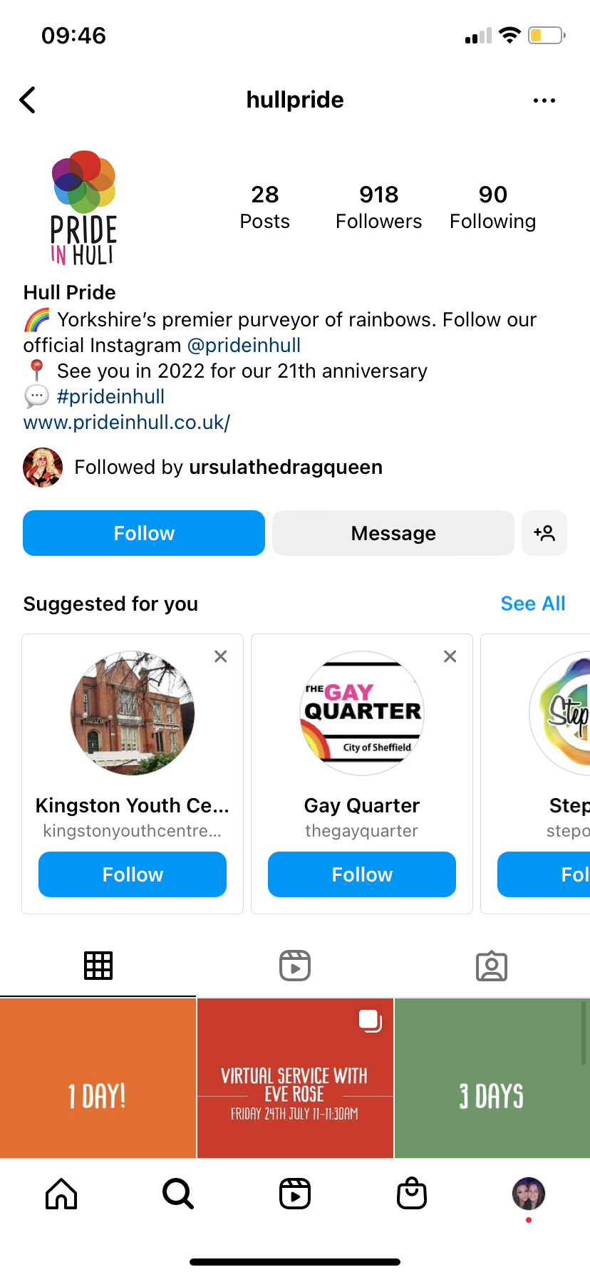
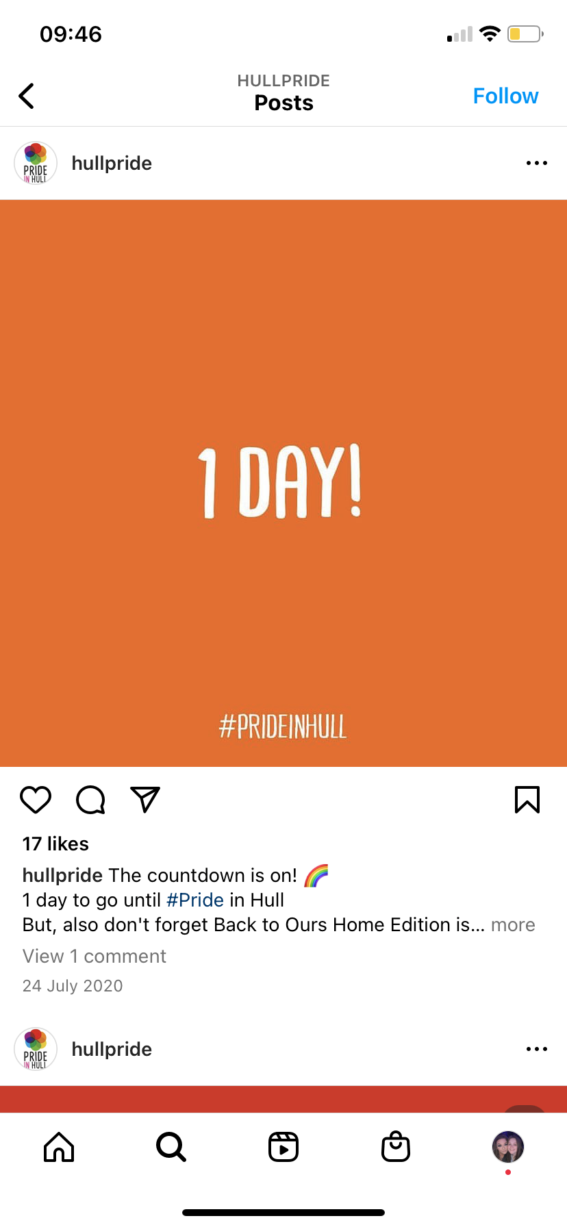
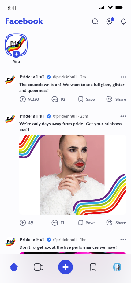
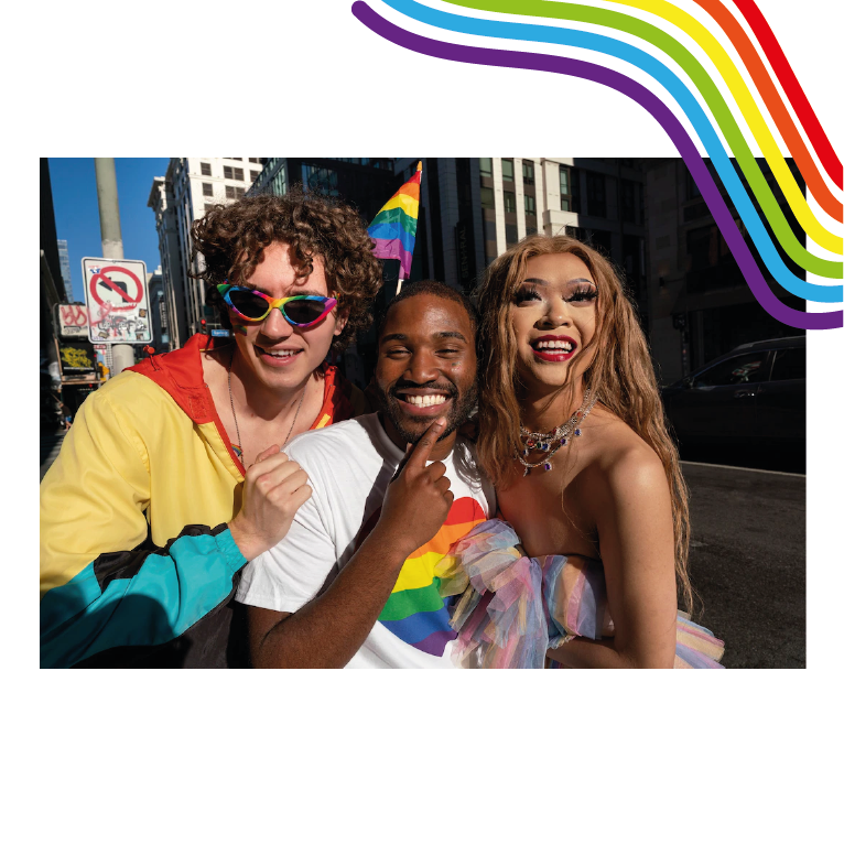
I decided to take a look at an event of cultural significance, Pride in Hull. Pride in Hull do already have accounts across social media platforms but after doing some research, I noticed that they are no longer active at the moment, they stopped posting when 2020’s pride had occurred.
Figure 1Figure 2Screen captures of Pride in Hull’s Instagram page.
As you can see, their Instagram page has become very quiet. Pride in Hull is an event that occurs every year so posting on their social media’s actively can increase the interest of their event.
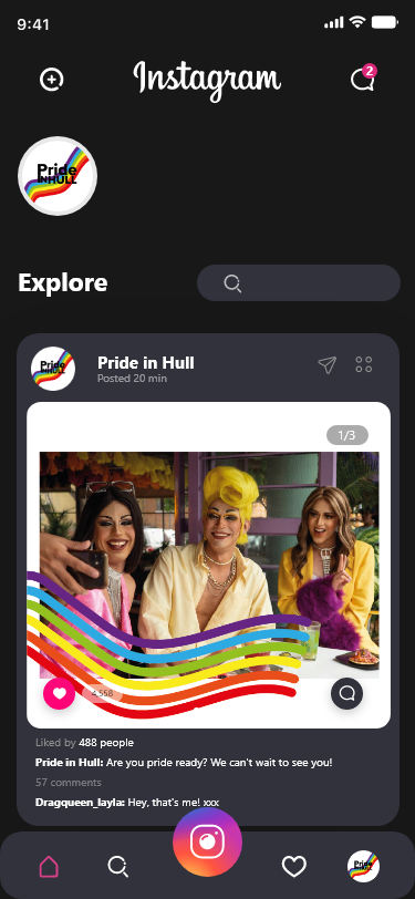
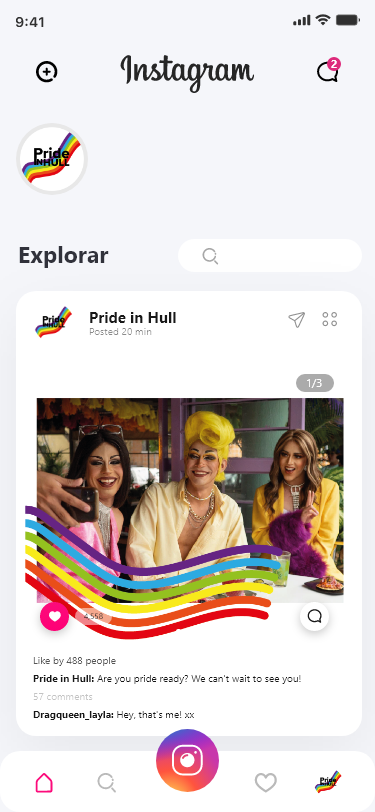
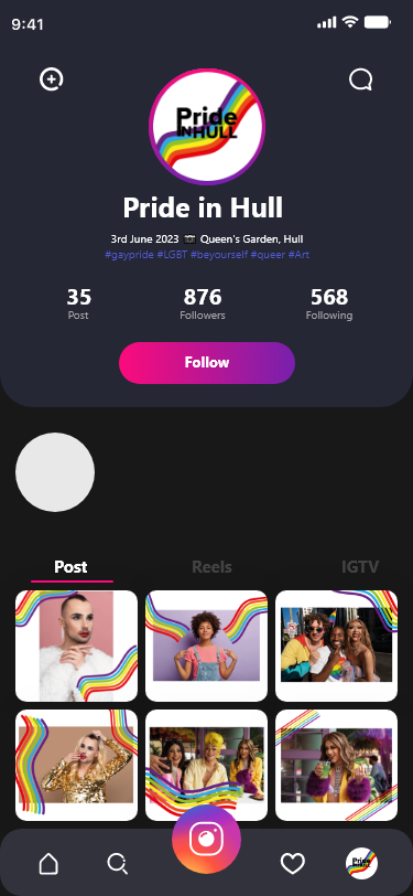
I decided to redesign their Instagram and Facebook page to show how they can become more active.
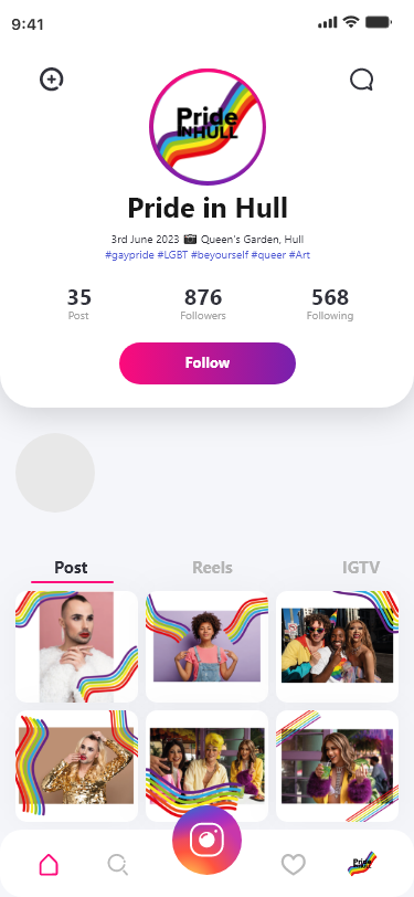
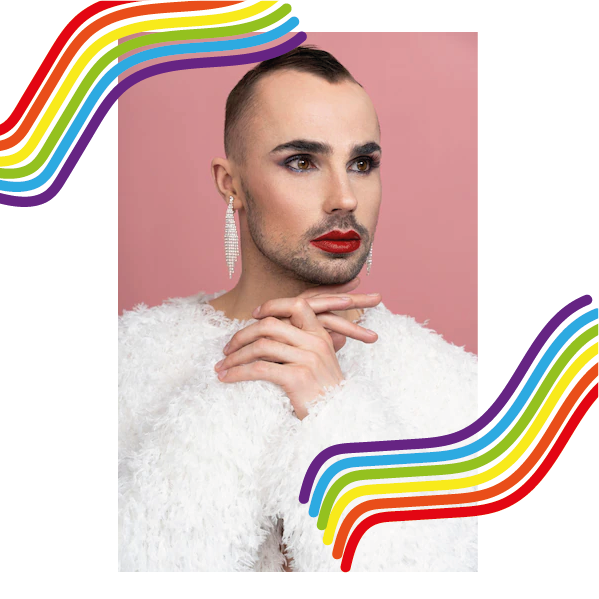
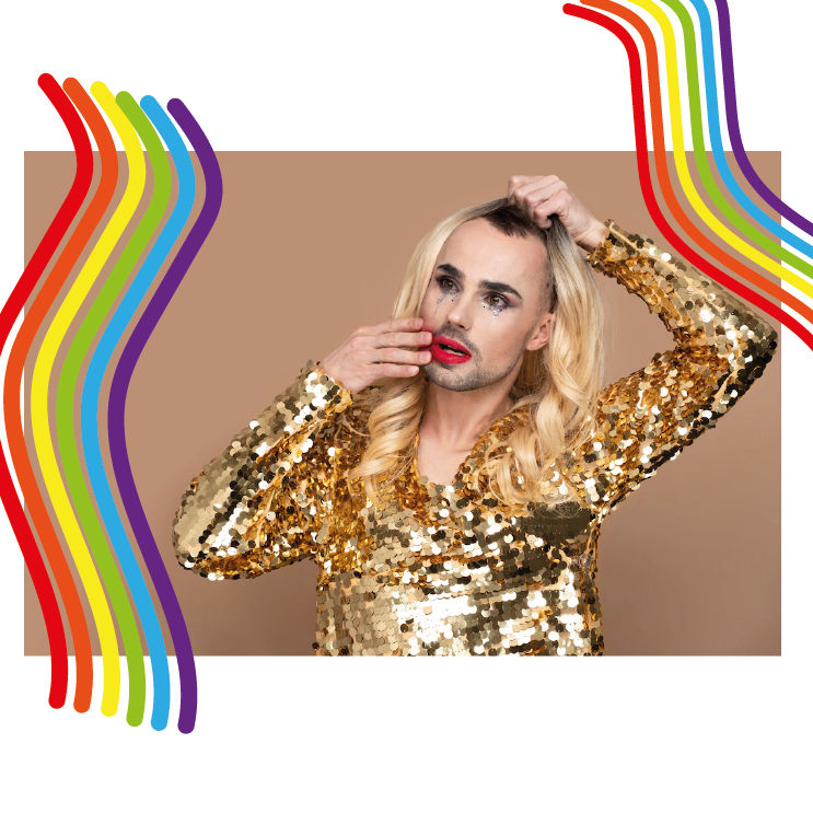
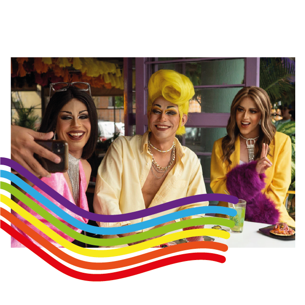
Figure 3Figure 4Figure 5Figure 6Redesign of the Pride in Hull Instagram page, showing light and dark mode.
I decided to redesign their Instagram page, using edited images. I decided to introduce an ongoing theme to make the Instagram page look more aesthetically pleasing to view. The rainbow border used across their images gives more personality into the page. Posting an image like this weekly can increase their page views and interaction to the actual event they host annually.
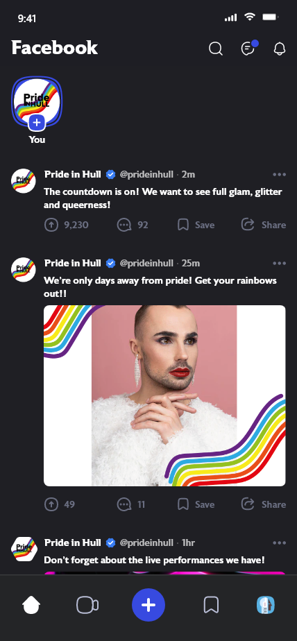
Figure 7Figure 8Redesign of Pride in Hull’s Facebook page, showing light and dark mode.
Like the Instagram redesign, this Facebook design shows the activeness they could achieve on their social media platforms. Again, using the bordered images creates an aesthetic and also creates a sense of memorability.
Figure 9Figure 10Figure 11Figure 12Figure 13Figure 14Collection of the redesigned images used on the social media designs.
To further develop the redesign of their social media platforms, the artistic rainbow border could be created as a photo filter which users and event attenders could use to show their experience at the event, this would also create more profile interaction.
Figure 15: Reworked design for the Pride in Hull logo, adjusted to fit the social media profile pictures.
References
Freepik (2019) Freepik – Free Graphic resources for everyone. Freepik. Available online: https://www.freepik.com/ [Accessed 23 Jan. 2023].
Social Media Feed Mockup and Templates. (2022) Xd File. Available online: https://xdfile.com/social-media-feed-mockup-and-templates/ [Accessed 23 Jan. 2023].
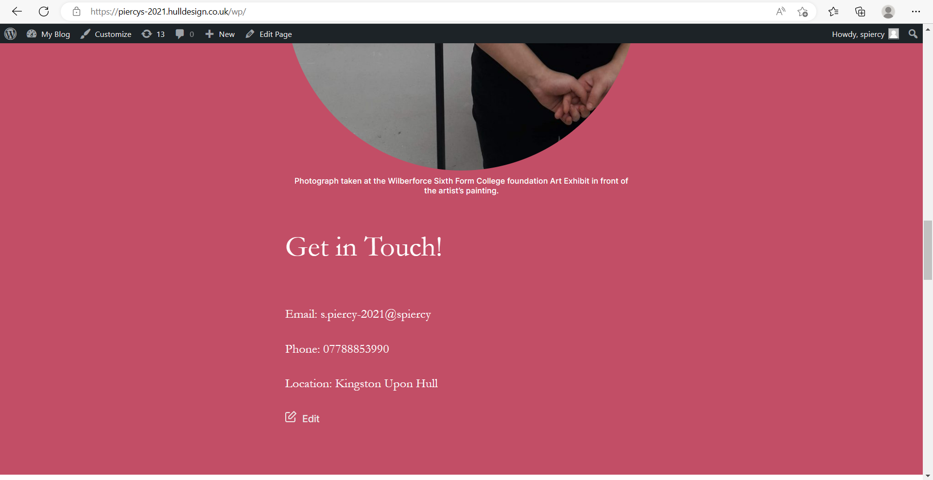
The 8 tasks I had given myself were: 1. Find out more about the designer 2. Locate a post from Year 1 3. Locate the references 4. Expand an image 5. Locate the caption to an image 6. Test a video within the site 7. Save a media file 8. Locate the Get in contact
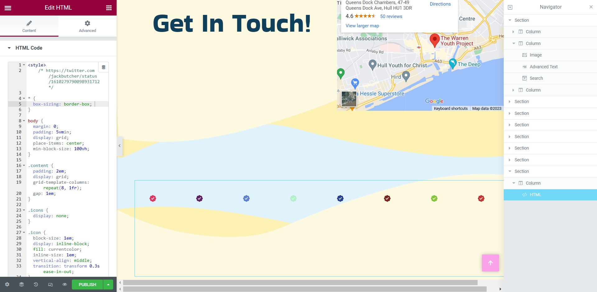
The tasks were achieved except no.8, their was nowhere within the site that had ‘get in touch’ information, this evaluation was taken into account and information on how to get in touch with the designer has now been added to the bottom of the home page.
Screenshot of the home page with added ‘get in touch’ details including an email, phone number and location of the designer.
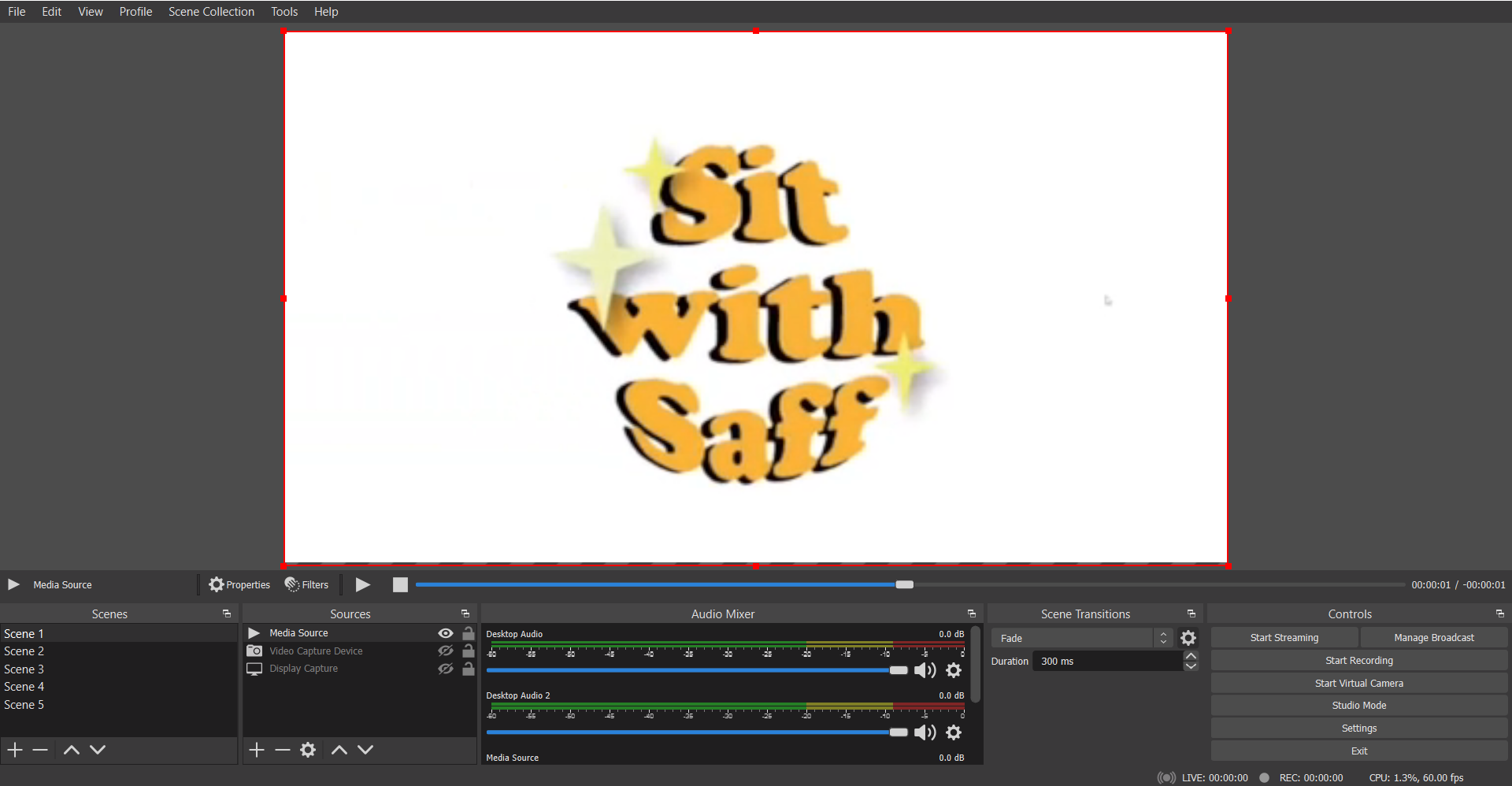
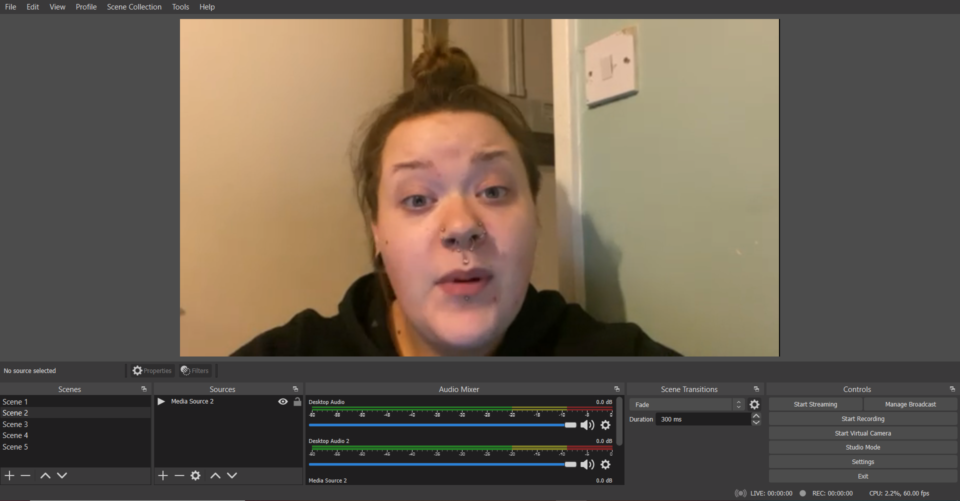
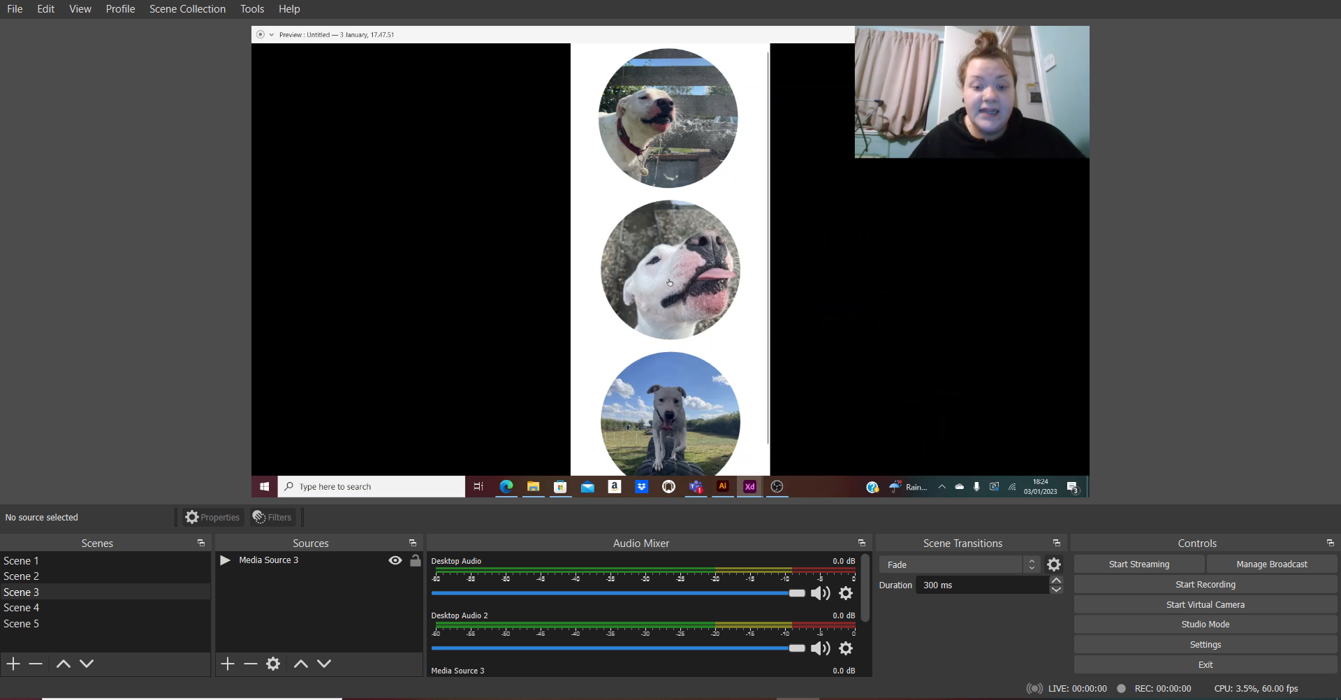
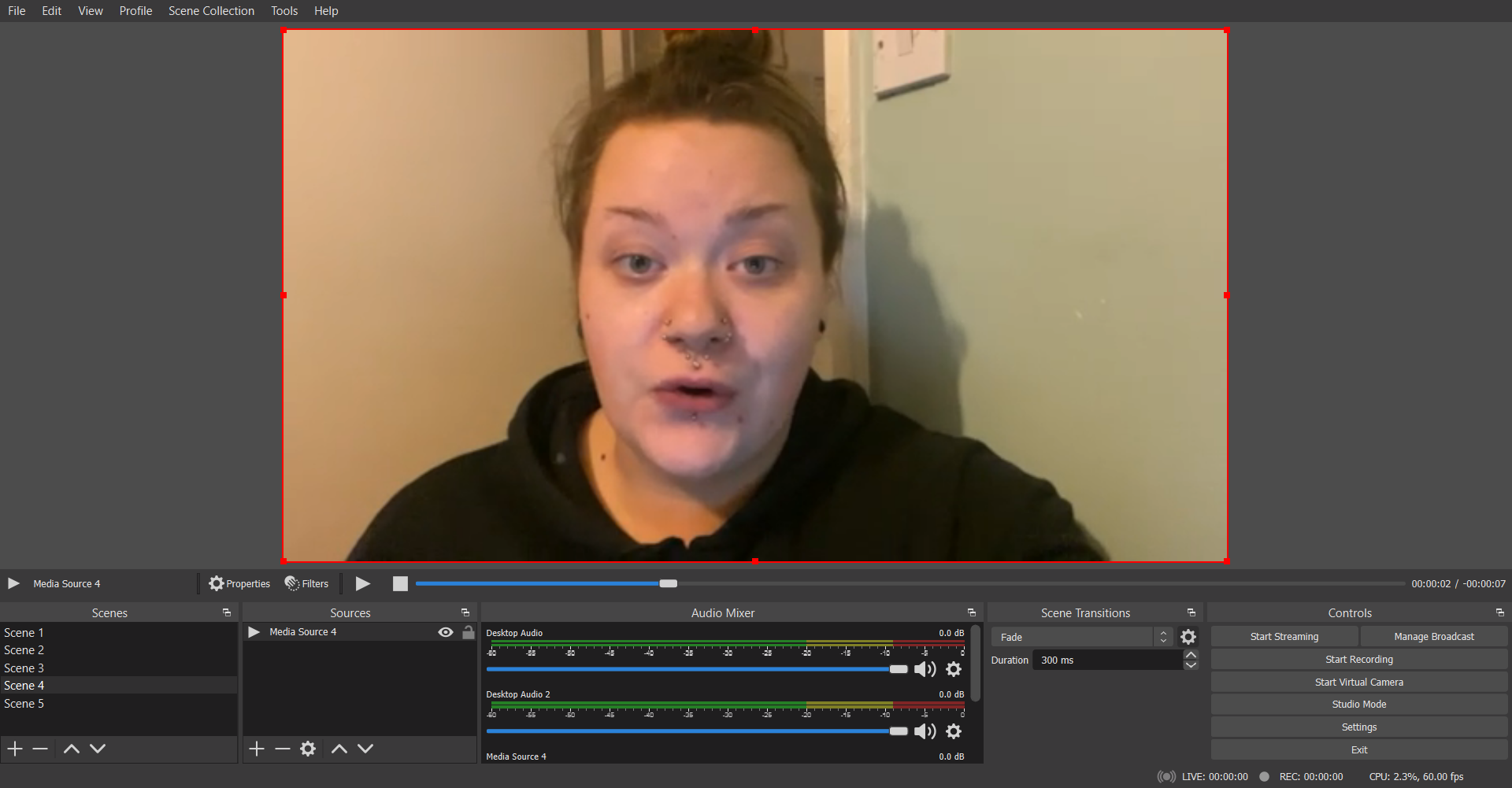
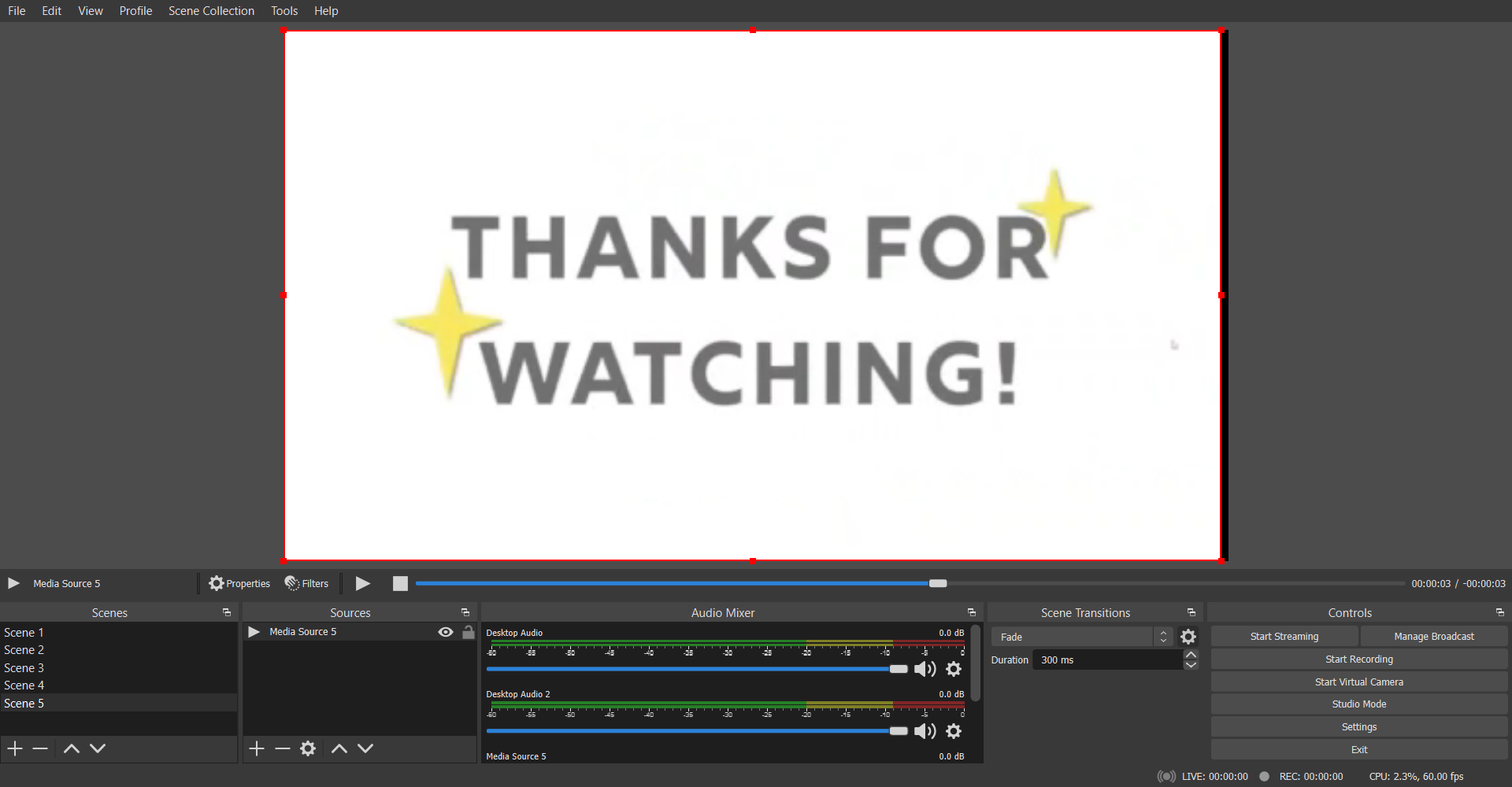
Final webinar video showing an example on how to create an animation in Adobe XD.Video of the animated logo before being trimmed and place at the beginning and ending of the final video. This animation was used in Scene 1 and 5. Selfie cam footage used in Scene 2.Closing selfie cam footage used in Scene 4. Scene 1Scene 2Scene 3Scene 4Scene 5
For the webinar video, five scenes were created using OBS Live Broadcasting. Scene 1 and 5 show the logo animations, scene 2 and 4 show selfie cam footage and scene 3 shows the OBS desktop recording of the animation example.
Once the broadcast was complete the video was then put into a video editing app where the background music was added, the background music adds some playfulness to the video and keeps the watcher engaged.
References
Joy, V. (2013) Riptide. Liberation Records. Available online: https://youtu.be/uJ_1HMAGb4k [Accessed 4 Jan. 2023].
