For this development blog I will be discussing responsive design and showing the progress of how to achieve a good responsive site within Elementor.
Responsive design is when developers use dynamic changes to the design of the site, it’s used to create the different sizes seen on commonly used screens, such as the desktop, tablet and mobile screen sizes (Experience, n.d.).
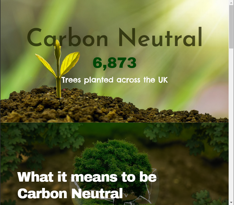
Using the WordPress plugin Elementor, I developed a web page on the topic of ‘carbon neutral’ as instructed. I included some basic widgets to create a very simple web design to show the responsiveness in my design.
The video above shows how the web page would look on an average 1366×768 screen size. While designing the web page I did remain on the desktop screen size when including the widgets, this was to ensure that the negative space within the desktop design was kept to a minimum.
When I was happy with the results of the desktop design, I took a look into the tablet and mobile responsiveness. Decreasing the web page size to an average tablet screen size did lose the spacing between the two photos shown in the top two widgets of the design.
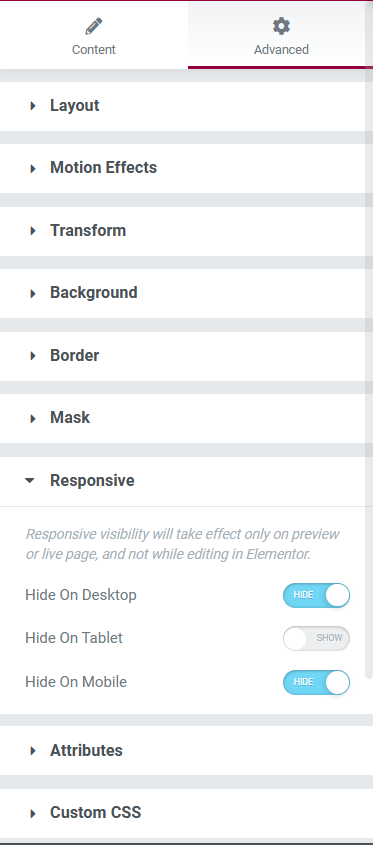
To resolve this issue, I manually inserted a spacer widget to let the white background peep back through. After inserting the spacer and checking the responsiveness towards this new widget in the desktop and mobile designs, I noticed that there was now too much space between the first and second widgets. This issue was resolved using the advanced settings of the spacer widget. In the ‘responsive’ section there were options to hide this widget in the three different sizes, after tinkering with these settings, the problem was fixed and I was happy with the tablet design.
After inserting the spacer and having a percentage of the white background back, I noticed that it looked a little too bare so I inserted a progress bar which I edited to only be viewed within the tablet screen viewing.
The mobile design remained very similar to the other two screen sizes but I decided to add a testimony widget, with a star rating, just above the ‘contact’ block.
The testimony widget was the perfect size for the mobile preview but looked out of place within the other two sizes, on the desktop size there was too much negative space surrounding the widget so I decided to only have the widget on the mobile design to creates a diverse user experience within the three screen sizes.
References
European Parliament (2019) What is carbon neutrality and how can it be achieved by 2050? Europa.eu. Available online: https://www.europarl.europa.eu/news/en/headlines/society/20190926STO62270/what-is-carbon-neutrality-and-how-can-it-be-achieved-by-2050 [Accessed 20 Jan. 2023].
Experience, W.L. in R.-B.U. (n.d.) Responsive Web Design (RWD) and User Experience. Nielsen Norman Group. Available online: https://www.nngroup.com/articles/responsive-web-design-definition/#:~:text=Responsive%20web%20design%20(RWD)%20is [Accessed 26 Oct. 2022].
Pixabay (2022) Pixabay. Pixabay.com. Available online: https://pixabay.com/ [Accessed 20 Jan. 2023].