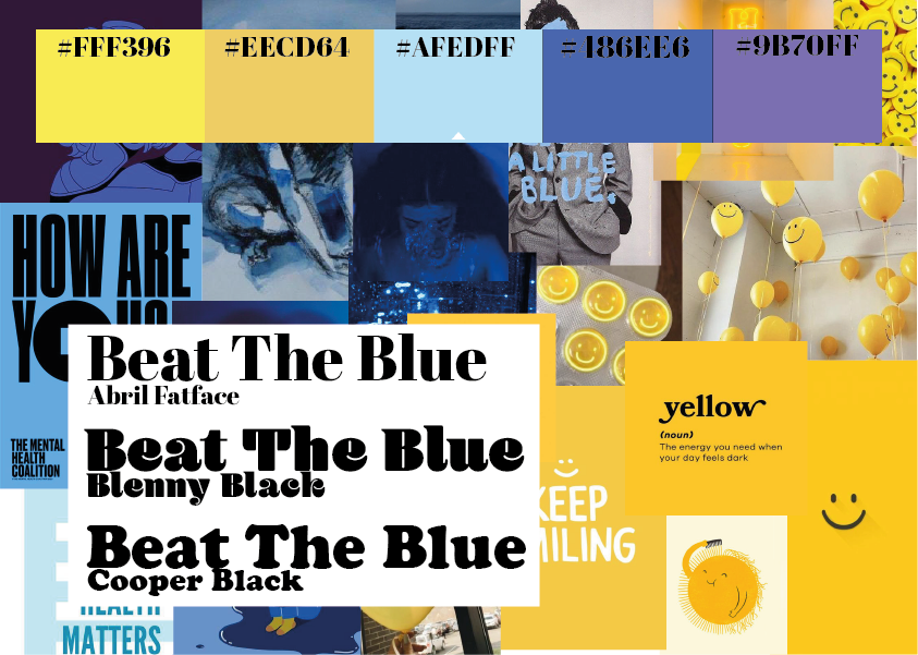
The colour palette has been chosen for the campaign to show the contrast between ‘sad’ colours and ‘happy’ colours. The aim of this chosen colour palette is to make the user feel as though they have achieved something.
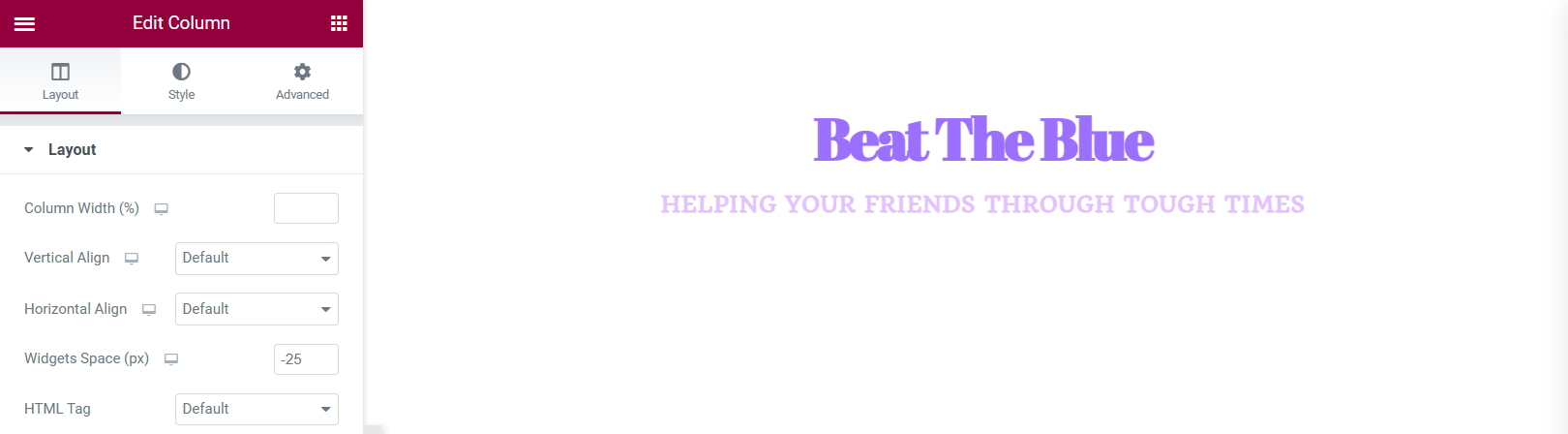
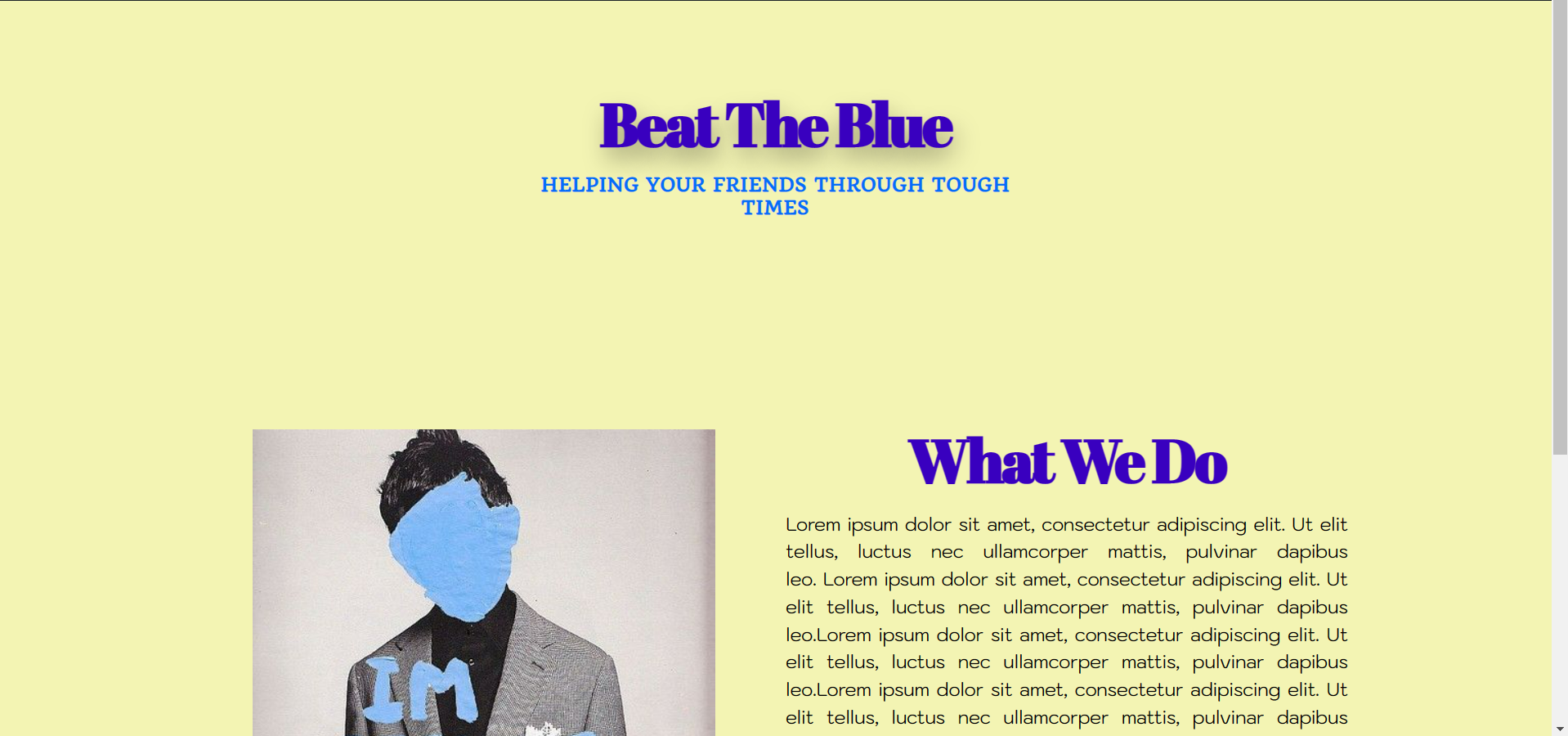
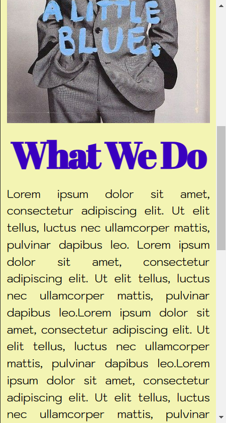
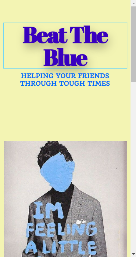
After experimenting with Elementor on WordPress, this is the site that was built. The site shows the initial idea of how the colour palette and chosen fonts will be used. the pale yellow background compliments the blue headings and sub-headings. This design is very minimal and simplistic which can come across as aesthetic but in the final design I would like the site to be a bit more youthful as the aimed audience for my campaign will be the younger generation.