Categories
Development Research Blog

Ethics & Sustainability: Pigeons

What is sustainability?

Sustainability is the avoidance of destruction to natural resources. Being sustainable means fulfilling the needs of the current environmental state without compromising future needs or increasing long term care for the environment, for example, many companies have reduced their use of plastic to keep the oceans clean (Kuhlman and Farrington, 2010).

What is ethics?

Ethics are the moral principles that alter a human being’s behaviour. Ethics determine the right or wrong behaviours of a person. If a person found a wallet on the floor and decided to retrieve it back to it’s owner, that would be the ethical thing to do (Treasury Board of Canada Secretariat, 2015).

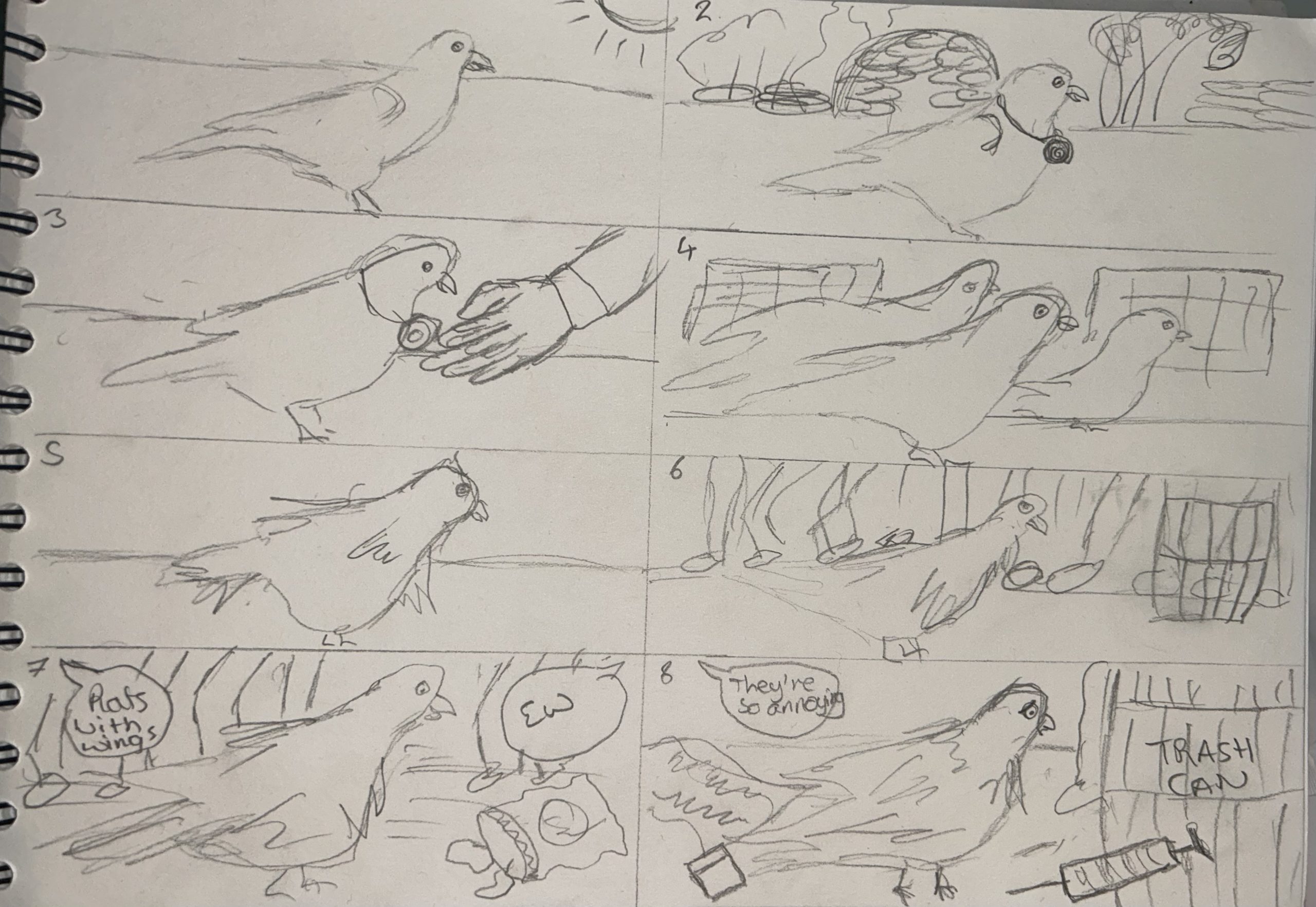
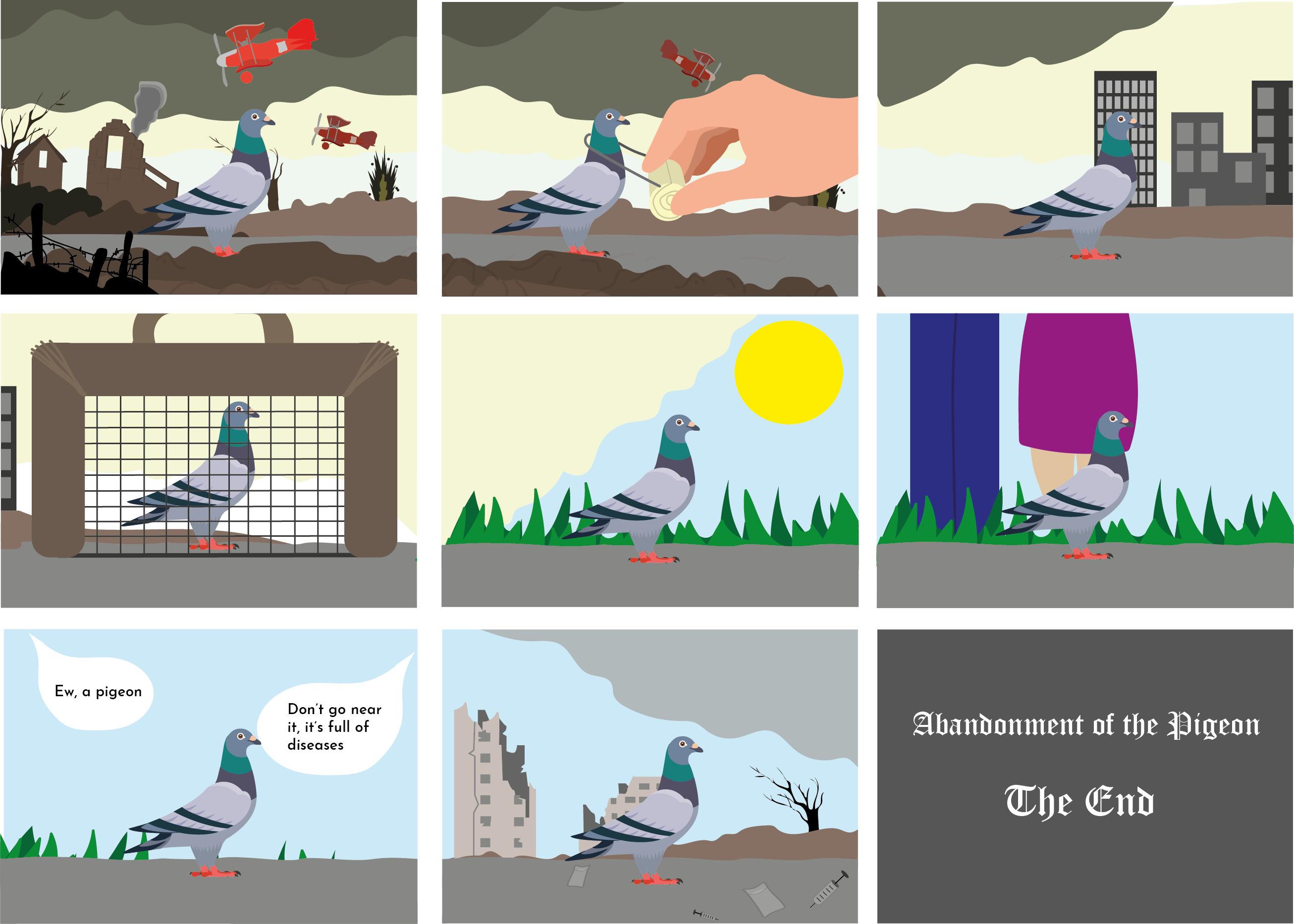
The chosen subject for the classical animation piece will be ethics. The animation will focus on the abandonment of pigeons. Pigeons were domesticated by humans thousands of years ago, they were used to carry and deliver paper messages. Pigeons were heavily relied on in the world wars to carry messages as this was the only form of communication to fellow soldiers who were distant. Carrier pigeons have saved lives throughout the wars and received medals. These birds were then used for sport purposes such as pigeon racing. Pigeons have been heavily neglected by society, they are seen as disease riddled birds that have to fend for themselves. Many pigeons are also physically abused by today’s society because as a generation we have never seen them to be useful for our needs and are now considered pests in towns and cities (Karlis, 2021).

As a generation, it is ethically wrong to have neglected and abused pigeons so the classical animation piece aims to send a message to show how heroic pigeons used to be so maybe as a generation they can be start being respected and cared for.

The 20 second animation piece will show a pigeon walking through a timeline of history, showing what pigeons used to go through. The first scene will be a war zone with the pigeon being handed a message, the next scene in the timeline will show the pigeon being used for sports. The timeline will eventually result in how pigeons are perceived today with insults being hurled at them. The last scene will show an abandoned landscape to emphasise how humans have abandoned pigeons, there will be litter and empty drug taking supplies around to show what it’s like for city pigeons.

The chosen audience for this animation piece will be teenagers and young adults. Having a young audience can be helpful when trying to teach the importance of something. Younger people will not know the history behind pigeons so this is a good message to educate them with in hopes that they grow to respect pigeons.

References

Karlis, N. (2021) Humans domesticated pigeons, then abandoned them. Is it time for a reappraisal? Salon. Available online: https://www.salon.com/2021/10/26/humans-domesticated-pigeons-then-abandoned-them-is-it-time-for-a-reappraisal/ [Accessed 15 Mar. 2023].

Kuhlman, T. and Farrington, J. (2010) What is Sustainability? Sustainability, 2(11), 3436–3448.

Treasury Board of Canada Secretariat (2015) What Is Ethics? Canada.ca. Available online: https://www.canada.ca/en/treasury-board-secretariat/services/values-ethics/code/what-is-ethics.html [Accessed 15 Mar. 2023].

Categories
Development Research Blog

Conceptual Design Transition Planning

The initial animation design will show a singular pigeon focused on the centre of the screen while the background will be slowly going by as the pigeon walks. The background scenery will transition through history, starting from the World War and finishing in the present day. The idea behind this is to show the reliance of the pigeon in earlier years, such as both world wars.

With only 20 seconds to show the importance of pigeons, the background transitions will only show significant events throughout history. This will still get the message across in the short timeframe. The conceptual design within the animation will be the background transitions. Each frame will be linked to the previous frame by the path, sky or clouds, this is to maintain a smooth transition.

First initial idea developed into a storyboard showing the different scenes throughout the animation.

This is the first sketch up of the animation sequence. The story board shows the visual scenes that will take place. As you can see the pigeon remains centred throughout and the background will change in each frame. This sketch will be enhanced digitally and eventually created into the classical animation sequence.

Digitally enhanced storyboard showing the conceptual details throughout the animation.

After digitally enhancing the storyboard sketch, this was the result. Digitally enhancing the sketch creates a detailed visual to the thought process behind the animation. The first two frames show the world war scenery with a message being strapped to the pigeon. The conceptual transition behind this animation will be the background e.g., the sky and clouds. Starting off with a very dull sky to show the brutality of the world wars and emphasise the pigeons heroicness during this time period. Moving onto the third frame, this shows the grey clouds clearing and buildings appearing, now the pigeon has moved out of the war time zone and is slowly entering the modern world. The fourth frame shows the pigeon being caged, this is to show the pigeon racing that still takes place today. The next two frames show a blue sky and people appearing, this is to show the audience that the pigeon has now moved into towns and cities. The blue sky is a metaphor to the pigeon’s emotions, its happier coming into the present day because the wars have ended. The last two slides show the way pigeons are treated today. Having to fend for them selves in litter and drug riddled areas as well as having abusive comments hurled at them. In the last slide the grey cloud is slowly coming back, this is to show that the pigeon is no longer happy and is starting to feel sad again.

Categories
Development Research Blog

Teamworking Storyboard

The Good, The Bad and The Ugly performed live by The Danish National Symphony Orchestra (The Good, the Bad and the Ugly – The Danish National Symphony Orchestra (Live), 2018).

After being assigned to watch ‘The Good, The Bad and The Ugly’ orchestra piece, we were asked to take a psychometric test to determine which team player suited each other. Unfortunately I didn’t attend the teamwork session so I took the test independently. The test resulted in me being The Whistler which I was happy with. The Whistler isn’t a leader but is the vital ingredient in the orchestra, they are the most memorable piece to the puzzle. In this case, the whistler is someone to rely on with ideas and solutions.

Psychometrics test which determined the roles of each team member, relating to the Danish National Symphony Orchestra.

In class, the team developed a flipbook storyboard inspired by ‘The Very Hungry Caterpillar’ a children’s book, written and illustrated by Eric Carle. Although I wasn’t present, the teamwork was fantastic and the storyboard created became very helpful guidance for my independent flipbook.

Flipbook storyboard created by in-class team, inspired by ‘The Very Hungry Caterpillar’.

Flipbook animation was one of the first forms of animation, it is created using a sequence of images that are rapidly flipped through, giving the illusion of an animation sequence (What Is a Flipbook Animation? (with pictures), n.d.). Flipbook animation is a cheaper solution when animating, it is also a great way to visualise the animation before enhancing them digitally.

Video showing independent contribution to the flipbook animation. This is the first scene from the team storyboard.

Above is a flipbook animation showing the first scene of the team storyboard, this was designed independently. This flipbook shows the caterpillar entering the screen from the left side and a piece of cheese entering from the right side. Having the cheese come in from the right emphasises the movement of the caterpillar coming towards the cheese. The caterpillar then curls itself around the cheese, entering and exiting the holes of the cheese before moving on.

This method of animation is very time-consuming and can consist of many mistakes. The flipbook created above includes 37 pages and took roughly an hour and 30 minutes to develop for only seconds of animation. It is not my preferred method of animating but it was definitely an experience learning the technique.

References

The Good, the Bad and the Ugly – The Danish National Symphony Orchestra (Live). (2018) www.youtube.com. Available online: https://youtu.be/enuOArEfqGo [Accessed 16 Mar. 2023].

What Is a Flipbook Animation? (with pictures). (n.d.) Musical Expert. Available online: https://www.musicalexpert.org/what-is-a-flipbook-animation.htm [Accessed 16 Mar. 2023].

Categories
Development Research Blog

Relevant Animation History

3D animation called ‘Pigeons’ showing a group of pigeons creating music (Pigeons, 2022).

The first animation chosen was ‘Pigeons’ by a youtuber called ‘Xander.mpg’. This animation shows a group of city pigeons creating music using their surrounding objects. The reason this animation was chosen as a good example was to show how the pigeons have been designed/animated, this animation shows the very detailed and characteristic movements a pigeon makes, like the fast blinking and head tilting. The animated characteristics of these pigeons are something that would be used in the personal classical animation piece.

Minimalistic animation called ‘Nuggets’ by Filmbilder & Friends (Nuggets, 2014).

This next animation is not related to the topic of the classical animation piece but shows is a good example for showing the movement of how the final animation will look. This video shows a bird-like cartoon walking and coming across yellow balls that it decides to consume. The character remains in the centre of the screen and path is moving in the opposite direction to emphasis the movement in the walk. This is how the final animation piece will be designed. The idea is to have the pigeon be central but walking on the spot and the path/background will move across in the opposite direction.

3D animation showing the timeline of a whales evolution by Museum of New Zealand Te Papa Tongarewa (Whales evolution, 2007).

This final animation shows the transitioning of a whales evolution, again the animal remains in the centre of the screen as it changes appearance and its surrounding environment moves in the opposite direction, again to show the animal walking/swimming through time. This is relevant to the final animation piece because this animal is moving through a history timeline while remaining central. This animation can also be considered educational which is another aim for the personal animation piece.

The audio used in these three animations is very minimal, neither of the videos have a voice or narration which will be similar to the end result of the classical animation piece. The aim is to have an audio of a pigeon cooing and maybe some slow, acoustic music overlapped. Using minimal audio can draw further attention to the actual animation and having a certain genre of music can emphasis the emotions the audience will experience during their viewing of the animation.

References

Nuggets. (2014) YouTube. Available online: https://youtu.be/HUngLgGRJpo [Accessed 16 Mar. 2023].

Pigeons. (2022) www.youtube.com. Available online: https://youtu.be/a93DUkkJGQ4 [Accessed 16 Mar. 2023].

Whales evolution. (2007) www.youtube.com. Available online: https://youtu.be/8cn0kf8mhS4 [Accessed 16 Mar. 2023].

Categories
Development Research Blog

Classical Animation Piece

The Abandonment of the Pigeon

Classical Animation piece showing the timeline of a pigeon through history. Designed for young adults.

Royalty free audio used within the animation.

Categories
Design Portfolio

Beat the Blue References

References

Black T-shirt. (2020) Available online: https://www.istockphoto.com/search/2/image?mediatype=illustration&phrase=black+t+shirt+front+back [Accessed 23 Jan. 2023].

Blank white round pin. (n.d.) Available online: https://www.canstockphoto.com/blank-white-round-pin-46409047.html [Accessed 23 Jan. 2023].

Dr Alex George on how to spot when a friend needs support with their mental wellbeing. (2022) www.youtube.com. Available online: https://youtu.be/aJe-4DDyxvY [Accessed 23 Jan. 2023].

Facebook (2022) Facebook. Facebook. Available online: https://www.facebook.com/ [Accessed 23 Jan. 2023].

Google Maps. (n.d.) Google Maps. Available online: https://www.google.com/maps/place/The+Warren+Youth+Project/@53.7445503 [Accessed 23 Jan. 2023].

Instagram (2022) Instagram. Instagram. Available online: https://www.instagram.com/ [Accessed 23 Jan. 2023].

Mug Template Canva. (n.d.) Available online: https://www.canva.com/mugs/templates/ [Accessed 23 Jan. 2023].

Twitter (2022) Twitter. It’s what’s happening. Twitter.com. Available online: https://twitter.com/ [Accessed 23 Jan. 2023].

Artwork Used

Figure 8: Logo
Figure 9: Merch Illustration
Categories
Development Log

Dev Blog 1 – Water Campaign

The goal of this group activity was to convince children/toddlers to drink more water. Above is a brainstorming session of the first initial ideas. The first agreed idea was to create a sticker sheet but then it was thought to make it digital because of the growth in technology within today’s generation.

Figure 2: Notes taken for the digital aspect of the campaign.

This was the planning of the app. It was agreed that the app will act as a competition between the child’s friends or family members. Children seem to like competition so why not apply that competitiveness to something healthy. The mind map and notes was taken by Jordan, another member of the group.

These are the before and after of a used sticker sheet. The idea was to have a reward when the sheet has been completed. This can be a physical copy or digital copy within the app, the physical would be a magnet sheet so it can be reused. This was designed by Sydney, one of the group members.

Figure 5: Digital mascot for the water campaign.

This was a little add-on to the group project, it was created and designed by Saffron. The idea behind having a mascot is to help kids put a face to the idea of drinking water, the face being a cute water droplet, by the name Dropple.

Categories
Development Log

Dev Blog 2 – Birdhouse

For this group activity, we were asked to design a ‘birdhouse’, but to use this concept to the best of our creative abilities.

Mind Map & Planning

Figure 1: Mind map of the ideas for the birdhouse concept, created using Mirro.

starting off with a mind map to really channel my ideas for the concept. My first initial idea was to create a realistic outdoor house for birds but after looking further into this the usability of this idea, it would not work and could only be used a decorative garden piece.

Other ideas included ‘House of Birds’ which to me, sounded like a luxurious brand, maybe a furniture or clothing brand. So I took this idea and turned it into a sketch.

Figure 2: A sketch showing the furniture and clothing brand ‘House of Birds’, there’s also some variations of logos in the centre.

When I saw the name ‘House of Birds’ this is what spoke to me, the very vintage, expensive looking furniture and luxurious night gowns. In the middle I have sketched up some renditions of what the logo could look like, the ‘HOB’ gives a very modern feel to the brand where as the ‘House of Birds’ underneath looks very vintage and gives the feel of a small business.

I wanted to venture into some of the other ideas from the mind map so i decided to experiment with the concept of ‘Birdhouse’ being the name of a nightclub or a DJ name.

Figure 3: Sketches of posters for ‘Birdhouse’ nightclub concept.

With these sketches, I wanted to include the aspect of the bird so on the left is a birds eye with the reflection of a music note, if I was to pursue this digitally I would turn the reflection of the eye into the club/partying scene. The sketch on the right is for the same concept but its a bird flying over a DJ with big nightclub speakers.

Above are the results of the birdhouse concept. Adding the photos of birds to original images of a rave, gives a very underground nightclub feeling to the posters. The birds seem to give a touch of Kitsch to the posters.

References

Byrd, S. (n.d.) The Bird’s-Eye View. University of Houston. Available online: https://uh.edu/research/news/magazine/2016/raven/ [Accessed 18 Jan. 2023].

Osprey Raptors. (n.d.) University of Minnesota. Available online: https://raptor.umn.edu/about-raptors/raptors-north-america/osprey [Accessed 18 Jan. 2023].

Categories
Development Log

Dev Blog 3 – Web Servers, HTML, CPanel & CCS

In groups of three, myself, Sydney Jackson and Jordan Thompson, we looked at web servers and HTML. After setting up an account on CPanel we were instructed to create a FTP account and sub folder called ‘team’.

After understanding how CPanel works, we then looked at HTML. Hypertext markup language is used for documents designed to be displayed on a web browser. It provides the content that gives web pages it’s structure (HTML Tutorial: Learn HTML For Free | Codecademy, 2018).

As instructed, we experimented with HTML in a website called W3Schools (W3Schools, 2022). This is were we created a test page, introducing ourselves.

Figure 1: Screen Capture of W3Schools website.
Figure 2: Screen capture of the test page created with links to team members test pages.

Using the example HTML shown in figure 1, we experimented with adding our own headings and text body. Figure 2 shows the results of editing the HTML example, as you can see I was able to add the other team member’s test pages using ‘href’ to add the webpage link.

Once I had an understanding with using W3Schools, I decided to independently experiment with the CCS templates that W3Schools have.

Figure 5: Screen capture of the template I decided to use in W3Schools.
Figure 6: Screen capture showing the finished template after editing the HTML.

Figure 5 shows the template I decided to experiment with, after looking through the HTML and understanding what could be altered, I changed certain areas to personalise the template and add my own, Sydney’s and Jordan’s links, just like figure 2.

Figure 7: Screen capture showing the second template I decided to use.
Figure 8: Screen capture showing the finished template after editing the HTML.

Just like figure 5 and 6, I decided to edit another template showing the team members page links on a menu down the left hand side. Again, this took some understanding with what I was able to edit but once I finished editing the HTML, the three page links worked perfectly.

Figure 9: Screen capture showing the working link from the template in figure 8.

In conclusion, it took a lot of patience and knowledge to be able to understand the way HTML works. I’ve not yet mastered the coding but would like to apply these skills and techniques to future work.

References

HTML Tutorial: Learn HTML For Free | Codecademy. (2018) Codecademy. Available online: https://www.codecademy.com/learn/learn-html [Accessed 22 Jan. 2023].

Jordan’s blog.(n.d) Available at:https://jthompsonj.2021.hulldesign.co.uk/team/[Accessed 15 jan .2023]

Saffron’s blog.(n.d) Available at:https://piercys-2021.hulldesign.co.uk/team/saffron.html[Accessed 15 jan .2023]

Sydney’s blog.(n.d) Available at:https://jackson-2021.hulldesign.co.uk/team/sydney2.html[Accessed 15 jan .2023]

W3Schools (2022) HTML Tutorial. W3schools.com. Available online: https://www.w3schools.com/html/default.asp [Accessed 22 Jan. 2023].

Categories
Development Log

Dev Blog 4 – Multi Channel Customer Experience

The use of email marketing within a website increases engagement with the user. For this task I was given a set of instructions on how to include a pop-up on my website for users to subscribe to a newsletter using their email. I decided to incorporate this within my campaign concept so instead of a newsletter the user would be registering for, it would be daily reminders to message their loved ones as my campaign is to guide those that want to support their loved ones through difficult times.

First, I needed to install a plugin called ‘Royal Addons’, this creates the pop-up template, to which I customised in Elementor.

Figure 1: Screen capture of Royal Addons asking me to name my pop-up template.

After you’ve named your template, you will be automatically redirected to Elementor and that is where you can customise the pop-up. For my pop-up, I used a little character, created for the campaign website.

Figure 2: Campaign character created for the subscribe pop-up.

Once I created the final pop-up template, I went to a website called ‘Mail Chimp’ and created a free account. Mail Chimp is used as an email marketing service, linking the second party to your website helps keep track of your list of subscribers.

Next, I located the API key of the owner, in this case it was myself. With the API key I needed to link it to Royal Addons on WordPress.

Now that Mail Chimp and WordPress had been connected, it should have been good to go but after testing it on the mobile browser that was an error somewhere that I couldn’t quite figure out.

Figure 7: Screen recording of first time testing, this is when an error occurred.

After looking into the error, it turned out to be a minute detail, I had not selected the audience in the Mail Chimp widget.

Figure 8: Screen Capture showing the correct audience selected.

Now that that problem had been resolved it was time to try again, the video below shows the second attempt at trying to subscribe to the mailing list, using an old email.

Figure 9: Screen recording of the second attempt testing, everything seems to be working.

Now that everything was in order, I decided to check my audience in Mail Chimp and it had in fact included the tester email.

Figure 10: Screen capture showing the contacts that have subscribed to the mailing list.

The pop-up will remain in the campaign web page for users to sign up to, the subscribed users will appear in the linked Mail Chimp account.