A visual responsive website is a web development that creates changes within the appearance of the design, depending on the size of the screen (Experience, n.d.).
Starting off with a good example of a responsive website/application, the two images below show the Netflix webpage and their application.
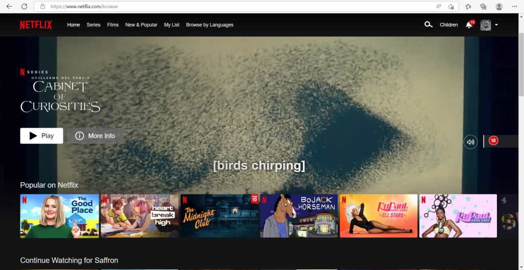
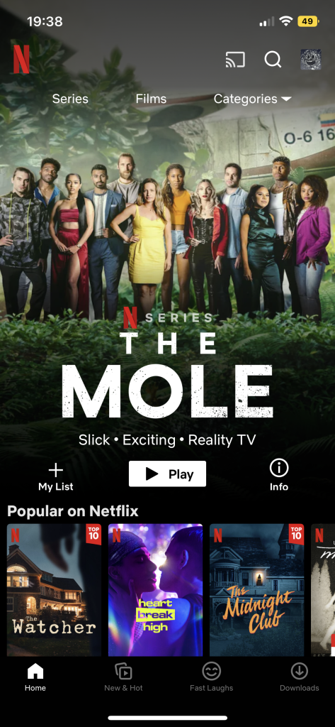
The two screen designs have very similar layouts, the website has allowed more than two thirds of the page to be an advert for a new film/series. The app also does this but the once the website has loaded the advert will play straight away whereas the app is just an image, promoting a new film/series. The menu that is across the top of the website wouldn’t be found on the app design because it has been developed into categories that automatically recommend films/series for you.
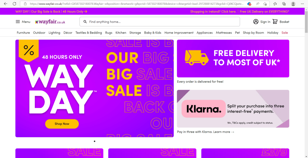

The two images above show the homepage of Wayfair, the web design looks very busy, there is a lot to look at whereas the mobile sized version looks very zoomed in, yet minimal.
On the larger sized screen there is a lot of options on show from the first screen, but the smaller size has just about 3 options in view. This is a good example of responsive websites because the spacing in the larger area has been used to add in more options.

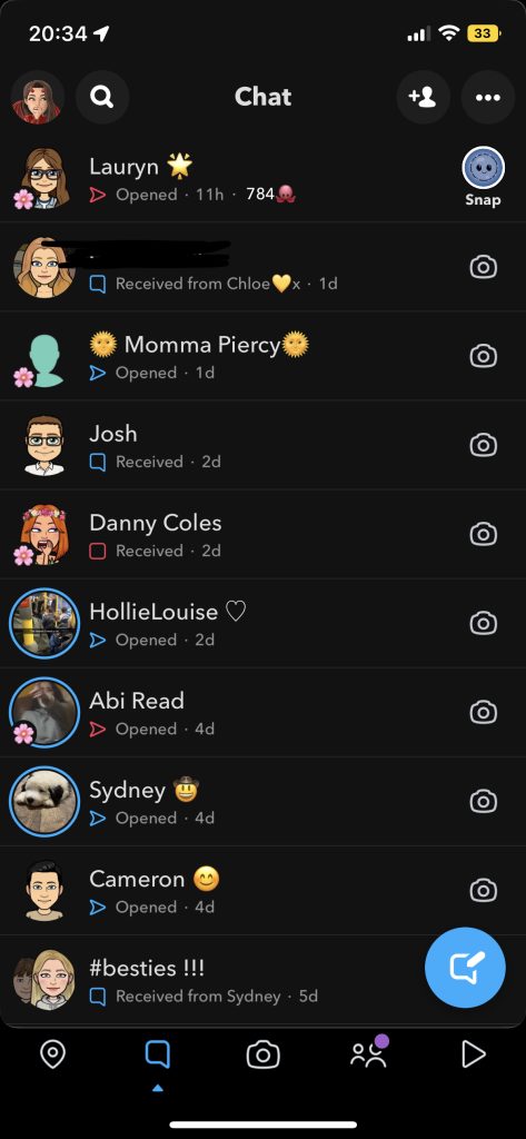

Snapchat was first created as an application for mobile and was not able to be accessed as a website, so this was going to be a bad example of a responsive website, but it turns out that Snapchat have now created a website with the same purpose as the app, you can still take pictures and chat with contacts through the website. There is still a lot of negative space on the web design but that is because the camera in the middle of the screen is still the size of a mobile so it can be shown on other mobiles.
Bibliography
Experience, W.L. in R.-B.U. (n.d.) Responsive Web Design (RWD) and User Experience. Nielsen Norman Group. Available online: https://www.nngroup.com/articles/responsive-web-design-definition/#:~:text=Responsive%20web%20design%20(RWD)%20is [Accessed 26 Oct. 2022].
Netflix. (n.d.) Available online: https://www.netflix.com/browse [Accessed 26 Oct. 2022].
Snapchat. (n.d.) Available online: https://web.snapchat.com/?lang=en-GB [Accessed 26 Oct. 2022].
Wayfair. (n.d.) Available online: https://www.wayfair.co.uk/?refid=GX587302180078.Wayfair%7Ee&position=&network=g&pcrid=587302180078&device=c&targetid=kwd-297288814273&gclid=Cj0KCQjwteOaBhDuARIsADBqReg8nx9XdZAsUNDTn9lTYq9GZ-9q6fsIej6vRhxwhBgHk5Pr3sSxhzgaAhrxEALw_wcB [Accessed 26 Oct. 2022].