Categories
Design Research Blog

RP4 – Visual Responsive Websites

A visual responsive website is a web development that creates changes within the appearance of the design, depending on the size of the screen (Experience, n.d.).

Starting off with a good example of a responsive website/application, the two images below show the Netflix webpage and their application.

Netflix’s website, showing the dynamic change of appearance compared to their application (Netflix, n.d.).
Preview of Netflix’s app showing a similar layout to their website.

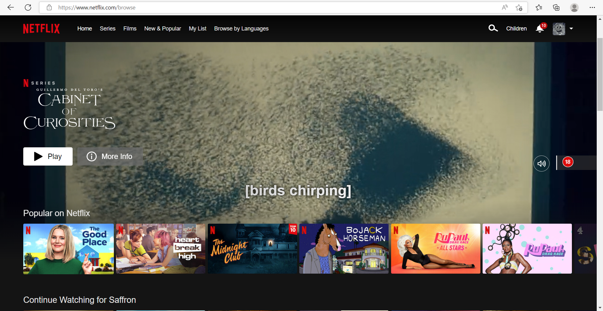
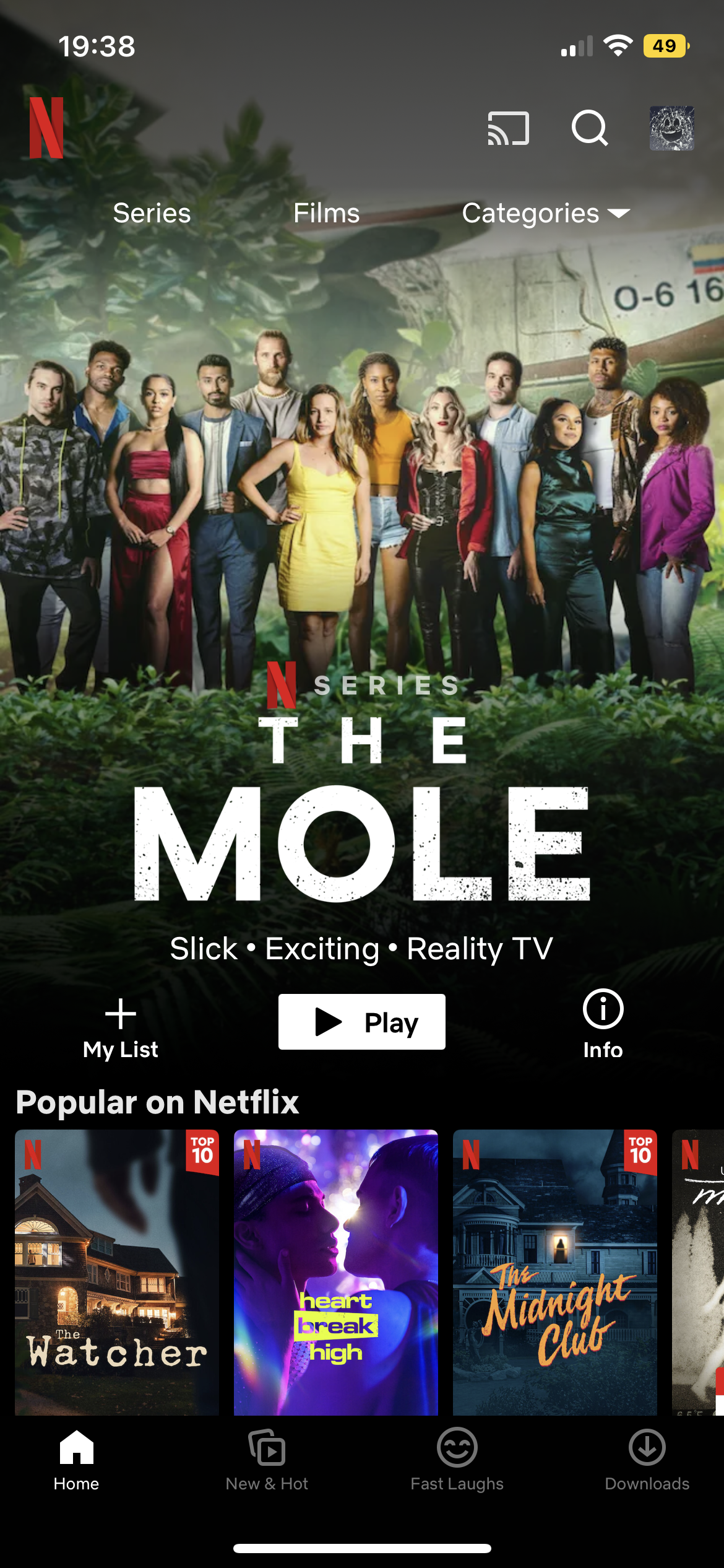
The two screen designs have very similar layouts, the website has allowed more than two thirds of the page to be an advert for a new film/series. The app also does this but the once the website has loaded the advert will play straight away whereas the app is just an image, promoting a new film/series. The menu that is across the top of the website wouldn’t be found on the app design because it has been developed into categories that automatically recommend films/series for you.

Web design for Wayfair, showing the layout of their home page (Wayfair, n.d.).
This is also the web design for Wayfair but shown an a IPhone screen.

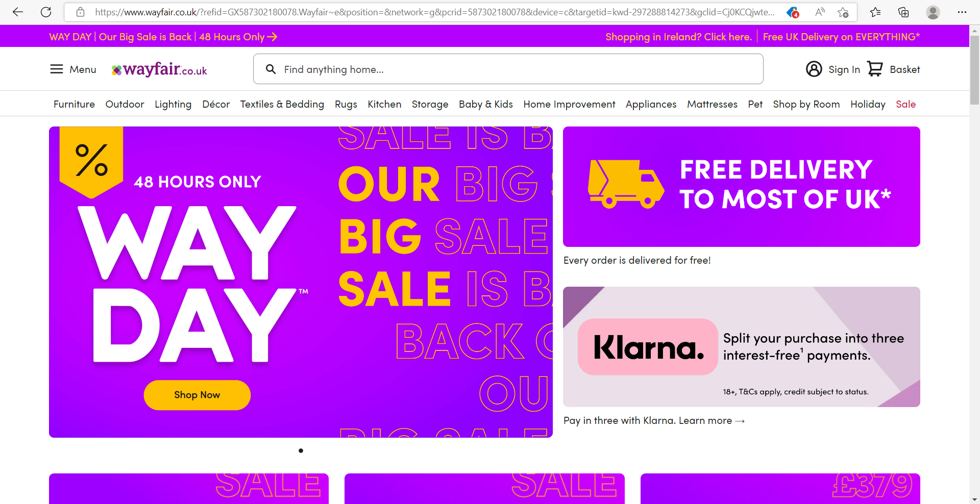
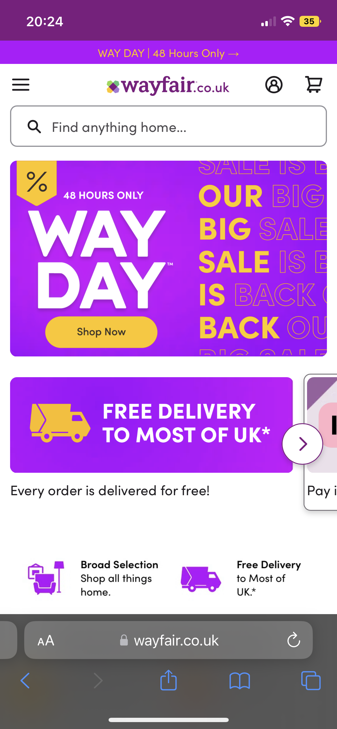
The two images above show the homepage of Wayfair, the web design looks very busy, there is a lot to look at whereas the mobile sized version looks very zoomed in, yet minimal.

On the larger sized screen there is a lot of options on show from the first screen, but the smaller size has just about 3 options in view. This is a good example of responsive websites because the spacing in the larger area has been used to add in more options.

Screenshot of Snapchat as a desktop layout (Snapchat, n.d.).

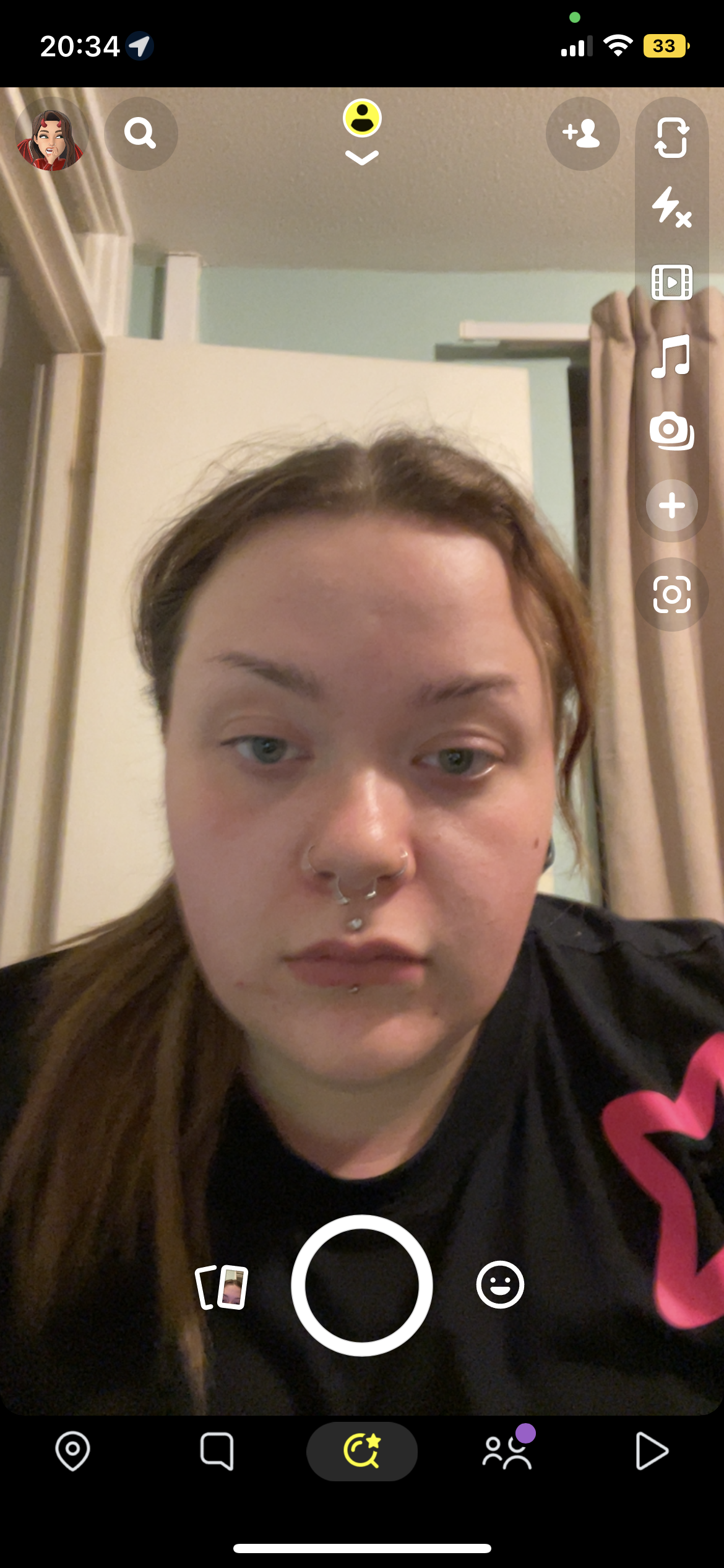
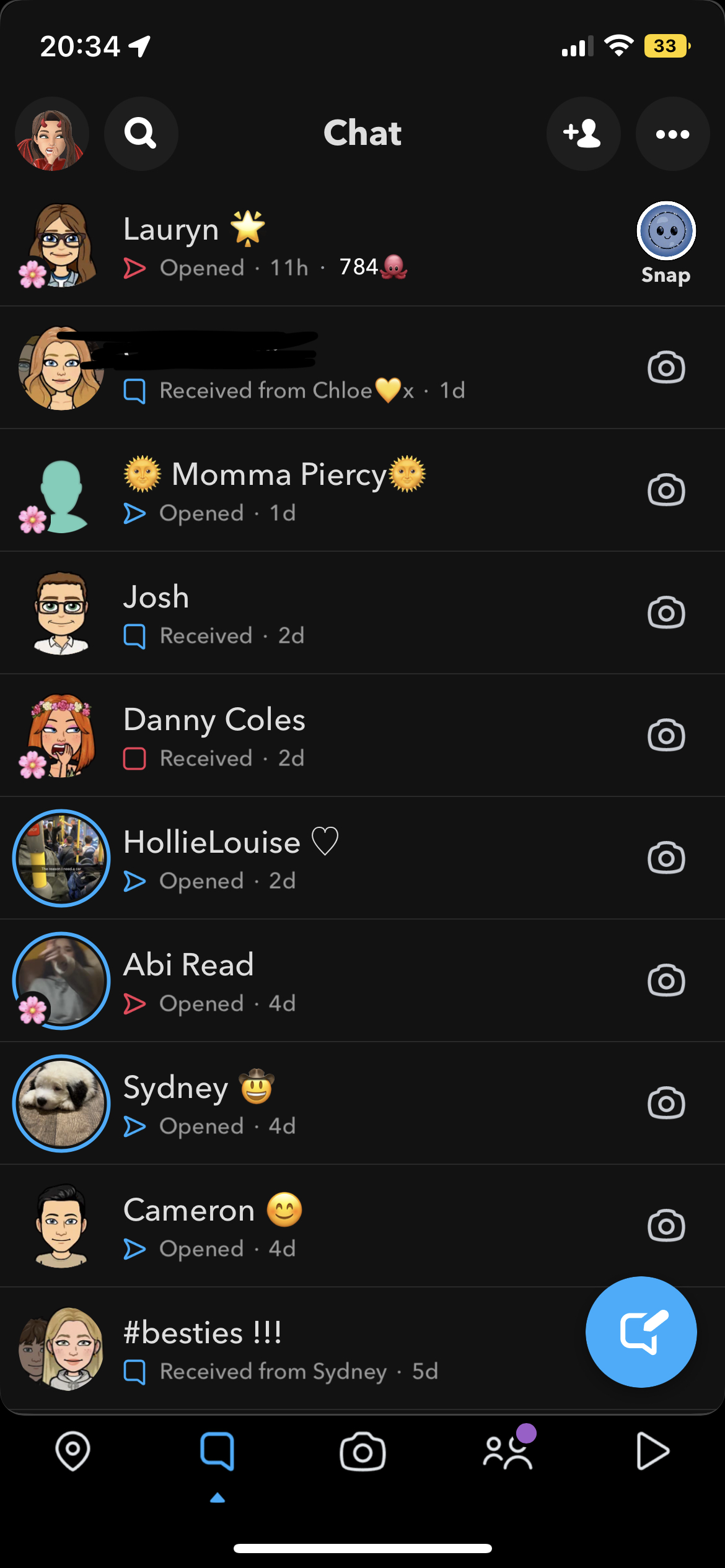
Snapchat was first created as an application for mobile and was not able to be accessed as a website, so this was going to be a bad example of a responsive website, but it turns out that Snapchat have now created a website with the same purpose as the app, you can still take pictures and chat with contacts through the website. There is still a lot of negative space on the web design but that is because the camera in the middle of the screen is still the size of a mobile so it can be shown on other mobiles.

Bibliography

Experience, W.L. in R.-B.U. (n.d.) Responsive Web Design (RWD) and User Experience. Nielsen Norman Group. Available online: https://www.nngroup.com/articles/responsive-web-design-definition/#:~:text=Responsive%20web%20design%20(RWD)%20is [Accessed 26 Oct. 2022].

Netflix. (n.d.) Available online: https://www.netflix.com/browse [Accessed 26 Oct. 2022].

Snapchat. (n.d.) Available online: https://web.snapchat.com/?lang=en-GB [Accessed 26 Oct. 2022].

Wayfair. (n.d.) Available online: https://www.wayfair.co.uk/?refid=GX587302180078.Wayfair%7Ee&position=&network=g&pcrid=587302180078&device=c&targetid=kwd-297288814273&gclid=Cj0KCQjwteOaBhDuARIsADBqReg8nx9XdZAsUNDTn9lTYq9GZ-9q6fsIej6vRhxwhBgHk5Pr3sSxhzgaAhrxEALw_wcB [Accessed 26 Oct. 2022].

Categories
Design Research Blog

RP3 – Storytelling

“Designers use storytelling to get insight into users, build empathy and reach them emotionally. Designers create personas to represent target users and add conflict to stories that reflect their user journeys and problems. Crafting stories, designers can better understand what users want from a solution.” (What is Storytelling?, 2013).

The storyboard example above shows four scenes within a film. The script on the right of the illustration’s states the angle and positioning of the camera during these scenes. Like graphic design, visuals are needed in the process of any storytelling because it helps developers understand the end result that designers or writers want. These two storyboards are scenes from Jordan Peele’s ‘Get Out’, a very popular psychological horror.

An example of storytelling in photography (Atkins, n.d.).

Storytelling doesn’t need numerous scenes to get the message across to an audience. The example above is by a wedding photographer, Simon Atkins, his main focus is to tell a story within his photographs. As you can see the man on the left is teary while looking at his presumed daughter in her wedding dress. This tells a beautiful story of happiness and joy within a family.

My example of storytelling through photography with added script.

Above is my own version of storytelling through photography. This is five images of my dog that create a narrative sequence of him trying to eat a bubble. Included is a script stating what the dog is doing and how the camera is angled, this was inspired by Eric Yamamoto’s Get Out storyboard.

Bibliography

Atkins, S. (n.d.) Storytelling Wedding Photographer. Available online: https://www.weddingphotojournalist.co.uk/storytelling-wedding-photography/ [Accessed 20 Oct. 2022].

What is Storytelling? (2013) The Interaction Design Foundation. Available online: https://www.interaction-design.org/literature/topics/storytelling [Accessed 20 Oct. 2022].

Yamamoto, E. (n.d.) Get Out Sunken Place. Available online: https://www.studiobinder.com/blog/storyboard-examples-film/ [Accessed 20 Oct. 2022].

Categories
Design Research Blog

RP2 – Multichannel UX

Multichannel User Experience is when a company uses multiple medias to engage with users. An example of a company using a multichannel is Superdrug, below are some images taken in-store.

Superdrug has used multiple designs around the store, including leaflets for their sim deals, posters showing student discount with an interactive QR code for their digital health and beauty membership card and posters showing different promotions for certain products.

Moving on to their digital side of things. Superdrug have an app and website where users can order products to their door or to their nearest store. Both the website and app also store a digital version of the membership card, this is convenient for the younger generation of users that use their phone more often.

Another company that uses Multichannel UX is fast food chain, Mcdonald’s. Mcdonald’s use many different designs throughout their restaurant such as their food packaging, wall art and the posters used for their trays.

Figure 12: Photo of a Mcdonalds Restaurant showing in-store UX. (Partridge, 2020)

Another example of design used within the restaurant chain is their yearly Monopoly. Recently they have switched the Monopoly to digital but a few years ago they would give customers a foldable Monopoly board for users to add their stickers. Below is a comparison of the 2.

Another good example of Mcdonald’s use of multichannel UX is the packaging used for Christmas time. The design is different and includes illustrations to fit the theme of Christmas, this is a good marketing scheme to convince the user to try their yearly Christmas menu.

Figure 15: Photo showing the Christmas design of the Mcdonald’s hot drinks cup. (Mcdonald’s Christmas Cup, n.d.)

Bibliography

Mcdonald’s Christmas Cup. (n.d.) Available online: https://www.pinterest.co.uk/pin/407153622537336192/ [Accessed 12 Oct. 2022].

Mcdonald’s Website. (n.d.) Available online: https://www.mcdonalds.com/gb/en-gb.html#carousel-e3792f9941-item-4f61fb3085 [Accessed 12 Oct. 2022].

Mcdonalds Monopoly. (n.d.) Available online: https://qsrmedia.co.uk/promotions/news/monopoly-returns-mcdonalds-uk-thirteenth-year [Accessed 12 Oct. 2022].

Partridge, J. (2020) Mcdonald’s to reopen. Available online: https://www.theguardian.com/business/2020/may/01/mcdonalds-to-reopen-some-restaurants-for-deliveries-during-coronavirus-lockdown [Accessed 12 Oct. 2022].

Superdrug. (2019) Superdrug.com. Available online: https://www.superdrug.com/ [Accessed 12 Oct. 2022].

Categories
Design Research Blog

RP1 – Grids & Frames

Grids and frames are the foundation to any design, using a grid brings accuracy to a design, it helps the structure become straight, clean and uniform. Grids are commonly used in architecture, whether that be the blueprints or the actual build itself. If you were to strip back a building, you would see that within the walls there are wooden frames in a grid like layout.

Above are some photos of buildings, these structures show examples of how grids can be used in architectural design. As well as the cubic structure of these buildings, the windows also create a grid layout with the same placement and size. The window frames also show very grid-like designs. Each of these four buildings show a modular grid within their structure.

Figures six and seven are again showing how grids are used within architecture.

Another grid to look at is the ‘rule of three’ grid. This is typically used within photography and above is an example of how this grid is used to make photos and designs look a lot cleaner and more professional. Grid layouts can normally be found within camera apps on smartphones for this reason. Another example of this grid can be seen below.

Grids and frames can also be found in everyday essentials, such as the toaster shown below. An example of a column grid can be seen within this toaster.

Bibliography

Galvan, M. (2021) Getting started with grids in digital design. Medium. Available online: https://uxplanet.org/getting-started-with-grids-in-digital-design-7aa3bcc8c881 [Accessed 6 Oct. 2022].