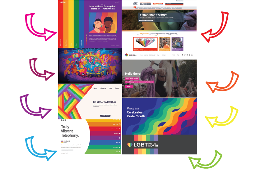
The initial idea behind the Rainbow Rave design plan was to include the distinctive LGBTQIA flag colours which are the colours of the rainbow. After doing some research into other LGBTQIA themed websites, the designs are very minimal because of the rainbows featuring throughout. Most of these websites, shown on the mood board diagram above, have a plain white or dark coloured background with rainbows appearing through.
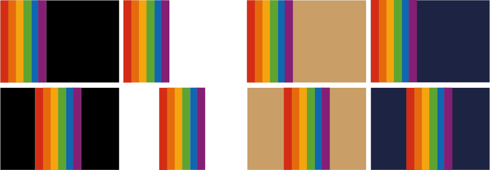
After doing some research it is said that neutral colours have the best effect when designing with the colours of the rainbow. ‘You can achieve some amazing visual effects by combining neutral colors with rainbow-influenced colors. The rainbow colors balance the neutral colors providing a magical touch to the design. Graphic designers tend to use the effect in dark designs to give it a special hypnotic charm.’ (Jansen, 2021). Below are some designs testing which backgrounds work best with rainbows.
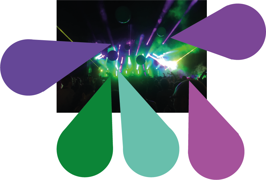
The final decision was to use an original image as the background and use the colour palette from that photo for the app design, shown below there is the original photo and samples of those colours taken from the photo.
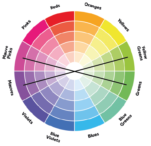
After looking into this colour combination, it was decided that the design’s colour palette would lean more towards the complimentary colours of the colour wheel, as seen below the yellow toned greens compliment the mauve tones and the greens compliment the pink toned mauves. This was the final colour palette chosen for the app and web design.
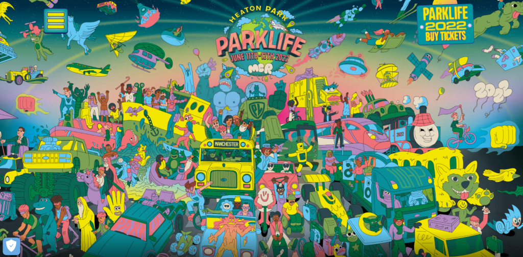
Another goal for the initial design was to include original illustrations. A lot of inspiration came from the Parklife web design with chaotic illustrations, the visual designs bring a lot of excitement to the customers and shows there will be a lot happening just from the first page. Sketched illustrations also add some personality to the design and can create a closer relationship with the stakeholders.
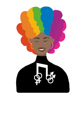
The illustration on the left is a rejected design for the Rainbow Rave logo, there is no relationship between the colours, the design is quite complicated and there seems to be too much happening for it to become a logo. The design in the centre was a completely different concept, it was decided to combine both music with LGBTQIA aspects, thus turning it into a conceptual design. The slogan ‘Girls, Gays and They’s’ has been added back to the design, this is a simple, memorable design. The logo on the left is another variation for the middle concept, it was decided to only include the top half of the woman in black clothing and brightly rainbow coloured hair. The text has been removed, simplifying the design, this creates less chaos with the chosen colour palette and background image.
Flamboyant Navigational Aids. (n.d.) DesignMantic. Available online: https://www.designmantic.com/blog/wp-content/uploads/2016/09/Flamboyant-Navigational-aids.jpg [Accessed 21 May 2022].
Jansen, M. (2021) 14 Ways to Use the 7 Colors of the Rainbow In Graphic Design. DesignBro. Available online: https://designbro.com/blog/inspiration/7-colors-of-rainbow-graphic-design/ [Accessed 20 May 2022].
Parklife. (2019). Parklife 2019. [online] Available at: https://parklife.uk.com/ [Accessed 2 Mar. 2022].
Pride at Progress. (n.d.) Progress. Available online: https://www.progress.com/blogs/pride-progress-promoting-inclusivity-june-beyond [Accessed 21 May 2022].
Pride in Hull. (n.d.) Pride in Hull. Available online: https://prideinhull.co.uk/ [Accessed 21 May 2022].