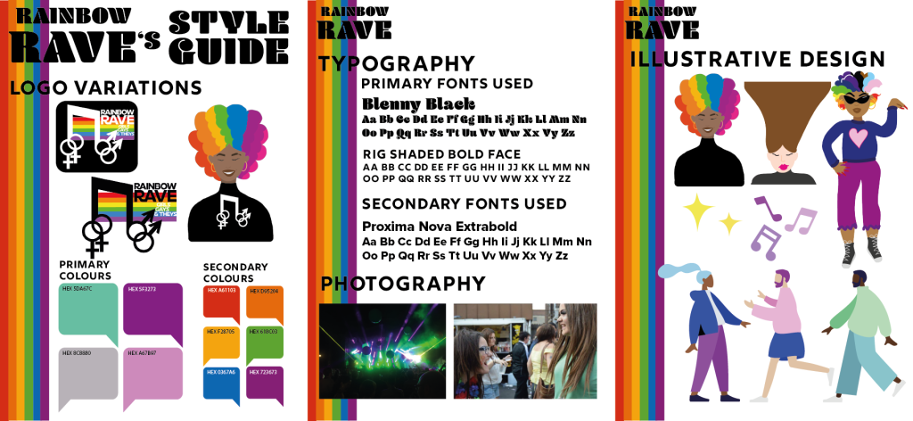
This is the style guide for rainbow rave, showing the colours, typography and photography used. Style guides are used to show designers what certain aspects are used within company’s web/app designs. The style guide also needs to be designed and look professional for the company’s benefit.
The first page of the style guide shows the logo variations and the colours used throughout the app and web design. As you can see the logo can be used in three forms, the first and second being a black and white version of the finalised logo and the third is a separate design with no text included. The idea behind using a logo with no text is to make it easier for the memorabilia of the company. ‘Your logo is important to your business because it communicates ownership, quality, and values. It’s imprinted on your products, your business card, website, social media, and most importantly, in the minds of your clients.’ (Why A Good Logo Is Important For Your Small Business › Design Powers, n.d.). On the bottom half of the first page, it shows the primary and secondary colours used within the app and web design. The primary colours are the main, most-used colours throughout the design, for example, the headings, sub-headings, borders etc. The secondary colours are the smaller fragments of that colour used, in this concept it’s the rainbow colours which can be seen on the loading screen, the ticket confirmation screen and the logo.
Page 2 of the style guide takes you through the typography and photography used in the designs. Like the colours, the app and web have primary and secondary fonts used. The most-used fonts (primary) are again, used for headings and sub-headings but also informative text. The secondary fonts can be used for pop-ups, drop-down options, and less informative text. The photography portion of the page shows the original images used in the designs; the left image can be seen as the background design.
The third and final page shows illustrative designs that have been used, the logo can again be seen within this page as well a rejected logo design, small decorative illustrations have also been added to show that they do make a difference in visual design. The bottom section of this page includes pre-made human illustrations called ‘Humaaans’ by Pablo Stanley, this is a plug-in feature for Adobe XD. The pre-made illustrations have been altered slightly to match the theme of the colour palette and to show certain personas. Using these original and pre-made illustrations add personality to the design, it can also increase attention to the younger generation because it is visually pleasing to view.
Why A Good Logo Is Important For Your Small Business › Design Powers. (n.d.) Design Powers. Available online: https://www.designpowers.com/blog/why-a-good-logo-is-important-for-your-small-business [Accessed 21 May 2022].