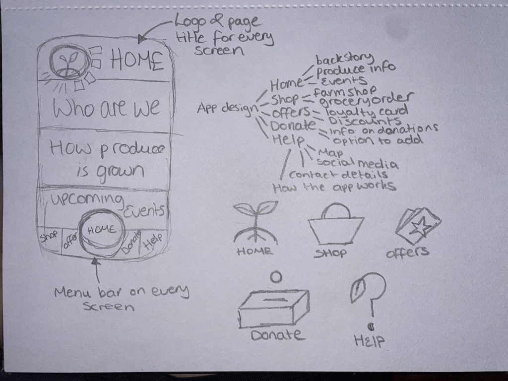
An app design was chosen from the master plan because of the growth in technology throughout today’s society. This app is something that everyone can get involved with and will attract more visitors to the Rooted in Hull farm. This is a great way to fulfil Adrian Fisher’s brief because it will spread more word about what Rooted in Hull do and how they help struggling families. In time, this will hopefully increase donations.
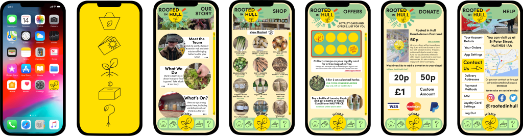
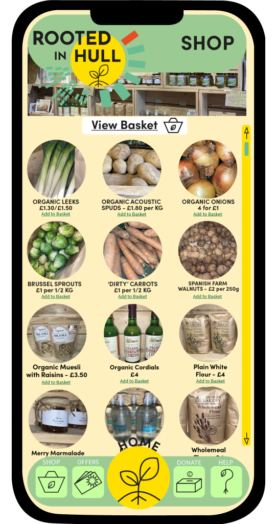
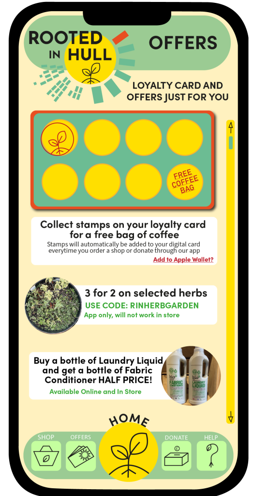
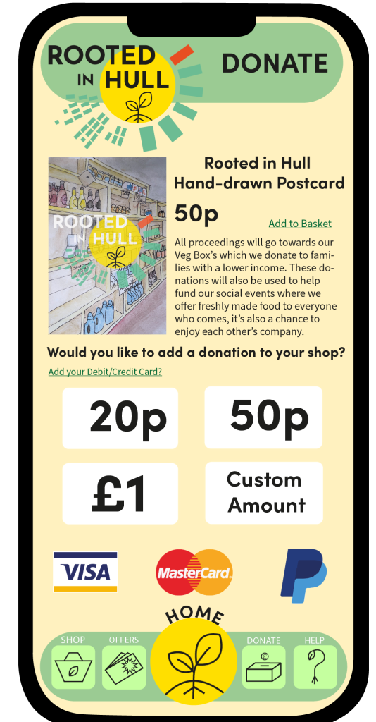
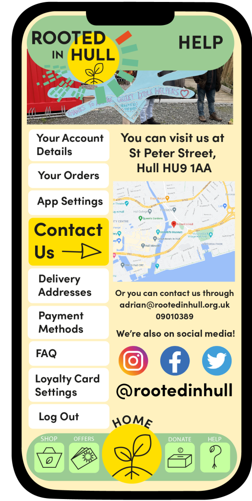
This is a six-screen app design with an example of what the app icon will look like against a generic iPhone home screen. Each screen shows all the different abilities the app offers, including a help page for queries about how the app functions. Other than the app icon and the loading screen, you will see that each page has the same composition. The logo, title and menu bar all have the same placement, this is to keep the design looking as minimal as possible. This also makes the design look very realistic and shows a level of professionalism.
Only three fonts have been used throughout the seven design examples. Sofia Pro Bold has been used for headings and subheadings, Source Sans Pro can be seen for the main body of text and informative sentences. Myriad Pro is the final font used for the iPhone home screen and the menu icons. All three typefaces are sans-serif and are easily readable against all backgrounds used in the design.
The colours used in the app have been limited to fit the Rotted in Hull’s colour palette, with tints of yellow and green, you can also see the colourful original images taken from the Rooted in Hull farm. Limiting the colour usage gives a clear palette and keeps the design from looking too chaotic, this again, enhances the level of professionalism.
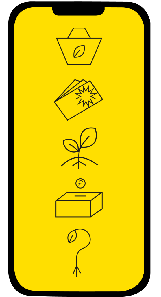
Conceptual design can also be found in the design of this app with the ‘Help’ icon, the icon shows a question mark with a leaf growing at the end and roots growing from the bottom, replacing where the tittle would be. This shows what the page is for and adds some of Rooted in Hull’s personality with the growing roots.
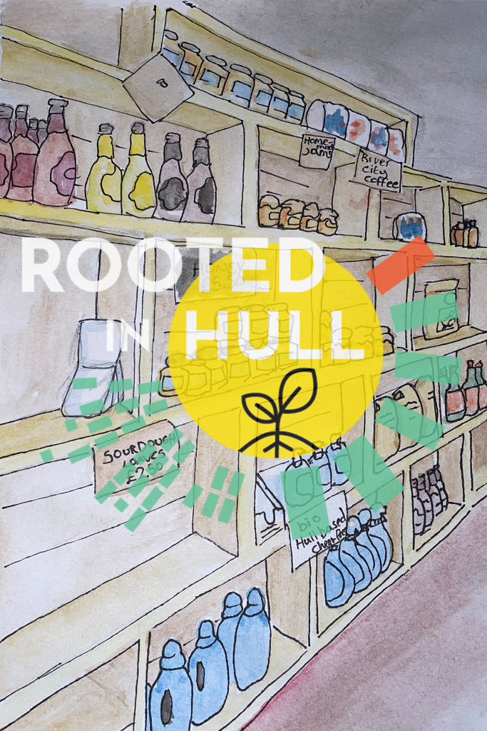
All photos used within this design are original images that were taken at the property of Rooted in Hull. In the ‘Shop’ section of the app, there are images for every product advertised, the idea behind this is to show the audience what they are paying for, so they do not become sceptical towards what they are buying. Including a photo of Adrian Fisher gives the costumer an insight to who they are buying from but also makes them feel more included. The purpose of this app design is to not make costumers feel like they are just buying from a brand that thrives in profit, it’s to show people where their produce comes from, how its grown and how the profits of the Farm Shop will be used or donated.
Bibliography
Instagram, Facebook, Twitter Logo. (n.d.). [Online Image] Available at: https://stock.adobe.com/uk/search/images?k=fb+logo [Accessed 17 Dec. 2021].
IPhone Home Screen Template. (n.d.). [Online Image] Available at: https://files.design/templates/ios12gui [Accessed 19 Dec. 2021].
Paypal. (n.d.). [Online Image] Available at: https://logos-download.com/1725-paypal-logo-download.html [Accessed 17 Dec. 2021].
Png Mastercard Logo Vector. (n.d.). [Online Image] Available at: https://www.pngitem.com/middle/hTJJJmR_png-mastercard-logo-vector-transparent-png/ [Accessed 17 Dec. 2021].
Rooted in Hull Google Map. (n.d.). [Online Map] Available at: https://www.google.co.uk/maps/place/Rooted+in+Hull/@53.7445283,-0.3266716,15z/data=!4m5!3m4!1s0x0:0x52d0ba15975c0e3f!8m2!3d53.7445283!4d-0.3266716 [Accessed 17 Dec. 2021].
Rooted in Hull Logo. (n.d.). [Online Image] Available at: https://www.rootedinhull.org.uk/ [Accessed 19 Jan. 2022].
Visa Debit. (n.d.). [Online Image] Available at: https://www.google.co.uk/search?q=visa&sxsrf=AOaemvImglfbF1_vOMejFw_L3TrWWv0urQ:1639760321265&source=lnms&tbm=isch&sa=X&ved=2ahUKEwjxvtybp-v0AhXKVsAKHWXTCl0Q_AUoAnoECAIQBA&biw=1536&bih=754&dpr=1.25#imgrc=9W_dnm08jQfJyM [Accessed 17 Dec. 2021].