A master plan is used in design for long-term planning, it’s a document that helps guide the design process to reach its full potential and fit the brief that clients have set out (Worldbank.org, 2009).
CEO of Rooted in Hull, Adrian Fisher stated that he wants a way to ask people who have money for money to donate to the less fortunate and fund veg boxes to them. With this brief, a master plan was created to help start the design journey towards Adrian’s brief.

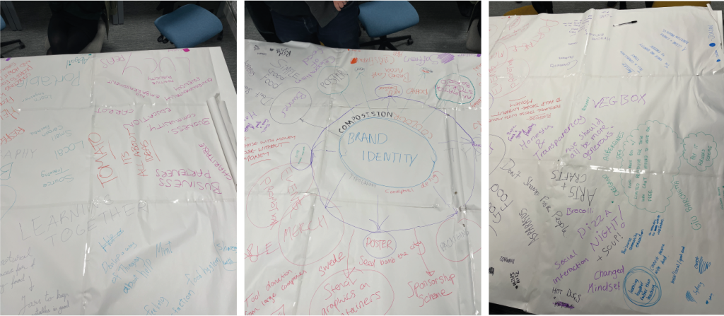
During a group discussion, many ideas and design concepts were spoke about and the master plan was evolved. Design ideas such as merchandise, app design, stationary packs and web design were discussed. With this group plan, a digital version was created including all the ideas spoke about. Plans and ideas from Adrian’s interview with the Graphic Design students and lecturers were picked apart and reconstructed into this master plan.

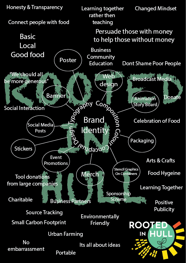
This is a rough digital redesign of the group master plan. The colours on this digital design are very simple and they remain within the Rooted in Hull’s logo colour palette. The text is white to create contrast with the dark background and is easily readable. The font is a simple sans-serif type face, this again, makes the text easily readable and doesn’t overly complicate the text against the second font used in the background design. This is a chalk-like font to create the effect of a chalkboard which relates again to why the main body of text is white.

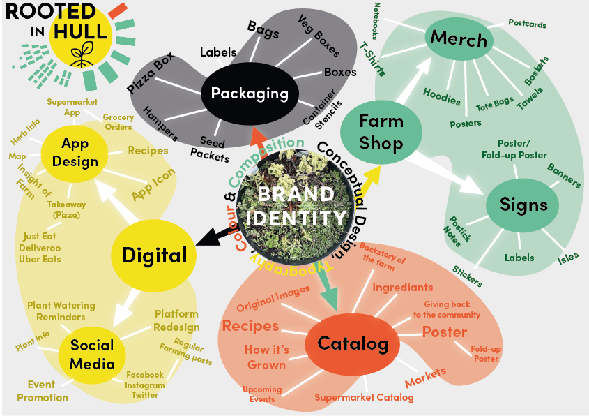
After some further discussions about the design options, a more personal master plan was created. This included individual idea likings from the main group master plan. In this final design, there are four categories which have been personally chosen to extend with more ideas. The initial design for this master plan is a lot funkier with the blotches of colour, it’s a lot more colourful but remains within the Rooted in Hull’s logo colour palette. For each of these four categories more ideas have been developed, two of these categories have sub-categories which show in-depth concepts. App design and merch, the two with sub-categories, are the ideas that want to be enhanced further throughout the design process and are better concepts for what Adrian is asking for.
Bibliography.
Rooted in Hull Logo. (n.d.). [Online Image] Available at: https://www.rootedinhull.org.uk/ [Accessed 19 Jan. 2022].
Worldbank.org. (2009). Master Planning | Urban Regeneration. [online] Available at: https://urban-regeneration.worldbank.org/node/51 [Accessed 19 Jan. 2022].