What are graphic standards?
Graphic standards are used within companies to provide a structure for using logos, colours, typography, and composition. It shows the correct way a logo should be positioned in every instance, an appropriate colour palette and the fonts used within the company’s visual graphics. Graphic standards should contain information about the branding and should be easily readable (www.usi.edu, n.d.).
Here are 3 A4 pages of Rooted in Hull’s graphic standards manual design, based around original artwork 1 and 2. These 3 pages are informative about colour, typography, composition, and photography. The manual has been designed with the same colour palette as the Rooted in Hull’s logo and uses the same typeface throughout.
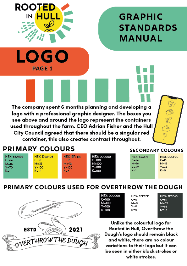
The first page is focused on Rooted in Hull’s logo with information on the story behind their logo design process, which CEO Adrian Fisher told the graphic design students and lecturers during his interview. The colourful blocks around the logo have been deconstructed and placed in the centre of the page to show a close view of what the text below is stating, choosing to talk about the blocks from the logo gives them a lot more personality as many people will just see them as a random design. In the second half of the page there are squares of primary colours used within the logo and the visual graphics of artwork 1 and 2. Included are the HEX codes of these colours, found using Adobe Capture, for other designers to use. There is a small section at the bottom of the page showing Overthrow the Dough’s primary and secondary colours used in Artwork 1.
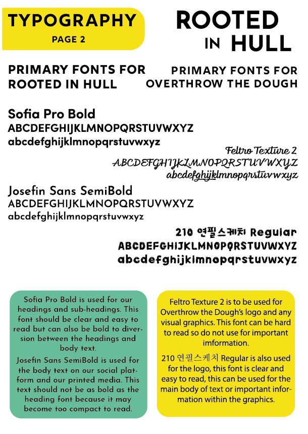
The second page shows the typography used within Rooted in Hull and Overthrow the Dough’s visual graphics, this includes both logos, 2D designs and digital artwork, which can be found in Artwork 1 and 2. The left side of the page shows the primary fonts of Rooted in Hull in flushed left, on the right side is Overthrow the Dough’s primary fonts in flushed right. All primary font examples show both upper case and lower-case alphabets to show the audience the typeface variations. At the bottom of the page there are coloured blocks containing information on the primary fonts and where they should be used. The fonts you see for Rooted in Hull’s side are similar typefaces used in their logo and web design, these were found using Adobe Capture.
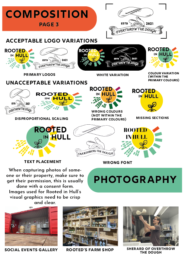
The third page shows the importance of composition within the logo placement. The first half of the page shows acceptable and unacceptable variations of the logo placement, this includes useful variations of Rooted in Hull and Overthrow the Dough’s logo. The second half of the page contains information on photography and advice when capturing photos of Rooted in Hull’s staff or their property.
Bibliography
Rooted in Hull Logo. (n.d.). [Online Image] Available at: https://www.rootedinhull.org.uk/ [Accessed 19 Jan. 2022].
www.usi.edu. (n.d.). Importance of Graphic Standards – University of Southern Indiana. [online] Available at: https://www.usi.edu/brand/importance-of-graphic-standards/#:~:text=Graphic%20standards%20provide%20a%20sound [Accessed 20 Jan. 2022].